16 July 2021

Tantrum by Jules Feiffer (No. 50)

Tantrum (1979)
by Jules Feiffer

REVIEW BY RAY MESCALLADO:
(from The 100 Best Comics of the Century! in The Comics Journal #210, 1999)
At 42, family man Leo Doug has had enough of responsibility, of maturity, of "No give. No give. No give." So one night, like Gregor Samsa with a Peter Pan complex, Leo makes himself two-years old again. What follows is a journey that would daunt any adult, never mind a child: Leo proceeds to abandon his family, tries to return to his parents, seeks help from his siblings, and even encounters an enclave of other two-year-old adults. As it turns out, Leo can't help acting like an adult, though that doesn't always mean he's behaving maturely when he does so. 

The most memorable sequence occurs when Leo seeks out his brother's estranged wife, Joyce. A whole other mind/body corruption is in evidence with Joyce: lost in body-image issues, desperately wishing, "If I could be all essence and no body..." The sick, sick, sick codependency is fleshed out between the two to excellent effect - and not without a touch of empathy for both characters.

Feiffer had previously explored the role of childhood in a supposedly mature world: 1959's Munro, his first extended comic story, was about a child accidentally drafted into the military. Published 20 years later, Tantrum is Feiffer at the height of his powers, and the graphic novel format allows him a scope and bravura that only amplifies the achievement of his weekly strip. Each panel takes up a whole page, allowing Feiffer to fill out the world around his characters (a luxury he often eschews in his strip) and create highly dramatic images. Leo is often drawn to emphasise his metamorphosis, but there are panels where the outsized emotions and ego of our anti-hero are reflected in the choice of angles. Feiffer's distinctive monologue rhythms remain very much in evidence, an incantatory exposure of modern non-communication. Even when facing each other, people rarely hold an actual dialogue in Feiffer's works: they compare their relative lots in life, they antagonise without hearing the other side, but rarely do they desire to connect. Consider Leo's brother upon meeting his de-aged sibling: "Leo! Good to see ya" Looking' good. Lost weight. Got hair piece. Fabulous! Miss Swallow, two Perriers."

Narcissism is just one flaw, and Feiffer delights in all the contradictions of human behaviour. The advice Leo gives a real child remains indisputable: Don't mature! Mature people do the shit work!" But where are the mature people in this story? At best, maturity is a fleeting moment of grace and not a consistent attitude. This lesson is writ large in the ending. Is it positive turn of events, is it a confirmation of our worst fears? It's left up to us to decide. After all, what matters most in Tantrum is the comedy of human passions. And as Feiffer so often reminds us, such passions are frequently misleading, rarely politically correct, and never as obvious as we think.


REVIEW BY NEIL GAIMAN:
...When the history of the Graphic Novel (or whatever they wind up calling long stories created in words and pictures for adults, in the time when the histories are appropriate) is written, there will be a whole chapter about Tantrum, one of the first and still one of the wisest and sharpest things created in this strange publishing category, and one of the books that, along with Will Eisner's A Contract With God, began the movement that brought us such works as Maus, as Love and Rockets, as From Hell -- the works that stretch the envelope of what words and pictures were capable of, and could not have been anything but what they were, pictures and words adding up to something that could not have been a film or a novel or a play: that were intrinsically comics, with all a comics' strengths. [Read the full essay here...]


15 July 2021

The Theatrical Caricatures of Al Hirschfeld (No. 34)

The Theatrical Caricatures of Al Hirschfeld (1928-2003)

REVIEW BY R.C. HARVEY:
(from The 100 Best Comics of the Century! in The Comics Journal #210, 1999)
For at least the last half of the century, one name has dominated the field of theatrical caricature in America. Although he stands virtually alone now, Al Hirschfeld is the last of a breed that proliferated in the earliest years of this century, prospered with the burgeoning of magazine journalism, and reached its apotheosis in the '20s and '30s, particularly in the pages of Vanity Fair, which gloried in full colour celebrity caricatures.

Hirschfeld emerged from the pack when he began concentrating on theatrical caricatures for New York newspapers in 1928; since 1943, exclusively for The New York Times. Some of his earliest efforts evoke the geometric patterning of Miguel Covarrubias (with whom the young Hirschfeld shared a studio in the 1920s), the lilting line of Al Frueh as well as a penchant for using the full figure to capture a likeness, and the embellishing complexities of Ralph Barton

But Hirschfeld soon developed his own distinctive style, and for pure, flowing, linear expression, no one has matched him. And in his cartoon tableaux of the cast and ambiance of a production, he achieves symphonic compositions of line, mass, texture, and shape, masterpieces in black-and-white, and in rendering action, particularly, in incomparable line achieves its ultimate expressiveness, where single lines coil and springing imitation of the performers' motion. 

Says the artist: "The problem of placing the right line in the right place has absorbed all of my interests across these many years... I am still enchanted when an unaccountable line describes and communicated the inexplicable."

OBITUARY BY PHILIP HAMBURGER:
(from The New Yorker, 2 June 2003)
Al Hirschfeld, the great caricaturist, was to have reached the magic age of one hundred on June 21st. Myriad celebrations were planned, the culmination to be the renaming of the Martin Beck Theatre the Al Hirschfeld Theatre. Death stepped in on January 20th, when Al died at home in his sleep. But, since Hirschfeld was Hirschfeld, only the centerpiece of the festivities will be gone. The Martin Beck will become the Hirschfeld on June 23rd. Since I can no longer talk to Al (we talked all the time), I have done the next best thing: I have had a chat with his wife, Louise Kerz Hirschfeld, a beautiful woman in her sixties. She came to see me the other day, and it was obvious that she has inherited one of Al’s most mysterious traits: regardless of traffic or municipal mayhem on the streets, Al always managed to park exactly where he wanted to park, right in front of where he was going. One might consider this some sort of extraterrestrial intervention, or just good luck, but whatever it was it always worked.

Mrs. H. was eager to talk about Al. Hiding her sorrow, she seemed calm and collected. “He felt so tired that Sunday that I suggested he stay in bed. This was not easy for Al. He lived for his work, and the notion of not climbing to the fourth floor of our lovely house on East Ninety-fifth Street, and sitting back in his old barber chair, and beginning to draw seemed strange to him. But he followed my advice. He was propped up against the pillows and making strange circular motions with one empty hand - circles and lines and dots and faces. He was drawing something: we will never know what."

"Al always said that he had been down every street in the city of New York, with a special, odd affection for the borough of Queens," she went on. "He always had special ways of getting out of the city - weird shortcuts from the Harlem River Drive, through a crowded commercial district, and onto the New York State Thruway. He loved to point out a cliff he used to climb as a boy on what is now the Harlem Drive. In the old days, his closest friends were Brooks Atkinson, drama critic of the Times, Alexander King, the writer, and Paul Osborn, whose plays he loved. But his favorite writer of all was Thoreau, and we printed a Thoreau passage on the funeral program that read, in part, 'There was an artist... who was disposed to strive after perfection... As he made no compromise with Time, Time kept out of his way and only sighed at a distance because he could not overcome him."

"Al never talked about death - he made no plans, none of that. He lived for every day. He once did a great drawing of Houdini - all bound and chained - and I often felt that Al was like Houdini, bound and chained to his work, from which he would miraculously emerge. Theatre totally fascinated and consumed him. His favorite plays were Long Day’s Journey Into Night and Death of a Salesman. Of course, he knew O’Neill - the two of them would haunt the jazz spots on Fifty-Second Street. The fact that a theatre was to be named in his honor almost overwhelmed him. Arthur Gelb, the Times eminence, and I went and told him the news. ‘It’s a great honor, but I won’t speak,’ he said. ‘Just take a bow.’ To see Al at a theatre was an uplifting experience. He became like a boy. The look of expectancy on his face before the curtain rose simply cannot be described."

"He didn’t ever want to be bored. Hence, he was always trying for something new. If you asked him what was his favorite drawing, he would always say, ‘The last one that I did.'"


FURTHER READING:


14 July 2021

Plastic Man by Jack Cole (No. 32)

Plastic Man (1941-1950)
by Jack Cole

REVIEW BY R. C. HARVEY:
(from The 100 Best Comics of the Century! in The Comics Journal #210, 1999)
In Plastic Man (starting in Police Comics No.1, August 1941) Jack Cole (1918-1958) demonstrated spectacularly how to combine superhero adventures with slapstick comedy to the detriment of neither. It was to prove a unique achievement: no one has successfully revived the feature. 

Written and drawn by Cole, Plastic Man could stretch himself into any shape or to any extremity at will. Extending his legs, he could stride across town in a few steps; he could infiltrate the criminal's lair by contorting into any form. Part of the fun for the reader lay in discovering which of the accoutrements in the crook's hideout was Plas in disguise, lying in wait for his prey. His rubber costume was a dead giveaway, of course: bright red long-sleeved tank suit with a wide yellow-and-black-striped belt. So all you had to do was to find the carpet or door or Oriental vase or easy chair that was red with yellow and black stripes, and, sure enough, the bad guy would get stuck in the carpet or couldn't open the door or flee or be grabbed by the vase or enveloped by the chair while sitting in it, and then Plastic Man would then resume his normal shape and arrest the culprit. 

Cole's device's were both ingenious and humorous, but the chief hilarity of the stories lay in the profusion of sight gags with which Cole infected virtually every page. To add to the fun, the underworld itself seemed populated entirely by fugitives from animated cartoons, but - and this was Cole's great secret - Plastic Man was never a figure of fun or a comedian. Surrounded by burlesque comedy and accompanied by a fat comic sidekick named Woozy Winks, Plas nonetheless took his crime-fighting seriously, and the combination gave the series its distinctive ambiance.


REVIEW BY ART SPIEGELMAN:
(from an article in The New Yorker, 19 April 1999)
If the going rate for pictures is still only a thousand words per, most Plastic Man panels are worth at least two or three pictures. Each panel seems to swallow several separate instants of time whole, as if the page were made up of small screens with different, though related, films whizzing by at forty-eight frames a second. Cole’s is an amphetamine-riddled art: Tex Avery on speed! And it’s not just Plastic Man who bounces and twists; any one of Cole’s incidental figures would seem as kinetic as Plastic Man if it were transplanted into someone else’s comic book. Each page is intuitively visualized to form a coherent whole, even though the individual panels form a narrative flood of run-on sentences that breathlessly jump from one page to the next. The art ricochets like a racquetball slammed full force in a closet. Your eye, however, is guided as if it were a skillfully controlled pinball, often by Plastic Man himself acting as a compositional device. His distended body is an arrow pointing out the sights as it hurtles through time. In just a single panel, our hero chases along a footpath in a park, trailing a mugger. Running from the rear of the picture, Plastic Man’s S-curved body echoes the path itself as he loops around one pedestrian in the distance and extends between two lovers about to kiss - lipstick traces are on his elongated neck as he passes them - to swoop up between an old man’s legs like an enormous penis wearing sunglasses and stare into his startled face. Plastic Man had all the crackling intensity of the life force transferred to paper. Pulpier than James Cameron’s Terminator, more frantic than Jim Carrey in The Mask, and less self-conscious than Woody Allen’s ZeligPlastic Man literally embodied the comic-book form: its exuberant energy, its flexibility, its boyishness, and its only partially sublimated sexuality. Cole’s infinitely malleable hero, Clinton-like in his ability to change shape and squeeze through tiny loopholes, just oozed sex. It was never made explicit - the idea of a hard-core version of Plastic Man boggles the mind - but there was a polymorphously perverse quality to a character who personified Georges Bataille’s notion of the body on the brink of dissolving its borders. Cole let it all hang out as Plastic Man slithered from panel to panel - sometimes shifting from male to female, and freely mutating from erect and hardboiled to soft as a Dali clock. [Read the full article here...]


FURTHER READING:

13 July 2021

A Contract With God by Will Eisner (No. 57)

A Contract With God (1978)
by Will Eisner

REVIEW BY DAVID RUST:
(from The 100 Best Comics of the Century! in The Comics Journal #210, 1999)
Will Eisner's breakout book A Contract With God & Other Tenement Stories has a contentious claim to be considered the first graphic novel. This makes it important as a historical curiosity, but hardly accounts for its inclusion on this list. Much more importantly, it marks a master craftsman's first attempt to turn the comics medium from genre-based storytelling to straight, literate fiction. As great as all those old Spirit stories are, Contract is Eisner showing us comics can be art and self-expression as well as entertainment.

The book collects four tales of urban life in a seamless blend of social realism and melodrama. Set in the same building in a New York Jewish ghetto, these stories fictionalise events Eisner remembers happening around him during his childhood. 

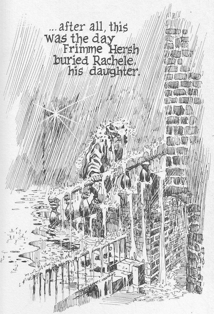
In the title piece, Frimme Herch believes he is favoured by God until the death of his daughter, which he interprets as God's betrayal. Herch becomes a financial success, but his loss of faith prevents him from happiness. In an ironic twist, Herch regains his faith but is them seemingly struck down by a God angered at Herch's presumptions.

In The Street Singer, a failed opera diva seduces the title character and plans to live out her failed dreams by guiding the younger man's career. The two are clearly using one another for their own purposes but manage to give one another hope in their otherwise bleak lives. Born losers, the star crossed pair become lost from one another in the big city and never get the opportunity to pursue their dreams. 

The Super manages to arouse sympathy for the grouchy, porn-addicted building manager who lusts after a young tenant. Eisner is not interested in heroes or villains, and the characteristics which would make the man repugnant in most stories are coupled with vulnerability and humanity.

In the final story, Cookalein, Eisner casts his sympathetic eye for human foibles on a group of urban residents summering in the country who grope about in clumsy searches for love, sex and social advancement.

The specificity of setting lends authenticity to the universality of Eisner's concerns, which include love, loss, alienation, hope and despair. Eisner's formal creativity and mastery of atmosphere invest these tales with emotional power. The novelty of the format aside, A Contract With God is a moving and compelling book, and the masterpiece of one of the medium's first true artists.


WILL EISNER:
(discussing the death of his daughter Alice from leukaemia)
My grief was still raw. My heart still bled. In fact, I could not even then bring myself to discuss the loss. I made Frimme Hersh’s daughter an “adopted child.” But his anguish was mine. His argument with God was also mine. I exorcised my rage at a deity that I believed violated my faith and deprived my lovely 16-year-old child of her life at the very flowering of it.


REVIEW BY FRANK MILLER:
(from an interview in The Comics Journal #209, December 1998)
Well, a lot of it to me gets back to Eisner. He still in many ways is a framework for me, and I think at least to date, probably the most important piece of work he did was A Contract With God. Certainly in terms of influence, because I wasn't the only one who sat up and took notice when that book came out. It had a profound effect on how I approached not just the fate of my work, but the kind I wanted to do. I wanted to work much more long form. That's ironic, because it was a series of short stories. But I think he quietly started a revolution. He's been relentless in pursuing it.


REVIEW BY SCOTT McCLOUD:
(from the introduction to the 1997 edition of A Contract With God)
I’m writing this in 2016, more than a decade after Will Eisner died. The potential of comics is being demonstrated daily in ways Eisner anticipated when he created A Contract With God nearly forty years ago, but also in ways he could’ve hardly imagined. And of course, inevitably, the book itself will suffer the fate of any first-of-its-kind pioneer. It’s been joined now by so many of its kind that it’s easy to lose it in the crowd. There are now graphic novels with ever more complex formal ambitions, with subtly written dialogue, up-to-date sensibilities, pitch-perfect irony, and politically urgent subject matter. Graphic novels proliferate and improve with every passing year. But they’re still branches on an immense family tree that was once just a sapling - planted in soil he always knew was fertile.


REVIEW BY DAVE SIM:
(from an interview in The Comics Journal #83, August 1983)
I kept putting off buying A Contract With God for a long time because I knew it would be a long time before I saw another Contract With God, and when I read it, it was just like, Oh, if there were only 18 things coming out like this.


REVIEW BY CHESTER BROWN:
(from an interview in The Comics Journal #135, April 1990)
Another bridge type book was A Contract With God by Will Eisner, which I picked up when it first came out back in '79... it was an important book too, in making me see that there were other types of ways of doing comics. There were other kinds of comics that were possible... here he was doing something different, and something that wasn't about a character with a mask on his face. That was neat stuff, and kind of eye-opening at the time.


FURTHER READING:

12 July 2021

The Bungle Family by George Tuthill (No. 99)

The Bungle Family (1924-1945)
by George Tuthill 

REVIEW BY ART SPIEGELMAN:
(from The 100 Best Comics of the Century! in The Comics Journal #210, 1999)
My candidate for Most Underrated Comic Strip in our History: George Tuthill's The Bungle Family, a domestic comedy strip that ran off and on from 1924 to 1945. It was fairly popular in its day but rarely gets a mention in books on the medium and has certainly never been honoured with a U.S. government postage stamp design like Blondie. Tuthill's grubby, uningratiating drawing style and the verbose density of balloon prose hardly make a good first impression; Tuthill's genius was as a writer able to put over one of the darkest visions of American life this side of Nathaniel West. The lower middle-class Bungles, George and Josephine, have no more charm than the style they're drawn in: they are petty, mean-spirited, with no self-awareness, constantly bickering and backbiting among themselves as well as with their neighbours and landlords. Unlike Dagwood and Blondie, one doesn't feel that this is a couple that genuinely cares for each other; they are accidental allies surrounded by hostile figures they detest more than each other. There is no one panel or sequence that can encapsulate this strip's sardonic qualities: Hell is in the details that accumulate in the repeated daily doses that the newspaper comics theatre can provide. Tuthill's misanthropic vision (he's the funny page's Celine) is painfully real, though the strip careened through surreal episodes - especially in its later years - that included visitors from outer space and time travel. visually deadpan, genuinely hilarious once you tune in to its frequency, with a great ear for dialogue and an unsurpassed sense of character, The Bungle Family grows on the reader like a fungus until, like all great art, it becomes a central reference point in one's way of understanding the world.


REVIEW BY DAN NADEL:
(from TCJ.com, 2014)
The Bungle Family deserves an audience - it is perhaps the most contemporary of the classic comic strips, with timing and dialogue situations that are oddly current in today's comedy culture. It's a great and funny and nasty and, in its way, beautiful piece of work.


REVIEW BY BILL BLACKBEARD:
As a work of narrative comic art, The Bungle Family effectively went unseen over its quarter-century span except on the daily and Sunday comic pages of American newspapers, with no shelvable record or cinematic adaptation of any kind. Yet the strip appeared in hundreds of papers with virtually no drops from its early years through the '40s, when Tuthill closed it down to almost universal protests from readers and editors, yielding to their entreaties once for a revival run of a few years, then retiring it firmly in 1945 for good. (For two more decades, Tuthill lived quietly as the wealthy squire of tiny Ferguson, Mo., relishing his days away from drawing-board demands, never knowing the attention that still unborn comic-strip fandom would have brought him from the ’60s on—and perhaps not caring.)


FURTHER READING:


11 July 2021

Covering The New Yorker: Jean-Jacques Sempé

Our Sunday-Morning Outings
The New Yorker (23 September 2019)
art by Jean-Jacques Sempé

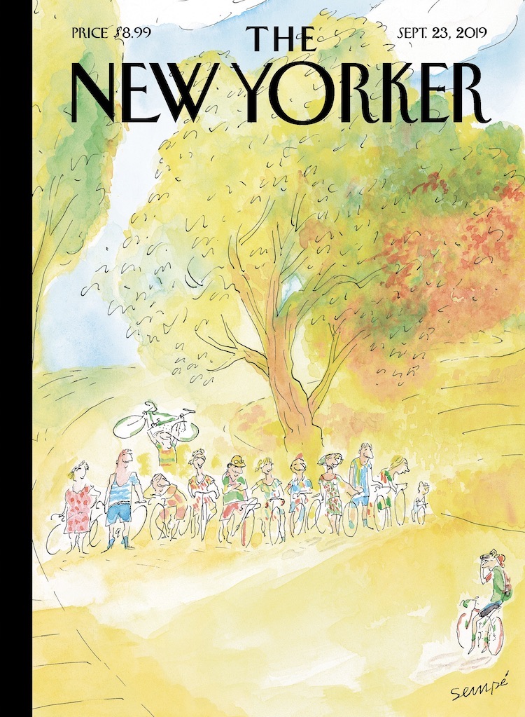
In the past fifty years, many of J. J. SempĂ©’s hundred and twelve covers have celebrated the gratifications offered by la petite reine, his beloved bicycle. With a fragile and delicate line, SempĂ© captures a wide range of life’s simple pleasures - friendship, nature, animals, and music are recurrent themes - that even contemporary French people can’t take for granted. We recently chatted with the eighty-seven-year-old artist, en français, about the sources of his inspiration and the dreams that haunt his old age. You have often spoken of your love of bicycling, but what inspired this specific image?

JEAN-JACQUES SEMPÉ:
It’s always been one of my dreams - to have a group of friends who go for bike rides in the country every Sunday morning. In real life, it never happened. I kept trying to organize it but everyone was always too busy to slow down for it.

How did you conceive those outings?

Well, we’d get a bit of exercise, build some muscle and also spend some time together. We’d take our bikes on the train and get to the small country roads that run along the fields. It’s quiet and smells good and it’s totally out of fashion. Sometimes one of us would know a good country restaurant, but then it would turn out that it was closed. I keep thinking back on those outings - it’s one of the things I really wish I had done.

Do you have many other unrealized dreams?

Well, my most vivid dream is to have a piano duel with Duke Ellington. And, of course, he gets to win because I’m pathetic and he’s very, very good. I think about it virtually every night. Ellington is a man I adored. There’s a photo of him, smiling, on my piano. I look at him when I play and search for his approbation.

Did you ever meet Ellington?

Yes, once, a while back in Saint-Tropez. He was giving a concert and a friend of mine said, Come with us, we’ll have a drink with him afterward. When the concert ended, I rushed to the back. It was pitch black, no one was there, but in the dark I made out the outline of a piano and sat down. I was hitting a few keys when Ellington walked in. He said, “Not so bad!,” sat next to me, and said, “Do the right hand, I’ll do the left.” (The right hand is the easier one, of course.) We played a piece of his that I know quite well: “Satin Doll.” By then there were lots of other people around and they drew his attention away. I was so impressed that I had exchanged a few notes with him that I didn’t want anyone to talk to me or even look at me. I was trying to preserve the moment.


art by Jean-Jacques Sempé

The cover for the magazine’s Fall Books Issue was done by Jean-Jacques SempĂ©... He recently talked to us about childhood, one of the more recurrent themes in his work. Your drawings often riff on [the theme of childhood]. What draws you to it?

I find youth attractive for its innocence and naïveté. Not my youth - I have only horrible memories of when I was young - but the hope that comes with being young. I miss the eagerness for discovery, the belief that things could get better.

You created many features for kids, including Le Petit Nicolas. Is there a special appeal in working for children?

Le Petit Nicolas was a series of books I did with René Goscinny, the French comics legend, who also was the scriptwriter of Astérix. I grew up in Bordeaux, in a piss-poor family, and hated school - I dropped out to enroll in the Army just so I could eat and have a place to sleep. René had gone to the Lycée Français in Buenos Aires, Argentina, where he was a good student - very much unlike me.

The Nicolas stories were a way to revisit the misery I endured while growing up while making sure everything came out just fine. Kids are always getting into fights but no one is hurt afterward.

Did you have favorite books when you were growing up?

I once read, in the advice column of a women’s magazine, that you should read as much as you can to improve your spelling. There was nothing to read at home, so I read the back of packages, manuals, billboards - anything I could find. I loved everything Alexandre Dumas wrote, especially “The Three Musketeers.” (I was d’Artagnan!) And I got to be a very good speller, which made me inordinately proud.


Biking In The Rain
The New Yorker (7 May 2018)
art by Jean-Jacques Sempé

New York City is one of your most obsessive themes. What draws you to that landscape?

I’m passionately attached to the city, so I try to find it again by drawing it. I love the colors in New York. They’re dynamic: bright yellows, greens, reds, and blues. Paris, where I live, is beautiful but it’s always gray. I love Paris too, but it’s not the same.

What are other differences between drawing New York and Paris? How are the cities different for you?

New York is a place where people know what it’s like to be starting out. New Yorkers have sympathy for those who are trying to se dĂ©brouiller, to make do or get by. Novices aren’t discouraged. It’s not a bourgeois town set in its ways like Paris. In New York, everyone has to keep moving forward.

It’s often hard to distinguish what era your work is set in. There’s a timeless quality there. Is that intentional?

You flatter me, but, yes, in a way. When I think about New York, I think about the whole. I try to paint an ambience that has the buildings, the smells, and the sounds, Duke Ellington and James Thurber. Here, I wanted to paint a petite dame, a little old lady who holds her balance in that immense and magnificent town.

Your first published cover was in 1978, yet you’ve made only five or six trips to New York over the past forty years. Why don’t you come more often?

A big issue for me is the language barrier. If I had been able to speak English well, I’d probably have settled there. But I just don’t speak it at all. I didn’t want to be seen as one of those arrogant Frenchmen who only speaks his own language. I hate not being able to talk. It throws me back to the old days, when I was young and so paralyzed with shyness that I stuttered.

You’ve noted Saul Steinberg as an influence. Any others?

Oh, yes! It’s all the artists of The New Yorker who have inspired me. Sam Cobean, Mary Petty, Saxon, or Chas Addams, too numerous to name them all - what they have in common is elegance and lightness of touch. I adore Thurber. I learned from all of them, I shaped my work just so I could fit in that group.


art by Jean-Jacques Sempé

It’s an obsession, I would love to become a child on the beach once again. It may sound infantile, but that’s the feeling I long for: to be a child without care, taking in the immensity of the ocean and still feeling safe.


10 July 2021

09 July 2021

Zap by Various (No. 80)

Zap #0-16 (1967-2016)
by Crumb, Griffin, Mavrides, Moscoso, Shelton, Spain, Williams & Wilson

REVIEW BY TOM SPURGEON:
(from The 100 Best Comics of the Century! in The Comics Journal #210, 1999)
It is well known in comics circles that Zap was neither the first underground comic (Jack Jackson published God Nose in 1963) nor even the first appearance by Crumb or many of the eventual contributors, who had enjoyed exposure through their appearances in the underground newspaper movement. But for the world at large, Zap in underground comix, and the buzz and excitement that greets the most recent issue is a sign that Zap struck at the collective consciousness of our culture in a way few comics ever have.

Zap has reinvented itself at least three times. The first two issues are all R. Crumb, and one can see the heavy Harvey Kurtzman influence, particularly in their presentation. But whereas with Kurtzman's magazine the medium was a big part of the message, Crumb's comics were more playful and his satire was more intensely personal. The anything-goes quality of his work continued into various extremes when the magazine made its first transition into an anthology. From a vantage point 30 years later, one is struck by how extreme the violence and sexual elements are in works from Wilson and Spain, and how elegant the art in cartoons from Moscoso and Williams. Strangely, Crumb and Shelton become almost straight men in this company, although it is Crumb's famous incest comic in issue #4 that ran afoul of New York obscenity  law. Even Zap's famous jam illustrations have a subtext of subverting standard creative practices in favour of sheer graphic splendour.

Somewhere along the way, Zap added a reflective element. For instance, the Crumb and Shelton strips in Zap #13 were both in more serious, accomplished styles, and both involved taking stock of the time Zap was created. Even the still shocking Wilson's work is viewed differently in the context of his having done so many years of Checkered Demon comics. Zap's time is past in terms of the accomplishments of the artists - all of whom remain interesting and worth reading - but because fewer and fewer artists are starting comics using similar approaches. What remains is less the movement than the comics, and for visual energy no-one will ever outstrip the creators behind Zap.


ROBERT CRUMB:
(from an interview with The Chicago Tribune, 2014)
In the 1940s, a lot of comics were done for servicemen (his own father had been an illustrator for the Marine Corps), but as culture, it was a very low form of popular entertainment. If you had pretensions to being cultured, you looked down on comics. So, to answer your question, the biggest change I have seen is comics going from being mainstream entertainment for children to something an adult can pick up. Specifically Zap said that this low form of culture could be a form of personal expression, and I think that, for the past 50 years, is our biggest legacy, that sense of comics as a form of personal expression. And maybe if comics are still seen that way, if comics have stayed honest, it's because you don't get rich doing them. The rewards are small. Because of that, (expletive) gets weeded out. You can't put across a good comic without thought. There is not enough reward for the sweat, and I think maybe, now that Zap is finished, that's what we said: If you don't love what you're doing, you're definitely not doing this.


CHRIS WARE:
Without Zap there would be no such thing as alternative / literary / artistic / self-expressive comics and graphic novels. Zap started it all.


FURTHER READING:


08 July 2021

Chris Ware Exhibitions: On Display Now!

Chicago: Where Comics Came to Life (1880-1960) 
Chicago Cultural Center, Chicago, USA 
June 19 to October 3, 2021 
Curated by artist and author Chris Ware, and Chicago Cultural Historian Emeritus, Tim Samuelson, this exhibition is designed and planned as an intentional historical companion to the concurrently appearing survey of contemporary Chicago comics at the Museum of Contemporary Art, in which Ware’s work also appears - see below.

A significant but often overlooked contribution to American art and culture is Chicago’s role in the development of the early comic strip. Through its countless newspapers and its publishing industry, Chicago led the transformation of comics from daily fantasy and joke features into ongoing stories grounded in the textures and details of real life, its first real step towards legitimacy as an expressive language and semi-literary art form. The exhibition focuses on the origins of the comics in popular publishing, the immeasurable importance of African-American cartoonists and publishing, the first woman cartoonists and editors, the first daily comic strip, and finally the art and comics of undeservedly forgotten Frank King, who with “Gasoline Alley” captured not only the rhythms and tone of everyday existence in his characters that aged not only at the same daily rate as its newspaper readers, but were also fictionalized versions of real people. More details here...

The Chicago Tribune: "Ware is arguably the most celebrated cartoonist of the past 20 years, an Oak Park resident and New Yorker illustrator whose intricate stories of regret, lonesomeness and childhood nod to architecture, the interconnectedness of everyday existence and the history of comics. Samuelson, who retired at the end of 2020, was longtime official historian of the city of Chicago. When he says he is just a pal, it sounds like a benign dodge, a wish to look more retired than he actually is. When it comes to architect Louis Sullivan, ragtime music and the earliest comic strips - the pair often fanboy as a team."

Chicago Comics: 1960s To Now 
Museum of Contemporary Art, Chicago, USA 
June 19 to October 3, 2021 
The exhibition is guest-curated by Dan Nadel. Chicago has been a center for comics for decades—a haven not only for making and publishing cartoons, but also for innovating on the medium. Chicago Comics: 1960s to Now tells the story of the art form in the influential city through the work of Chicago’s many cartoonists: known, under-recognized, and up-and-coming. The exhibition traces the evolution of comics in Chicago, as cartoonists ventured beyond the pages of newspapers and into experimental territory including long-form storytelling, countercultural critique, and political activism. Chicago Comics examines styles, schools of thought, and modes of publication across six decades of cartooning, including works from artists who are changing the medium today. The exhibition seeks to bring to the fore artists of color who were previously under-recognized throughout their careers. In this pursuit, the exhibition features archival material previously not seen in museums and offers a revised history of the art form. Represented throughout this timeline are special sections that highlight key artists including Kerry James Marshall, Lynda Barry, and Chris Ware. More details here...


MAD #1-24 edited by Harvey Kurtzman (No. 8)

MAD #1-24 (1952-1956)
edited by Harvey Kurtzman, with Wally Wood, Bill Elder, Jack Davis and others

REVIEW BY DARCY SULLIVAN:
(from The 100 Best Comics of the Century! in The Comics Journal #210, 1999)
Despite their very name, comics have contributed very little to America's comic legacy. Comic strips have introduced many of the most famous persona of American humour, from Charlie Brown to Zippy to Ziggy. But strip away the obscurities (including all alternative comics), the borrowings from other media and the juvenilia, and only one comic book emerges as a true influence on the country's comic consciousness: MAD.

MAD has been an American institution for more than 40 years. Even kids who skipped the Superman and Spider-Man phase snuck MAD to school, memorised the zany names given to characters from films (even films they'd never seen), compete to see who could most adeptly manipulate the back cover fold-in.

The MAD honoured here, however, prospered for just four years, from the comic's birth in 1952 until 1956, when its father, Harvey Kurtzman, left its publisher, William Gaines' EC Comics, in one of the classic creator's rights disputes in comics history. (Shades of Image: Kurtzman not only left MAD, he took his top artists with him and started his own humour magazines.)

Kurtzman possessed a fluid, rhythmic drawing style suited to physical humour. He was also a detail obsessed writer, who had rewritten the rule book on war comics on EC's Two-Fisted Tales and Frontline Combat. As Kurtzman saw it, he was a seeker of Truth.

Of course, a few bucks wouldn't hurt. Kurtzman wanted a book he could crank out faster than his heavily researched war comics. He proposed a humour magazine to Gaines. In its first incarnation MAD was a comic book about comic books (postmodernist alert!) - largely poking fun at the kinds of comics that kept EC afloat.

MAD quickly ran out of comic books to lampoon and began taking on other media, particularly film and advertising. And in a stroke that still seems revolutionary, Kurtzman persuaded Gaines to publish MAD in magazine format - thus sidestepping the then raging furor over comic books and giving Kurtzman the "status" book he sought (he'd been wooed by a major magazine of the day, Pageant).

Notoriously strict about artists following his breakdowns, Kurtzman is clearly MAD auteur. But the artists who drew it - especially Wally Wood, Bill Elder and Jack Davis - rose to the occasion, introducing a new freneticism to comic art. They squirted panels full of sight gags and non sequiturs, creating a dense style described as "chicken fat". That manic energy, along with Kurtzman's rapid-fire verbal riffing, made MAD's pages absolutely electric and immediate.

Critics have praised MAD so fulsomely that the magazines true historical impact has been distorted. Neither Kurtzman or MAD created American satire - but they did bring it to a younger audience. Kurtzman and company used humour as a crowbar to pry apart what things were and what they pretended to be. "Just as there was a treatment of reality in the war books," Kurtzman wrote in his comics history From Aargh! to Zap!, "there was a treatment of reality running through MAD; the satirist/parodist tries not just to entertain his audience but to remind it of what the real world is like."

Ultimately, though, Kurtzman and MAD's subsequent writers were part-time satirists and full-time funnymen. Like children, they would make fun of anything - left or right, young or old, good or bad - simply because it was there. Gaines would later argue that MAD had no morality, no statement beyond "Watch out - everybody is trying to screw you!" Satire was important to MAD, but its real metier was iconoclasm. It was a pie chucked at the nearest face visible.

And like the pie in the face, it was both anarchic and quaintly traditional. Kurtzman brought the Jewish inflections of Catskills comedy to comic books - what are MAD coinages like "potrzebie" and "veedlefetzer" if not put-on Yiddish? Kurtzman's joke constructions drew frequently and expertly from vaudeville comics. The balance between deconstructive cliche-busting and well-structured routines, between Swiftian wit and pure spitball silliness, helps account for Mad's sustained and wide-ranging popularity. For all its buzzing surface quality and apparent rudeness, MAD wasn't nasty - it had charm.

MAD's historical importance grew in the 1960s and 1970s, when it offered the pre-protest set their own connect-the-dots guide to social criticism. And many of MAD's most famous conventions - the movie parodies with Mort Drucker's deadly caricatures, the gonzo visual slapstick of Don Martin, the witty wordless rim-shots by Sergio Aragones and Antonio Prohias - post-date Kurtzman's reign as well. But these and other riches simply wouldn't exist without Kurtzman and his original collaborators, who created MAD's skewed, sarcastic, staccato style. Godfather of the undergrounds, influencer of modern film humour, infiltrator of virtually all media, Kurtzman's little "quickie book" stands not just as one of the greatest comic books ever, but as a true cultural phenomenon.


REVIEW BY ALAN MOORE:
(from a tribute to Harvey Kurtzman in The Comics Journal #157, 1993)
The first time I encountered Harvey Kurtzman, I was around ten years old. The encounter took place between the covers of The Bedside MAD, a paperback collection; strange, American, the cover painting possibly by Kelly Freas, the edges of the pages dyed a bright, almost fluorescent yellow. To this day, it burns inside my head. The stories in that volume and the Kurtzman stories I discovered later brandished satire like a monkey-wrench: a wrench to throw against pop-culture's gears or else employed to wrench our perceptions just a quarter-twist towards the left, no icon left unturned. 


REVIEW BY DAN CLOWES:
Had he not existed, I'd be a dull, humorless lout working in a muffler shop somewhere, and so would practically everyone I know. I shudder to think how horrible the world would be today without that which Harvey Kurtzman begat!


REVIEW BY BILL GRIFFITH (ZIPPY THE PINHEAD)
MAD was a life raft in a place like Levittown, where all around you were the things that MAD was skewering and making fun of. MAD wasn't just a magazine to me. It was more like a way to escape. Like a sign, This Way Out. That had a tremendous effect on me.


FURTHER READING: