Showing posts with label The New Yorker. Show all posts

22 September 2021

The New Yorker Cartoons of Peter Arno (No. 21)

The New Yorker Cartoons of Peter Arno (1925-1968)

REVIEW BY R. C. HARVEY:
(from The 100 Best Comics of the Century! in The Comics Journal #210, 1999)
New Yorker cartoonist Peter Arno may not have invented the single-speaker captioned cartoon, but he surely perfected it. A prototype of the Jazz Age's young man about town, Arno was rich, debonair, tall, urbane, impeccably dressed and multi-talented, and he had the jutting-jaw good looks of a model in the popular Arrow shirt ads of the day. 

He was about to abandon his ambition to be an artist for a musical career when he received a check for a drawing that he had submitted to a new humour magazine that had debuted February 21, 1925. With the publication of this spot illustration in the June 20, 1925 issue of The New Yorker, Arno began a 43-year association with Harold Ross' weekly. 

Arno's single-panel cartoons helped significantly to shape the magazine's sophisticated but irreverent personality with a Manhattan menagerie that included: the aristocratically moustached old gent in white tie and tails, whose eyes, as Somerset Maugham observed, "gleamed with concupiscence when they fell upon the grapefruit breasts of the blonde and blue-eyed cuties" whom he avidly pursued; a thin, bald, albeit youngish man with a wispy walrus moustache, a razor sharp nose, and an ethereally placid expression who was often seen simply lying in bed beside an empty-headed ingenue with an overflowing nightgown; and a ponderous dowager, stern of visage and impressive of chest, whose imposing presence proclaimed her right to rule. This trio was joined by an assortment of rich predatory satyrs in top hats, crones, precocious moppets, tycoons, curmudgeonly clubmen, ruddy-duddies and bar-flies of all description - in short, the probable population of all of New York's cafe society which Arno subjected to merciless scrutiny from his favoured position well within the pale, and he found something ridiculous and therefore valuable in everyone from roue to cab driver.

Arno's cartoons juxtaposed the seeming urbanity of his cast against their underlying earthiness, thereby stripping all pretension away. He proved again and again that humankind is just a little larcenous and lecherous and trivial in its passions and pursuits, social decorum to the contrary notwithstanding.

An admirer of Georges Rouault, Arno employed a broad brush stroke to delineate his subject with the fewest lines possible, holding the compositions together with a wash of varying gray tones. Arno denied that he had invented the single-speaker, or one-line, caption cartoon that by the end of the 1920s had replaced its historic predecessor, the illustrated comic dialogue. In truth, the one-line caption had been used occasionally for years, but Arno deployed it more consistently than others (thereby doing much to establish the form) because he valued the astonishing and therefore risible economy of its interdependent elements: neither words nor picture made any sense alone, but together they blended unexpectedly to create comedy.

One of his classic efforts shows a mousy little man emerging from a knot of military experts who have just witnessed an airplane crash, the flames visible on the horizon in the distance. The picture makes no sense until we read below it what the mousy little man is saying: "Well, back to the drawing board." And his utterance makes no comedic sense without the picture. But when we read the caption after viewing the picture, the comedy surfaces suddenly as a kind of "surprise": the picture explains the words and vice versa, and we are startled, joyously, by the discovery that it all makes sense. Presto: in this perfect blending of word and picture, in this "surprise explanation" the modern magazine cartoon is born.


14 August 2021

Saul Steinberg: An Appreciation by Chris Ware


Saul Steinberg's View of the World
by Chris Ware

Like many children of the 1970s, I first encountered Saul Steinberg’s drawings on the cover of The New Yorker. Or, to be more precise, I first saw printed reproductions of his drawings on New Yorker covers plastered all over the walls of my family’s bathroom in Omaha, Nebraska. Like many bathrooms of the era, ours had become a do-it-yourself decorating project for my mother, for which New Yorkers - and, apparently, reproductions of nineteenth-century Sears-Roebuck catalog pages - were deemed de rigueur sometime during the years of the Ford administration. I would spend extended sessions puzzling over the pictures, which towered not only above my child-sized perspective, but also beyond the limits of my understanding. (I think my mother put the antique whalebone corset and uterine syringe advertisements near the ceiling for a reason.)

But it was the View of the World from Omaha, Nebraska poster framed in our den that most fascinated me. Its title, typeset in the legitimizing New Yorker font, and its curious, childlike cartoon map of familiar downtown buildings disappearing into a pastureland of distant pimples labeled with names like “Pittsburgh,” “Philadelphia,” and “New York” before rolling off into the ocean absolutely captivated me with the idea that I could be living in such an important city as Omaha - especially given that The New Yorker had seen fit to highlight the fact on a sheet of paper four times the usual size of the magazine. After all, Nebraska is more or less traditionally considered the geographic center of the United States - and is actually labeled as such in the real View of the World from 9th Avenue, drawn by Steinberg, which appeared on the March 29, 1976, cover of The New Yorker. The original did not, unfortunately, appear on our bathroom wall, so when I first saw the genuine image years later as a teenager, I still felt a lingering security within its strange loop of place-time - even if only then was I getting the actual joke.

Historically speaking, View of the World from 9th Avenue was a cartoon nuclear reaction, smashing together what New York thought of itself with what the world thought of New York, all on the cover of The New Yorker itself. It spawned countless city-centered rip-offs that spiraled their particle trails through 1970s dens across the nation, including mine. To this day it remains the magazine’s most famous cover not featuring its unofficial mascot, Eustace Tilley. Yet the thieving of Steinberg’s easily thieved premise rankled him for the rest of his life, the most visible sign of his success legitimizing yet also blurring the importance of his contributions to cartooning, to say nothing of twentieth-century art. A new exhibition at the Art Institute of Chicago, Along the Lines: Selected Drawings by Saul Steinberg, gives some sense of his electrifying work.

As a cartoonist myself, I am dismayed that there’s little in the show I can steal, the crossover in the Venn diagram of the image-as-itself versus as-what-it-represents being depressingly slim. I am painfully aware that in comics, stories generally kill the image. But Steinberg’s images grow and even live on the page; somewhere in the viewing of a Steinberg drawing the reader follows not only his line, but also his line of thought. Describing himself as “a writer who draws,” Steinberg could just as easily be considered an artist who wrote; as my fellow cartoonist Lynda Barry puts it, his “drawing went not from his mind to his hand but rather from his hand to his mind.” Or as Steinberg himself declared at the beginning of a 1968 television interview, “[my hand explains] to myself what goes on in my mind.”


One can’t overstate the importance of Steinberg’s working for reproduction, of his creating drawings to be disseminated to the mailboxes, laps, and, I guess, bathroom walls, of receptive readers and not, at least initially, to museum walls. The Museum turns on an eminently Steinbergian tool - the rubber stamp - and, as a lithograph, manipulates the idea of reproduction while pictorially lampooning and dissembling it. Identical figures are plunked out to represent visitors and viewers of (what else?) official stamps of approval; over the museum’s horizon, stamps rise like suns, the entire composition grounded and buttressed by illegible signatures and, of course, more stamps. As a visa-seeking emigré in his early life, Steinberg’s fascination with legal seals is easily understandable.


Riverfront and Certified Landscape pivot on the objectively ridiculous but fundamentally necessary imprimatur of government made corporeal, territorially imprinted as a skein of walls and fences. Steinberg quietly added his own signature directly into the rather unaccommodating landscapes - are they farms, factories, or concentration camps? - rather than putting it in the traditional antiseptic nonspace outside the pictorial “border.” But in The Museum, Steinberg bundles the stamp’s sanctioning power and aesthetics into the frame of the art itself, stamping his own authorizing red imprimatur in that expected nonspace outside the image, along with his signature (legible, one notes) and, as a digestif, a blind stamp (a stamp without ink, visible by the impression it leaves on the page), just to snuff out any lingering doubt about the drawing’s authenticity and, by proxy, the artist’s own legitimacy.


Even a seemingly dashed-off stamp-and-doodle drawing such as Untitled (Rush Hour) rewards the viewer with a fizz of epiphany: all of the figures and cars are made from impressions of the same four rubber stamps, so that the flow of the urban workforce is made clear only in relation to the perspective of the building into which they rush and from which they leave, and all this is captured graphically with the very clerical tools that grant the city its life. Even the seemingly random zig-zag gestures of the stamped taxicabs’ bumpers synaesthetically combine to create the sound of traffic in the reader’s eye. Konak and Untitled (Table Still Life with Envelopes) are similarly constructed around office ephemera - an official invoice, a postal envelope - but within the deliberate strictures of Analytical Cubism. For Steinberg, Cubism wasn’t only a metaphysical investigation but an immigrant’s observation: 

“As soon as I arrived in New York, one of the things that immediately struck me was the great influence of Cubism on American architecture... the Chrysler Building, the Empire State Building, jukeboxes, cafeterias, shops, women’s dresses and hairdos, men’s neckties - everything was created out of Cubist elements.”

New York Moonlight appears observed by alien eyes, the spiky Chrysler Building looking more like an Aztec totem or butterfly genitalia than a skyscraper. Steinberg does not resort to the cliché of lit windows stretching into the sky; instead, his buildings sink into the horizon, not so much looking like Manhattan in the moonlight as feeling like the metallic, acidic impression of wet moonlit pavement.


Sometime in the 1970s, Steinberg’s work took a turn for the observed, typified in the Art Institute’s collection by the lovely Breakfast Still Life. Steinberg’s wife, the artist Hedda Sterne, criticized this “realistic” direction, but Breakfast Still Life is hardly realistic, with its pencil purples and greens cast against the usual metaphysical Steinberg white, capturing in reverse-thermal snapshot the stuff of the artist’s morning - black coffee, bread, cornflakes, butter, jam, Chianti bottle, a newspaper - which Steinberg sets up in alienating opposition to the tableau most humans seek as a daily reassurance. Seemingly finding it freeing to leave the artificial atmosphere of his earlier work and return to the pleasure of observed drawing, Steinberg remarked, “in drawing from life I am no longer the protagonist, I become a kind of servant, a second-class character.”

Of all the drawings in the Art Institute exhibition, The South stands out for the simple genius of its rough construction. As our gaze passes over it, moving from right to left (and we have no choice, as the rightmost word BOOKS is the first thing we see - Steinberg knew that one always reads before one sees), the stuffed toy and guitar in the bookstore’s window plant the first seeds of suspicion. What sort of bookstore sells toys? This prompts further investigation across darkened shops and postbellum buildings, ending at a Confederate monument and a courthouse before one is dumped into a confused, crosshatched tangle of black vegetation. In a single drawing, Steinberg has “read” a southern town and taken the reader backward in time and space to the mechanisms and history behind it - all without depicting directly what the South itself was trying to conceal: the legacy of slavery. Not that he was averse to more direct tactics: later works make free use of a disturbing Day of the Dead–like Mickey Mouse–type character, which Steinberg considered inherently racist: “Mickey Mouse was black... half-human, comic, even in the physical way he was represented with big white eyes.”


Steinberg’s later work adopts an increasingly dyspeptic view of the nation in which he had taken up residence. Untitled (Citibank) and Untitled (Fast Food) are prescient condemnations of corporate America and the ketchup-and-mustard trickle-down effect of prioritizing appetite over ethics. The artist pulled no punches on this subject, lamenting, “Gastronomy in America, the restaurant, the taste of the nation are governed by the tastes of children.” Like hundreds of Steinberg’s drawings, these two employ a shot-from-the-hip, up-skirt, underfoot perspective of an outsize world: huge legs, skyscraper tops, big shoes. His friend and fellow New Yorker writer Ian Frazier noted in a posthumous reminiscence that Steinberg said “he always tried to draw like a child... the goal was to draw like a child who never stopped drawing that way even as he aged and his subject matter became not childish.”

Really, if one thinks about it, it’s a child’s perspective that grants View of the World from 9th Avenue its power. Ironically, it’s also what most appealed to me as a child, even in the knock-off “Omaha” version I initially encountered. As embarrassing as it is to admit now, growing up in those Reagan years I enjoyed a cultivated blindness to America’s place in our post-war planet, and I think it’s fair to say that I was not alone in this if the television programs of the era are any indication.

Steinberg knew that we are all the functional centers of our own universes. Beginning with an airless blank of empty white, every time Steinberg set his pen to paper, a cosmos exploded through the mnemonic mimesis of his line; not surprisingly, all the works in this exhibition also act in some way as universes unto themselves. While the artist may have preferred, at least early in his career, to see his work in reproduction first and in memory second (which is, really, how we spend the majority of our time with those works of art that most surprise us: thinking about them), each of these drawings also offers a single, signature proof that yes, Saul Steinberg the person really at one point did exist, and, most importantly, that he offered us a view of the world that was both comically unique yet disquietingly universal.


The above text was adapted from Chris Ware’s essay in the catalog for “Along the Lines: Selected Drawings by Saul Steinberg,” which was held at the Art Institute of Chicago in 2017.


08 August 2021

Covering The New Yorker: Chris Ware


Still Life
Art by Chris Ware

Having lived in Chicago for thirty years, I’ve only ever been a visitor to New York, but I love it like no other city. Teeming with unpredictable people and unimaginable places and unforeseeable moments, life there is measured not in hours but in densely packed minutes that can fill up a day with a year’s worth of life. Lately, however, closed up in our homes against a worldwide terror, time everywhere has seemed to slur, to become almost Groundhog Day-ish, forced into a sort of present-perfect tense - or, as my fellow New Yorker contributor Masha Gessen more precisely put it, ‘loopy, dotted, and sometimes perpendicular to itself.’ But disaster can also have a recalibrating quality. It reminds us that the real things of life (breakfast, grass, spouse) can, in normal times, become clotted over by anxieties and nonsense. We’re at low tide, but, as my wife, a biology teacher, said to me this morning, ‘For a while, we get to just step back and look.’ And really, when you do, it is pretty marvellous.


Looking Up
Art by Chris Ware

As the resident stay-at-home cartoonist, stay-at-home dad and stay-at-home laundress of my family, I knew some paradigm had shifted when I could no longer tell my wife’s clothes from my daughter’s. Soon, shirts were being traded. Then shoes. Sounds of footsteps on the stairs became indistinguishable, and I found I had to wait to adjust my speaking tone to see whom I was scolding for not hanging up a sweater. Five years - only five years! - since I was helping my daughter into a bike seat to take her to second grade, and now I could barely kiss the top of her head, though she could now kiss my wife’s. It’s cliché and it’s sentimental but it’s true: parents, when your child asks, “Will you play with me?” - do. Because one day they really will stop asking, just like you did.


Hurricane Harvey
Art by Chris Ware

I lived in San Antonio in high school, in the mid-nineteen-eighties, and attended college in Austin, occasionally driving to Houston with my fellow art students to visit museums, and sometimes alone, just for the change of scenery. I liked Houston for its big buildings, its diversity, and its slack zoning laws, which made neighborhoods unpredictable and surprising. One night, my cartoonist friend John Keen and I stopped at a restaurant-bar that was about halfway to Houston, in the very Texas-sounding town of Winchester. The parking lot was locked and loaded with about two dozen pickup trucks, and, as scrawny liberal Austinites, we braced ourselves and pushed open the saloon doors, only to find black and white farmers talking and laughing, playing poker, and shooting pool together. In a corner, an interracial couple quietly ate barbecue. This Winchester bar, we realized, was more integrated than the University of Texas we’d just left.


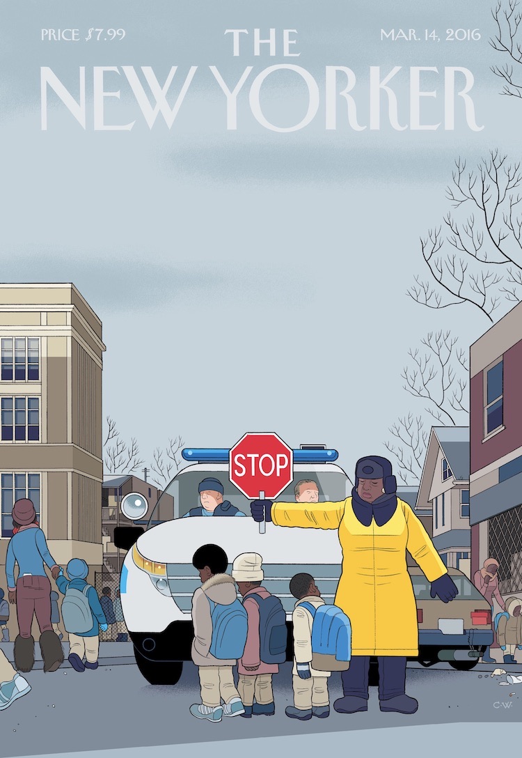
Stop
Art by Chris Ware

Most mornings, after I drop my eleven-year-old daughter off at school in Oak Park, Illinois, I drive my wife to the west side of Chicago, where she works as a teacher in a public school. Along the way, we’ll frequently pass a few of her students waiting for the bus, huddled in hoodies with their backward backpacks and my wife 0 it’s against Chicago Public School policy for a teacher to offer rides to students - will recognize and wave at many of them, citing an affectionate anecdote (“He’s one of the smartest students I’ve ever had”) or a bracing detail (“She beat up her boyfriend”) or a horrifying story (“His brother got shot”).

Stationed among these students are the crossing guards, all of whom are Chicago Police employees. In the outer peripheries work the Safe Passage guards, hired by the city when fifty schools were closed in 2013, lengthening the daily walks, drives, and bus rides of thousands of students to reassigned schools through neighborhoods identified as gang territory, just because they have streets and corners. Nearly all of the Safe Passage guards are middle-aged African-American women, and they nearly all recognize us and wave and smile, braving icy temperatures for hours every winter morning and afternoon. Our favorite is an energetic lady who spins around and sings to herself in the middle of the street, luring and halting traffic with graceful pirouettes that make it look as if she’s controlling the cars as part of some larger, secret ballet. However, she can turn on the cars just as easily: we’ve seen her scream at disobeying drivers, smacking her stop sign on the pavement with rage. Once, she even yelled at me, tearing through the fabric of our years-long silent code of friendship, when I guess I didn’t slow down fast enough.

Last week, as we gingerly crept through her intersection, my wife noted the sorry state of her sign, new at the beginning of the school year but now showing its battle damage: the top chipped, bent and curled down nearly halfway through the lettering, the consequence of it being slammed to the ground, over and over.


Mirror
Art by Chris Ware

The New Yorker is arguably the primary venue for complex contemporary fiction around, so I often wonder why the cover shouldn’t, at least every once in a while, also give it the old college try? In the past, the editors have generously let me test the patience of the magazine’s readership with experiments in narrative elongation: multiple simultaneous covers, foldouts, and connected comic strips within the issue. This week’s cover, “Mirror,” a collaboration between The New Yorker and the radio program “This American Life,” tries something similar. Earlier in the year, I asked Ira Glass (for whose 2007-2009 Showtime television show my friend John Kuramoto, d.b.a. “Phoobis,” and I did two short cartoons) if he had any audio that might somehow be adapted, not only as a cover but also as an animation that could extend the space and especially the emotion of the usual New Yorker image. I knew that Ira was the right person to go to with this experiment in storytelling form, because he’s probably one of the few people alive making a living with a semiotics degree.

So he sent me an audio story, and, after coming up with a cover image based around it, I set to work with John Kuramoto to somehow animate it. Usually, when listening to a story, one’s mind not only sees but also feels in images; you imagine and constantly revise and update entire tableaux, much the way you imagine things while reading a book. I hoped that our pictures wouldn’t interfere with that ineffable mental dance but would somehow, like my usual medium of graphic novels, complement it. In fact, it seems to me that much of what we “see” in our everyday lives isn’t in front of us at all but within our memories and imaginations. I’ve noticed as my daughter Clara has grown older that the unfocussed “not seeing what’s in front of her because she’s lost in thought” look has become, perhaps sadly, more and more common. Then again, it’s what I do all day.

In the weird synchrony of life imitating art (or at least of life imitating half-finished New Yorker covers), this year ten-year old Clara’s Halloween costume employed as its crucial component the application of “scary/sexy” makeup. You know - black lipstick, green eye shadow. Though it was a sinister look, her strategy had an innocent purpose: she just wanted to try on lipstick. Worried, I did some intel with the local moms and discovered, not surprisingly, that this same costume idea seemed to be a coördinated plan within many of the pre-teen sleepover cells in our neighborhood. But I wasn’t ready for this moment, and neither was my wife; for years, my daughter had yelled at her mom for putting on lipstick because it made her “look fake.” But now, dear God, she wanted to see what it looked and felt like herself - the first application of a fiction to mask her remaining few months of childhood. This led to some convoluted car discussions. “Dad, if you say women are doing it just to accommodate men, then what are men doing to accommodate women? You’ve always said women can do anything men can, right? So, as a woman, I want to wear makeup!” And so on. But - point taken.

The question was complicated even further when, in a chat with a friend, I grumbled, like lots of people at the time, about Hillary Clinton’s seemingly tone-deaf statements about her use of a private e-mail server. “Why can’t she just apologize and play nice?” I pleaded. My female friend, taking a moment, offered, “Well, as a woman she’s being held to a different standard.” Point taken, again. The adage about working twice as hard for half as much. Or: maybe I’m just not as great a guy as I thought I was.

Of course, the most important people here are the subjects of the story: Hanna Rosin (the co-host of NPR’s “Invisibilia” and a writer for the Atlantic and Slate) and her daughter, and they are not at all fictional. But the interpretations that John and I have provided more or less are. Thus, my apologies and thanks to Hanna and her daughter both for any and all liberties taken. The video’s music, by Nico Muhly, was composed and performed especially for this cartoon, so most grateful regards to him as well and to the musicians who recorded it: Nathan Schram, on viola, and Fritz Myers, on piano.


01 August 2021

Covering The New Yorker: Adrian Tomine

Between the ages of 17 and 20, Adrian Tomine self-published 7 issues of his mini-comic Optic Nerve, which comprised of short stories displaying the first hints of the distinctive, realist style that he would go on to perfect. In 1994 Optic Nerve was subsequently published for 14 issues by Drawn & Quarterly and would be where his acclaimed graphic novels (Sleepwalk & Other StoriesSummer BlondeShortcomings and Killing & Dying) would be first serialised.

His Eisner Award winning book, The Loneliness of a Long-Distance Cartoonist, was published in 2020, which Alan Moore described as:

"In this heartfelt and beautifully crafted work, Adrian Tomine presents the most honest and insightful portrait you will ever see of an industry that I can no longer bear to be associated with."


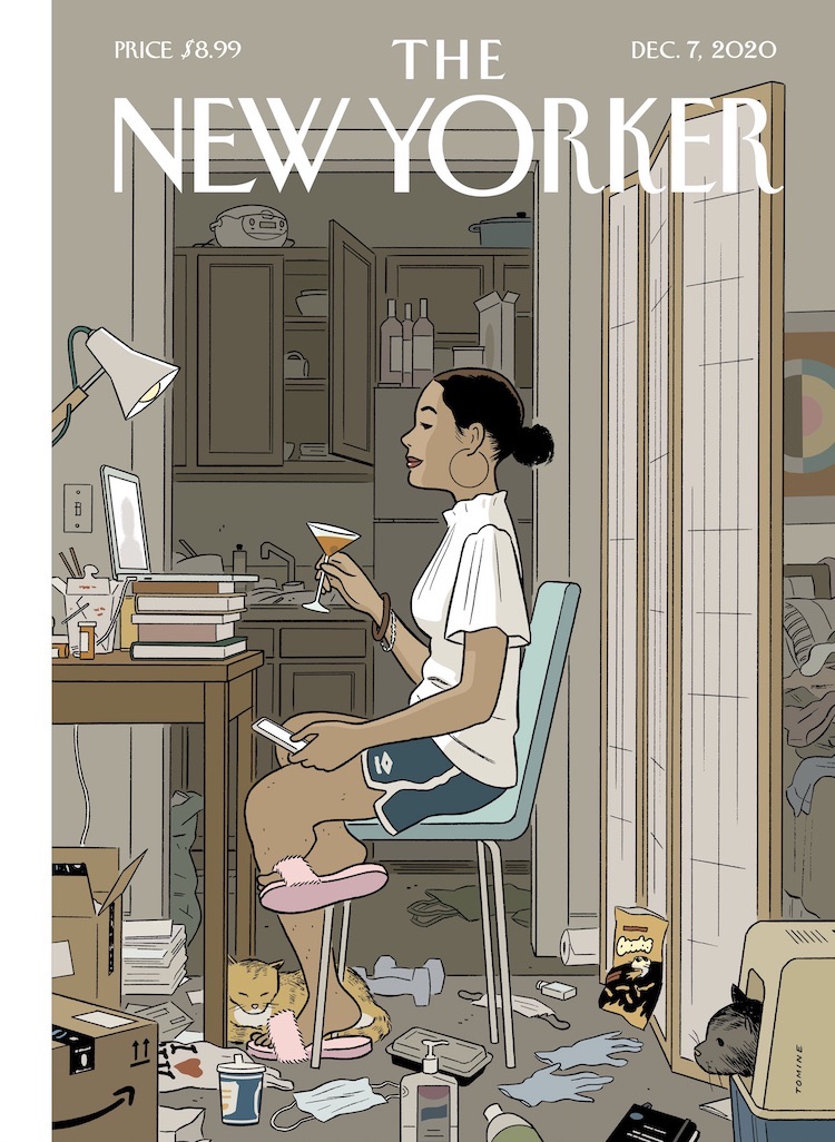
Love Life
by Adrian Tomine

The New Yorker:
Your work tends toward concision, yet a big part of the pleasure in this cover is the accumulation of details. Was that difficult to achieve?

Adrian Tomine:
For better or worse, I’ve developed a fairly specific, detailed illustration style, and there’s no real shorthand for a messy room. Once I realized that I would actually have to draw all the things that would telegraph that messiness, I got a little obsessive about cataloguing artifacts from daily pandemic life. I have a feeling that, years from now, I might look back at this cover and have a kind of P.T.S.D. reaction to something as insignificant as a bottle of hand sanitizer.

You have a distinctive palette of muted, neutral tones, yet you’ve still managed to highlight your subject against the background. How important is light in your compositions?

I’ve wasted an insane amount of time thinking about lighting in Zoom meetings, so it seemed fitting that it would be central to this image. I’d love to be one of those effortlessly beautiful people who can just open their laptop in a dark room and look terrific, but, instead, I’m often rearranging entire rooms, running extension cords to various lighting sources, and scheduling meetings based on when I can get natural window light. Also, I was looking at Edward Hopper as I was working on this, and light was probably the most consistent thread that ran through his work.

You recently published a book, “The Loneliness of the Long-Distance Cartoonist,” which makes a cameo on this cover. The book was very well received. Did the praise help you with the next project, or paralyze you?

Everything paralyzes me, whether it’s praise or criticism. Somehow I always find a way to carry on and to keep making things, but there’s literally no reaction to my work that I can’t twist into something to obsess over.

In your book, and in your New Yorker covers, you seem to home in on painful moments to find the humor in them. Do you experience a eureka moment when you locate that contradiction?

I think that’s a good way of putting it. To be honest, I don’t know how someone could get through life without being able to bask in that contradiction. In my personal life, I’ve often felt very moved by that act of finding humor in pain. If someone can authentically pull that off and be really funny, that’s worth more than a hundred words of earnest consolation to me.

I know you and your wife have been confined at home with two young children—but what’s with the cat? Is that from life or from your imagination?

That’s my tribute to our cats, Dolly and Pepper. Dolly passed away, unfortunately, but it felt nice to immortalize her in this way. I’ve drawn every other member of our household on the cover at some point, so it seemed only fair. (For the record, we keep the litter box in a much more socially distanced location.)


Fourth Wall
by Adrian Tomine

Sometimes a cover image will just appear in my mind, fully formed. In other cases, I’ll have the vaguest semblance of an idea but no sense of how to turn it into a cover. Those movie-set trailers are a good example of this. I’d drawn them in my sketchbook a long time ago, and I knew they were an ubiquitous, specific part of New York life, but I didn't have a story beyond that. Then, a few years ago, I decided to try my hand at screenwriting, and in a particular moment of frustration and despair this image popped into my mind. The apron on the back of the chair was a spur-of-the-moment addition while I was sketching, and I think that was the last piece I was looking for.

I think New York is one of those cities where, whatever your ambition is, you can look around and instantly see someone achieving that dream, often at a level that you never even knew was possible. That experience can be dispiriting, but also extremely inspiring, and that’s part of what I was trying to capture.


Upstate
by Adrian Tomine

Spending time in nature is something I do solely for the happiness of my children, like going to puppet shows or listening to Katy Perry. I can wander around the city with my kids, potentially surrounded by psychopaths, and I’m completely at ease. But put us in some tall grass, and all my neurotic, protective instincts come out.


Recognition
by Adrian Tomine

Where I live in Brooklyn, there’re always a lot of books being set out on the sidewalk, and there’re also a lot of authors walking around the neighborhood. Lifelong New Yorkers may take for granted the sight of people setting stuff on their steps to give away, but I still notice it. I’ve had the experience of seeing stacks of New Yorkers with my cover out on the street, though I haven’t seen my books put out - but then, I also don’t have a giant photo of myself on the back cover.


Gowanus Canal, Brooklyn
by Adrian Tomine

I think it's kind of beautiful and hilarious to see people eating their organic kale and quinoa salads while gazing across the opaque, fetid water. It’s strange to see the recent proliferation of health-conscious and environmentally conscious restaurants and grocery stores, right next to the piles of scrap and rubble. I guess it proves that there's no part of the city that can't be revitalized, recontextualized, or ruined - depending on your point of view.


Memorial Plaza
by Adrian Tomine

When I heard that the 9/11 memorial and museum were going to be the top tourist attractions in New York this summer, I first sketched only tourists going about their usual happy activities, with the memorial in the background. But when I got to the site, I instantly realized that there was a lot more to be captured - specifically, a much, much wider range of emotions and reactions, all unfolding in shockingly close proximity. I guess that’s the nature of any public space, but when you add in an element of such extreme grief and horror, the parameters shift.


25 July 2021

Covering The New Yorker: Eric Drooker

Eric Drooker's drawings and posters are a familiar sight in the global street art movement, and his paintings appear frequently on covers of The New Yorker. Born and raised in New York City, he began to slap his images on the streets as a teenager. Since then, Drooker's reputation as a social critic has grown, and has led to countless editorial illustrations for The Nation, The New York Times, The Progressive etc. His first graphic novel, Flood! A Novel in Pictures won the American Book Award, followed by Blood Song, soon to be a major motion picture. After designing the animation for the film, Howl, he was hired by DreamWorks Animation.


Grand Central Terminal
The New Yorker (20 March 2020)
art by Eric Drooker

TNY: This image evokes the public art created under the Works Progress Administration, during the Great Depression. Has the pandemic changed your notions of what public art should look like in times of crisis?

ERIC DROOKER: I always loved the public art of the nineteen-thirties. I’m drawn not only to the democratic aesthetic of the W.P.A. but to the very concept of public works. During the New Deal, the U.S. government actually hired artists to create grand works in public places. And the experiment was hugely successful; it gave relief to thousands of Americans—and meaning to millions—and helped pull the country out of the Great Depression. In recent decades, concepts such as “public space” and “public health” are often branded as socialist, but many of my images are influenced by the art of that era.

Are there artists whom you turn to for solace in times of upheaval?

Francisco Goya immediately comes to mind; I find myself returning, in times of tumult, to his etchings. Pieter Bruegel, James Baldwin, and, recently, Emil Ferris have helped me through many a long, dark night. And I’m as inspired as the next guy by Bill Shakespeare. He’s thought to have written some of his best plays (“King Lear,” “Macbeth”) while the theatres were closed during an outbreak of bubonic plague.

What has been your main source of news for the pandemic?

I read a wide variety of newspapers, and especially the foreign press, which generally gives a more nuanced, rounded, and relevant picture than U.S. media.


Central Park Row
The New Yorker (12 November 2018)
art by Eric Drooker

You grew up and went to school in New York. Were you often in Central Park?

I lived downtown, and so as a kid spent far more time in Tompkins Square Park, but my family went up to Central Park frequently. I have many vivid memories of exploring it with friends and my little brother.

Has the park changed for you over the decades?

Thankfully, no. The zoo was rebuilt some years ago; a slight improvement, I’d say. (The old zoo of my childhood felt like visiting animals in jail.) Of course, the surrounding metropolis, once so wild and teeming with life, has been tamed, defanged, and now feels utterly suburban. But the park is an oasis frozen in time.

What does fall in New York recall for you?

Fall is my favorite season. The city’s towers are gray and sombre, but once you step into the park the autumn leaves put on their bright, spectacular show.

Who are your influences, in terms of artists who render urban landscapes?

Artistically, I’m in the Ashcan School - the urban lineage of John Sloan, George Bellows, Lynd Ward, Martin Lewis, Edward Hopper, and Rockwell Kent.


Rockaway Beach
The New Yorker (6-13 July 2015)
art by Eric Drooker

I’m attached to Rockaway Beach: school teachers often took us there on class trips. It’s so easy to get to: simply take the A train all the way to the end of the line. Of course, the elevated subway doesn’t literally run in the water, but as a kid it felt that way. When Hurricane Sandy hit in 2012, the entire neighborhood was submerged and thousands became homeless overnight. FEMA and the Red Cross were late to respond; parts of Rockaway remained without electricity for several months. 


Maximising Profit
The New Yorker (10 October 2011)
art by Eric Drooker

There’s this growing crowd of mostly young people down there right now, who camp out. Manhattan Island has become more and more an exclusive place for the super wealthy, or the super corporations - and a hostile place for people to live, not just for the working class, but even for the middle class. The city has become this monolithic cathedral to money.


Coney Island Express
The New Yorker (5 September 2011)
art by Eric Drooker

Coney Island is probably my favorite spot remaining in the city... a surreal dreamland, with its original, ethnic character. It has a seedy, kind of dangerous quality - it’s the underbelly of American culture, the unconscious.


11 July 2021

Covering The New Yorker: Jean-Jacques Sempé

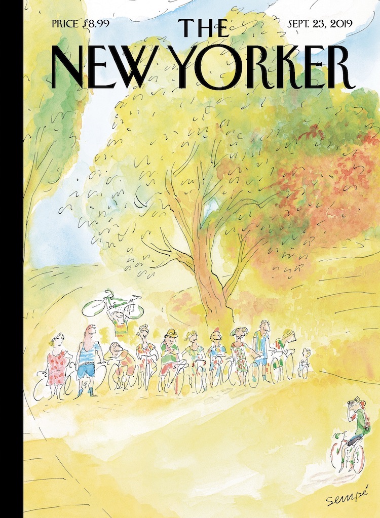
Our Sunday-Morning Outings
The New Yorker (23 September 2019)
art by Jean-Jacques Sempé

In the past fifty years, many of J. J. Sempé’s hundred and twelve covers have celebrated the gratifications offered by la petite reine, his beloved bicycle. With a fragile and delicate line, Sempé captures a wide range of life’s simple pleasures - friendship, nature, animals, and music are recurrent themes - that even contemporary French people can’t take for granted. We recently chatted with the eighty-seven-year-old artist, en français, about the sources of his inspiration and the dreams that haunt his old age. You have often spoken of your love of bicycling, but what inspired this specific image?

JEAN-JACQUES SEMPÉ:
It’s always been one of my dreams - to have a group of friends who go for bike rides in the country every Sunday morning. In real life, it never happened. I kept trying to organize it but everyone was always too busy to slow down for it.

How did you conceive those outings?

Well, we’d get a bit of exercise, build some muscle and also spend some time together. We’d take our bikes on the train and get to the small country roads that run along the fields. It’s quiet and smells good and it’s totally out of fashion. Sometimes one of us would know a good country restaurant, but then it would turn out that it was closed. I keep thinking back on those outings - it’s one of the things I really wish I had done.

Do you have many other unrealized dreams?

Well, my most vivid dream is to have a piano duel with Duke Ellington. And, of course, he gets to win because I’m pathetic and he’s very, very good. I think about it virtually every night. Ellington is a man I adored. There’s a photo of him, smiling, on my piano. I look at him when I play and search for his approbation.

Did you ever meet Ellington?

Yes, once, a while back in Saint-Tropez. He was giving a concert and a friend of mine said, Come with us, we’ll have a drink with him afterward. When the concert ended, I rushed to the back. It was pitch black, no one was there, but in the dark I made out the outline of a piano and sat down. I was hitting a few keys when Ellington walked in. He said, “Not so bad!,” sat next to me, and said, “Do the right hand, I’ll do the left.” (The right hand is the easier one, of course.) We played a piece of his that I know quite well: “Satin Doll.” By then there were lots of other people around and they drew his attention away. I was so impressed that I had exchanged a few notes with him that I didn’t want anyone to talk to me or even look at me. I was trying to preserve the moment.


art by Jean-Jacques Sempé

The cover for the magazine’s Fall Books Issue was done by Jean-Jacques Sempé... He recently talked to us about childhood, one of the more recurrent themes in his work. Your drawings often riff on [the theme of childhood]. What draws you to it?

I find youth attractive for its innocence and naïveté. Not my youth - I have only horrible memories of when I was young - but the hope that comes with being young. I miss the eagerness for discovery, the belief that things could get better.

You created many features for kids, including Le Petit Nicolas. Is there a special appeal in working for children?

Le Petit Nicolas was a series of books I did with René Goscinny, the French comics legend, who also was the scriptwriter of Astérix. I grew up in Bordeaux, in a piss-poor family, and hated school - I dropped out to enroll in the Army just so I could eat and have a place to sleep. René had gone to the Lycée Français in Buenos Aires, Argentina, where he was a good student - very much unlike me.

The Nicolas stories were a way to revisit the misery I endured while growing up while making sure everything came out just fine. Kids are always getting into fights but no one is hurt afterward.

Did you have favorite books when you were growing up?

I once read, in the advice column of a women’s magazine, that you should read as much as you can to improve your spelling. There was nothing to read at home, so I read the back of packages, manuals, billboards - anything I could find. I loved everything Alexandre Dumas wrote, especially “The Three Musketeers.” (I was d’Artagnan!) And I got to be a very good speller, which made me inordinately proud.


Biking In The Rain
The New Yorker (7 May 2018)
art by Jean-Jacques Sempé

New York City is one of your most obsessive themes. What draws you to that landscape?

I’m passionately attached to the city, so I try to find it again by drawing it. I love the colors in New York. They’re dynamic: bright yellows, greens, reds, and blues. Paris, where I live, is beautiful but it’s always gray. I love Paris too, but it’s not the same.

What are other differences between drawing New York and Paris? How are the cities different for you?

New York is a place where people know what it’s like to be starting out. New Yorkers have sympathy for those who are trying to se débrouiller, to make do or get by. Novices aren’t discouraged. It’s not a bourgeois town set in its ways like Paris. In New York, everyone has to keep moving forward.

It’s often hard to distinguish what era your work is set in. There’s a timeless quality there. Is that intentional?

You flatter me, but, yes, in a way. When I think about New York, I think about the whole. I try to paint an ambience that has the buildings, the smells, and the sounds, Duke Ellington and James Thurber. Here, I wanted to paint a petite dame, a little old lady who holds her balance in that immense and magnificent town.

Your first published cover was in 1978, yet you’ve made only five or six trips to New York over the past forty years. Why don’t you come more often?

A big issue for me is the language barrier. If I had been able to speak English well, I’d probably have settled there. But I just don’t speak it at all. I didn’t want to be seen as one of those arrogant Frenchmen who only speaks his own language. I hate not being able to talk. It throws me back to the old days, when I was young and so paralyzed with shyness that I stuttered.

You’ve noted Saul Steinberg as an influence. Any others?

Oh, yes! It’s all the artists of The New Yorker who have inspired me. Sam Cobean, Mary Petty, Saxon, or Chas Addams, too numerous to name them all - what they have in common is elegance and lightness of touch. I adore Thurber. I learned from all of them, I shaped my work just so I could fit in that group.


art by Jean-Jacques Sempé

It’s an obsession, I would love to become a child on the beach once again. It may sound infantile, but that’s the feeling I long for: to be a child without care, taking in the immensity of the ocean and still feeling safe.


15 June 2021

The New Yorker Cartoons of George Price (No. 87)

The New Yorker Cartoons (1929-1995)
of George Price

REVIEW BY TOM SPURGEON:
(from The 100 Best Comics of the Century! in The Comics Journal #210, 1999)
George Price is a remarkably underestimated cartoonist, an amazing thing given the nearly seven-decade span of his career, most notably doing cartoons for The New Yorker. Whereas the art from other cartoonists from that magazine, like Peter Arno's or Chales Addams', might overwhelm the reader with heavy black and fat, ill-filled lines, George Price's delicate style was often so completely subservient to the joke a reader could miss its beauty. It is only on a second look - at the sheer detail in the scenes depicted, at the virtuosity with which Price could draw anything - that one begins to fully realise the extent of his talent. 

The cartoons early in Price's career - best represented to my mind by the book George Price's Characters - showed Price dabbling in variations of his trademark style and displaying a wide range of humour. As the years went by, Price became best known for cartoons about various couples, living amidst a vast avalanche of clutter, making humorous commentary about the matter-of-fact reality of their lives. Those cartoons adroitly acknowledge the gap between self-conception and reality, and did so in a way that could be read as both sarcastic and sweet. They served as perfect grace notes to the extremely image-conscious magazine in which they appeared.

Price was genuinely funny, and his comics were genuinely gorgeous. His strong line work has rarely been equalled, and Price's idiosyncratic sense of humour - speaking to a 20th Century way of American life that is slowly fading from view - has been sorely missed since his death in 1995. Giving Price's cartoons a second glance - even a third, fourth, and fifth - is to grant an audience to a quiet, unassuming, but often great artist who went beyond fulfilling the expectations of his particular niche to helping define one unique corner of American culture.


OBITUARY BY LEE LORENZ:
(from The New Yorker, 30 January 1995)
George Price, who died on January 12th, at the age of ninety-three, was a member of the remarkable generation of New Yorker cartoonists - among them Helen Hokinson, James Thurber, Peter Arno, and William Steig - who, between 1925 and 1935, reinvented American comic art. His happily rendered portraits of lowlifes, harridans, and sourballs added a distinctive, egalitarian note to the magazine's comic drawings, which up to that point had largely focussed on the diversions and rituals of the upper crust. Price's chosen terrain was proudly, even defiantly, lower crust. He claimed that his oddball repertory company was based on memories of his eccentric neighbours in his home hamlet of Coytesville, New Jersey (pop. 400). His father (a carpenter) and his mother (a seamstress) were both employed in the fledgling movie business, which was them establishing a beachhead in nearby Fort Lee.

Another neighborhood resource for the young Price was the painter George Hart, in whose studio Price came to meet such stimulatingly diverse artists as George Herriman and Diego Rivera. Hart encouraged Price's fondness for the offbeat and the picturesque by inviting him along on sketching trips to the crowded public picnic grounds at the foot of the Palisades or, across the river, the steamier corners of Hell's Kitchen. Price's first submissions to The New Yorker were based on these sketches and were published in 1929 as spot drawings. 

Price claiming that he was not an "idea" person, was reluctant to attempt the leap from illustrator to cartoonist, but he was prodded by the resourceful editor Katherine S. White, who assured him the the magazine would keep him supplied with ideas. Never was a promise better fulfilled; of the twelve-hundred odd "Geo. Price"-signed drawings that he created for the magazine, only one, amazingly was based on an idea of his own - it appeared as the cover of the December 25, 1965, issue and showed a covey of frayed, ill-cast street Santas riding the I.R.T. It is a sign of Price's genius that he could transform such a mass of other people's gags and roughs into a life's work of absolutely original, instantly identifiable art. On paper, the Price line was whiplike and beautifully finished; when lasers came along, they at last provided an image that befitted such exactitude. His drawings were elegantly composed, and featured an obsessive and hilarious attention to detail. Who else could make a barstool or the back of a TV set funny. Frank Modell, a long-term colleague, once remarked that Price's rendering of a tenement boiler room could have served as a blueprint for an apprentice plumber.


SELECTED BIBLIOGRAPHY:
George Price's Characters: More Than 200 of His Best Cartoons (2012)
The World Of George Price - A 55-Year Retrospective (1988)
Browse At Your Own Risk (1977)
The People Zoo (1971)


13 June 2021

Covering The New Yorker: R. Kikuo Johnson

R. Kikuo Johnson is a cartoonist and illustrator born on Maui, Hawaii, in 1981. His award winning drawings and stories regularly appear in books, advertisements, periodicals, animation, and on the cover of The New Yorker - see a selection of his covers below. Johnson divides his time drawing in Brooklyn, teaching at the Rhode Island School of Design, and playing the ukulele with his family in Hawaii. He is the author of the acclaimed 2005 graphic novel Night Fisher and his new book No One Else is due for release in November 2021 from Fantagraphics Books.


Delayed
art by R. Kikuo Johnson
“The only thing worse than the feeling of paranoia is the sickening realization that it’s not paranoia after all,” the staff writer Jiayang Fan wrote in a recent piece. Fan was studying the shadows of the Asian-American experience—and the experience of Asian-American women, in particular, in which ambient fear can curdle suddenly into outright violence. Her words followed a spate of such violence: a mass shooting, in Atlanta, that left six women of Asian descent dead, and a series of anti-Asian attacks across the country, often targeting the elderly. The air of anxiety is also captured in the magazine’s latest cover, by the artist R. Kikuo Johnson.


Shifting Gears
art by R. Kikuo Johnson
As covid-19 infection rates have risen in New York, and the city braces for winter, it can be hard to see a reason for optimism. For his latest New Yorker cover, R. Kikuo Johnson finds one: the welcome surge of cycling across the boroughs.


Safe Travels
art by R. Kikuo Johnson
The timing seemed right for a new spin on a classic illustrator’s theme, the family summer getaway. A few summers ago, I passed through a small town in Montana to buy some emergency bear spray for a week of backpacking in grizzly country. Soon after, that same town made headlines as a hotbed of white nationalism. Instantly, the grizzlies seemed like the lesser threat. For the record, I support a hunter’s right to humanely harvest wild food as much as I support a father’s right to wear dorky hats with sandals.


Tech Support
art by R. Kikuo Johnson
“I’m not too worried about machines replacing cartoonists,” the artist R. Kikuo Johnson says, about his cover for the Money Issue. Johnson may have switched from drawing with ink, brushes, and paper to using a stylus and a digital tablet, but he isn’t worried that computers will take over the rest of his cartooning process. “When robots are advanced enough to be neurotic, then maybe I’ll be concerned,” he said, “though I don’t think too many of us choose this field for job security, anyway.”


The Finish Line
art by R. Kikuo Johnson
R. Kikuo Johnson seldom goes to the gym. (“I prefer to cycle everywhere to get my exercise,” he says.) But the artist was still able to find inspiration for his cover for this week's Fall Books Issue in his daily life: “I don’t have much time to read, but I listen to books on tape or podcasts while I draw. I’m at a desk sixteen hours a day, and I’ll often have a moment like this where I find myself just staring blankly at a screen, not drawing at all but completely consumed by what I’m listening to."


Commencement
art by R. Kikuo Johnson
“My first job after graduation was as a waiter in a Times Square steak house. It lasted eight years,” R. Kikuo Johnson said, of his cover for this week’s issue, “Commencement.” “Around this time of year, I’d see lots of caps and gowns coming into the restaurant with their proud parents. Those were definitely moments of reflection.” Johnson graduated from the Rhode Island School of Design, in 2003. He now supports himself as an artist and lives in Brooklyn. After an initial move to Williamsburg, he’s on his second combination studio/living space in Bed-Stuy: “My rent is good right now and I’m not worried—the landlord likes me," he said with a smile. He also commutes to Providence, Rhode Island, to teach at his alma mater: “It’s not just me—I’d say most of the other teachers at risd are also alumni. That’s what made me think of this image.”


Closing Set
art by R. Kikuo Johnson
“Everyone in Brooklyn is a d.j., so I rely on my much cooler friends to take me out,” the artist R. Kikuo Johnson says. “I have been taken to many one-night-only warehouse parties—I love dancing—but this was my first time at the Palisades,” he continues, referencing the underground venue in Bushwick that was the model for his cover of this week’s issue.