Showing posts with label Editorial Cartoons. Show all posts

19 October 2021

The Editorial Cartoons of Pat Oliphant (No. 39)

The Editorial Cartoons of Pat Oliphant (1964 to present)

REVIEW BY R.C. HARVEY:
(from The 100 Best Comics of the Century! in The Comics Journal #210, 1999)
Pat Oliphant may be the most influential editorial cartoonist since Thomas Nast, who is, for all practical purposes, the father of American political cartooning. Arriving on these shores from his native Australia in 1964, he proceeded to revise utterly the appearance and approach of American editorial cartooning. 

Deploying his pictures in horizontal manner of the British (as did John Fischetti, a little earlier but without quite the same impact), Oliphant drew with a juicy, raggedy brushline (reminiscent at first of Ronald Searle's) - not a grease crayon, then the petard of choice among American editorial cartoonists; and he sharpened his points with a pungent sense of humour. 

At the time of his arrival on these shores, he said (with typical irreverent outspokenness), "American cartooning was a laughingstock among other cartoonists in the world. All we ever saw was the Peace Dove with the scroll in its mouth. Hope coming over the hill, and the Rocky Road to prosperity. There was a stagnation one could see. Here was an audience that was really ready for a variety of new approaches." 

Oliphant was quickly aped by nearly an entire generation of American cartoonists, who drew like him and tried to provoke their readers with comedy as well as a visual metaphor. An unanticipated by-product of this development is that more and more editorial cartoonists in the Oliphant era resort to being simply funny instead of aiming their humour at a target. Oliphant, however, never lets up: his humour hits targets with terrifying accuracy.


FURTHER READING:


14 October 2021

The Editorial Cartoons of Herblock (No. 53)

The Editorial Cartoons of Herblock (1929-2001)

REVIEW BY RON EVRY:
(from The 100 Best Comics of the Century! in The Comics Journal #210, 1999)
In the field of editorial cartooning, the 20th century belongs to one man: Herbert Block, who has been signing his cartoons since 1929 with the name "Herblock". At 20, Herblock's pointed barbs at politicians and other scallywags graced the pages of the Chicago Daily News. Even then, his drawings demonstrated a mastery of the conventions of the political cartoon. His blend of bold lines and crayon-based shading matured over the decades, but drawings from the days of Herbert Hoover and Hindenburg are still recognisably Herblock's.

The early '30s brought Herblock to Cleveland, where he drew exclusively for syndication at NEA. Curiously, as the decade wore on, Herblock grew more liberal as his syndicate's politics became increasingly conservative. By the late '30s, the syndicate shrank the size of his cartoons, and begrudgingly waited out the term of his contract. But in 1939, the cartoonist won the first of his three Pulitzer Prizes, and he became the NEA's darling again. After serving in the military during World War II, Herblock joined The Washington Post in 1946, where he has remained since. 

There are few cartoonists today who draw in anything remotely like Herblock's style. Moreover, There are even fewer cartoonists who are as effective. Like the great editorial cartoonists of the 19th century such as Nast, Davenport, McDougall and Keppler, Herblock's cartoons clarify issues to the public and earn the ire of his targets. The '50s saw Herblock crusading against the mud-slinging hate-mongers and red-baiters; he was responsible for coining the word "McCarthyism".

Herblock's power as a cartoonist made itself clear during the Nixon era, when he frequently pointed an accusing finger at the White House, earning the President's hatred and a place on the "Enemies List". Approaching 90, Herblock still chronicles the outrages of today, with a clear view of outrages that came before.


FURTHER READING:


24 September 2021

Doonesbury by Garry Trudeau (No. 37)

Doonesbury (1970-1983, 1984 to present)
by Garry Trudeau

REVIEW BY BART BEATY:
(from The 100 Best Comics of the Century!, in The Comics Journal #210, 1999)
Not because it's been famously dropped by the papers that carry it time and time agin. Not because it's pushed more hot button issues than any daily strip before or since. Not because it's drawn the ire of so many of its targets, from presidents to captains of industry to entertainment figures and the news media. Not because it was the most topical comic strip of its day in the 1970s and remains so in the 1990s. But because it is still the most fully actualised collection of characters to hit the comics page in half a century, at least.

And still it manages to scandalous and subversive, agenda-setting and rhetoric-destroying, and above all else, laugh-out-load funny. 

It's a testimony to Garry Trudeau's vision that no matter what happens he seems to have a character ready to step into the situation. Want to take on Microsoft and the '90s go-go software culture? Not a problem: Trudeau already has an ad man and a science nerd in the cast. Want to talk about Nike abusing its overseas labourers? No problem: Trudeau already has not one but two recurring Vietnamese characters.

It's flexibility like that which has given Doonesbury the ability to remain constantly on the cutting edge of social change. Sure, sometimes hindsight shows us that he was a little too close for parodic comfort (a Reagan meets Max Headroom shtick? The '80s really were an inexplicable time), but for the most part the strip succeeds in finding the right mix of character driven comedy and sharp-witted mockery of the rich, powerful and out of control.

This past holiday season saw the release of the most essential Doonesbury collection yet: Bundled Doonesbury came complete with a CD-ROM collection of more than 9,000 of the daily strips, excerpts from the animated television special and other assorted new-gaws for the technologically inclined. If only it had included the Duke action figure we could have counted it the best strip collection of all time. Instead, we may have to settle with calling Doonesbury the best daily strip of the past quarter century.


FURTHER READING:


22 September 2021

The New Yorker Cartoons of Peter Arno (No. 21)

The New Yorker Cartoons of Peter Arno (1925-1968)

REVIEW BY R. C. HARVEY:
(from The 100 Best Comics of the Century! in The Comics Journal #210, 1999)
New Yorker cartoonist Peter Arno may not have invented the single-speaker captioned cartoon, but he surely perfected it. A prototype of the Jazz Age's young man about town, Arno was rich, debonair, tall, urbane, impeccably dressed and multi-talented, and he had the jutting-jaw good looks of a model in the popular Arrow shirt ads of the day. 

He was about to abandon his ambition to be an artist for a musical career when he received a check for a drawing that he had submitted to a new humour magazine that had debuted February 21, 1925. With the publication of this spot illustration in the June 20, 1925 issue of The New Yorker, Arno began a 43-year association with Harold Ross' weekly. 

Arno's single-panel cartoons helped significantly to shape the magazine's sophisticated but irreverent personality with a Manhattan menagerie that included: the aristocratically moustached old gent in white tie and tails, whose eyes, as Somerset Maugham observed, "gleamed with concupiscence when they fell upon the grapefruit breasts of the blonde and blue-eyed cuties" whom he avidly pursued; a thin, bald, albeit youngish man with a wispy walrus moustache, a razor sharp nose, and an ethereally placid expression who was often seen simply lying in bed beside an empty-headed ingenue with an overflowing nightgown; and a ponderous dowager, stern of visage and impressive of chest, whose imposing presence proclaimed her right to rule. This trio was joined by an assortment of rich predatory satyrs in top hats, crones, precocious moppets, tycoons, curmudgeonly clubmen, ruddy-duddies and bar-flies of all description - in short, the probable population of all of New York's cafe society which Arno subjected to merciless scrutiny from his favoured position well within the pale, and he found something ridiculous and therefore valuable in everyone from roue to cab driver.

Arno's cartoons juxtaposed the seeming urbanity of his cast against their underlying earthiness, thereby stripping all pretension away. He proved again and again that humankind is just a little larcenous and lecherous and trivial in its passions and pursuits, social decorum to the contrary notwithstanding.

An admirer of Georges Rouault, Arno employed a broad brush stroke to delineate his subject with the fewest lines possible, holding the compositions together with a wash of varying gray tones. Arno denied that he had invented the single-speaker, or one-line, caption cartoon that by the end of the 1920s had replaced its historic predecessor, the illustrated comic dialogue. In truth, the one-line caption had been used occasionally for years, but Arno deployed it more consistently than others (thereby doing much to establish the form) because he valued the astonishing and therefore risible economy of its interdependent elements: neither words nor picture made any sense alone, but together they blended unexpectedly to create comedy.

One of his classic efforts shows a mousy little man emerging from a knot of military experts who have just witnessed an airplane crash, the flames visible on the horizon in the distance. The picture makes no sense until we read below it what the mousy little man is saying: "Well, back to the drawing board." And his utterance makes no comedic sense without the picture. But when we read the caption after viewing the picture, the comedy surfaces suddenly as a kind of "surprise": the picture explains the words and vice versa, and we are startled, joyously, by the discovery that it all makes sense. Presto: in this perfect blending of word and picture, in this "surprise explanation" the modern magazine cartoon is born.


14 August 2021

Saul Steinberg: An Appreciation by Chris Ware


Saul Steinberg's View of the World
by Chris Ware

Like many children of the 1970s, I first encountered Saul Steinberg’s drawings on the cover of The New Yorker. Or, to be more precise, I first saw printed reproductions of his drawings on New Yorker covers plastered all over the walls of my family’s bathroom in Omaha, Nebraska. Like many bathrooms of the era, ours had become a do-it-yourself decorating project for my mother, for which New Yorkers - and, apparently, reproductions of nineteenth-century Sears-Roebuck catalog pages - were deemed de rigueur sometime during the years of the Ford administration. I would spend extended sessions puzzling over the pictures, which towered not only above my child-sized perspective, but also beyond the limits of my understanding. (I think my mother put the antique whalebone corset and uterine syringe advertisements near the ceiling for a reason.)

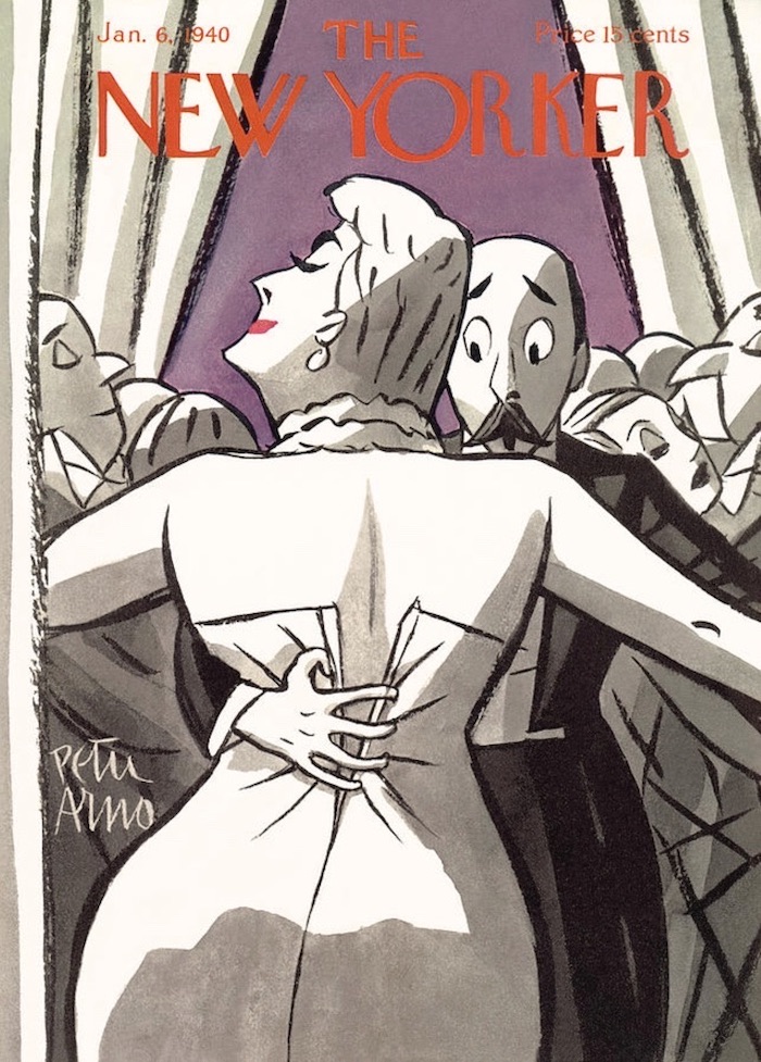
But it was the View of the World from Omaha, Nebraska poster framed in our den that most fascinated me. Its title, typeset in the legitimizing New Yorker font, and its curious, childlike cartoon map of familiar downtown buildings disappearing into a pastureland of distant pimples labeled with names like “Pittsburgh,” “Philadelphia,” and “New York” before rolling off into the ocean absolutely captivated me with the idea that I could be living in such an important city as Omaha - especially given that The New Yorker had seen fit to highlight the fact on a sheet of paper four times the usual size of the magazine. After all, Nebraska is more or less traditionally considered the geographic center of the United States - and is actually labeled as such in the real View of the World from 9th Avenue, drawn by Steinberg, which appeared on the March 29, 1976, cover of The New Yorker. The original did not, unfortunately, appear on our bathroom wall, so when I first saw the genuine image years later as a teenager, I still felt a lingering security within its strange loop of place-time - even if only then was I getting the actual joke.

Historically speaking, View of the World from 9th Avenue was a cartoon nuclear reaction, smashing together what New York thought of itself with what the world thought of New York, all on the cover of The New Yorker itself. It spawned countless city-centered rip-offs that spiraled their particle trails through 1970s dens across the nation, including mine. To this day it remains the magazine’s most famous cover not featuring its unofficial mascot, Eustace Tilley. Yet the thieving of Steinberg’s easily thieved premise rankled him for the rest of his life, the most visible sign of his success legitimizing yet also blurring the importance of his contributions to cartooning, to say nothing of twentieth-century art. A new exhibition at the Art Institute of Chicago, Along the Lines: Selected Drawings by Saul Steinberg, gives some sense of his electrifying work.

As a cartoonist myself, I am dismayed that there’s little in the show I can steal, the crossover in the Venn diagram of the image-as-itself versus as-what-it-represents being depressingly slim. I am painfully aware that in comics, stories generally kill the image. But Steinberg’s images grow and even live on the page; somewhere in the viewing of a Steinberg drawing the reader follows not only his line, but also his line of thought. Describing himself as “a writer who draws,” Steinberg could just as easily be considered an artist who wrote; as my fellow cartoonist Lynda Barry puts it, his “drawing went not from his mind to his hand but rather from his hand to his mind.” Or as Steinberg himself declared at the beginning of a 1968 television interview, “[my hand explains] to myself what goes on in my mind.”


One can’t overstate the importance of Steinberg’s working for reproduction, of his creating drawings to be disseminated to the mailboxes, laps, and, I guess, bathroom walls, of receptive readers and not, at least initially, to museum walls. The Museum turns on an eminently Steinbergian tool - the rubber stamp - and, as a lithograph, manipulates the idea of reproduction while pictorially lampooning and dissembling it. Identical figures are plunked out to represent visitors and viewers of (what else?) official stamps of approval; over the museum’s horizon, stamps rise like suns, the entire composition grounded and buttressed by illegible signatures and, of course, more stamps. As a visa-seeking emigrĂ© in his early life, Steinberg’s fascination with legal seals is easily understandable.


Riverfront and Certified Landscape pivot on the objectively ridiculous but fundamentally necessary imprimatur of government made corporeal, territorially imprinted as a skein of walls and fences. Steinberg quietly added his own signature directly into the rather unaccommodating landscapes - are they farms, factories, or concentration camps? - rather than putting it in the traditional antiseptic nonspace outside the pictorial “border.” But in The Museum, Steinberg bundles the stamp’s sanctioning power and aesthetics into the frame of the art itself, stamping his own authorizing red imprimatur in that expected nonspace outside the image, along with his signature (legible, one notes) and, as a digestif, a blind stamp (a stamp without ink, visible by the impression it leaves on the page), just to snuff out any lingering doubt about the drawing’s authenticity and, by proxy, the artist’s own legitimacy.


Even a seemingly dashed-off stamp-and-doodle drawing such as Untitled (Rush Hour) rewards the viewer with a fizz of epiphany: all of the figures and cars are made from impressions of the same four rubber stamps, so that the flow of the urban workforce is made clear only in relation to the perspective of the building into which they rush and from which they leave, and all this is captured graphically with the very clerical tools that grant the city its life. Even the seemingly random zig-zag gestures of the stamped taxicabs’ bumpers synaesthetically combine to create the sound of traffic in the reader’s eye. Konak and Untitled (Table Still Life with Envelopes) are similarly constructed around office ephemera - an official invoice, a postal envelope - but within the deliberate strictures of Analytical Cubism. For Steinberg, Cubism wasn’t only a metaphysical investigation but an immigrant’s observation: 

“As soon as I arrived in New York, one of the things that immediately struck me was the great influence of Cubism on American architecture... the Chrysler Building, the Empire State Building, jukeboxes, cafeterias, shops, women’s dresses and hairdos, men’s neckties - everything was created out of Cubist elements.”

New York Moonlight appears observed by alien eyes, the spiky Chrysler Building looking more like an Aztec totem or butterfly genitalia than a skyscraper. Steinberg does not resort to the cliché of lit windows stretching into the sky; instead, his buildings sink into the horizon, not so much looking like Manhattan in the moonlight as feeling like the metallic, acidic impression of wet moonlit pavement.


Sometime in the 1970s, Steinberg’s work took a turn for the observed, typified in the Art Institute’s collection by the lovely Breakfast Still Life. Steinberg’s wife, the artist Hedda Sterne, criticized this “realistic” direction, but Breakfast Still Life is hardly realistic, with its pencil purples and greens cast against the usual metaphysical Steinberg white, capturing in reverse-thermal snapshot the stuff of the artist’s morning - black coffee, bread, cornflakes, butter, jam, Chianti bottle, a newspaper - which Steinberg sets up in alienating opposition to the tableau most humans seek as a daily reassurance. Seemingly finding it freeing to leave the artificial atmosphere of his earlier work and return to the pleasure of observed drawing, Steinberg remarked, “in drawing from life I am no longer the protagonist, I become a kind of servant, a second-class character.”

Of all the drawings in the Art Institute exhibition, The South stands out for the simple genius of its rough construction. As our gaze passes over it, moving from right to left (and we have no choice, as the rightmost word BOOKS is the first thing we see - Steinberg knew that one always reads before one sees), the stuffed toy and guitar in the bookstore’s window plant the first seeds of suspicion. What sort of bookstore sells toys? This prompts further investigation across darkened shops and postbellum buildings, ending at a Confederate monument and a courthouse before one is dumped into a confused, crosshatched tangle of black vegetation. In a single drawing, Steinberg has “read” a southern town and taken the reader backward in time and space to the mechanisms and history behind it - all without depicting directly what the South itself was trying to conceal: the legacy of slavery. Not that he was averse to more direct tactics: later works make free use of a disturbing Day of the Dead–like Mickey Mouse–type character, which Steinberg considered inherently racist: “Mickey Mouse was black... half-human, comic, even in the physical way he was represented with big white eyes.”


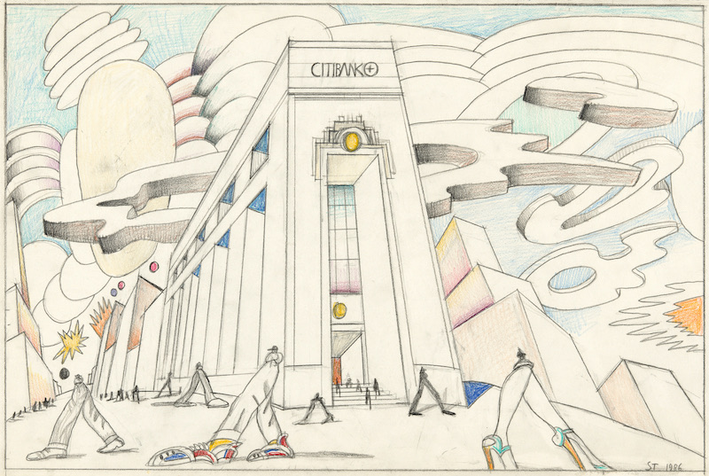
Steinberg’s later work adopts an increasingly dyspeptic view of the nation in which he had taken up residence. Untitled (Citibank) and Untitled (Fast Food) are prescient condemnations of corporate America and the ketchup-and-mustard trickle-down effect of prioritizing appetite over ethics. The artist pulled no punches on this subject, lamenting, “Gastronomy in America, the restaurant, the taste of the nation are governed by the tastes of children.” Like hundreds of Steinberg’s drawings, these two employ a shot-from-the-hip, up-skirt, underfoot perspective of an outsize world: huge legs, skyscraper tops, big shoes. His friend and fellow New Yorker writer Ian Frazier noted in a posthumous reminiscence that Steinberg said “he always tried to draw like a child... the goal was to draw like a child who never stopped drawing that way even as he aged and his subject matter became not childish.”

Really, if one thinks about it, it’s a child’s perspective that grants View of the World from 9th Avenue its power. Ironically, it’s also what most appealed to me as a child, even in the knock-off “Omaha” version I initially encountered. As embarrassing as it is to admit now, growing up in those Reagan years I enjoyed a cultivated blindness to America’s place in our post-war planet, and I think it’s fair to say that I was not alone in this if the television programs of the era are any indication.

Steinberg knew that we are all the functional centers of our own universes. Beginning with an airless blank of empty white, every time Steinberg set his pen to paper, a cosmos exploded through the mnemonic mimesis of his line; not surprisingly, all the works in this exhibition also act in some way as universes unto themselves. While the artist may have preferred, at least early in his career, to see his work in reproduction first and in memory second (which is, really, how we spend the majority of our time with those works of art that most surprise us: thinking about them), each of these drawings also offers a single, signature proof that yes, Saul Steinberg the person really at one point did exist, and, most importantly, that he offered us a view of the world that was both comically unique yet disquietingly universal.


The above text was adapted from Chris Ware’s essay in the catalog for “Along the Lines: Selected Drawings by Saul Steinberg,” which was held at the Art Institute of Chicago in 2017.


12 August 2021

The New Yorker Cartoons of Charles Addams (No. 58)

The New Yorker Cartoons of Charles Addams (1935-1988*)
* New Addams cartoons appeared in The New Yorker well after his death.

REVIEW BY LARRY RODMAN:
(from The 100 Best Comics of the Century! in The Comics Journal #210, 1999)
Charles Addams morbid fancy was just beneath the surface when his first cartoon appeared in The New Yorker in 1935, but it's possible that the gag - featuring an out-of-his-depth, milquetoast hockey player - hinted at a future career of unsettling, sometimes violent incongruities.

This apparently gentle soul went on to produce disturbing work for over 60 years. In keeping with The New Yorker's perforation of social affection, these cartoons solicited a cruel shock of recognition at the expense of gentility. Behavioural codes (never mind the laws of physics) were completely subverted, artfully suggesting the most uncivilised outcome.

The characters who make up the Addams Family began to appear in his cartoons by 1937, jelling Addams' mordant identity for generations of readers. While they're not the persistent focus of his work, it's easy to see what people responded to in them. They're warped, yet friendly; an eccentric presence within an often threatening framework. His mise en scene conjured the mildew of Victorian gothic conservatories, intimating that forgotten customs, such as laying out the recently deceased in the front parlour, would not be considered off-base to the maladjusted characters in their hedge against the outside world.

Verbally describing The New Yorker single-panel cartoons, with their interrelated captions and drawing, can be a flat, awkward proposition. It's probably unnecessary in Addams' case, anyway. His situational cartoons, in themselves, are familiar icons. Just about everyone has seen his cartoons of ski tracks which run on both sides of the tree. He excelled at captionless "What's wrong with this picture?" cartoons, and drawings of bizarre whimsy and surreality.

Striking a precarious balance of urbanity and malevolence, Addams showed us the banality of evil - in a perky, cheerful manner - which only made things worse.


FURTHER READING:


10 August 2021

The Willie & Joe Cartoons by Bill Mauldin (No. 85)

The Willie & Joe Cartoons (World War II Era)
by Bill Mauldin

REVIEW BY ROBERT BOYD:
(from The 100 Best Comics of the Century! in The Comics Journal #210, 1999)
Bill Mauldin acquired his fame as an anti-authoritarian critic in the most autocratic of societies, the U.S. Army during World War II: in the panel cartoons he drew for military newspapers, he depicted the life of the "dogface" (foot soldier) the way it was. Rained on, shot at and kept awake in the trenches day and night, the combat soldier was wet, scared, city and tired all of the time; and Mauldin's spokesman - the scruffy, bristle-chinned, stoop-shouldered Willie and Joe in their wrinkled and torn uniforms - were taciturn but eloquent witnesses on behalf of the persecuted. Through simple combat-weary inertia, they defied pointless army regulation and rituals: they would fight the war, but they wouldn't keep their shoes polished. 

Their popularity was an affront to generally accepted notions of military propriety, but Mauldin never wavered even after General George S. Patton leaned on him. "I knew these guys best," Mauldin said, " and [the cartoons] gave the typical soldier an outlet for his frustrations, a chance to blow off steam." 

Returning to civilian life a celebrity, Mauldin continued the same satirical approach he'd followed in the military, but cartoons that were critical of post-war America were seen as "political" rather than "entertaining", and newspapers began dropping his feature, saying they had their own political cartoonists.  Then in 1958, he simply became a political cartoonist, replacing the dour Daniel Fitzpatrick at The St. Louis Post-Dispatch, and suddenly, Mauldin's liberal perspective had a home again. "I'm against oppression," he said, " - by whomever."


JEAN SCHULZ:
Although he was basically reserved, Sparky [Charles M. Schulz] was not afraid to publicly declare his admiration for fellow cartoonists and authors... I am not sure how Sparky and Bill first became acquainted, but I think it is likely that Sparky contacted an editor at United Features Syndicate, which then handled both Peanuts and Mauldin’s cartoons, and asked that an introduction be made. At any rate, Sparky and Bill had a telephone relationship for a number of years, and what I remember most are the times he would come home and share with me the war stories that Bill had regaled him with over the phone earlier that day. One of Mauldin’s best-known cartoons is of the soldier shooting his Jeep. Sparky has a bronze sculpture of that scene in his studio. Sparky admired Bill’s ability to be “in the face” of the officers, always sticking up for the little guy.


TODD DePASTINO:
Bill Mauldin retired from cartooning in 1991 after an injury to his drawing hand. Stricken by Alzheimer’s disease, he entered a nursing home in 2002. In the months before he died, old veterans and their relatives sent him over 10,000 cards and letters They thanked him for keeping their humanity alive during that most savage of wars. These tributes, more than any honor or award, rank Bill Mauldin as one of the greatest artists of the twentieth century. Bill Mauldin died on January 22, 2003. He is buried at Arlington National Cemetery.


DAVE SIM:
(from a letter to Bill Mauldin, reprinted in Cerebus Vol 16: The Last Day, 2004)
...the Willie and Joe cartoons still hold up as tip-top examples of the cartoonist's craft more than half a century later. Great composition, great expression, great body language, great execution, buoyant spontaneous brush strokes, spotting of blacks. I'll stop now before I start sporting a beret and a pointy little goatee. But to say the least, you always made the most difficult parts of cartooning look easy... If even a handful of my own readers still find my own work half so memorable decades after I have at last put down my pen and brush, I will count myself fortunate, indeed. To use the phrase which always denoted my father's highest accolade, Mr Mauldin, "Y'done good."


FURTHER READING:


04 August 2021

Feiffer / Sick, Sick, Sick by Jules Feiffer (No. 6)

Feiffer / Sick, Sick, Sick (1956-1965)
by Jules Feiffer 

REVIEW BY ROBERT BOYD:
(from The 100 Best Comics of the Century! in The Comics Journal #210, 1999)
Jules Feiffer began his strip Sick, Sick, Sick in the Village Voice in 1956. He later claimed that it was a cynical move, designed to put him on the map by putting his work in front of the New York book editors who had previously given him the bum's rush. But this doesn't ring totally true when one sits down and reads the strips. It took Feiffer a little while to get up to full steam, but once he did, Sick, Sick, Sick (later retitled Feiffer) became a classic - a razor-sharp satire of the lives of hip young urbanites and the world they inhabited. 

His quintessential character Bernard Mergendelier, a young urban hippie type destined for a life of mediocrity. He craves power over his own life - his love life, his work, his day-to-day existence - and simultaneously worships and despises anyone who does have that kind of power. Hence his ambiguous relationship with his friend Huey, the Brando-esque jerk to whom all the women flock. Feiffer gives Huey some of his best lines: "Put on your shoes, I'll walk you to the subway' is repeated ironically by R. Crumb's loathsome protagonist in Snoid. The sequence in which Bernard is discussing love and respect while Huey makes eye-contact with a "phoney little magazine chick" is a classic comparison of two types.

As Feiffer and the country moved deeper into the '60s, Feiffer evolved into more of a political strip, and Feiffer is still one of the best political cartoonists alive. He works without the symbolic characters that have been the political cartoonists stock in trade since Nast. His approach to political cartooning is original and obviously an influence on younger political cartoonists like Toles and Tom Tomorrow.

It almost seems too much to add that Feiffer is an excellent playwright, screenwriter, and most recently, children's book author. And as a cartoonist, Feiffer's been willing to radically experiment, as best exemplified by the oddly fascinating cartoon novel Tantrum. It is difficult to imagine any other successful strip cartoonist taking such a bold aesthetic risk as Feiffer did with Tantrum

But his weekly strip remains his most influential work. In the world of daily strips, it is impossible to conceive of Doonesbury without Feiffer. And perhaps more important, he showed cartoonists that it was possible to have relatively uncensored, adult-oriented weekly comic strips. As underground newspapers evolved into alternative newsweeklies all over America, Feiffer's descendants proliferated. Without Feiffer, there may have been no weekly strips be Matt Groening, Lynda Barry, Ben Katchor, Kazans, Carol Lay, Tony Millionaire, Tom Tomorrow and many other. But few of these younger cartoonists have yet matched the brilliance of the first 10 years of Sick, Sick, Sick.


15 June 2021

The New Yorker Cartoons of George Price (No. 87)

The New Yorker Cartoons (1929-1995)
of George Price

REVIEW BY TOM SPURGEON:
(from The 100 Best Comics of the Century! in The Comics Journal #210, 1999)
George Price is a remarkably underestimated cartoonist, an amazing thing given the nearly seven-decade span of his career, most notably doing cartoons for The New Yorker. Whereas the art from other cartoonists from that magazine, like Peter Arno's or Chales Addams', might overwhelm the reader with heavy black and fat, ill-filled lines, George Price's delicate style was often so completely subservient to the joke a reader could miss its beauty. It is only on a second look - at the sheer detail in the scenes depicted, at the virtuosity with which Price could draw anything - that one begins to fully realise the extent of his talent. 

The cartoons early in Price's career - best represented to my mind by the book George Price's Characters - showed Price dabbling in variations of his trademark style and displaying a wide range of humour. As the years went by, Price became best known for cartoons about various couples, living amidst a vast avalanche of clutter, making humorous commentary about the matter-of-fact reality of their lives. Those cartoons adroitly acknowledge the gap between self-conception and reality, and did so in a way that could be read as both sarcastic and sweet. They served as perfect grace notes to the extremely image-conscious magazine in which they appeared.

Price was genuinely funny, and his comics were genuinely gorgeous. His strong line work has rarely been equalled, and Price's idiosyncratic sense of humour - speaking to a 20th Century way of American life that is slowly fading from view - has been sorely missed since his death in 1995. Giving Price's cartoons a second glance - even a third, fourth, and fifth - is to grant an audience to a quiet, unassuming, but often great artist who went beyond fulfilling the expectations of his particular niche to helping define one unique corner of American culture.


OBITUARY BY LEE LORENZ:
(from The New Yorker, 30 January 1995)
George Price, who died on January 12th, at the age of ninety-three, was a member of the remarkable generation of New Yorker cartoonists - among them Helen Hokinson, James Thurber, Peter Arno, and William Steig - who, between 1925 and 1935, reinvented American comic art. His happily rendered portraits of lowlifes, harridans, and sourballs added a distinctive, egalitarian note to the magazine's comic drawings, which up to that point had largely focussed on the diversions and rituals of the upper crust. Price's chosen terrain was proudly, even defiantly, lower crust. He claimed that his oddball repertory company was based on memories of his eccentric neighbours in his home hamlet of Coytesville, New Jersey (pop. 400). His father (a carpenter) and his mother (a seamstress) were both employed in the fledgling movie business, which was them establishing a beachhead in nearby Fort Lee.

Another neighborhood resource for the young Price was the painter George Hart, in whose studio Price came to meet such stimulatingly diverse artists as George Herriman and Diego Rivera. Hart encouraged Price's fondness for the offbeat and the picturesque by inviting him along on sketching trips to the crowded public picnic grounds at the foot of the Palisades or, across the river, the steamier corners of Hell's Kitchen. Price's first submissions to The New Yorker were based on these sketches and were published in 1929 as spot drawings. 

Price claiming that he was not an "idea" person, was reluctant to attempt the leap from illustrator to cartoonist, but he was prodded by the resourceful editor Katherine S. White, who assured him the the magazine would keep him supplied with ideas. Never was a promise better fulfilled; of the twelve-hundred odd "Geo. Price"-signed drawings that he created for the magazine, only one, amazingly was based on an idea of his own - it appeared as the cover of the December 25, 1965, issue and showed a covey of frayed, ill-cast street Santas riding the I.R.T. It is a sign of Price's genius that he could transform such a mass of other people's gags and roughs into a life's work of absolutely original, instantly identifiable art. On paper, the Price line was whiplike and beautifully finished; when lasers came along, they at last provided an image that befitted such exactitude. His drawings were elegantly composed, and featured an obsessive and hilarious attention to detail. Who else could make a barstool or the back of a TV set funny. Frank Modell, a long-term colleague, once remarked that Price's rendering of a tenement boiler room could have served as a blueprint for an apprentice plumber.


SELECTED BIBLIOGRAPHY:
George Price's Characters: More Than 200 of His Best Cartoons (2012)
The World Of George Price - A 55-Year Retrospective (1988)
Browse At Your Own Risk (1977)
The People Zoo (1971)