
INTRODUCTION:
Alan,Thanks for the entertaining letter. Seeing as it was of such a high intellectual calibre, we'll most likely print it in our next issue... You almost found us too late. No 7 is just out and No 8 (out in 6-10 months) will be our last as a magazine. After that we go annual, in paperback form. I'm afraid we're a bit too avant-garde for the Mafia.Tally ho,Griffy
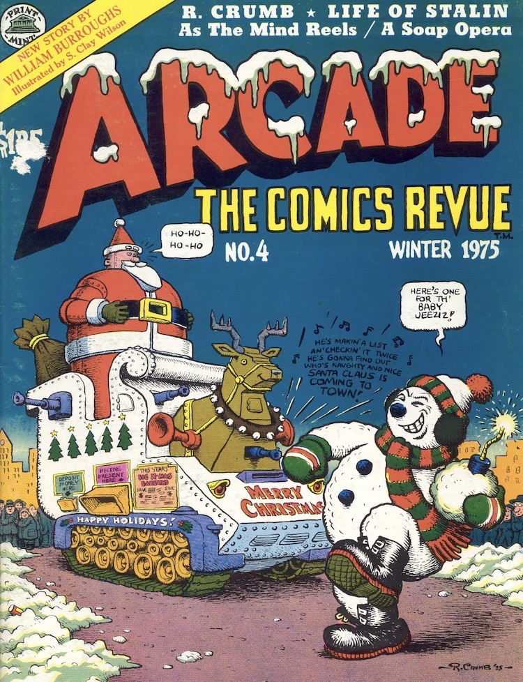
I received the above letter in the late September of 1976 after coming across a handful of issues of Arcade at the comic shop Dark They Were & Golden Eyed. I'd originally picked the magazine up on impulse after being attracted by a cover line that promised the unlikely combination of William S Burroughs and S Clay Wilson, apparently to be found within. What I discovered was a collection of comic material that swiftly elevated Arcade: The Comics Revue to the Olympian reaches of my Three Favourite Comics Ever In The History Of The Universe. As is usually the way when I encounter something I'm really fond of, my condition escalated rapidly from good natured boyish enthusiasm to an embarrassing display of slobbering hysteria. I wrote a long and love-struck letter to the magazine swearing that in order to ensure the continued publication of this Pulp Paragon I would be prepared to have sexual intercourse with a Komodo dragon or kill my family with a blunt butter-knife (or words to that effect). A few weeks latter I received the above rely from Bill Griffiths. I reprint it here partly because I really like the bit about my high intellectual calibre, and partly because of its historical interest: The last issue of Arcade was issue 7. There was no annual paperback. The Mafia obviously got them after all.
During its brief lifespan Arcade published some of the only truly worthwhile material produced during the 1970s, and for a short time seemed almost capable of revitalising the near extinct genus of the Underground Comic. This dream was truncated suddenly when Bill Griffiths woke up one morning to find Zippy The Pinhead's pointed, severed head in bed with him, or whatever way it was that those ruthless pinstripes Sicilians put the frighteners on him. The fact that Arcade folded is a shame; the fact that it has been pointedly ignored ever since is a tragedy... at least on the effete scale with which we aesthetes evaluate tragedies.
In an effort to address the balance a little I'd like to attempt a brief and necessarily inconclusive rundown on the magazine. To understand Arcade you first have to understand a little of its historical context, so I hope you'll bear with me as I do my best to lubricate the dry facts.

In 1975 then, Arcade served as a rallying point for those cartoonists who were more concerned with their art than their bank balances. In the process it brought more concentrated intelligence to bear upon the comix strip medium than has been experienced since the balmy heyday of the Great American Newspaper Strip. So what was it all about?
As a package it was delightful: Nice printing on white paper and card covers aside, it had a sort of garish pulp charm that latterday descendants such as RAW can't really hope to capture. Arcade wasn't hard edged and intimidatingly intellectual. It was approachable, and everything from the style of the mast head lettering to the gallery of self-portraits on the contents page reflected this somehow. Entertaining as the package might have been however, it didn't hold a candle to the contents.
The contents of Arcade had a pleasing regularity, considering how diverse the actual material was. Most of the early issues opened with a full page illustrated text feature by Jim Osborne on the inside front cover, similar to the Loathsome Lore features that the late Roy Krenkel did for Warren's early run of Creepy. These were historical items centring upon some famous real-life monster from history, such as baby-butchering Caterina Sforza or Peter Kurten the Düsseldorf vampire. Lovingly illustrated in Osborne's delicate stippling, these catalogues of genuine atrocities became so numbingly terrible as to be almost funny, leading the reader in to the uneasy no-mans land between the disturbing and the amusing that was to almost a trade mark for a number of the most prominent Arcade artists, and the nearest that the magazine ever got to a distinctive House Style.

After an imaginatively designed contents and editorial page, the main contents unrolled. As the issues passed, some of these emerged as Arcade's equivalent to continuing features.
Jim Hoberman also contributed a text column, Space Age Confidential by name. Variously illustrated by Deitch, Robert Williams and Art Spiegelman, Space Age Confidential talked enthrallingly about such American icons as Coca-Cola, Disneyworld and President Calvin Coolidge. In doing so it underlined another prominent strand running through Arcade, a sort of determination to expose the dark and bizarre side of contemporary pop culture, starting with the comic strip and working outwards.
Despite the heavy whiff of Dadaism in the material, Arcade displayed nothing but the greatest respect for the medium it was working within. Great moments in the medium's past were recalled and re-examined in a feature called Arcade Archives. While at the moment we have an exemplary publication like Nemo to help us find out about strips of the past, in 1975 Arcade Archive's four or five pages a quarter were the best thing on offer. It was here that I first discovered such glittering geniuses as Harrison Cady, and became convinced that a familiar name like H.M. Bateman might be worth a deeper examination.
This concern for the past of the medium was matched with a concern for its future that was best reflected in a feature known as Arcade Sideshow, which rounded out the magazine. Sideshow consisted of numerous half-page strips by new artists, or occasionally by an older hand who simply wanted to experiment with the interesting restrictions of the half-page format. Aline Kominsky, Mark Beyer, Sally Cruikshank, Rory Hayes - I encountered them all for the first time in the sawdust and popcorn atmosphere of the Sideshow. The title seemed especially adequate in light of the freakishness of some of the art-styles on display. It was my first exposure to the idea of primitivism in comic art, and after my initial conditioned repulsion had worn off – about three months – I found myself approaching the work of people like the late Rory Hayes with a real and almost inexplicable pleasure. This is the edge of the underground that most comic fans balk at. When confronted by the painful amateurishness of an Aline Kominsky, the mind conditioned to Neal Adams and Mike Golden will probably recoil in stark terror and vomit mauve bile. The root of the argument seems to be, "But she can't draw." In terms of standard comic art, this is perfectly true. John Byrne can draw and Aline Kominsky can't. What you have to realise however, is that the drawing ability of the artist is not what art is about. Not all the time. And I for one would love to see Aline Kominsky do an issue of the Fantastic Four.
All of the above is an attempt to list just the continuing features of Arcade, and even so it is incomplete. I haven't mentioned Art Spiegelman's Real Dream spot, where readers were invited to send in dreams for Spiegelman to illustrate, or Yippie monument Paul Krassner's expose upon Timothy Leary and the grim facts behind the Lenny Bruce industry. This is largely because the most significant of Arcade's contributions to the medium were one-off pieces rather than continuing features. However astonishing the material listed above might actually be it was really only the setting for the various pieces de resistance that Arcade was to present over its seven issue lifespan.
There were so many good pieces, even in such a drastically curtailed run, that I can only hope to list a few in passing before tackling a couple of personal favourites in depth. There was Jay Kinney's wordless and ominous Midnight, executed entirely upon scaper-board; the late Willy Murphy's excellent Arnold Peck adventures, Diane Noomin's Sultana of schlock Didi Glitz in a series of vacuous vignettes, the stunning colour work adorning the back covers by Spiegelman, Moscoso, McMillan, Robert Williams, Kliban and others, and so on and so on in an endless shopping list of extraordinary talent gathered in one place at one time. Quite genuinely, this was the most perfectly conceived and executed comic publication since Harvey Kurtzman's MAD, and there has been nothing like it since.

I think that without a doubt the three most consistent creators working at Arcade were the magazines editors; Bill Griffith and Art Spiegelman; and that cranky old misogynist Robert Crumb himself.
In Arcade #6, Crumb contributed something that looked very much like the last word in funny animal anthropomorphism at the time, and still does to a certain extent. Entitled Ain't It Nice and starring Those Cute Little Bearzy Wearzies, the strip portrayed a vision of inner urban life and love every bit as flatly and methodically as something like Last Exit To Brooklyn could achieve in the literary field. It was seven pages long, and each page had a grid containing twenty individual panels. The strip minutely chronicles a day in the life of two working class inner urban bears, Jippo and Boopsy, as they go through their day. Some moments are ugly, some are surprisingly touching, but by the end of the strip you feel a sort of pang of recognition, along with a sensation of having learned something. Crumb has used funny animals in the classic sense: By showing human foibles portrayed by animals an artist can sidestep all the obscuring preconceptions that people have about human behaviour and enable them to look at themselves dispassionately as if they were observing another species. The beauty of Crumb's concept here is that he has made the human behaviour being portrayed a lot more disturbingly naturalistic and near the knuckle than most of his predecessors. In doing so he also shows us how much of the animal there is in human behaviour by way of the rough physical preliminaries that the two-lovers go through before finally arriving at a sloppy and drunken sexual bout. There's a sort of inversion of the principals of anthropomorphism there that hasn't been attempted since Kurtzman/Elder Mickey Rodent strip in MAD.
Crumb's best piece, however, concerned real people. Appearing in Arcade #3 under the title That's Life, it chronicled the brief and unspectacular rise and fall of a black backwoods singer called Tommy Grady who cut one 78rpm record before being shot dead in 1931. The first three pages take us through Tommy Grady's last year of life. He fights with his wife and hits the road taking only a knapsack and a guitar. Picked up by friends on their way to Memphis to cut a record, he is persuaded to cut a tune himself as part of the then-current boom in Ethnic Music. Blowing his first pay-check on drink he picks up a woman and gets shot dead in a senseless argument with her boyfriend. The next two pages carry us through the depression of the thirties, when many of the small record labels went out of business and a large number of records deleted, Tommy Grady's amongst them. The final page brings us up to the seventies, where an avaricious blues collector looking suspiciously like Crumb himself, buys a solitary surviving copy of Tommy Grady's only record from an old black woman as part of a job lot. He takes it to his blues aficionado friends in L.A. who give it a public airing over their expensive hi-fi units. The last panel shows a crowd of rich white-American blues scholars smiling blissfully as Tommy Grady's voice drifts around the elegant apartment: "Po-o boy, lo-ong way f'um home... Po-o boy lo-ong way f'um home..." A lone caption reminds us of the title: "...And that's life!" Crumb at his manic-depressive zenith.

Griffith's best piece, at least in my mind, remains A Fools Paradise Revisited in Arcade #3. In this ten page strip, Griffith followed the passage of the ubiquitous Zippy The Pinhead through a lavish and classical Stately home. Each page is divided into four wide horizontal panels, stacked one on top of the other, creating a cinemascope effect (or Zippyscope, as the artist would have it). After a number a splendid sequences made more evocative by the panoramic nature of the visuals, we get a single deviation from this rigid page structure. One strip on the last page is broken into seven smaller panels, showing Zippy The Pinhead's progress as he drifts out to sea upon a chunk of ice-berg. Zippy's comment at this juncture, delivered with one word in each panel as the pitiful Pinhead drifts away towards the distant horizon, is revealing: "I Hate Everything That's Modern. Everything. That's. Modern. I Hate. It..." It's not until you've read it a few times that you realise that the sun is slowly rising in the background as night gives way to daytime, and that the magnificent microcephile has managed to string one sentence out over some three or four hours. Like Jarry's Pere Ubu, Zippy perpetrates a sort of comedy of the unconscious, stumbling through a half-understood landscape shattering time, logic and preconception as he goes. The bits that you laugh at loudest are always the bits that you least understand consciously, and at times the Zippy mystique manifests itself eerily beneath the veneer of slapstick – and nowhere more effectively than here.
ART SPIEGELMAN:
Griffith's co-editor, Art Spiegelman, is the last artist under discussion here. Of all the contributors to Arcade, Spiegelman remains the most creatively self-conscious in his use of the medium, and in consequence achieves many of the more penetrating insights. For the most part Spiegelman's work is as much about the comic-strip medium as whatever story he happens to be telling. While this is true to a lesser extent even of such recent work as Maus, the trend for self-examination was most apparent during Spiegelman's stint on Arcade.
In the first issue, Spiegelman contributed a piece entitled Cracking Jokes which manages to provide an accurate and scholarly dissertation upon humour while being in itself funny. By taking a simple four frame gag and examining it over and over again from every conceivable standpoint for three pages, Spiegelman actually manages to say something about humour itself at the same time as expanding one's notions of what the comic medium is capable of.
Other notable strips include Ace Hole Midget Detective, in which Spiegelman manages to weave a detective story in together with a few observations on Picasso and the relationship between comics and modern art; and As The Mind Reels, in which he successfully intercuts between a mundane soap-opera, a pasta advertisement, a bored housewife's telephone conversation and his own working notes for the strip, creating a sort of collage of everyday life punctuated by televisual inanity, contrasting the real-life of soap operas with the real-life of the everyday world.
My favourite Spiegelman piece, however, is a two page exercise included in Arcade #6, entitled The Malpractice Suite. What Spiegelman has done is to take panels from the Rex Morgan newspaper strip by Bradley and Edgington - head and shoulders shots for the most part – and then extend the lines of the image beyond the panel borders to form them into new shapes and contexts. As an example, we see a standard Rex Morgan panel with a woman up close in the foreground, turning away from us in a head and shoulders shot. She is starting to glance towards a man in a raincoat who has just come to the door, his feet invisible below the bottom panel borders, however we see that what Spiegelman has added to the original design has placed it into a disturbingly different and surreal context. The woman whose face we see in the foreground is given a crude and stumpy body beyond the frame borders, the blouse open to reveal naked and sagging breasts. The man in the background, it transpires is not in the background at all. He's about eight inches high and he's in the foreground. The bare-breasted woman is holding him up in one hand like a popsicle. The sudden change in he way that reality is perceived is disturbing, and suggests all of the subliminal tensions and currents that exist just beyond the panel borders of everyday life.

LEGACY:
Of course the most bewildering thing is exactly how they managed to fit all of the good material mentioned at wearying length above as well as all the worthy stuff I didn't mention – into a mere seven issues, although I for one am glad that they did. To me Arcade was an almost perfect culmination of the whole idea of Underground Comix. Granted, there have been worthy individual efforts by the various Arcade contributors since then, but somehow without the same flair. RAW is a splendid magazine, but it's intimidating. I can't bring myself to criticise anything that is that well printed and I find myself approaching RAW in almost the same way as I approach gallery art - coldly and from a polite distance. Crumb's Weirdo is similarly excellent, but I think that at least in terms of a magazine he needed someone to balance his consuming taste for artistic deviance with slightly less iconoclastic sensibilities.
Balance is what Arcade achieved, in a nutshell. It balanced Griffiths' metaphysical slapstick against Spiegelman's thirst for self-reverential comic material and ground their more explosive experiments with a solid anchor of Robert Crumb's simple and unadorned storytelling. It pushed the medium in all sorts of new directions, the vast majority of which still remain to be properly explored almost ten years later. Anyone seriously interested in seeing what directions comics might go in the future could do a lot worse than checking out just how far they've been in the not too distant past.
If the Mafia were really responsible for Arcade's demise then perhaps Joe Valachi was right to squeal on the bastards after all.
Alan Moore
This article is reprinted with the kind permission of the author. It originally appeared in the British fanzine Infinity #7-8 in 1984. Infinity resurfaced between 2012 and 2014 as a free-digital magazine and is well worth checking out.
No comments:
Post a Comment