
...but RYR will be back in early September.
See you then!
It was a misnomer that started it...
In the mid '80s some well-intended journalists and booksellers tried to distinguish a handful of book-format comics from other, less ambitious, works by dubbing them "graphic novels." But even though my own book, Maus, was partially responsible for making bookstores safe for comics, the new label stuck in my craw as a mere cosmetic bid for respectability. Since "graphics" were respectable and "novels" were respectable (though that hadn't always been the case), surely "graphic novels" must be doubly respectable!
It was a wrong-headed notion that started it...
It would take another decade before enough long, ambitious comics gave the concept critical mass - until enough work worthy of critical attention made a bookstore section of some sort inevitable - but, tired of seeing my Maus volumes surrounded by fantasy and role-playing game manuals, I tried to jump-start the process. In the early '90s I groused to one of my editors that if my work was fated to be ghettoized in a graphic novel section, perhaps the neighborhood could be improved by hiring some serious novelists to provide scenarios for skilled graphic artists. I got permission to approach several well-known novelists, including William Kennedy, John Updike and Paul Auster.
It was a number of friendships that started it...
I was fortunate enough to become friends with Paul Auster in the late 1980s, and my repeated cajoling got him to toy with the possibility of collaborating with a cartoonist. He had the glimmering of an idea: a vision of a boy floating above water. Next thing I knew, that glimmer became his next novel, Mr. Vertigo, and he kindly invited me to provide a jacket drawing. All the novelists I contacted were intrigued by my proposal, then fled. (Updike, who early in his career wanted to become a cartoonist, said it had taken him fifty years to finally become reconciled to making his cartoons with words.) Even I was a bit dubious of my own idea, secretly convinced that the "purest" expression of the comics form demanded text and pictures made by one person.

And so the project languished, only to be replaced with what I believed was an even worse idea. At some point Paul had suggested that I simply adapt one of his already published works. I shrugged that off until another friend, Bob Callahan, in turn cajoled me into co-editing a series of books with him: comics adaptations of urban noir-inflected literature. I couldn't figure out why on Earth anyone should bother to adapt a book into... another book! To make the task more difficult, the goal here was not to create some dumbed-down "Classics Illustrated" versions, but visual "translations" actually worthy of adult attention. City of Glass was exactly the sort of novel Callahan was reaching for to define what we eventually called "Neon Lit," but rereading Auster's slim volume made the choice seem downright daunting - and therefore actually worth a shot! For all its playful references to pulp fiction, City of Glass is a surprisingly non-visual work at its core, a complex web of words and abstract ideas in playfully shifting narrative styles. (Paul warned me that several attempts to turn his book into a film script had failed miserably.)
I enlisted David Mazzucchelli, whose art on Frank Miller's Batman: Year One had shown a grace, economy and understanding of the form that made the superhero genre almost interesting. The astonishing avant-garde comics and graphics he then went on to self-publish after abandoning the "mainstream" at the height of his acclaim made him seem ideally suited to the challenge of grappling with our proposed adaptation. But after a number of attempts, David began to look disheartened: he was more than able to tell the "story" in Paul's novel but couldn't quite locate the inner rhythms and real mysteries that made the story worth telling. Maybe it was impossible.

Grasping at straws, I called Paul Karasik who had been a student of mine at New York's School of Visual Arts back in 1981 and 1982 (the very years, it turns out, that Paul Auster was writing City of Glass). As a teacher I had come up with some resolutely implausible assignments - like asking students to turn a rather non-narrative passage of Faulkner's The Sound and the Fury into comics - and Karasik had consistently demonstrated a gift for intelligent, plausible solutions.
After explaining our impasse, I remember him cockily telling me he was born for this assignment, but I didn't hear his Auster-like back-story til much later. It seems that back in 1987 (the year, it turns out, that Paul Auster and I first met) Paul Karasik was teaching art at Packer Collegiate in Brooklyn Heights. Learning that one of his most talented eleven year old students, Daniel, was the son of the novelist, Paul Auster, Karasik read several of his books, and for a lark... broke down a few pages of City of Glass in one of his sketchbooks!
The new breakdown sketches he did six or seven years after that first experiment were inspired. When I got to the pages that captured Peter Stillman's memorable speech to Quinn, my jaw dropped. It was an uncanny visual equivalent to Auster's description of Stillman's voice and movements:
"Machine-like, fitful, alternating between slow and rapid gestures, rigid and yet expressive, as if the operation were out of control, not quite corresponding to the will that lay behind it."
By insisting on a strict, regular grid of panels, Karasik located the Ur-language of Comics: the grid as window, as prison door, as city block, as tic-tac-toe board; the grid as a metronome giving measure to the narrative's shifts and fits.

There was one problem with the sketches: Neon Lit's small final page format couldn't accommodate all those relentless rows of tiny panels without looking uncomfortably cramped. The scrupulous compressions (Paul K had shaped the adaptation so that each cluster of panels took up proportionally about as much space as the corresponding paragraphs did in Paul A's prose original) needed to be rethought so the pages could "breathe" a bit more. Occasional larger images were needed to beckon the reader's eyeballs into the congested grid. Fortuitously, this allowed David back in as a full participant in the further condensing and reshaping whereby he could engage the work with all his formidable skills.
As for Auster, I'm convinced he behaved generously throughout...
Paul Auster, appreciative of the wiggle-room translations and adaptations demand, spent a long, fruitful day with Mazzucchelli, Karasik and I, studying the draft and offering suggestions. Generous as always, he was pleased and supportive, but I don't think he fully realized just how overwhelming the odds against success had been or that his novel had occasioned a break-through work. By poking at the heart of comics structure, Karasik and Mazzucchelli created a strange doppelganger of the original book. It's as if Quinn, confronted with two nearly identical Peter Stillmans at Grand Central Station, chose to follow one drawn with brush and ink rather than one set in type. The volume that resulted, first published in 1994, overcame all my purist notions about collaboration. It offers one of the richest demonstrations to date of the modern Ikonologosplatt at its most subtle and supple.
- art spiegelman 12/31/03

In 1952, Scrooge was granted his own comic. Barks celebrated Scrooge's autonomy with the issue-length Four Color story Only A Poor Old Man - a standard battle with the larcenous Beagle Bros, it doubled as a perfect summation of Scrooge's final personality: less nasty and cantankerous than the '40s McDuck, but more complex and sympathetic.
Barks would write and draw four to six full-length Uncle Scrooge adventures a year for the next decade and a half. It's true that by this time, Barks had moved past his first hot blast of inspiration, but to argue that the Scrooge stories were not as brilliant as Barks' '40s work is hardly a slight. Even if some of the sharp edges had been lost (including the rounder, cartooned, less detailed artwork), Barks proved in such yarns as Back To The Klondike, The Golden Fleecing, Land Beneath The Ground, The Golden River, The Flying Dutchman, and stories set in Atlantis and Seven Cities of Cibola, that he still had a sense of wit and craftsmanship, that far outstripped other cartoonists.
Barks often dropped hints about Scrooge's past. These hints were studied obsessively by fans - one of whom, Don Rosa, would eventually attempt to weave them all into a single "history" of Scrooge. The effort was never entirely convincing (Barks himself, who had no such grand scheme in mind, had thrown in flashbacks or lines of dialogue purely on a story-by-story basis) but it suggests the degree to which the world Barks delineated in these stories created its own reality - and give a hint as to why the Scrooge cannon remains a particular favourite among many readers.
REVIEW BY ART SPIEGELMAN:
I loved Carl Barks' work since those days of long-lost innocence when I assumed the duck stories were all written and drawn by Walt Disney himself. As far as I was concerned, they were Walt's best work, done on lunch-breaks, when he wasn't making animated cartoons or hosting his weekly TV show. Before that I just believed the ducks were somehow real, and now, as an adult I've reverted to my first opinion: the ducks ARE real. Not the way they look, of course, but they're emotionally real, realer than most people I've met.
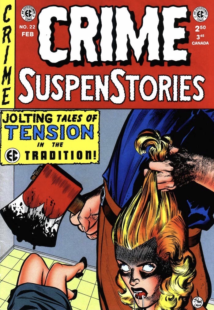
No comic book company, before or since, has maintained such a high standard of graphic excellence as EC - and the horror comics boasted some of the best artists even within EC. Jack Davis' southern-fried Bigfoot style routinely curdled laughter into terror; Graham Ingels' putrescent detail gave a tactile impact to his tales of ghouls and decomposing corpses; and Johnny Craig (who also wrote many of his own stories, and took over the editorial reins on Vault of Horror) trumped them all by presenting the most awful occurrences in such clean and tidy strokes that the horror seemed to leak out between the panels. (As a result, a Craig axe-in-the-head panel seemed to carry more of a jolt than any graphic disembowlment from the pen of his peers.) Reed Crandall, George Evan, and even the maligned Jack Kamen, while not as distinctive, ensure that no EC horror story was drawn with anything less than superlative skill, and the occasional surprise appearance by an Al Williamson or a Bernard Krigstein (or, on the writer's side, Ray Bradbury!) kept things hopping.
Frequently formulaic (bad person get ironically appropriate comeuppance), often ludicrously overwritten, and knee-jerkingly transgressive to a fault, the EC horror comics remain compelling and influential half a century after their initial release. Their mixture of campy comedy (typified by the cackling, pun-crazy "hosts" who married every story) and unflinching, grisly horror has been endlessly copied - in other comics, on TV, and on the silver screen - but never with the panache and freshness of those pulpy pamphlets. In fact, even if their ambitions may not have been as great, they often remain more compulsively readable than Feldstein's (somewhat) more serious-minded ventures into socially conscious crime fiction (Crime and Shock Suspen-Stories) and science fiction (Weird Science and Weird Fantasy).

Aside from a handful of EC stories, Hey, Look! represents some of the last comics that Kurtzman not only created and executed entirely on his own, but that showed such a dedication to every step of the cartooning process. Each is a one-page lesson in the language of comics: storytelling, timing, control, pacing, page design, panel composition, movement, light and shade... it's all there.
Inside each simple illustrated page is a complex and sophisticated design of panels that tell the essentially simple "joke" of the script with as much humour as is possible. These (usually) nine-panel gags that were intended as filler for Timely monster and romance comics could only be the creation of someone who had honed his craft so finely as to compliment and give life to the intangible instinct and inspiration flowing from his mind.
For me, what makes Hey, Look! hold up so well against the more mature work he later created is the unabashed devotion to craft that the pages display. I miss the Toth-like dedication to black-and-white contrast in later Kurtzman solo projects like The Jungle Book. What the Hey, Look! strips lack in the visceral and naturalistic penwork of The Jungle Book they more than make up for in dripping blacks that proudly display Kurtzman's mastery of the brush. (Kurtzman's ego perhaps never loomed larger than in these strips.) He never again embraced the process of "inking" quite so romantically as then, preferring to collaborate with other master craftsmen like Bill Elder or stick to the simpler, more expressive style of The Jungle Book.
FURTHER READING:
Harvey Kurtzman at The Dennis Kitchen Art Agency
Harvey Kurtzman at Fantagraphics Books
The Harvey Awards

REVIEW BY R.C. HARVEY:
(from The 100 Best Comics of the Century! in The Comics Journal #210, 1999)
The strip called Jiggs & Maggie by most of its readers started January 12, 1913, and like many of its vintage, it was essentially a one-joke enterprise, part of a constellation of strips about various aspects of courtship and married life that George McManus (1882-1954) was producing.
In Bringing Up Father, Jiggs, an ordinary Irish labourer, has become very wealthy and has moved his family into posh surroundings, but Jiggs persists in his old habits. And in his uninhibited naturalness (of which his socially ambitious wife Maggie is ashamed), and consequent desire to escape (for however brief a time) from the pretensions of the social world into which his wealth has thrust him (and from his wife's relentless attempts to reform him), we have both the source of the strip's comedy and an evocation of the immigrant experience in America - the ascent out of old world poverty into the relative prosperity of the new world.
A tireless escape artist, Jiggs is victorious (and persistent) enough to suggest that people are always better off being themselves than pretending to be something else. McManus multiplied endless comedic variations on this theme, preserving the aura of early comic strips well into mid-century.
Drawing with a fine and delicate line, he embellished the strip with decorative rococo backgrounds and ornate props - the filigree of a city skyline, the graceful curlicues in the design of a stair-railing or in the pattern of Maggie's dress - and by the artful placement of solid blacks, including the stunning deployment of silhouettes.
Still in circulation, Bringing Up Father is the second-longest running strip in history.
FURTHER READING:
TCJ: Bringing Up Father & The Rest of The Comics Page by R.C. Harvey
Bringing Up Father at Wikipedia
The Library of American Comics

Ware has proven himself to be a tactical cartoonist, perhaps the most doggedly innovative practitioner since funnies froze into form. Each volume in the carefully and lavishly appointed Library represents a supremely rational invention or appropriation of forms. As excruciatingly apt crystallisations, they suggest what Joseph Cornell's exquisite boxes might have looked like had they intended to tell stories. Individual issue subvert nostalgia (childhood toys and comic book ads), quaint neutral backdrops (isolated, beautifully-drawn panels and scenes), and appropriate innocent visual formats and languages (cartoonish characters and animation-like sequences). They reveal a sensitivity to period architecture and to the role of music as catalyst. Invariably they co-opt cheery design elements, darken the claire-ligne, and generally shutter up any ray of hope of optimism. Each is a singular provocative, mordantly humorous, utterly wrenching read, cunningly executed, as cleanly and irrefutably rendered as an electrician's blue-print.
Ware's exploration of the medium's properties spans the visual spectrum and reconstructs its borders. At an iconic level - drawing's atomic scale - cartoon quanta acquire abstracted strangeness and charm. At eye level, mechanical manipulations produce amazing narrative rebuses. At the relatively "cosmic" scale, Ware fashions whole universes in uniquely propertied packaged where alternative laws of narrative physics operate side by side with traditional artistic flourishes. "It's like reading in three dimensions", said Journal critic Andrew Arnold (TCJ #200). No need to be so Newtonian. With topographical warping and expanded horizons, Ware now has us traversing the fourth dimension of visual time.
The series format-busting instalments depict thematic stumbles through childish nightmare (where eyeballs repeatedly pop from heads), psychologically resonant images (abandoned homes are returned to and, locked, broken into), modern woes of alienation and emotional paralysis (being encased in a crude, bulky robotic shell), and fears that defy common taxonomy (a suicidal pistol shot to the head that has little effect). A slate of significant and intermittent characters dream their pathetic fantasies, embody their perverse and ruinous romanticism, and play out their sad repertoire of conditioned responses accordingly. "Characters grind dryly off each other, sliding into blank, isolated holes of disappointment and loss... The comics proceed without the usual cushioning of denial and self-delusions which allow most human beings to continue living without going mad." (Scott Gilbert, TCJ #174)
The most lovingly ground down and uncushioned is Jimmy Corrigan, The Smartest Kid on Earth. His extended story has taken on new dimensions of generational misery, particularly the impossibility of compensating for a lack of parental affection and oversight. His airless and ineluctable domestic tortures, blunt spiritual trauma, and bleak social terrain are so ghastly that Aeschylus would have shied from levelling them on the House of Atreus.
Remarkable talents force the rest of us - especially critics - to keep up. Some have slighted the book for its seeming coolness and distance from its emotional content; this sounds like the early gripe against analytic cubism for departing from the dynamics of overt emotional displays of prior artistic movements. I myself once fretted that, on the basis of the first issue, the book "may be something of a one-note, but that singular unwavering pitch is held so long and perfectly that the comic remains an altogether unique and powerful experience." (TCJ #168) Leave it to the great ones to demonstrate how that one clear, perfectly perceived and transmitted tone can be the timbre of the spheres. The ACME Novelty Library remains absolutely piercing.
The 100 List | The Reviewers | List Making
Cartoonist Kayfabe
The Cartoonist Kayfabe YouTube Channel is THE place to get an audio/visual inside scoop on comics from two lifetime comic-book makers - Jim Rugg and Ed Piskor! In the videos below Jim and Ed turn the pages of The Comics Journal #210, which featured The 100 Best Comics of the Century! list.
Top 100 Best Comics of the Century: Part 1
Top 100 Best Comics of the Century: Part 2
*Spanish for 'Remembering'

GARY GROTH:
(from The Comics Journal #278, October 2006)
The moment I learned that Jack Jackson died, I felt like I'd been hit by one of those 18-pounders that he drew with such fidelity in The Alamo. Jack had still been creatively vital (with the 2002 publication of what turned out to be his last great graphic novel - The Alamo). I had not kept in touch with Jack, knew nothing of his current health problems, and had no other reason to believe he wasn't doing as well as usual - that is, struggling, but still producing the work he loved. I was genuinely shaken by the news.
Jack Jackson and I go back a long way. After checking the files, I realised that Jack was the first cartoonist Fantagraphics Books ever contracted with - July 13, 1981. Not the first cartoonist we published, but the first cartoonist we signed a contract with; it would take Jack nine months to complete Los Tejanos, which we would publish in June 1982. But, it is possible that Fantagraphics wouldn't have published comics if it hadn't been for this initial effort on our part.
As nearly as I can recall, Jack's second major historical work stalled after the first two chapters had been published by Last Gasp as comic books under the titles Recuerden el Alamo and Tejano Exile. I no longer remember why. Perhaps Last Gasp didn't want to publish the two remaining issues that would have finished the story because of low sales; Jack's work was notoriously difficult to sell in the then inchoate comic-book market and the vestiges of the underground head shop system. But, the modest income from the serialised publication was essential to allow Jack just enough money to live on while he finished it. The Journal had an interview with Jack scheduled later that year (conducted by Jim Sherman, our official underground comix columnist at the time) and I must have gotten in touch with Jack when I was editing it. At some point, he must've told me he couldn't finish the book and I offered to publish it. My earliest letter from him negotiating the contract is dated February 3, 1981:
I would like to start the conclusion of my tejano 'epic' shortly and was wondering if you're still of a mind to publish it as indicated.
My situation requires 3 essential ingredients:
1. 10% of cover price2. ownership of original art3. maintenance of copyrightAnything else is open to negotiation. Let me know something on this venture, Gary, or I will have to soon turn to honest labor like dishwashing for a living instead of drawing pictures.
We negotiated the details and entered into an agreement on July 14, 1981. I agreed to pay Jack $275 a month through March 31, upon which date he was supposed to deliver the book. In 1981 $275 a month was an enormous sum to us, but I remember being thrilled at the time that we could help an artist of Jack's stature complete such an important piece; it was precisely the kind of comics we were championing in the magazine when there was little work of this kind being produced. It was a struggle, but we paid Jack the $275 a month and he delivered the work exactly when he promised he would. It was probably this arrangement that allowed us to think of ourselves as comics publishers and that resulted in Love & Rockets in July 1982.
As everyone probably knows by now, Jack published God Nose in 1964 in Austin, Texas, one of the earliest underground comics, arguably the first. He then lit off on two tracks - he wrote and drew works of in-your-face satire as well as work influenced by the EC comics he admired, which was usually somewhat satirical but also more fantasy/SF-oriented and relied on the traditional EC twist ending. His satirical strips culminated in the 1973 White Man's Burden, the last strip he drew in San Francisco before moving back to Texas. In it, he pretty much pushed underground political satire as far as he could; it "was the last comic strip I did in the situation," he said, "and I realised at the time I was becoming really cynical and disillusioned with all the crap going on around me." In a way, this recognition freed him to do what he devoted the rest of his life to and which he was clearly meant to do - comic strips about American history.
The first significant strip he did in this vein was Nits Make Lice, which was the first of many strips he would do chronicling the Indian massacres of the 19th century. This one took place at Sand Creek in Colorado Territory against the Cheyenne and Arapaho Indians. The EC influence is most obvious in the dense captions and dialogue balloons - the art looks closer to Severin's more delicate line-work than Davis' more exaggerated, caricatured approach, whose influence on Jaxon becomes more prominent later - but it is far more explicit than anything EC could or would do, thus taking advantage of his creative freedom nurtured in San Francisco. It is Jack's most novelistic historical work, with a stress on narrative momentum and the invention of character: primarily that of the repugnant Col. John M. Chivington. In his subsequent works, he would refine a more documentary approach to historical recapitulation, where invention would yield somewhat to the expatiation of complex historical vortices.

Jackson's mission was to tell the truth about American history and in pursuit of that goal he made himself into a first-rate historian, and created a half-dozen bona fide comics masterpieces: Comanche Moon, Los Tejanos, Lost Cause, Indian Lover, The Alamo, and including several shorter pieces such as God's Bosom. His major preoccupations were two-fold: First, the genocidal and territorial impulses behind America's expansion across the West, and the ruthless political expediency required to fulfil those goals on the one hand; and, on the other, the hell played on the consciences of specific individuals who tried to resist this inevitability - and failed. Thus, he masterfully combined the private and the public, the personal and the political, and history is seen through the prism on an individual character's consciousness. Comanche Moon is the story of Quannah, the last chief of the Comanches; Los Tejanos is about Juan Seguin, a tejano patriot who found himself compromising with both sides in an attempt to make Texas independent; Indian Lover, about Sam Houston, who consistently and tenaciously and suicidally fought for Indian rights; and, of course, The Alamo is told through the voices of William Travis, David Crockett, Jim Bowie and General Santa Ana.
Maybe style is destiny. In the best comics, there is always a beautiful harmony between style and content. As good an historian as Jack was, the characters in his histories would never have truly come alive if not for his drawings and storytelling skill. His earlier work (Nits Make Lice, Comanche Moon) had a more supple line and a greater attention to detail; this evolved into the more chiseled, rough-hewn line on display in The Alamo. (This incremental change over the 30 years he devoted to historical comics may have been due to Jack's degenerative muscular disease that made drawing harder and harder for him.) His approach to drawing changed over the years, but it remained consistent at its core, and one cannot imagine it being applied to anything other than the American historical narratives he composed.
Jack's "graphic novels" were steeped in historical accuracy, but they also embodied a deeper truth. They are stories about heroism and the failure of that heroism to prevail, fierce combativeness eventually giving way to an elegiac tone. Which is to say that it is the flip side of American history as it is taught in our schools and through the mass media. "I hate to say it," he once told me, "but we really have got a thing with our Old West, an aversion to authenticity. We really, as a people, are incapable of viewing our past, our experience in the great frontier, and it's really alarming to me. I've noticed this particularly with my new book [Los Tejanos] which talks about Mexicans of Texas. I mean, everybody knows pretty much the thing with the Plain Indians, but even something like the authentic history of the Mexican people in Texas, no one knows about that. And it's like we have raised a generation of idiots in this country, almost purposely I think. Sometimes I think it's a conspiracy that we do not educate our children to have any knowledge of what went on before. Maybe the reason why is that we have a suspicion that if we devote too much time to the past, there won't be so much time for the future. In other words, these kid's minds will be directed backwards instead of to the Great Leap Forward, which is necessary for us to conquer the universe. So what do we do, we either ignore or lie about our past. And it is very upsetting for me as someone who appreciates the authentic history, to see this going on. It's very disturbing." If David Runciman's recent observations that "the genuine antitheses of progressivism are between truth and superstition, knowledge and ignorance, common sense and ancestor-worship" is accurate, Jack was a true progressive.

America's history of predation is strewn with corpses and so is Jack's work; his refusal to gloss over the consequences of real politic made his work unpalatable to many, including educational institutions, which routinely refused to use his work in the classroom. (The ultimate insult came when The Alamo's bookstore refused to even sell The Alamo because it was politically incorrect.) Jack did not shy away from explicit depictions of violence against - and violations of - the human body. What makes his scenes of carnage so chilling is the absence of perceivable indignation, surely one of the easiest defects a work of art can succumb to. Jack was never morally shrill or didactic, either aesthetically or personally, and neither was the cruelty and carnage he drew: its portrayal rode a razor's edge between horrifyingly visceral and purely objective. One could sense the artist took no pleasure in the drawing, but that it was nonetheless an essential part of his art. (The only other cartoonist who can combine these subjective and objective realms in a single image is Joe Sacco.) Jack mastered this kind of distance, at once stepping back from the horror and rendering it with unflinching realism. He seemed to understand the consequences of violence from the inside out and follows in a long tradition of American authors who respected the consequences of violence, from Hemingway to Faulkner, from Walter Van Tilburg to James Dickey to Cormac McCarthy.
I'd see Jack every summer at the Dallas-Con. We'd always get together for lunch or dinner or drinks at the end of the night. In person, Jack very much reflected his meat-and-potatoes aesthetic: He had a straight forward, no-nonsense approach to conversation, eschewing bonhomie and bullshit, always focusing in on the salient points, never trying merely to score points, always Socratic and probing by nature. He was never a grandstander and never much concerned with status, either. He busted his ass, was never compensated adequately, and remained stedfast in his creative convictions in the face of indifference, hostility and commercial failure. He knew what he was doing had value. I don't have to point out how rare this kind of commitment is.
We later went on to publish two collections of Jack's work, God's Bosom, his shorter historical pieces, and Optimism of Youth, his earlier genre-based and satirical work. Working with Jack was both a privilege and a pleasure.
Jack lived his life with great integrity, passion, generosity and courage - as a father, an artist and a man. He lived his life like he ended it: without equivocation.
===========================
On June 8, 2006, Jack Jackson shot himself at the cemetery where his parents were buried in Stockdale, Texas, leaving his wife, Tina, and son, Sam. "I accept that it was his choice," said Sam. "I wasn't blind. I saw him suffering every day because he couldn't do what he wanted to do. He still had that brilliant mind, but it was caged by his body. In one way, I don't respect what he did and in another way I do. I'll just concentrate on my understanding of what he did, because being resentful of it won't ever get you anywhere. It was his choice. He always had control of his life, and then, due to these physical problems, he was losing control of his life and couldn't do what he wanted to do any more and he wasn't going to accept that."
===========================
Los Tejanos by Jack Jackson features in The Comics Journal's '100 Best Comics of the Century' list.

Like many children of the 1970s, I first encountered Saul Steinberg’s drawings on the cover of The New Yorker. Or, to be more precise, I first saw printed reproductions of his drawings on New Yorker covers plastered all over the walls of my family’s bathroom in Omaha, Nebraska. Like many bathrooms of the era, ours had become a do-it-yourself decorating project for my mother, for which New Yorkers - and, apparently, reproductions of nineteenth-century Sears-Roebuck catalog pages - were deemed de rigueur sometime during the years of the Ford administration. I would spend extended sessions puzzling over the pictures, which towered not only above my child-sized perspective, but also beyond the limits of my understanding. (I think my mother put the antique whalebone corset and uterine syringe advertisements near the ceiling for a reason.)
But it was the View of the World from Omaha, Nebraska poster framed in our den that most fascinated me. Its title, typeset in the legitimizing New Yorker font, and its curious, childlike cartoon map of familiar downtown buildings disappearing into a pastureland of distant pimples labeled with names like “Pittsburgh,” “Philadelphia,” and “New York” before rolling off into the ocean absolutely captivated me with the idea that I could be living in such an important city as Omaha - especially given that The New Yorker had seen fit to highlight the fact on a sheet of paper four times the usual size of the magazine. After all, Nebraska is more or less traditionally considered the geographic center of the United States - and is actually labeled as such in the real View of the World from 9th Avenue, drawn by Steinberg, which appeared on the March 29, 1976, cover of The New Yorker. The original did not, unfortunately, appear on our bathroom wall, so when I first saw the genuine image years later as a teenager, I still felt a lingering security within its strange loop of place-time - even if only then was I getting the actual joke.
Historically speaking, View of the World from 9th Avenue was a cartoon nuclear reaction, smashing together what New York thought of itself with what the world thought of New York, all on the cover of The New Yorker itself. It spawned countless city-centered rip-offs that spiraled their particle trails through 1970s dens across the nation, including mine. To this day it remains the magazine’s most famous cover not featuring its unofficial mascot, Eustace Tilley. Yet the thieving of Steinberg’s easily thieved premise rankled him for the rest of his life, the most visible sign of his success legitimizing yet also blurring the importance of his contributions to cartooning, to say nothing of twentieth-century art. A new exhibition at the Art Institute of Chicago, Along the Lines: Selected Drawings by Saul Steinberg, gives some sense of his electrifying work.
As a cartoonist myself, I am dismayed that there’s little in the show I can steal, the crossover in the Venn diagram of the image-as-itself versus as-what-it-represents being depressingly slim. I am painfully aware that in comics, stories generally kill the image. But Steinberg’s images grow and even live on the page; somewhere in the viewing of a Steinberg drawing the reader follows not only his line, but also his line of thought. Describing himself as “a writer who draws,” Steinberg could just as easily be considered an artist who wrote; as my fellow cartoonist Lynda Barry puts it, his “drawing went not from his mind to his hand but rather from his hand to his mind.” Or as Steinberg himself declared at the beginning of a 1968 television interview, “[my hand explains] to myself what goes on in my mind.”

One can’t overstate the importance of Steinberg’s working for reproduction, of his creating drawings to be disseminated to the mailboxes, laps, and, I guess, bathroom walls, of receptive readers and not, at least initially, to museum walls. The Museum turns on an eminently Steinbergian tool - the rubber stamp - and, as a lithograph, manipulates the idea of reproduction while pictorially lampooning and dissembling it. Identical figures are plunked out to represent visitors and viewers of (what else?) official stamps of approval; over the museum’s horizon, stamps rise like suns, the entire composition grounded and buttressed by illegible signatures and, of course, more stamps. As a visa-seeking emigré in his early life, Steinberg’s fascination with legal seals is easily understandable.

Riverfront and Certified Landscape pivot on the objectively ridiculous but fundamentally necessary imprimatur of government made corporeal, territorially imprinted as a skein of walls and fences. Steinberg quietly added his own signature directly into the rather unaccommodating landscapes - are they farms, factories, or concentration camps? - rather than putting it in the traditional antiseptic nonspace outside the pictorial “border.” But in The Museum, Steinberg bundles the stamp’s sanctioning power and aesthetics into the frame of the art itself, stamping his own authorizing red imprimatur in that expected nonspace outside the image, along with his signature (legible, one notes) and, as a digestif, a blind stamp (a stamp without ink, visible by the impression it leaves on the page), just to snuff out any lingering doubt about the drawing’s authenticity and, by proxy, the artist’s own legitimacy.

Even a seemingly dashed-off stamp-and-doodle drawing such as Untitled (Rush Hour) rewards the viewer with a fizz of epiphany: all of the figures and cars are made from impressions of the same four rubber stamps, so that the flow of the urban workforce is made clear only in relation to the perspective of the building into which they rush and from which they leave, and all this is captured graphically with the very clerical tools that grant the city its life. Even the seemingly random zig-zag gestures of the stamped taxicabs’ bumpers synaesthetically combine to create the sound of traffic in the reader’s eye. Konak and Untitled (Table Still Life with Envelopes) are similarly constructed around office ephemera - an official invoice, a postal envelope - but within the deliberate strictures of Analytical Cubism. For Steinberg, Cubism wasn’t only a metaphysical investigation but an immigrant’s observation:
“As soon as I arrived in New York, one of the things that immediately struck me was the great influence of Cubism on American architecture... the Chrysler Building, the Empire State Building, jukeboxes, cafeterias, shops, women’s dresses and hairdos, men’s neckties - everything was created out of Cubist elements.”
New York Moonlight appears observed by alien eyes, the spiky Chrysler Building looking more like an Aztec totem or butterfly genitalia than a skyscraper. Steinberg does not resort to the cliché of lit windows stretching into the sky; instead, his buildings sink into the horizon, not so much looking like Manhattan in the moonlight as feeling like the metallic, acidic impression of wet moonlit pavement.

Sometime in the 1970s, Steinberg’s work took a turn for the observed, typified in the Art Institute’s collection by the lovely Breakfast Still Life. Steinberg’s wife, the artist Hedda Sterne, criticized this “realistic” direction, but Breakfast Still Life is hardly realistic, with its pencil purples and greens cast against the usual metaphysical Steinberg white, capturing in reverse-thermal snapshot the stuff of the artist’s morning - black coffee, bread, cornflakes, butter, jam, Chianti bottle, a newspaper - which Steinberg sets up in alienating opposition to the tableau most humans seek as a daily reassurance. Seemingly finding it freeing to leave the artificial atmosphere of his earlier work and return to the pleasure of observed drawing, Steinberg remarked, “in drawing from life I am no longer the protagonist, I become a kind of servant, a second-class character.”
Of all the drawings in the Art Institute exhibition, The South stands out for the simple genius of its rough construction. As our gaze passes over it, moving from right to left (and we have no choice, as the rightmost word BOOKS is the first thing we see - Steinberg knew that one always reads before one sees), the stuffed toy and guitar in the bookstore’s window plant the first seeds of suspicion. What sort of bookstore sells toys? This prompts further investigation across darkened shops and postbellum buildings, ending at a Confederate monument and a courthouse before one is dumped into a confused, crosshatched tangle of black vegetation. In a single drawing, Steinberg has “read” a southern town and taken the reader backward in time and space to the mechanisms and history behind it - all without depicting directly what the South itself was trying to conceal: the legacy of slavery. Not that he was averse to more direct tactics: later works make free use of a disturbing Day of the Dead–like Mickey Mouse–type character, which Steinberg considered inherently racist: “Mickey Mouse was black... half-human, comic, even in the physical way he was represented with big white eyes.”
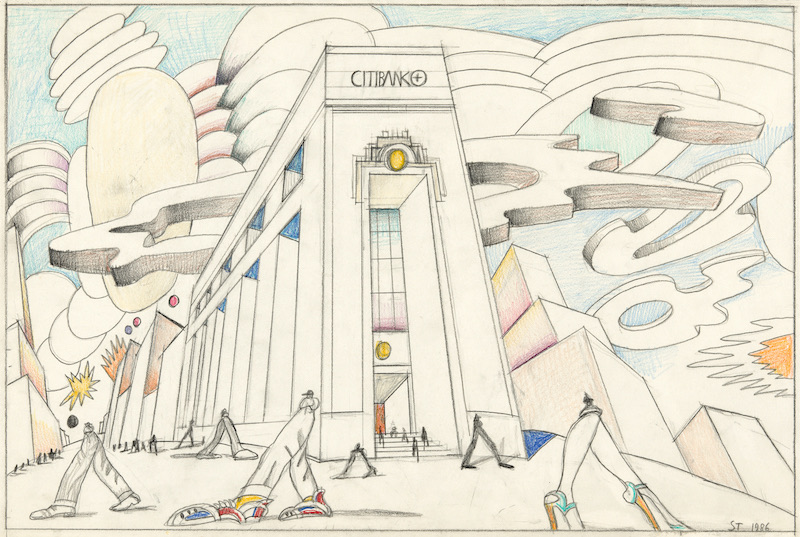
Steinberg’s later work adopts an increasingly dyspeptic view of the nation in which he had taken up residence. Untitled (Citibank) and Untitled (Fast Food) are prescient condemnations of corporate America and the ketchup-and-mustard trickle-down effect of prioritizing appetite over ethics. The artist pulled no punches on this subject, lamenting, “Gastronomy in America, the restaurant, the taste of the nation are governed by the tastes of children.” Like hundreds of Steinberg’s drawings, these two employ a shot-from-the-hip, up-skirt, underfoot perspective of an outsize world: huge legs, skyscraper tops, big shoes. His friend and fellow New Yorker writer Ian Frazier noted in a posthumous reminiscence that Steinberg said “he always tried to draw like a child... the goal was to draw like a child who never stopped drawing that way even as he aged and his subject matter became not childish.”
Really, if one thinks about it, it’s a child’s perspective that grants View of the World from 9th Avenue its power. Ironically, it’s also what most appealed to me as a child, even in the knock-off “Omaha” version I initially encountered. As embarrassing as it is to admit now, growing up in those Reagan years I enjoyed a cultivated blindness to America’s place in our post-war planet, and I think it’s fair to say that I was not alone in this if the television programs of the era are any indication.
Steinberg knew that we are all the functional centers of our own universes. Beginning with an airless blank of empty white, every time Steinberg set his pen to paper, a cosmos exploded through the mnemonic mimesis of his line; not surprisingly, all the works in this exhibition also act in some way as universes unto themselves. While the artist may have preferred, at least early in his career, to see his work in reproduction first and in memory second (which is, really, how we spend the majority of our time with those works of art that most surprise us: thinking about them), each of these drawings also offers a single, signature proof that yes, Saul Steinberg the person really at one point did exist, and, most importantly, that he offered us a view of the world that was both comically unique yet disquietingly universal.


And that feels so appropriate.
This story of a young woman recklessly tossed about on the sea of fate, cut loose by a series of coincidences and plot points well beyond her control, used and abused by crazed ex-boyfriends, sisters, and editors belongs in a book that, like its lead character, is just nearly holding it together.
Baker's fashionably hip end-of-the-80s sensibility seemed mildly outrageous a the time (remember the bazooka-wielding finale?) but after the intervening decade it's beginning to look a lot like reportage. What hasn't changed is the fact the rapid-fire dialogue still crackles with life while Baker's hyper-expressive visuals still make this one of the most approachable graphic novels of the past decade.
My copy's in such bad shape because I've yet to meet someone who won't finish the book once they've started it. It's simply too fast, too funny and too difficult to put down. So it gets read and read and read again.
It may not look so pretty up on the shelf, but I'd trade a dozen of those pristine graphic novels that I've read once and then put away for just one more of these books that looks like it's been read by a small army. Because it has been.
REVIEW BY HO CHE ANDERSON:
(from an Instagram post, 2021)
Kyle Baker! This man’s work was like a depth charge going off in my brain. The Shadow was my intro to his stuff; it was only later I discovered his more personal work like Cowboy Wally. Then came this bad boy and Kyle ascended to the levels of Los Bros, and (cough, cough) Woody Allen (this book feels a lot like an Allen-style New York comedy). Hilarious, beautiful, highly recommended.

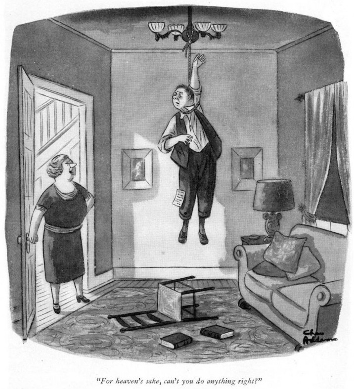
This apparently gentle soul went on to produce disturbing work for over 60 years. In keeping with The New Yorker's perforation of social affection, these cartoons solicited a cruel shock of recognition at the expense of gentility. Behavioural codes (never mind the laws of physics) were completely subverted, artfully suggesting the most uncivilised outcome.
The characters who make up the Addams Family began to appear in his cartoons by 1937, jelling Addams' mordant identity for generations of readers. While they're not the persistent focus of his work, it's easy to see what people responded to in them. They're warped, yet friendly; an eccentric presence within an often threatening framework. His mise en scene conjured the mildew of Victorian gothic conservatories, intimating that forgotten customs, such as laying out the recently deceased in the front parlour, would not be considered off-base to the maladjusted characters in their hedge against the outside world.
Verbally describing The New Yorker single-panel cartoons, with their interrelated captions and drawing, can be a flat, awkward proposition. It's probably unnecessary in Addams' case, anyway. His situational cartoons, in themselves, are familiar icons. Just about everyone has seen his cartoons of ski tracks which run on both sides of the tree. He excelled at captionless "What's wrong with this picture?" cartoons, and drawings of bizarre whimsy and surreality.
Striking a precarious balance of urbanity and malevolence, Addams showed us the banality of evil - in a perky, cheerful manner - which only made things worse.

Since being published by Last Gasp in 1972, Binky has inspired seminal first-person comics by such cartoonists as Crumb, Kaminsky-Crumb and Spiegelman. On its own terms, it remains an extraordinary achievement: a surreal, bleakly humourous mixture of anti-Catholic polemic and scourging confession. Over its 40 pages, Green uncorks his psyche, examining in harrowing detail the intersection of Catholic doctrine and his own neurotic, guilt-driven personality. Religious fervour and psychological obsession feed into each other, turning "Binky" (Green) into a fretfulzealot whose life is all but consumed by radical self-doubt. Binky is devoted to (and exhausted by) constant checking, double-checking, and triple-checking to make sure no sins are committed - or at least none left unatoned.
Binky's obsession involves imaginary rays of light emanating from his penis, his limbs, and even the material objects around him. These rays must be prevented at all costs from sticking representations (visual or verbal) of the Catholic Church, and in particular the Virgin Mary. This is of course an artist's conceit: the rays threaten to converge on the Virgin in much the same way that, in classical perspective, imaginary lines connect parallel objects to a common vanishing point. The world of Binky is one of grid-like precision, a landscape crisscrossed by invisible vectors of sin. Green's artwork both reflects and resists this linearity, with a riot of mixed forms: rigid and angular versus rounded and fleshy. Indeed, his carefully worked pages enact a struggle between hard-edged asceticism (in his words, "order, uniformity, rigidity, and obedience") and indulgent sensuality. Binky crackles with this tension.
What makes Binky so bold and effective is the extravagance of Green's visual metaphors. While he faithfully captures the cultural landscape of his formative years, Green also deploys a series of bizarre symbols that capture young Binky's inner landscape just as precisely. At first such conceits are confined to young Binky's dreams and fantasies, but they gradually assert themselves through passages of Green's anti-Catholic argument (eg parochial school students are brainwashed and turned into marionettes, replete with strings). Eventually, elements of fantasy begin to intrude on Binky's everyday life: visual metaphors multiply as Binky becomes increasingly dominated by his obsessive guilt. As Binky's world becomes more and more pinched and cloistral, Green's artwork breaks free, employing a huge arsenal of design conceits, graphic devices and rendering styles. Shifting layouts, labels, signboards and mock-scholarly annotations run rampant, while open, white panels contrast with zip-a-tone grays and densely cross-hatched backgrounds. Those expecting a documentary realism, to authenticate Green's polemic, will be perplexed by his anarchic visual imagination.
Reflexive playfulness characterises Binky from beginning to end. For example, the penultimate panel finds the hero, having spurned Catholicism, eyeing an overdue stack of library books: First Catechism, Perspective and Fun With a Pencil. This single image underscores not only Green's relationship to the Church, but also his grasp of classical art and his dedication to drawing. Even more: in the background, a cartoon by R. Crumb hints at another source of inspiration. Metonymically, Crumb (himself a lapsed Catholic) stands in for the underground comix, then in their heyday, which liberated Green artistically, inspiring him to set forth his own story in comics form.
Of course, the "pencil" in the third title, Fun With a Pencil, also substitutes metamorphic ally for the feared penis, the original source of the rays which have so monopolised Binky's imagination. Green employs this metaphoric likeness from the outset: the frontispiece is a grimly hilarious image of the naked artist, hands bound behind his back, a pen gripped in his mouth, with a long scythe-like blade poised dangerously close to his groin. Both artist's tool and endangered phallus are impious and inadmissible (Green dips his pen in God's blood; his very word balloon bears a crown of thorns). Here Green, in a confession to his readers, admits that Binky represents an effort to "purge" himself of a "compulsive neurosis." Begging indulgence for focusing on "the petty conflict in [his] crotch", the cartoonist suggests that portraying his neurosis in "easy-to-understand comic-book format" may actually help others similarly afflicted, and thus intervene in a larger social problemm: "If all the neurotics were tied together we would entwine the globe many times over in a vast chain of human suffering."
With this, Green hits on one of the great virtues of autobiography: its ability to expose private trauma as a public issue, and to focus our attention on the relationship between self and society. It is this social dimension which lifts Binky above mere calculated outrage and makes it insightful, provocative, and, finally, wonderfully moving.

