Showing posts with label Chris Ware. Show all posts

16 August 2021

The ACME Novelty Library by Chris Ware (No. 17)

The ACME Novelty Library (1993-present)
by Chris Ware

REVIEW BY RICH KREINER:
(from The 100 Best Comics of the Century! in The Comics Journal #210, 1999)
Over the past six year, the 11 issues of ACME Novelty Library have established Chris Ware as the most electrifying new cartoonist of our personal fin-de-siecle. It's a title to which he couldn't resist bi-polar meaning. On the plus side, there's the fresh tingle of innovative graphics conveying earnest narratives which compel unique participatory experiences. At the opposite pole, involvement carries an unsettling jolt which, at low voltage, can be laughed off; at full power, the comic shocks like a live wire, too direct, visceral, and overwhelming to want to stay in touch with.

Ware has proven himself to be a tactical cartoonist, perhaps the most doggedly innovative practitioner since funnies froze into form. Each volume in the carefully and lavishly appointed Library represents a supremely rational invention or appropriation of forms. As excruciatingly apt crystallisations, they suggest what Joseph Cornell's exquisite boxes might have looked like had they intended to tell stories. Individual issue subvert nostalgia (childhood toys and comic book ads), quaint neutral backdrops (isolated, beautifully-drawn panels and scenes), and appropriate  innocent visual formats and languages (cartoonish characters and animation-like sequences). They reveal a sensitivity to period architecture and to the role of music as catalyst. Invariably they co-opt cheery design elements, darken the claire-ligne, and generally shutter up any ray of hope of optimism. Each is a singular provocative, mordantly humorous, utterly wrenching read, cunningly executed, as cleanly and irrefutably rendered as an electrician's blue-print.

Ware's exploration of the medium's properties spans the visual spectrum and reconstructs its borders. At an iconic level - drawing's atomic scale - cartoon quanta acquire abstracted strangeness and charm. At eye level, mechanical manipulations produce amazing narrative rebuses. At the relatively "cosmic" scale, Ware fashions whole universes in uniquely propertied packaged where alternative laws of narrative physics operate side by side with traditional artistic flourishes. "It's like reading in three dimensions", said Journal critic Andrew Arnold (TCJ #200). No need to be so Newtonian. With topographical warping and expanded horizons, Ware now has us traversing the fourth dimension of visual time.

The series format-busting instalments depict thematic stumbles through childish nightmare (where eyeballs repeatedly pop from heads), psychologically resonant images (abandoned homes are returned to and, locked, broken into), modern woes of alienation and emotional paralysis (being encased in a crude, bulky robotic shell), and fears that defy common taxonomy (a suicidal pistol shot to the head that has little effect). A slate of significant and intermittent characters dream their pathetic fantasies, embody their perverse and ruinous romanticism, and play out their sad repertoire of conditioned responses accordingly. "Characters grind dryly off each other, sliding into blank, isolated holes of disappointment and loss... The comics proceed without the usual cushioning of denial and self-delusions which allow most human beings to continue living without going mad." (Scott Gilbert, TCJ #174)

The most lovingly ground down and uncushioned is Jimmy Corrigan, The Smartest Kid on Earth. His extended story has taken on new dimensions of generational misery, particularly the impossibility of compensating for a lack of parental affection and oversight. His airless and ineluctable domestic tortures, blunt spiritual trauma, and bleak social terrain are so ghastly that Aeschylus would have shied from levelling them on the House of Atreus.

Remarkable talents force the rest of us - especially critics - to keep up. Some have slighted the book for its seeming coolness and distance from its emotional content; this sounds like the early gripe against analytic cubism for departing from the dynamics of overt emotional displays of prior artistic movements. I myself once fretted that, on the basis of the first issue, the book "may be something of a one-note, but that singular unwavering pitch is held so long and perfectly that the comic remains an altogether unique and powerful experience." (TCJ #168) Leave it to the great ones to demonstrate how that one clear, perfectly perceived and transmitted tone can be the timbre of the spheres. The ACME Novelty Library remains absolutely piercing. 


FURTHER READING:


14 August 2021

Saul Steinberg: An Appreciation by Chris Ware


Saul Steinberg's View of the World
by Chris Ware

Like many children of the 1970s, I first encountered Saul Steinberg’s drawings on the cover of The New Yorker. Or, to be more precise, I first saw printed reproductions of his drawings on New Yorker covers plastered all over the walls of my family’s bathroom in Omaha, Nebraska. Like many bathrooms of the era, ours had become a do-it-yourself decorating project for my mother, for which New Yorkers - and, apparently, reproductions of nineteenth-century Sears-Roebuck catalog pages - were deemed de rigueur sometime during the years of the Ford administration. I would spend extended sessions puzzling over the pictures, which towered not only above my child-sized perspective, but also beyond the limits of my understanding. (I think my mother put the antique whalebone corset and uterine syringe advertisements near the ceiling for a reason.)

But it was the View of the World from Omaha, Nebraska poster framed in our den that most fascinated me. Its title, typeset in the legitimizing New Yorker font, and its curious, childlike cartoon map of familiar downtown buildings disappearing into a pastureland of distant pimples labeled with names like “Pittsburgh,” “Philadelphia,” and “New York” before rolling off into the ocean absolutely captivated me with the idea that I could be living in such an important city as Omaha - especially given that The New Yorker had seen fit to highlight the fact on a sheet of paper four times the usual size of the magazine. After all, Nebraska is more or less traditionally considered the geographic center of the United States - and is actually labeled as such in the real View of the World from 9th Avenue, drawn by Steinberg, which appeared on the March 29, 1976, cover of The New Yorker. The original did not, unfortunately, appear on our bathroom wall, so when I first saw the genuine image years later as a teenager, I still felt a lingering security within its strange loop of place-time - even if only then was I getting the actual joke.

Historically speaking, View of the World from 9th Avenue was a cartoon nuclear reaction, smashing together what New York thought of itself with what the world thought of New York, all on the cover of The New Yorker itself. It spawned countless city-centered rip-offs that spiraled their particle trails through 1970s dens across the nation, including mine. To this day it remains the magazine’s most famous cover not featuring its unofficial mascot, Eustace Tilley. Yet the thieving of Steinberg’s easily thieved premise rankled him for the rest of his life, the most visible sign of his success legitimizing yet also blurring the importance of his contributions to cartooning, to say nothing of twentieth-century art. A new exhibition at the Art Institute of Chicago, Along the Lines: Selected Drawings by Saul Steinberg, gives some sense of his electrifying work.

As a cartoonist myself, I am dismayed that there’s little in the show I can steal, the crossover in the Venn diagram of the image-as-itself versus as-what-it-represents being depressingly slim. I am painfully aware that in comics, stories generally kill the image. But Steinberg’s images grow and even live on the page; somewhere in the viewing of a Steinberg drawing the reader follows not only his line, but also his line of thought. Describing himself as “a writer who draws,” Steinberg could just as easily be considered an artist who wrote; as my fellow cartoonist Lynda Barry puts it, his “drawing went not from his mind to his hand but rather from his hand to his mind.” Or as Steinberg himself declared at the beginning of a 1968 television interview, “[my hand explains] to myself what goes on in my mind.”


One can’t overstate the importance of Steinberg’s working for reproduction, of his creating drawings to be disseminated to the mailboxes, laps, and, I guess, bathroom walls, of receptive readers and not, at least initially, to museum walls. The Museum turns on an eminently Steinbergian tool - the rubber stamp - and, as a lithograph, manipulates the idea of reproduction while pictorially lampooning and dissembling it. Identical figures are plunked out to represent visitors and viewers of (what else?) official stamps of approval; over the museum’s horizon, stamps rise like suns, the entire composition grounded and buttressed by illegible signatures and, of course, more stamps. As a visa-seeking emigré in his early life, Steinberg’s fascination with legal seals is easily understandable.


Riverfront and Certified Landscape pivot on the objectively ridiculous but fundamentally necessary imprimatur of government made corporeal, territorially imprinted as a skein of walls and fences. Steinberg quietly added his own signature directly into the rather unaccommodating landscapes - are they farms, factories, or concentration camps? - rather than putting it in the traditional antiseptic nonspace outside the pictorial “border.” But in The Museum, Steinberg bundles the stamp’s sanctioning power and aesthetics into the frame of the art itself, stamping his own authorizing red imprimatur in that expected nonspace outside the image, along with his signature (legible, one notes) and, as a digestif, a blind stamp (a stamp without ink, visible by the impression it leaves on the page), just to snuff out any lingering doubt about the drawing’s authenticity and, by proxy, the artist’s own legitimacy.


Even a seemingly dashed-off stamp-and-doodle drawing such as Untitled (Rush Hour) rewards the viewer with a fizz of epiphany: all of the figures and cars are made from impressions of the same four rubber stamps, so that the flow of the urban workforce is made clear only in relation to the perspective of the building into which they rush and from which they leave, and all this is captured graphically with the very clerical tools that grant the city its life. Even the seemingly random zig-zag gestures of the stamped taxicabs’ bumpers synaesthetically combine to create the sound of traffic in the reader’s eye. Konak and Untitled (Table Still Life with Envelopes) are similarly constructed around office ephemera - an official invoice, a postal envelope - but within the deliberate strictures of Analytical Cubism. For Steinberg, Cubism wasn’t only a metaphysical investigation but an immigrant’s observation: 

“As soon as I arrived in New York, one of the things that immediately struck me was the great influence of Cubism on American architecture... the Chrysler Building, the Empire State Building, jukeboxes, cafeterias, shops, women’s dresses and hairdos, men’s neckties - everything was created out of Cubist elements.”

New York Moonlight appears observed by alien eyes, the spiky Chrysler Building looking more like an Aztec totem or butterfly genitalia than a skyscraper. Steinberg does not resort to the cliché of lit windows stretching into the sky; instead, his buildings sink into the horizon, not so much looking like Manhattan in the moonlight as feeling like the metallic, acidic impression of wet moonlit pavement.


Sometime in the 1970s, Steinberg’s work took a turn for the observed, typified in the Art Institute’s collection by the lovely Breakfast Still Life. Steinberg’s wife, the artist Hedda Sterne, criticized this “realistic” direction, but Breakfast Still Life is hardly realistic, with its pencil purples and greens cast against the usual metaphysical Steinberg white, capturing in reverse-thermal snapshot the stuff of the artist’s morning - black coffee, bread, cornflakes, butter, jam, Chianti bottle, a newspaper - which Steinberg sets up in alienating opposition to the tableau most humans seek as a daily reassurance. Seemingly finding it freeing to leave the artificial atmosphere of his earlier work and return to the pleasure of observed drawing, Steinberg remarked, “in drawing from life I am no longer the protagonist, I become a kind of servant, a second-class character.”

Of all the drawings in the Art Institute exhibition, The South stands out for the simple genius of its rough construction. As our gaze passes over it, moving from right to left (and we have no choice, as the rightmost word BOOKS is the first thing we see - Steinberg knew that one always reads before one sees), the stuffed toy and guitar in the bookstore’s window plant the first seeds of suspicion. What sort of bookstore sells toys? This prompts further investigation across darkened shops and postbellum buildings, ending at a Confederate monument and a courthouse before one is dumped into a confused, crosshatched tangle of black vegetation. In a single drawing, Steinberg has “read” a southern town and taken the reader backward in time and space to the mechanisms and history behind it - all without depicting directly what the South itself was trying to conceal: the legacy of slavery. Not that he was averse to more direct tactics: later works make free use of a disturbing Day of the Dead–like Mickey Mouse–type character, which Steinberg considered inherently racist: “Mickey Mouse was black... half-human, comic, even in the physical way he was represented with big white eyes.”


Steinberg’s later work adopts an increasingly dyspeptic view of the nation in which he had taken up residence. Untitled (Citibank) and Untitled (Fast Food) are prescient condemnations of corporate America and the ketchup-and-mustard trickle-down effect of prioritizing appetite over ethics. The artist pulled no punches on this subject, lamenting, “Gastronomy in America, the restaurant, the taste of the nation are governed by the tastes of children.” Like hundreds of Steinberg’s drawings, these two employ a shot-from-the-hip, up-skirt, underfoot perspective of an outsize world: huge legs, skyscraper tops, big shoes. His friend and fellow New Yorker writer Ian Frazier noted in a posthumous reminiscence that Steinberg said “he always tried to draw like a child... the goal was to draw like a child who never stopped drawing that way even as he aged and his subject matter became not childish.”

Really, if one thinks about it, it’s a child’s perspective that grants View of the World from 9th Avenue its power. Ironically, it’s also what most appealed to me as a child, even in the knock-off “Omaha” version I initially encountered. As embarrassing as it is to admit now, growing up in those Reagan years I enjoyed a cultivated blindness to America’s place in our post-war planet, and I think it’s fair to say that I was not alone in this if the television programs of the era are any indication.

Steinberg knew that we are all the functional centers of our own universes. Beginning with an airless blank of empty white, every time Steinberg set his pen to paper, a cosmos exploded through the mnemonic mimesis of his line; not surprisingly, all the works in this exhibition also act in some way as universes unto themselves. While the artist may have preferred, at least early in his career, to see his work in reproduction first and in memory second (which is, really, how we spend the majority of our time with those works of art that most surprise us: thinking about them), each of these drawings also offers a single, signature proof that yes, Saul Steinberg the person really at one point did exist, and, most importantly, that he offered us a view of the world that was both comically unique yet disquietingly universal.


The above text was adapted from Chris Ware’s essay in the catalog for “Along the Lines: Selected Drawings by Saul Steinberg,” which was held at the Art Institute of Chicago in 2017.


11 August 2021

Binky Brown Meets the Holy Virgin Mary by Justin Green (No. 9)

Binky Brown Meets the Holy Virgin Mary (1972)
by Justin Green

REVIEW BY CHARLES HATFIELD:
(from The 100 Best Comics of the Century! in The Comics Journal #210, 1999)
Binky Brown is the longest, and most profound, piece of sustained narrative to emerge from underground comix. A shocking, riotous, and absurdly moving memoir of Catholic guilt, Binky offers both harrowing psychological insight (into the condition since labeled Obsessive-Compulsive Disorder) and stunning graphics, the latter courtesy of Green's eclectic vocabulary and dead-on parodic instincts. Rife with pointed symbolism, the pages of Binky riff deliriously on Durer, Crumb, Chester Gould, Superman comics, and scores of other sources, with a superb technique that at times approaches engraving-like texture. The story begins lucidly enough, clearly dividing fantasy from reality, but eventually its finely observed realism collides and merges with antic, dreamlike symbolism. Green's restless, protean style demonstrates that realistic, personal comics need not be tethered to any literal-minded notion of illustrative realism - a lesson not lost on the many cartoonists who have been influenced by Binky's blend of autobiography and graphic fantasy.

Since being published by Last Gasp in 1972, Binky has inspired seminal first-person comics by such cartoonists as Crumb, Kaminsky-Crumb and Spiegelman. On its own terms, it remains an extraordinary achievement: a surreal, bleakly humourous mixture of anti-Catholic polemic and scourging confession. Over its 40 pages, Green uncorks his psyche, examining in harrowing detail the intersection of Catholic doctrine and his own neurotic, guilt-driven personality. Religious fervour and psychological obsession feed into each other, turning "Binky" (Green) into a fretfulzealot whose life is all but consumed by radical self-doubt. Binky is devoted to (and exhausted by) constant checking, double-checking, and triple-checking to make sure no sins are committed - or at least none left unatoned.

Binky's obsession involves imaginary rays of light emanating from his penis, his limbs, and even the material objects around him. These rays must be prevented at all costs from sticking representations (visual or verbal) of the Catholic Church, and in particular the Virgin Mary. This is of course an artist's conceit: the rays threaten to converge on the Virgin in much the same way that, in classical perspective, imaginary lines connect parallel objects to a common vanishing point. The world of Binky is one of grid-like precision, a landscape crisscrossed by invisible vectors of sin. Green's artwork both reflects and resists this linearity, with a riot of mixed forms: rigid and angular versus rounded and fleshy. Indeed, his carefully  worked pages enact a struggle between hard-edged asceticism (in his words, "order, uniformity, rigidity, and obedience") and indulgent sensuality. Binky crackles with this tension.

What makes Binky so bold and effective is the extravagance of Green's visual metaphors. While he faithfully captures the cultural landscape of his formative years, Green also deploys a series of bizarre symbols that capture young Binky's inner landscape just as precisely. At first such conceits are confined to young Binky's dreams and fantasies, but they gradually assert themselves through passages of Green's anti-Catholic argument (eg parochial school students are brainwashed and turned into marionettes, replete with strings). Eventually, elements of fantasy begin to intrude on Binky's everyday life: visual metaphors multiply as Binky becomes increasingly dominated by his obsessive guilt. As Binky's world becomes more and more pinched and cloistral, Green's artwork breaks free, employing a huge arsenal of design conceits, graphic devices and rendering styles. Shifting layouts, labels, signboards and mock-scholarly annotations run rampant, while open, white panels contrast with zip-a-tone grays and densely cross-hatched backgrounds. Those expecting a documentary realism, to authenticate Green's polemic, will be perplexed by his anarchic visual imagination.

Reflexive playfulness characterises Binky from beginning to end. For example, the penultimate panel finds the hero, having spurned Catholicism, eyeing an overdue stack of library books: First Catechism, Perspective and Fun With a Pencil. This single image underscores not only Green's relationship to the Church, but also his grasp of classical art and his dedication to drawing. Even more: in the background, a cartoon by R. Crumb hints at another source of inspiration. Metonymically, Crumb (himself a lapsed Catholic) stands in for the underground comix, then in their heyday, which liberated Green artistically, inspiring him to set forth his own story in comics form.

Of course, the "pencil" in the third title, Fun With a Pencil, also substitutes metamorphic ally for the feared penis, the original source of the rays which have so monopolised Binky's imagination.  Green employs this metaphoric likeness from the outset: the frontispiece is a grimly hilarious image of the naked artist, hands bound behind his back, a pen gripped in his mouth, with a long scythe-like blade poised dangerously close to his groin. Both artist's tool and endangered phallus are impious and inadmissible (Green dips his pen in God's blood; his very word balloon bears a crown of thorns). Here Green, in a confession to his readers, admits that Binky represents an effort to "purge" himself of a "compulsive neurosis." Begging indulgence for focusing on "the petty conflict in [his] crotch", the cartoonist suggests that portraying his neurosis in "easy-to-understand comic-book format" may actually help others similarly afflicted, and thus intervene in a larger social problemm: "If all the neurotics were tied together we would entwine the globe many times over in a vast chain of human suffering."

With this, Green hits on one of the great virtues of autobiography: its ability to expose private trauma as a public issue, and to focus our attention on the relationship between self and society. It is this social dimension which lifts Binky above mere calculated outrage and makes it insightful, provocative, and, finally, wonderfully moving.


REVIEW BY ART SPIEGELMAN:
It' s no small thing to invent a genre. I readily confess that without his work there could have been no Maus.


REVIEW BY ROBERT CRUMB:
Justin Green - he's out of his mind. I love every stroke of his nervous pen, every tortured scratch he ever scrawled. He was among the top storytelling artists of the first wave of “underground” comics, a darkly humorous social commentator, and the FIRST, absolutely the FIRST EVER cartoonist to draw highly personal autobiographical comics. Binky Brown started many other cartoonists along the same path, myself included. Few have come close to him in revealing themselves in this medium. For me, there’s nothing more enjoyable than the confessions of a tortured soul, if the story is well-told, entertaining, honest, and then funny on top of it. If that’s what you’re looking for, and if you like it in comic book form, Justin Green is the first and the best!


REVIEW BY CHRIS WARE:
Thank God that it’s getting harder to imagine a time when comics were a lowly commercial hack-job for illustrators who couldn’t find work anywhere else. It’s even harder to imagine the effect of a comic book in such a cultural climate by an artist who tore himself to pieces right on the page, trying to get at the core of something that was literally consuming him, but this is what Justin Green did. With Binky Brown, comics went practically overnight from being an artform that saw from the outside in to one that sees from the inside out. His internal struggle can practically be felt in the drawings themselves, the style sometimes changing from panel to panel - sometimes even within the panels themselves - all in an effort to simply arrive at The Truth. Comics wouldn’t be what they are today without this book, and this new edition places it in its proper place in the comics literary canon. Thank God for Binky Brown. And thank God for Justin Green.


FURTHER READING:
TCJ: The ABCs of Autobiography Comics by Patrick Rosenkranz (2011)


08 August 2021

Covering The New Yorker: Chris Ware


Still Life
Art by Chris Ware

Having lived in Chicago for thirty years, I’ve only ever been a visitor to New York, but I love it like no other city. Teeming with unpredictable people and unimaginable places and unforeseeable moments, life there is measured not in hours but in densely packed minutes that can fill up a day with a year’s worth of life. Lately, however, closed up in our homes against a worldwide terror, time everywhere has seemed to slur, to become almost Groundhog Day-ish, forced into a sort of present-perfect tense - or, as my fellow New Yorker contributor Masha Gessen more precisely put it, ‘loopy, dotted, and sometimes perpendicular to itself.’ But disaster can also have a recalibrating quality. It reminds us that the real things of life (breakfast, grass, spouse) can, in normal times, become clotted over by anxieties and nonsense. We’re at low tide, but, as my wife, a biology teacher, said to me this morning, ‘For a while, we get to just step back and look.’ And really, when you do, it is pretty marvellous.


Looking Up
Art by Chris Ware

As the resident stay-at-home cartoonist, stay-at-home dad and stay-at-home laundress of my family, I knew some paradigm had shifted when I could no longer tell my wife’s clothes from my daughter’s. Soon, shirts were being traded. Then shoes. Sounds of footsteps on the stairs became indistinguishable, and I found I had to wait to adjust my speaking tone to see whom I was scolding for not hanging up a sweater. Five years - only five years! - since I was helping my daughter into a bike seat to take her to second grade, and now I could barely kiss the top of her head, though she could now kiss my wife’s. It’s cliché and it’s sentimental but it’s true: parents, when your child asks, “Will you play with me?” - do. Because one day they really will stop asking, just like you did.


Hurricane Harvey
Art by Chris Ware

I lived in San Antonio in high school, in the mid-nineteen-eighties, and attended college in Austin, occasionally driving to Houston with my fellow art students to visit museums, and sometimes alone, just for the change of scenery. I liked Houston for its big buildings, its diversity, and its slack zoning laws, which made neighborhoods unpredictable and surprising. One night, my cartoonist friend John Keen and I stopped at a restaurant-bar that was about halfway to Houston, in the very Texas-sounding town of Winchester. The parking lot was locked and loaded with about two dozen pickup trucks, and, as scrawny liberal Austinites, we braced ourselves and pushed open the saloon doors, only to find black and white farmers talking and laughing, playing poker, and shooting pool together. In a corner, an interracial couple quietly ate barbecue. This Winchester bar, we realized, was more integrated than the University of Texas we’d just left.


Stop
Art by Chris Ware

Most mornings, after I drop my eleven-year-old daughter off at school in Oak Park, Illinois, I drive my wife to the west side of Chicago, where she works as a teacher in a public school. Along the way, we’ll frequently pass a few of her students waiting for the bus, huddled in hoodies with their backward backpacks and my wife 0 it’s against Chicago Public School policy for a teacher to offer rides to students - will recognize and wave at many of them, citing an affectionate anecdote (“He’s one of the smartest students I’ve ever had”) or a bracing detail (“She beat up her boyfriend”) or a horrifying story (“His brother got shot”).

Stationed among these students are the crossing guards, all of whom are Chicago Police employees. In the outer peripheries work the Safe Passage guards, hired by the city when fifty schools were closed in 2013, lengthening the daily walks, drives, and bus rides of thousands of students to reassigned schools through neighborhoods identified as gang territory, just because they have streets and corners. Nearly all of the Safe Passage guards are middle-aged African-American women, and they nearly all recognize us and wave and smile, braving icy temperatures for hours every winter morning and afternoon. Our favorite is an energetic lady who spins around and sings to herself in the middle of the street, luring and halting traffic with graceful pirouettes that make it look as if she’s controlling the cars as part of some larger, secret ballet. However, she can turn on the cars just as easily: we’ve seen her scream at disobeying drivers, smacking her stop sign on the pavement with rage. Once, she even yelled at me, tearing through the fabric of our years-long silent code of friendship, when I guess I didn’t slow down fast enough.

Last week, as we gingerly crept through her intersection, my wife noted the sorry state of her sign, new at the beginning of the school year but now showing its battle damage: the top chipped, bent and curled down nearly halfway through the lettering, the consequence of it being slammed to the ground, over and over.


Mirror
Art by Chris Ware

The New Yorker is arguably the primary venue for complex contemporary fiction around, so I often wonder why the cover shouldn’t, at least every once in a while, also give it the old college try? In the past, the editors have generously let me test the patience of the magazine’s readership with experiments in narrative elongation: multiple simultaneous covers, foldouts, and connected comic strips within the issue. This week’s cover, “Mirror,” a collaboration between The New Yorker and the radio program “This American Life,” tries something similar. Earlier in the year, I asked Ira Glass (for whose 2007-2009 Showtime television show my friend John Kuramoto, d.b.a. “Phoobis,” and I did two short cartoons) if he had any audio that might somehow be adapted, not only as a cover but also as an animation that could extend the space and especially the emotion of the usual New Yorker image. I knew that Ira was the right person to go to with this experiment in storytelling form, because he’s probably one of the few people alive making a living with a semiotics degree.

So he sent me an audio story, and, after coming up with a cover image based around it, I set to work with John Kuramoto to somehow animate it. Usually, when listening to a story, one’s mind not only sees but also feels in images; you imagine and constantly revise and update entire tableaux, much the way you imagine things while reading a book. I hoped that our pictures wouldn’t interfere with that ineffable mental dance but would somehow, like my usual medium of graphic novels, complement it. In fact, it seems to me that much of what we “see” in our everyday lives isn’t in front of us at all but within our memories and imaginations. I’ve noticed as my daughter Clara has grown older that the unfocussed “not seeing what’s in front of her because she’s lost in thought” look has become, perhaps sadly, more and more common. Then again, it’s what I do all day.

In the weird synchrony of life imitating art (or at least of life imitating half-finished New Yorker covers), this year ten-year old Clara’s Halloween costume employed as its crucial component the application of “scary/sexy” makeup. You know - black lipstick, green eye shadow. Though it was a sinister look, her strategy had an innocent purpose: she just wanted to try on lipstick. Worried, I did some intel with the local moms and discovered, not surprisingly, that this same costume idea seemed to be a coördinated plan within many of the pre-teen sleepover cells in our neighborhood. But I wasn’t ready for this moment, and neither was my wife; for years, my daughter had yelled at her mom for putting on lipstick because it made her “look fake.” But now, dear God, she wanted to see what it looked and felt like herself - the first application of a fiction to mask her remaining few months of childhood. This led to some convoluted car discussions. “Dad, if you say women are doing it just to accommodate men, then what are men doing to accommodate women? You’ve always said women can do anything men can, right? So, as a woman, I want to wear makeup!” And so on. But - point taken.

The question was complicated even further when, in a chat with a friend, I grumbled, like lots of people at the time, about Hillary Clinton’s seemingly tone-deaf statements about her use of a private e-mail server. “Why can’t she just apologize and play nice?” I pleaded. My female friend, taking a moment, offered, “Well, as a woman she’s being held to a different standard.” Point taken, again. The adage about working twice as hard for half as much. Or: maybe I’m just not as great a guy as I thought I was.

Of course, the most important people here are the subjects of the story: Hanna Rosin (the co-host of NPR’s “Invisibilia” and a writer for the Atlantic and Slate) and her daughter, and they are not at all fictional. But the interpretations that John and I have provided more or less are. Thus, my apologies and thanks to Hanna and her daughter both for any and all liberties taken. The video’s music, by Nico Muhly, was composed and performed especially for this cartoon, so most grateful regards to him as well and to the musicians who recorded it: Nathan Schram, on viola, and Fritz Myers, on piano.


17 July 2021

George Herriman's Secret by Chris Ware

George Herriman (circa 1940)

To Walk in Beauty
by Chris Ware

For one of the most prolific and highly-praised cartoonists who ever lived, George Herriman, the creator of Krazy Kat (1913-1944), didn’t like talking about himself. Recoiling from photographers and brushing off personal questions with elliptical answers and even occasional fabrications, George or “Garge” or “The Greek” always preferred the focus to be on the multivalent, multifarious, and multicultural characters who populated the inner world he made every day with the scratchings of his pen. A direct throughline of thought-to-gesture in black ink on white paper, George Herriman’s drawings come alive before the reader’s eye with a vital, persuasive complexity previously unknown in the history of art. Krazy Kat lived on the page - but he - or she - had a secret. And so did George Herriman.

Krazy Kat has been described as a parable of love, a metaphor for democracy, a “surrealistic” poem, unfolding over years and years. It is all of these, but so much more: it is a portrait of America, a self-portrait of Herriman, and, I believe, the first attempt to paint the full range of human consciousness in the language of the comic strip. Like the America it portrays, Herriman’s identity has been poised for a revision for many decades now. Michael Tisserand’s new biography Krazy does just that, clearing the shifting sands and shadows of Herriman’s ancestry, the discovery in the early 1970s of a birth certificate which described Herriman as “colored” sending up a flag among comics researchers and aficionados. Tisserand confirms what for years was hiding in plain sight in the tangled brush of Coconino County, Arizona, where Krazy Kat is supposedly set: Herriman, of mixed African-American ancestry, spent his entire adult life passing as white. He had been born in the African-American neighborhood of racially mixed, culturally polyglot 1880s New Orleans, but within a decade Herriman’s parents moved George and his three siblings to the small but growing town of Los Angeles to escape the increasing bigotry and racial animosity of postbellum Louisiana. The Herrimans melted into California life, and it was there that George, with brief professional spates in New York, would remain for the rest of his life.

But imagine knowing something about yourself that’s considered so damning, so dire, so disgusting, that you must, at all cost, never tell anyone. Imagine leaving behind a life to which you cannot claim allegiance or affection. Imagine suddenly gaining advantages and opportunity while you see others like you, who have not followed in the footsteps of your deception, suffering. Herriman, once he was considered white, didn’t even have a way of voicing this identity. Until he started drawing Krazy Kat.

I may be in the minority here, but I really think that most if not all readers of Krazy Kat during Herriman’s lifetime would have had a hard time thinking of Krazy as anything but African-American. Krazy’s patois, social status, stereotypical “happy-go-lucky despite it all” disposition all funnel into a rather pointed African-American identity. And Herriman, confoundingly, was not above using racial and even racist imagery himself, his early work especially filled with eye-popping stereotypes and blackface caricatures. At the turn of the century, when Herriman was just starting his career, the nineteenth-century cultural phenomenon of blackface minstrelsy, while admittedly in the early process of passing into nostalgia, was still prevalent. Large orchestral shows of dozens of performers like Haverly’s and Christy’s Minstrels, grotesquely metastasized from the already ghastly four-person troupes, filled vaudeville halls and theaters; blackface performances, in a cruel twist of cultural fairness, were the first places for African-American performers to find a foothold. (W. C. Fields called Bert Williams, probably still the best known African-American entertainer from this era, “the saddest man I ever knew.”)

At the same time, a reader alive in the early part of the twentieth century probably didn’t really have to think about these associations any more specifically than we think the “Minions” sound vaguely Latino, or why Felix the Cat or Mickey and his minstrel mouse gloves were so funny. Of course Krazy Kat was black. A funny black cat. Just the right amount of slippage and shift in Krazy’s animus, helped along by a tradition of children’s animal stories, was all that was necessary for him/her to be two things - and nothing - all at once.

Nevertheless, one detail in Herriman’s strip that would have absolutely cemented this identity in the minds of contemporary readers has since passed into obscurity: Krazy Kat’s banjo. Through received clichés and shifts of poverty and culture in America, the banjo has come to be thought of as an instrument of poor whites, but at the turn of the century, it was as emblematic as a watermelon as part of the African-American stereotype. In fact, the banjo has a solemn origin: descended from the West African akonting, xalam, and ngoni instruments, played as an accompaniment to storytelling by Wolof griots in Senegal or the Jola in Gambia, early instruments like what became the American banjo were recreated by American slaves from whatever plantation materials were at hand - gourds, turtle shells, coconuts, animal skins - to try to hold on to a memory of life and culture torn from their grasp.


To the modern reader, the banjo in Krazy Kat might seem a lighthearted accessory, but when Krazy picks it up to sing “There is a Heppy Land Fur, Fur Away”, the meaning, to thoughtful readers of the 1920s to the 1940s, would have been clear. Even more astonishingly, Krazy never plays a “proper” banjo, but plays the gourd or coconut banjo, the origins of which by the time of the strip’s appearance would indeed have been obscure. Herriman knew what he was doing, and it’s not insignificant that the very last strip he left unfinished on his drawing table showed Krazy playing a gourd banjo. The earliest representation known of such an instrument appears in the watercolor The Old Plantation, painted by South Carolina slaveholder John Rose in the late eighteenth century.

What do these racial and cultural connections mean for how we see Herriman’s work? From their dimming over the years compared with Krazy Kat’s increasing artistic incandescence, they are clearly not necessary to an appreciation of the strip. But put yourself in Herriman’s shoes, and then reread Krazy Kat with this knowledge rewoven into the tapestry of his work. Think of pink Ignatz, the mouse who is Krazy’s constant tormentor. Think of the brick. Think of what W.E.B. DuBois called the “dual consciousness” of African-Americans, think of the brick hitting Krazy, over and over and over again. (Tisserand shrewdly notes that a July 30, 1866, New Orleans race riot, which Herriman’s father may have witnessed, started when a white boy threatened to throw a brick at African-American soldiers parading through the town.) Think of what recasting that gesture of hate as one of love actually means to its recipient. Think of the lynchings of the 1910s, the race riots of the 1960s, the American police shootings of 2016, the iPhone videos that continually show the treatment of African-Americans as property. Think of Barack Obama, half Scotch-Irish, half African.

George Herriman saw the history of America and its future and wrote it in ink as a dream on paper, and it is a dream that is still coming true. In December, disparate Native-American tribes and activists who had gathered in North Dakota for months staved off an oil pipeline that would have cut through ancestral Sioux burial lands; Herriman began visiting the Diné or Navajo nation and befriending its citizens before some western states were even twenty-five years old. Navajo rug patterns and the folklore of Monument Valley came to define the very cosmos of Krazy Kat. (A wonderful detail in Tisserand’s book recalls Herriman, who had Hollywood friends, setting up a private screening of older western movies with actual Navajo supporting actors for a Navajo audience, solely because the actors had said insulting things in their native language that only the Native audience could understand.)

And our most recent election involved debates about the equality of transgender teens, of those trapped inside a body by which they feel betrayed. Krazy Kat’s self-defining gender-switching - “I don’t know if I should take a husband or a wife,” Krazy once remarks - couldn’t be more timely, more oracular. Nor, sadly, could Ignatz’s seemingly implacable hatred. Even sadder, in that same American election, Ignatz won.

Everyone “passes” in some way or another; everyone has something they’d rather not discuss, something of their history they’re trying to downplay or hide, some story that doesn’t jibe with the vision and identity they’d prefer to have. This is the essence of fiction. Every one of us nightly, daily, hourly—every minute—reviews, sorts, discards, rewrites details that allow us to somehow get on with our lives, unrecorded acts of revision tantamount to what a writer commits professionally on a page. Do it well, and you’re mentally healthy. Do it badly, and you’re crazy. Fundamentally, we understand others only as refractions through the optic of ourselves, and fiction not only offers an alternative construct, but in its finest form allows the reader to inhabit, and most importantly, to empathize with another consciousness. (Or in Herriman’s case, with a cartoon cat.) So is kaleidoscopic Krazy really the crazy one, whom Ignatz can only understand through the reducing lens of his narrow, white mind?

Lately, I’ve been wondering if Herriman knew that one day his secret-in-plain-sight would be uncovered, that America would change, adapt and grow up enough as a people to understand Krazy Kat in all of its psychological and poetic depth. I’m not sure if we’ve yet reached that point, but what myself and other cartoonists already knew - that the strip was already the greatest ever drawn - is now magnified, multiplied and maximized. Krazy Kat is not just one of the greatest comic strips, it’s one of the strangest, most inventive, emotional, and personal works of art of the twentieth century. In their admiration for Herriman, Philip Guston, Willem de Kooning, and Jack Kerouac sensed something in his line and voice that was endemically American, deeply felt. Herriman should now take his rightful place as one of the most original African-American voices of the early twentieth century, contemporary with, if not predating, Richard Wright and Zora Neale Hurston as one of the first writers to understand the racial animus of America and to try to fix the essence of black consciousness on paper. That Herriman made it come alive, sing, dance and suffer in an art form barely fifty years old is all the more astonishing. For decades, we’ve all been reading and laughing and, most of all, feeling for Krazy Kat, who passed right under our eyes as a living drawing on a page. But what we were really feeling came straight from the heart. It was the very soul of George Herriman himself.


Adapted from an essay that appeared in the catalog of an exhibition on George Herriman at the Museo Nacional Centro de Arte Reina Sofía, Madrid, Spain, in 2017.


09 July 2021

Zap by Various (No. 80)

Zap #0-16 (1967-2016)
by Crumb, Griffin, Mavrides, Moscoso, Shelton, Spain, Williams & Wilson

REVIEW BY TOM SPURGEON:
(from The 100 Best Comics of the Century! in The Comics Journal #210, 1999)
It is well known in comics circles that Zap was neither the first underground comic (Jack Jackson published God Nose in 1963) nor even the first appearance by Crumb or many of the eventual contributors, who had enjoyed exposure through their appearances in the underground newspaper movement. But for the world at large, Zap in underground comix, and the buzz and excitement that greets the most recent issue is a sign that Zap struck at the collective consciousness of our culture in a way few comics ever have.

Zap has reinvented itself at least three times. The first two issues are all R. Crumb, and one can see the heavy Harvey Kurtzman influence, particularly in their presentation. But whereas with Kurtzman's magazine the medium was a big part of the message, Crumb's comics were more playful and his satire was more intensely personal. The anything-goes quality of his work continued into various extremes when the magazine made its first transition into an anthology. From a vantage point 30 years later, one is struck by how extreme the violence and sexual elements are in works from Wilson and Spain, and how elegant the art in cartoons from Moscoso and Williams. Strangely, Crumb and Shelton become almost straight men in this company, although it is Crumb's famous incest comic in issue #4 that ran afoul of New York obscenity  law. Even Zap's famous jam illustrations have a subtext of subverting standard creative practices in favour of sheer graphic splendour.

Somewhere along the way, Zap added a reflective element. For instance, the Crumb and Shelton strips in Zap #13 were both in more serious, accomplished styles, and both involved taking stock of the time Zap was created. Even the still shocking Wilson's work is viewed differently in the context of his having done so many years of Checkered Demon comics. Zap's time is past in terms of the accomplishments of the artists - all of whom remain interesting and worth reading - but because fewer and fewer artists are starting comics using similar approaches. What remains is less the movement than the comics, and for visual energy no-one will ever outstrip the creators behind Zap.


ROBERT CRUMB:
(from an interview with The Chicago Tribune, 2014)
In the 1940s, a lot of comics were done for servicemen (his own father had been an illustrator for the Marine Corps), but as culture, it was a very low form of popular entertainment. If you had pretensions to being cultured, you looked down on comics. So, to answer your question, the biggest change I have seen is comics going from being mainstream entertainment for children to something an adult can pick up. Specifically Zap said that this low form of culture could be a form of personal expression, and I think that, for the past 50 years, is our biggest legacy, that sense of comics as a form of personal expression. And maybe if comics are still seen that way, if comics have stayed honest, it's because you don't get rich doing them. The rewards are small. Because of that, (expletive) gets weeded out. You can't put across a good comic without thought. There is not enough reward for the sweat, and I think maybe, now that Zap is finished, that's what we said: If you don't love what you're doing, you're definitely not doing this.


CHRIS WARE:
Without Zap there would be no such thing as alternative / literary / artistic / self-expressive comics and graphic novels. Zap started it all.


FURTHER READING:


08 July 2021

Chris Ware Exhibitions: On Display Now!

Chicago: Where Comics Came to Life (1880-1960) 
Chicago Cultural Center, Chicago, USA 
June 19 to October 3, 2021 
Curated by artist and author Chris Ware, and Chicago Cultural Historian Emeritus, Tim Samuelson, this exhibition is designed and planned as an intentional historical companion to the concurrently appearing survey of contemporary Chicago comics at the Museum of Contemporary Art, in which Ware’s work also appears - see below.

A significant but often overlooked contribution to American art and culture is Chicago’s role in the development of the early comic strip. Through its countless newspapers and its publishing industry, Chicago led the transformation of comics from daily fantasy and joke features into ongoing stories grounded in the textures and details of real life, its first real step towards legitimacy as an expressive language and semi-literary art form. The exhibition focuses on the origins of the comics in popular publishing, the immeasurable importance of African-American cartoonists and publishing, the first woman cartoonists and editors, the first daily comic strip, and finally the art and comics of undeservedly forgotten Frank King, who with “Gasoline Alley” captured not only the rhythms and tone of everyday existence in his characters that aged not only at the same daily rate as its newspaper readers, but were also fictionalized versions of real people. More details here...

The Chicago Tribune: "Ware is arguably the most celebrated cartoonist of the past 20 years, an Oak Park resident and New Yorker illustrator whose intricate stories of regret, lonesomeness and childhood nod to architecture, the interconnectedness of everyday existence and the history of comics. Samuelson, who retired at the end of 2020, was longtime official historian of the city of Chicago. When he says he is just a pal, it sounds like a benign dodge, a wish to look more retired than he actually is. When it comes to architect Louis Sullivan, ragtime music and the earliest comic strips - the pair often fanboy as a team."

Chicago Comics: 1960s To Now 
Museum of Contemporary Art, Chicago, USA 
June 19 to October 3, 2021 
The exhibition is guest-curated by Dan Nadel. Chicago has been a center for comics for decades—a haven not only for making and publishing cartoons, but also for innovating on the medium. Chicago Comics: 1960s to Now tells the story of the art form in the influential city through the work of Chicago’s many cartoonists: known, under-recognized, and up-and-coming. The exhibition traces the evolution of comics in Chicago, as cartoonists ventured beyond the pages of newspapers and into experimental territory including long-form storytelling, countercultural critique, and political activism. Chicago Comics examines styles, schools of thought, and modes of publication across six decades of cartooning, including works from artists who are changing the medium today. The exhibition seeks to bring to the fore artists of color who were previously under-recognized throughout their careers. In this pursuit, the exhibition features archival material previously not seen in museums and offers a revised history of the art form. Represented throughout this timeline are special sections that highlight key artists including Kerry James Marshall, Lynda Barry, and Chris Ware. More details here...


03 July 2021

Peanuts: An Appreciation by Chris Ware

The following essay is taken from "The Peanuts Papers: Writers & Cartoonists on Charlie Brown, Snoopy & the Gang, & the Meaning of Life", published in 2019 by the Library of America.

As a kid, I spent a lot of time alone. Because my mother was single and worked all day long, my grandparents’ house became a sort of second home, where, if I wasn’t being monitored directly, I occupied myself drawing or reading while my grandmother and grandfather tended to their yard and housework. My grandfather had been a managing editor of the Omaha World-Herald, where he assumed the makeup of the daily and Sunday comics pages. For him, this task was a vestigial pleasure, because, as a boy, he’d wanted to be a cartoonist, though providence and necessity (he had been booted from college for stealing university stationery and sending a forged letter to all the fraternities mandating that they appear Sunday morning for V.D. testing) had willed otherwise.

As a perk of his role as the comics decider, he’d received collections of the various comic strips that the World-Herald published, and kept them on a shelf in his basement office, which I was free to peruse in my housebound wanderings, while he and my grandmother raked, mowed, and sprayed DDT on their lawn outside. My grandfather had been among the country’s earlier managing editors to add a strange, iconographic, and purposefully designed “space-saving” strip to the World-Herald’s pages, named Peanuts. (My grandmother told me once how she had sat at the kitchen table with him reading the syndicate pitch samples and “howling with laughter.”) I regularly lost myself in these early Peanuts paperback collections. Charlie Brown, Linus, and Snoopy became my friends. At one point, after reading an especially upsetting Valentine’s Day strip, where, as usual, Charlie Brown received no cards, I crafted an awkward valentine and demanded that my mother mail it directly to the newspaper, where I knew she had an “in” and where, somehow, I hoped it might find its way into Charlie Brown’s tiny, stubby-fingered hands.

What kind of artist, through his simple newsprint drawings, could break the heart of a child like that?

Even the least critical reader can sense falseness and fakery on the part of an unskilled - or, worse, dishonest - cartoonist. And, because the comic strip is a valueless throwaway, the cartoonist must win the reader’s trust without benefit of critical backing, museum walls, and monied collectors. The best comic strips present the cartoonist laid bare on the page; they are a condensed sum-uppance of the artist’s notions of, ideally, what makes life funny, but also of what makes it worth living. This artistic effort has to occur not over a career punctuated by a handful of masterpieces but every single day. The skeptical reader arrives cold to a little slice of comic-strip newsprint and gives the cartoonist four, maybe five, seconds: “O.K., make me laugh.” It’s no wonder that Charles Schulz, the creator of Peanuts, woke up feeling funereal, or like he had a term paper due every morning. Or, as he also said, “In a comic strip, yesterday doesn’t mean anything. The only thing that matters is today and tomorrow.”

It’s not the skill of the drawing, or the lines, or the lettering, or the funny words that make a strip work. Timing is the life force of comics. Without a sensitivity to the rhythms and the music - a.k.a. the reality - of life, a comic strip will arrive D.O.A., nothing more than a bunch of dumb pictures. When the comic-strip reader moves through those four panels containing those little repeating hieroglyphs, the characters must come alive on the page with as much ferocity and resonance as the people in one’s own life and memory. The reader doesn’t just look at Charlie Brown, Linus, Lucy, and Snoopy but reads them as musical notes in a silently heard composition of hilarity, cruelty, and occasional melancholy.

In 1950, the comics page was a more or less settled territory into which very few new features could be shoehorned, and, from the get-go, Peanuts was marketed as a space-saver. The strip was created out of four equally sized panels, which allowed it to run horizontally, vertically, or stacked two by two. The simple, almost typographical reduction of the Peanuts characters - the inflated heads and the shrunken bodies - not only saved editorial-column inches but created room for the words in the strip to be legible. This requirement, nearly alchemically, also enabled the transplanting of the children of Peanuts out of a seen, external world of people and places and into a minimalist, abstract, remembered, and internal world. Who would’ve thought that such a hard-nosed commercial decision would catalyze one of the greatest works of popular art of the twentieth century?

Indeed, the earliest Peanuts strips almost seem to take smallness as its peeved raison d’être, a sort of humiliation that the characters must suffer in a space unaccommodating to their bigger ideas, urges, and emotions. The Peanuts characters evolved rapidly right before readers’ eyes during the first two years of the nineteen-fifties. Schulz instinctively allowed just the tiniest bit of realism back into their proportions and postures, and somehow, I think, ineffably shaped them within the idiosyncrasies of his own handwriting. By 1954, Schulz was so masterfully intuiting and internalizing his characters that they seemed to burn the page, modulating between whispers and cataclysmic eruptions so violent that the panels could barely contain their fury. The blank, everyman Charlie Brown of the earliest strips gave way to a self-doubting loser; Lucy developed into a tormentor, while her younger brother, Linus, eventually became the strip’s philosopher.

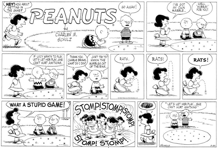
Whereas the daily strip enabled the characters’ personalities to mature, the Sunday iteration - double the size and number of panels, and in color - allowed for an expansion of the strip’s time and space. Here Schulz drew what, by contrast, were redolently realistic suburban settings. This longer form also allowed him to develop his “music,” orchestrating more complex, extended moments than the shorter daily strips permitted. A choice example of a finely tuned Peanuts Sunday strip might be the March 20, 1955, episode where Charlie Brown and Schroeder are playing marbles and Lucy invades their game, getting angrier and angrier at her missed shots (“rats... Rats! rats!”) and then improbably and violently (“What a stupid game!”) stomping all of their marbles flat (stomp! stomp! stomp! stomp! stomp!). The penultimate panel shows her angrily stalking away, a scribbled skein of lines in a balloon above her head - a skein that the reader “hears” as the endnote of the zigzaggy musical composition that precedes it.

By contrast, just nine months earlier, in May, 1954, Schulz had produced a multi-part Sunday sequence that is one of the weirdest hiccups in the strip’s development: Lucy, with Charlie Brown’s encouragement, enters an adult golf tournament. Now, it’s odd enough that these kid characters would even play golf, let alone play in a tournament, but the fact that Schulz would place Charlie Brown and Lucy next to adults - yes, actual adults appear in the strip - feels very, very wrong. The four-week sequence is full of clunkers and disharmonies, producing a queer sense of dislocation and falseness. It’s almost like the strip has the flu. Indeed, even Schulz seems to be aware of the problem - one panel shows Charlie Brown and Lucy through a forest of adult legs, he admonishing her to “just try to forget about all these people... just forget about ’em.” While the experiment proves Schulz’s willingness to test his strip’s limits, it cemented the primary rule of the Peanuts cosmos: adults might be talked about (sports legends, Presidents, Charlie Brown’s father), or even soliloquized (Linus’s infatuation with Miss Othmar), but they must always, quite literally, be out of the picture.

Peanuts increasingly became a strip where the children acted like adults (unlike the very earliest newspaper comics, in which adults acted like children). For a strip, and a nation, riding on postwar economic euphoria, such psychological inversion seems all too appropriate for the baby-boomer readers of its heyday. In the same way that architecture seems both to contain and to affect our memories, something about the synthetic psychological landscape of Peanuts seems to capture the peculiar timelessness by which we imagine and embody our sense of self. To loosely quote Vladimir Nabokov: we all have children buried alive inside us somewhere. “You have to put yourself, all of your thoughts, all of your observations and everything you know into the strip,” Schulz said in 1984. Peanuts could even be tartly described, as Art Spiegelman once did to me, in a phone call, as “Schulz breaking himself into child-sized pieces and letting them all go at each other for half a century.”

Caught up in remembrances of age-old wrongs and slights, Schulz seemed to have well-worn ruts in a road that led backward, the gates of injustice opening on his drawing table with every new strip. Rejections, dismissals, and disappointments flooded into the story lines of Peanuts. So accessible and immediate were these memories that, after the end of his first marriage, he apparently thought it O.K. to pay a visit to his old girlfriend Donna Johnson Wold, a.k.a. the Little Red-Haired Girl, who had rejected him at least twenty years before and was by all accounts perfectly happy being married to someone else. Toward the end of his life, Schulz regularly noted in his school yearbook (from which his drawings had been rejected, incidentally) when his classmates died, one by one. I’ll corroborate: in my own life as a cartoonist, I’ve made similarly ill-advised personal decisions, and sometimes a vicious word spoken by a mean kid to me forty years before will surface while I’m working, and I’ll say something back to him at the drawing table, out loud. There’s definitely something very weird about this profession, and my simply typing “the Little Red-Haired Girl” and not having to explain it demonstrates Schulz’s genius at harnessing it. We all have our own little red-haired girl.

Cartoonists, like dog owners, tend to look like their work, but Schulz somehow skirted that rule, the parenthetical, closely spaced eyes in the middle of Charlie Brown’s fat bald head resembling nothing about Schulz the man, who had widely spaced eyes, a strong, long nose, and an enviable thatch of hair to the very end. But that’s part of Schulz’s talent: Charlie Brown looks less like Schulz than, one must suppose, he feels like him. From the Yellow Kid to Barnaby to Henry to Tintin to Charlie Brown, there’s a long history of large, bald, white male faces through which the reader may “see” these characters’ various comic-strip worlds. This is no accident; the less specificity a character has, the more he (or maybe she—where are our shes?) becomes the strip’s protagonist, an everyman. Culturally, and however unfairly, the pink disc of Charlie Brown’s big baby face is about as blank and everyman as one can get.

For white American males, at least. But Schulz did try: in answer to certain readers feeling “left out” of the strip, the introduction of Franklin, in 1968, came with a rightful dose of dread on Schulz’s part about seeming condescending to African-Americans. He needn’t have worried, though, because Franklin felt real - or at least felt respected - as a kind kid on the beach with whom Charlie Brown plays in the sand. (“Whites Only” pools were not uncommon in 1968.) Though Schulz may have lived a quiet, remote life in his California studio, he was woke enough to realize that all one had to do was care enough about a character for he or she to “work,” even if the shell of the character wasn’t his own. Despite the over-all racial imbalance of the Peanuts cast, this caring is really the secret, mysterious power of Schulz’s entire strip. Charlie Brown, Lucy, Linus, Snoopy, Schroeder, Franklin, and everyone else came alive on that page because of Charles Schulz’s ability to make you care about and feel for - and, in Charlie Brown’s case, at least, feel through - nearly every one of them.

There is a translucency, if not a transparency, to Schulz’s drawing style that allows for such sympathy. It’s not diverting or virtuosic - it’s direct and humble. (He described it as “quiet.”) The simple act of looking from one drawing to the next animates the rhythm of the characters’ movements, echoing, somehow, our own distillation of experience. Due to an essential tremor in Schulz’s drawing hand, as the result of a quadruple-bypass surgery in 1981, this distillation felt shakier in later years; he sometimes even steadied his drawing arm with the other, to reduce the tremors to a minimum. But this difficulty did not change the strip’s essence, or Schulz’s devotion to drawing it: “I am still searching for that wonderful pen line that comes down - when you are drawing Linus standing there, and you start with the pen up near the back of his neck and you bring it down and bring it out, and the pen point fans out a little bit, and you come down here and draw the lines this way for the marks on his sweater, and all of that... This is what it’s all about - to get feelings of depth and roundness, and the pen line is the best pen line you can make. That’s what it’s all about.”

Schulz’s mind, and then hand, transmuted the Peanuts characters onto the paper and then into the eyes and minds of millions of readers, and he knew those readers trusted him to “make the best he could make.” He never gave up on them. Besides, no one else could have done it; despite the deceptive simplicity of a Peanuts drawing, faking one - let alone four of them in a row - is impossible. If there is one accomplishment in the art of cartooning for which Schulz should be credited, it’s that he made comics into a broader visual language of emotion and, more importantly, empathy. For this, all cartoonists - especially those of us who have attempted “graphic novels” - owe Schulz, well, everything.

© Chris Ware