Showing posts with label Newspaper Strips. Show all posts

20 October 2021

Wash Tubbs / Captain Easy by Roy Crane (No. 25)

Wash Tubbs / Captain Easy (1924-1943)
by Roy Crane

REVIEW BY TOM SPURGEON:
(from The 100 Best Comics of the Century! in The Comics Journal #210, 1999)
Wash Tubbs is the best adventure comic of all time for one reason and one reason only: it moved. Cartoonist Roy Crane kept the soap opera, character interaction and romance in his strip to a minimum, perhaps sacrificing a larger audience and legacy in the process, but leaving more room for the straight-ahead action he did best. And what action! Fistfights could last for days, pursuers could chase the lead characters over miles of lovingly-drawn countryside, and characters had few qualms about not only scooping up a gun if one was available but using it. Crane's style, a mix of cartoon and fine-line drawing, was perfectly suited for the task at hand.

The vehicle for all that action was slow in developing. Wash Tubbs was originally a domestic continuity about the romantic travails of its namesake lead. The strip later became a kind of adventure-comedy, as Tubbs, and soon enough, too-similar pal Gozy Gallup, practiced hijinks and farcical comedy in a number of locations across the world. Things finally fell into place with the arrival of soldier of fortune Easy (in typical Crane fashion, he made his debut by breaking down a door). With Easy providing the muscle and a sense of mystery, and Tubbs providing a combination of earnest support, comedy relief, and a second avenue for romantic entanglements, the two spent several years exploring the then wider world in a variety of fast-paced adventures.

As fodder for the stories, Crane drew on his own past as a seaman, a career he gave up to enter newspaper illustration in the early '20s. But details were only important when the story called for verisimilitude - as in the well-regarded whaling sequence in which Easy and Tubbs are forced into service on a sailing ship. More than the plain facts, Crane captured a sense of travel and freedom that is uniquely American, during perhaps the last decade when one could thrill to faraway shores, endless escapes, and the eventual victory promised two square-shooters.


ALEX TOTH:
(from an interview conducted in 1979/1980, printed in The Comics Journal #262, 2004)
My appreciation of simplicity - truth in line art and tone - eventually led me to Roy Crane's Wash Tubbs / Captain Easy and his later Buz Sawyer / Rosco Sweeney strips (and all the comic books which reprinted them). Roy was an inspiration for [Noel] Sickles as well as [Milton] Caniff, remember - and he has become my own, too. Roy kept vitality, life, action, humour, expression, expressive body attitudes and pictorial elegance, simplicity, honesty, design, interest, patterns, continuity and surprises, lovely girls and distinct, identifiable secondary characters and authentic worldwide locales and settings, props, language rhythms, customs and costumes constantly running through these strips. Never a dull moment - and always much visual and storytelling fun! He was the epitome of adventure strip cartoonists! A simple, humble man, too! I miss him. We all do.


FURTHER READING:


08 October 2021

Alley Oop by V.T. Hamlin (No. 60)

Alley Oop (1933-1971)
by Vincent Trout Hamlin 

REVIEW BY R.C. HARVEY:
(from The 100 Best Comics of the Century! in The Comics Journal #210, 1999)
V.T. Hamlin's Alley Oop (officially launched August 7, 1933) is unique among the century's cartooning enterprises: initially about a caveman and his pet dinosaur, the comic strip was transformed into a science fantasy romp through history and myth. Hamlin coupled dramatic storytelling to a cartoony style (albeit delicately cross-hatched in the manner of an 18th century etching) and told high-spirited adventure tales that bristled with action and suspense, not to mention comedy and genuine human interest. 

The fun began in earnest on April 6, 1939, when the caveman and his girlfriend. Oopla, are suddenly transported from their prehistoric haunts to the 20th century - specifically, to the science laboratory of Dr. Wonmug. Wonmug has perfected a Time Machine, and Alley and Oopla become forthwith his time travellers. Designing his daily strips as single works of art, not as aggregations of so many panels per day, Kamlin delighted in tinkering with legend and literature as he sent his troupe to ancient Troy, King Arthur's Camelot, Cleopatra's Egypt, Ceasar's Rome, the American West of Billy the Kid, and the decks of Captain Kidd's ship. 

When Oop and Ulysses escape the Cyclop's cave, for instance, it is Oop not Ulysses who blinds the one-eyed giant, and he does it by giving him a black-eye instead of driving a stake into the orb. Thus, mythology is left intact, but is deliciously modified to give Hamlin's hero the central role. 

Visually a cliche strongman with a barrel chest and bullet head, Oop is an obstreperous, truculent, club-wielding comedian caveman until the advent of the Time Machine, and then he becomes less comedic and more commanding, his skill as both warrior and tactician determining the outcome of most escapades. Unflappable in a crisis, Oop becomes a cool pragmatist, his temper honed to a fine belligerence: he is as peevish and cranky as ever but much less excitable than in his earliest days. But there is still comedy a-plenty in his adventures: when his favourite horse gives out during hot pursuit of a villain, Oop dismounts but continues the chase, now carrying the horse.


FURTHER READING:


07 October 2021

Barney Google by Billy DeBeck (No. 98)

Barney Google (1919-1942)
by Billy DeBeck

REVIEW BY R.C. HARVEY:
(from The 100 Best Comics of the Century! in The Comics Journal #210, 1999)
Launched in June 17, 1919, Barney Google was one of the first strips to tell stories that continued from day-to-day. Initially, the strip was merely another ne'er-do-well husband and over-bearing wife domestic comedy, but on July 17, 1922, creator Billy DeBeck (1890-1942) changed all that: Barney acquired a race course named Spark Plug, and the sad-faced nag, most of whose anatomy is hidden underneath a moth-eaten, shroud-like, horse blanket, became the Snoopy of the roaring '20s. 

Barney entered the horse in a race, and DeBeck quickly discovered the potency of a continuing story for captivating readers: for most of the decade, drawing with a loose but confident line and intricately wispy shading. DeBeck kept his audience on tender-hooks by entering Spark Plug in a succession of hilarious albeit suspenseful contests, he outcomes of which were never certain (some of them, surprisingly, Spark Plug won). 

The characters were relentlessly merchandised, and Billy Rose even wrote a song about the horse and his master, Barney Google With The Goo-Goo Googly Eyes, which even the characters in the strip sang. 

DeBeck's cartooning genius was such that he seemed capable of renewing his creation again and again, each time with a more inventively comedic novelty than before, and in 1934, he sent Barney off into the hills of North Carolina, where he encountered bristly, pint-sized hillbilly named Snuffy Smith, who was so popular with readers that DeBeck stayed in the hills for the rest of the '30s, introducing into popular usage dozens of colourful expressions ("tetched in the hair", "bodacious"). 

By Word War II, the strip was called Barney Google and Snuffy Smith. Snuffy joined the army, and Barney enlisted in the Navy and almost disappeared from the strip forever. DeBeck's assistant Fred Lasswell inherited the strip, and it's still running.


06 October 2021

Li'l Abner by Al Capp (No. 77)

Li'l Abner (1934-1977)
by Al Capp 

REVIEW BY R.C. HARVEY:
(from The 100 Best Comics of the Century! in The Comics Journal #210, 1999)
Al Capp extended the boundaries of permissible satire in syndicated comic strips by applying the principles of burlesque to the adventure genre, which, when Li'l Abner started in August 13, 1934, was the rage. Capp's comedic effort was not so much to end his daily strips with punchlines as it was to finish with outlandish cliffhangers. Li'l Abner Yokum, a red-blooded country boy with the physique of a body-builder and the mind of an infant, is Capp's Candide, fated to wander often into a threatening outside world beyond his hillbilly home, where he encounters civilisation - politicians and plutocrats, scientist and swindlers, mountebanks, bunglers, and love-starved maidens. By this conceit, Capp contrasts Li'l Abner's country simplicity against society's sophistication - or, more precisely, his innocence against its decadence, his purity against its corruption.

Capp ridiculed humanity's follies and baser instincts - greed, bigotry, egotism, selfishness, vaulting ambition - which the satirist saw manifest in many otherwise socially acceptable guises. And he undertook to strip away the retentions that masked those follies revealing society (all civilisation perhaps) as mostly artificial, often shallow and self-serving, usually avaricious, and ultimately, inhumane. Li'l Abner is the perfect foil in this enterprise: naive and unpretentious (and, not to gloss the matter, just plain stupid), Li'l Abner believes in all the idealistic preachments of his fellowman - and is therefore the ideal victim for their practices (which invariably fall far short of their noble utterances). He is both champion and fall guy. A protean talent, Capp invented a host of memorable Dickensian characters and introduced a number of cultural epiphenomena, all grist for his satiric mill.


FURTHER READING:


04 October 2021

Dennis The Menace by Hank Ketcham (No. 93)

Dennis The Menace (1951-1994)
by Hank Ketcham

REVIEW BY GARY GROTH:
(from The 100 Best Comics of the Century! in The Comics Journal #210, 1999)
Hank Ketcham was born and raised in Seattle, Washington, and developed an interest in drawing and cartooning at an early age: on his 10th birthday, his dad made a studio for young Hank by installing "a slanted drawing board, a shelf, an overhead light and a kitchen chair." Ketcham studied Tack Knight's Cartoon Tips and signed up to the mail order drawing course W.L. Evans School of Cartooning, and was on his way. (The artists who he most admired, he wrote later, were, among others, Walt Kelly, Percy Crosby, Milton Caniff, Cliff Sterret, William Steig, Ronald Searle, Jules Feiffer, George McManus and Winsor McCay.)

Ketcham's professional cartooning career parallels that of his peer Charles Schulz: Ketcham enlisted in the Navy during WWII, after which he sold cartoons to a variety of popular magazines. He then created Dennis The Menace, which was first syndicated in 1951 (a year after Peanuts began).

Dennis began as a fairly conventional gag panel but in a short time both the humour and drawing attained a remarkable level of sophistication. (Surely the early widespread popularity of the winsome five-year-old rapscallion and his exasperated but infinity patient nuclear family had much to do with its timing at the height of the post-War baby boom.)

At their best, the Dennis gags were so visually inspired that they couldn't have existed in any other medium. The ideas behind even the best gags would not have been as pleasing if it weren't for the expressiveness of Ketcham's line, and his attention to facial nuance and body gesture, which provided exactly the degree of subtle and understated contrast to Dennis' notorious breaches of decorum.


PATRICK McDONNELL:
Each meticulously designed panel was a masterpiece of composition.


FURTHER READING:


28 September 2021

Ernie Pook's Comeek by Lynda Barry (No. 74)

Ernie Pook's Comeek (1979 to 2008)
by Lynda Barry

REVIEW BY MARSHALL PRYOR:
(from The 100 Best Comics of the Century! in The Comics Journal #210, 1999)
Lynda Barry belongs to the tradition of James Thurber and Jules Feiffer: talented humorists for whom comics is one of several media suited to their talents. Barry, along with close friend Matt Groening, stood at the forefront of the least talked-about aspect of the 1980s comics renaissance, the rise of the alternative newspaper strip. Appearing in a number of free weeklies across the United States, particularly the Readers in Los Angeles and Chicago, Barry in some ways has achieved the alternative comics dream. Her work reached adults who might not read any other comics, adults who because of work like Barry's don't question the fact that the art form can produce sophisticated reading matter.

Ernie Pook's Comeek is most remarkable because of its voice: lonely, unremarkable children struggling with everything that is awful and over-whelming about the world. In Ernie Pook's best years, in the late '80s, Barry's strip reads like actual diaries of children. While the writing has become less convincing as the characters have aged, they are such great characters that the reader is willing to forgive the occasional off-kilter week. In an act of developmental shorthand, Barry has created characters that have earned affection it takes most cartoonists decades to build.

The second great strength of Ernie Pook lies in the veracity of Barry's observations. In a time when recognition "humour" has spread across mainstream newspaper strips like a virus, Barry manages to convey common experiences of adolescent existence without ever once crossing over into generalities and cliche. She does this by being very, very specific - even if it's not your experience, it feel authentic - and by doggedly staying in character. Several elements may draw one into a comic strip, but one takes away the characters; there are none better than those in Ernie Pook's Comeek.


FURTHER READING:


23 September 2021

Terry & The Pirates by Milton Caniff (No. 23)

Terry & The Pirates (1934-1946)
by Milton Caniff

REVIEW BY R.C. HARVEY:
(from The 100 Best Comics of the Century! in The Comics Journal #210, 1999)
With the comic strip Terry & The Pirates, Milton Caniff (1907-1988) virtually redefined the adventure strip so thoroughly did he improve upon the genre's basic ingredients. Starting October 22, 1934, the strip focused on the China wanderings of a youth and his adult mentor, a vagabond journalist named Pat Ryan. 

In less than a year, Caniff, inspired by the work of his studio-mate, Noel Sickles, developed the most imitated of his refinements, an impressionistic style of drawing that suggested reality with shadow rather than with linear particulars. He added realism of detail, striving for absolute authenticity in depicting every aspect of the strip's locale, whether Oriental or, later, military. 

But Caniff's signal achievement was to enrich the simple adventure story formula by making character development integral to the action of his stories: readers wanted to know not just what would happen but how the characters would fare. To weave into his stories such an intriguing character as an alluring but ruthless pirate queen called the Dragon Lady (doubtless the most famous of Caniff's creations) was to add to the strip's exotic locale a powerful enhancement: her characterisation complemented the mysteriousness of the Orient with the inscrutability of her personality, which nonetheless seemed so true-to-life that it lent the authority of its authenticity to the strip's stories, making the most improbable adventures seem real.

Within a few years of its debut, Terry was setting the pace for cartoonists who did adventure strips. During World War II, Caniff sent his strip to war, infusing the action with a trenchant patriotism that inspired both soldiers at the front and their families at home and brought Caniff unprecedented fame. After the war, he gave up Terry and on January 13, 1947, started Steve Canyon in order to own and control his creation. Terry was continued by George Wunder, who did his best to follow in the master's footsteps until the strip ceased in 1973.


FURTHER READING:


17 September 2021

Thimble Theatre by E.C. Segar (No. 11)

Thimble Theatre (1925-1938)
by E.C. Segar

REVIEW BY ERIC REYNOLDS:
(from The 100 Best Comics of the Century! in The Comics Journal #210, 1999)
Comic strips are at heart a narrative medium, and nobody told stories like E.C. Segar. With a fantastic ensemble cast of comic characters Segar fulfilled the self-imposed duel responsibility of delivering a daily laugh while furthering an on-going continuity that would run for months. He made it look effortless. Segar spun wonderful yarns while cracking his readers up every step of the way. The outwardly farcical gaggle of vaudevillianesque antiheroes, bumbling about on picaresque chases (usually for riches more than fame) was actually one of the most intrinsically sophisticated comic strips in history.

All of this takes away from the fact that Thimble Theatre, under Segar and starring Popeye (although Segar's pre-Popeye TT than its obscurity indicates), is really, really funny. Popeye is the ultimate scoundrel with a heart of gold, not to mention a tongue of silver: "My sweet patootie loves me because I yama high-voltage poppa, and she is my hotly-totsy momma!" Popeye's butchered English never becomes obtrusive - its rhythm and internal logic is poetic in its own vulgar way, a fact testified to by so many of Popeye's philosophical musings having entered the vernacular, including "I yam what I yam an' tha's all I am!" and "Well blow me down!" Popeye's oxymoronic moral code (I never hits a man as hard as I kin on account of it ain't right to kill peoples") is riotously compelling, even today. Okay, so he emotionally and physically abused Olive (she dished back in spades), often blew his money on craps games, and resorted to his fists almost always, but he also would do things like open up a bank that did nothing but give money out to the poor (wilfully ignoring the financial impracticality and earmarking patrons of the cute, young, female variety) and literally give the needy the clothes off his back, happy to go around in his scivvies if it helped a friend in need. He was a deserving role model for a roughneck scoundrel. The ultimate rugged individualist, Popeye is the perfect antidote for the endless altruism and comfortable gentility of Mickey Mouse and his brethren. Beside, was Mickey ever "dictapater" of his own country? I think not.

And Wimpy! In him and Popeye, Segar may have created the two greatest characters in comic history. Wimpy stands as one-of-a-kind some 67-years after his creation, the most lowdown and worthless creature to ever grace the comics. Venality was his essence. His worthlessness and selfishness was unparalleled. Still, Wimpy wasn't even a villain! How could you hate him? He couldn't help it. Wimpy'd steal a burger from a starving friend and remain wholly convinced of his own righteousness. He couldn't possibly notice how he was hurting others because he never took his mind off himself. Utterly disloyal but eternally blissful, Wimpy stole the show, committing travesty after travesty, repeating his mantra-like one-liners at every turn: "Come up to my house for a duck dinner; you bring the ducks," "Will you join me in a lunch on you?", "Let's you and him fight," "You are the Acme of femininity, my dear") etc... Wimpy's predictability is precisely what makes him so captivating; it is hard to believe anyone could be so thoroughly stubborn and spineless. Wimpy once said, "The inconsistency of some people is astonishing!" not realising for a moment that his consistency will always be endlessly more so.

Segar's greatness is testified to by the embarrassing limpness of Popeye's adventures in the hands of other cartoonists and in other media. Segar died when he was 38, quite possibly before hitting his prime. But no one has been able to mimic his talent, which is a shame, because it's largely these post-Segar productions (mostly the cartoons) that people think of when the one-eyed sailor comes to mind.

Segar's humour raised the spirits of a generation of depression survivors, but has obviously faded from the collective consciousness of today. It's a shame, because Segar stands among Crumb and Kurtzman as the best cartoonist of their generation and set the standard for greatness that led to the success of Al Capp (creator of another famously invulnerable hick with poor grammatical skills) and countless others. Some say he might have even been the first superhero, paving the way for the genre's creation with Superman's debut in 1939.


ART SPIEGELMAN:
I think of Thimble Theatre as blue-collar Beckett.


CHARLES M. SCHULZ:
The perfect comic strip.


FURTHER READING:


14 September 2021

The Kin-der-Kids by Lyonel Feininger (No. 40)

The Kin-der-Kids (1906)
by Lyonel Feininger

REVIEW BY RICH KREINER:
As a painter, Lyonel Feininger would eventually garner the aesthetic acclaim that in a better world would already have been his as a cartoonist. In each area of his creative endeavours, Feininger was attuned to the preoccupations of the fine arts of his day, so much so that biographer and critic Hans Hess noted that a single comic strip sequence "contains the problems of modern art in pure form" as well as Feininger's own solutions to the same.

What will strike contemporary readers of 1906's The Kin-der-Kids is a stunning burst of pictorial imagination informed by cultivated taste and executed with distinct flair. Today we get caught up by the colours and their bold combinations, the clever construction of panel and page, the expressive line work, the stylised design, the purposeful exaggerations and distortions, and we need never be the wiser for the international artistic movements they reflected. Instead we are carried away by the glorious full-page Sunday funnies with Feininger's remarkable crew of kids adventures, dashing across the globe in a bathtub, chased by Auntie Jim-Jams and her dreaded bottle of medicinal fish oil.

Despite its madcap nature, the strip radiates a gentleness and takes time to revel in wonder (commissioned, as it was, to serve as a commercial foil for the furious rough-and-tumble of the Hurst funny pages). In that better world, it would have lasted more than 29 episodes.

The Kin-der-Kids was survived by an even more gentle and wonder-filled strip by Feininger, Wee Willie Winkie's World. With its lyric and pervasive anthropomorphism, sheltered-hamlet sensibilities, quieted graphic idiosyncrasies, and close knit of muted, sympathetic colours, it endures as another all too short-lived fantasy land of the beatific.


FURTHER READING:


17 August 2021

Bringing Up Father by George McManus (No. 65)

Bringing Up Father (1913-1954)
by George McManus

REVIEW BY R.C. HARVEY:
(from The 100 Best Comics of the Century! in The Comics Journal #210, 1999)
The strip called Jiggs & Maggie by most of its readers started January 12, 1913, and like many of its vintage, it was essentially a one-joke enterprise, part of a constellation of strips about various aspects of courtship and married life that George McManus (1882-1954) was producing. 

In Bringing Up Father, Jiggs, an ordinary Irish labourer, has become very wealthy and has moved his family into posh surroundings, but Jiggs persists in his old habits. And in his uninhibited naturalness (of which his socially ambitious wife Maggie is ashamed), and consequent desire to escape (for however brief a time) from the pretensions of the social world into which his wealth has thrust him (and from his wife's relentless attempts to reform him), we have both the source of the strip's comedy and an evocation of the immigrant experience in America - the ascent out of old world poverty into the relative prosperity of the new world.

A tireless escape artist, Jiggs is victorious (and persistent) enough to suggest that people are always better off being themselves than pretending to be something else. McManus multiplied endless comedic variations on this theme, preserving the aura of early comic strips well into mid-century. 

Drawing with a fine and delicate line, he embellished the strip with decorative rococo backgrounds and ornate props - the filigree of a city skyline, the graceful curlicues in the design of a stair-railing or in the pattern of Maggie's dress - and by the artful placement of solid blacks, including the stunning deployment of silhouettes. 

Still in circulation, Bringing Up Father is the second-longest running strip in history.


FURTHER READING:
TCJ: Bringing Up Father & The Rest of The Comics Page by R.C. Harvey
Bringing Up Father at Wikipedia
The Library of American Comics


02 August 2021

Polly & Her Pals by Cliff Sterrett (No. 18)

Polly & Her Pals (1912-1958)
by Cliff Sterrett

REVIEW BY R.C. HARVEY:
(from The 100 Best Comics of the Century! in The Comics Journal #210, 1999)
The first comic strip with a woman as title character, Cliff Sterrett's masterpiece debuted December 4, 1912. At first dubbed Positive Polly, it focused on one of the social phenomena of the time, the "new woman": Polly Perkins is a thoroughly modern self-possessed young miss who is attending college and otherwise making a place for herself in the world outside the home. Her rebellion against society's stereotypical expectation for women amazes and alarms her more old-fashioned parents, particularly poor Paw, whose traditional sensibilities are constantly bombarded by new fashions in both clothes and manners, his once secure and sane Victorian world in a state of continual comic turmoil.

Although Sterrett (1883-1964) changed the strip's title to indicate its broadening focus, even Polly & Her Pals does not reflect the true basis of the comedy - the clash of mores between generations. Paw's exasperated outrage inspired most of the laughter, and he was soon the star of the strip. To wring everything he could from the situation, Sterrett surrounded the old man with a cast of idiosyncratic secondary characters whose assorted eccentricities were designed expressly to assail Paw with modernity in all its variations and varieties. Polly eventually faded into the background, but in the early days of the strip, she attracted considerable attention for daring to display her long legs. And in her facial profile - bulging brow, tiny nose, pouting mouth - Sterrett established a convention for depicting a pretty girl's face that was widely adopted by other cartoonists. But little else about Sterrett's way of drawing could be readily imitated.

As his style matured in the mid-twenties, Polly became a spectacular symphony of line design in black and white in daily strips and a riot of primary colours on Sundays - rampant reds, succulent yellows, pristine blues. The stylistic earmark was the interplay of patterned line and geometric shape. Checks, strips, black solids, quilt-like patchworks, and surrealistic backgrounds were juxtaposed in panels populated by creatures whose anatomy was wholly abstract, completely geometric in cubism's Futuristic manner: heads were simple spheres; bodies and limbs, cylindrical tubes. This abstraction of the human form permitted widely unrealistic but supremely comic expressiveness in both face and feature, and Sterrett exploited the possibilities with playful exuberance. 

Kitty, the family pet, for instance, became a completely geometric cat, assuming a larger significance in the strip's motif: her geometry made her as anthropomorphic as her owner, and she emerged as a Greek chorus, commenting on Paw's predicaments by outright imitation of his actions or in her exaggerated reaction to his moods.

Inspired by the surrealistic impulses of modern art as well as Futurism, Sterrett's Sunday pages in the late twenties in particular were unparalleled in their comic distortions of reality, in their subordination to abstract design of the representational mission of the drawings. The pages were agog in exotic potted plants, fanciful embroidered pillows, abstracted cityscapes, outlandish tubular trees with electric foliage zig-zagging across the sky. Any many of the gags seemed dictated by Sterrett's desire to draw certain subjects in certain ways, often experimental. It's midnight on one Sunday and the panels are mostly black, the action revealed solely in patches of light; on a Sunday at the beach, all the action id depicted under water, and we see only the distorted bottom portions of the characters wading. 

By the 1930s, Sterrett's drawings were less inventive: the surrealistic elements disappeared, leaving just the geometric forms of Futurism, and these had become mere conventions. Suffering from arthritis, Street surrendered the art chores on the dailies to an assistant; the last Sunday Polly was published June 15, 1958.


FURTHER READING:


29 July 2021

Little Orphan Annie by Harold Gray (No. 62)

Little Orphan Annie (1924-1968)
by Harold Gray 

REVIEW BY DAVID LASKY:
(from The 100 Best Comics of the Century! in The Comics Journal #210, 1999)
[This review has been removed at the request of the author.]

REVIEW BY ART SPIEGELMAN:
Check out The Complete Little Orphan Annie by Harold Gray. The blank-eyed orphan was far grittier and moving than the saccharine Annie you know from the damn musical. [It] started in 1924 in a world chillingly like ours: crawling with cake-eaters, greedy bankers and international con men who exploit the hardscrabble working stiffs Annie hangs with when her “Daddy” isn’t around to protect her. The cartoonist, a tightlipped Midwestern Dickens, pushes the virtues of honesty, pluck, and hard work in adventures that can melt the heart of even hard-boiled cynics like I pretend to be.


REVIEW BY CHESTER BROWN:
I remember talking about how much I’d been influenced by Harold Gray, the cartoonist who wrote and drew Little Orphan Annie. That influence has certainly continued, along with being influenced by other cartoonists of the early-to-mid-20th century. In those days, cartoonists tended to draw full characters in the frame and not rely so much on close-ups. Very early on, close-ups were unheard of. At the time of George Herriman, you just didn’t do close-ups. Even Harold Gray, he might do a shot from the waist up, but never a full face in a panel, y’know. For whatever reason, that’s what I respond to. It seems kind of emotionally excessive to really zoom in on a face or a pair of eyes, or things like that. And it probably has a lot to do with my psychological makeup, but I don’t examine that too closely. It’s just a matter of, “Yeah, this is what I respond to, so I want to create similar sorts of work."


FURTHER READING:


28 July 2021

Julius Knipl, Real Estate Photographer by Ben Katchor (No. 56)

Julius Knipl, Real Estate Photographer (1988-1996)
by Ben Katchor

REVIEW BY BART BEATY:
(from The 100 Best Comics of the Century! in The Comics Journal #210, 1999)
I don't know if every one of Ben Katchor's Julius Knipl, Real Estate Photographer strips is comprised of eight panels, four on the top and four on the bottom, but I suppose they must be. That same drudge-like layout week after week seems all too fitting a reflection of the general mundane surroundings in which the events routinely unfold. Moreover, the plain layout reminds us to look deeply at the content of the strip itself, to recognise that the significance resides not on the surface  but in the constant evolution of minor details that come to light when you care to examine the seemingly quotidian long enough to find real beauty.

Katchor's strip is a celebration of the mundane and the ordinary. Every week he takes his readers into ordinary lives in a quest for the sublime. The breakfast special, the vacant lot, the souvenir program, these are the basis for some of the most spectacular ruminations on like ever to grace the comics page. For make no mistake about it, these are spectacular strips. Katchor's inventive use of the framing, his sketchy, sometimes hesitant lifework and his confident washes conspire to create one of the most visually arresting strips in decades. When his art is combined with his sly, subtle pacing, the result is never overpowering but it can often take your breath away just the same.

Julius Knipl, Real Estate Photographer is, without a doubt in my mind, the most literate, intelligent and consistently important weekly comic strip to have emerged since Feiffer. That so few papers and readers have recognised that fact at this point is only an indicator of how oblivious people become when they fail to search for the significance of what's right in front of their noses.


FURTHER READING:


26 July 2021

Dick Tracy by Chester Gould (No. 33)

Dick Tracy (1931-1977)
by Chester Gould

REVIEW BY ROBERT EDISON SANDIFORD:
(from The 100 Best Comics of the Century! in The Comics Journal #210, 1999)
Before Bob Kane's Batman made the quirky villain criminally chic, before Hollywood movies turned trench coats and fedoras into hero's garb and before American detectives (at least the hardboiled sort) were known for brains as well as braun, there was Dick Tracy, the quintessential, as his name announces, "cop's cop".

Strong, savvy, only menacingly silent, he was a classic (and classy) type in the making since his first appearance in the Sunday, October 4, 1931 edition of the Detroit Mirror. Distant cousin to Sir Arthur Conan Doyle's Sherlock Holmes and influenced by the bloody tales of Edgar Allan Poe, Dick Tracy the comic strip was a response to Al Capone's Chicago, where its creator, Chester Gould, an Oklahoman, was living and working at the time. Initially pitched as "Plainclothes Tracy" to Captain Joe Patterson of The Chicago Tribune-New York News syndicate, the character was born to be, according to Gould, "a detective in this country that would hunt [gangsters] up and shoot 'em down."

Despite the efforts of mystery writers like Max Collins or true-to-Gould artists like Mike Lilian, the series today reads like a parody of itself, far removed from its neorealistic, slightly futuristic pulp fiction origins. It's almost a dirty thing to say a comic is less great because it is less than realistic. Yet as George Perry and Alan Aldridge observed of the strips at its best in The Penguin Book of Comics, "The criminals and crimes in Dick Tracy may be wildly exaggerated; his police work is sound and orthodox."

Because a work is ultra realistic, does that make it art or good? No. What makes good art is its truth, its sentiment and the quality of its expression. Once Gould's skills as an illustrator and storyteller grew to transcend his four-panel dailies, so, too, did the iconographic appeal of his creation.

In his introduction to The Celebrated Cases of Dick Tracy 1931-1951, Ellery Queen wrote: "Pictorially, Gould has a comic-book genius for drawing grotesquely caricatured faces and heads and for inventing grotesquely Dickensian character-names to match the faces and heads [to wit, The Brow, Flattop, Pruneface, B-B Eyes]. And Gould's plots have all the excitement and suspense of 'thriller' fiction. So Dick Tracy is blood-brother in the royal line of fictional detectives, and an authentic 'first' in the history of the form."

The original procedural detective of fiction, he is as singular creation as his yellow trench coat or two-way wrist radio.


CHESTER GOULD:
My only thought is to keep my strip faithfully realistic and powerful enough so that it will stand out from the usual run of wishy-washy everyday stuff.


REVIEW BY JERRY ROBINSON:
Chester Gould introduced a new hard-hitting type of realism [that] marked a radical and historic departure: the comics were no longer just funny.


FURTHER READING:


23 July 2021

Zippy by Bill Griffith (No. 66)

Zippy (1970-present)
by Bill Griffith 
(Photo by Caryn B. Davis)

REVIEW BY GENE KANNENBERG Jr:
(from The 100 Best Comics of the Century! in The Comics Journal #210, 1999)
From his early appearances in underground comics to his place in today's more discriminating newspapers, Zippy the Pinhead has scattered non sequiturs throughout Amrican culture like an addled Johnny Appleseed. Bill Griffith's range of work is wide, but Zippy is the Elmer's glue which holds it all together. Who would have guessed that this micro-encephalitic, muumuu-wearing enigma would one day supply an entry to Bartlett's Familiar Quotations? "Are we having fun yet?" indeed.

Griffith's artwork, very detailed at the start, has matured over time. The daily Zippy strip is one of the best drawn strips in syndication. No cookie-cutter profiles or Photoshop-composited environments here; each day's finely-lined instalment contains more careful detail than a week's worth of practically any other strip. A compulsive sketcher, Griffith uses his artistic skill to bring a healthy dose of realism to Zippy's rapid-fire free association.

Zippy's longevity has much to do with his accompanying cast of characters. Mr. (The) Toad, Shelf-Life, Claude Funston, Vizeen and more: their opinionated interactions provide both guffaws aplenty and food for thought. But most important is "Griffy", the cartoonist's alter-ego. An altogether credible mixture of elitist distain and acute self-awareness, Griffy is complicit in the very culture he criticises. For every strip bemoaning tacky fashion or vapid entertainment icons, there's another celebrating Jack Palance's distinctly chiseled features or including another cameo by Hello Kitty. Griffy's rants combine with Zippy's foolish inconsistency to produce comics which simultaneously critique and celebrate American culture. Griffy is the yin to Zippy's yang, the Abbott to his Costello, the taco sauce to his Ding Dongs. Are we in the Top 100 yet?


BILL GRIFFITH:
I'm not trying to do a comic for the masses. I'm not trying to appeal to every demographic slice. I'm not consciously trying to appeal to anybody but myself. Although I'm not trying to alienate people. This is not a domestic strip, a strip in which you can instantly recognize archetypes - like, for instance, For Better or For Worse. A strip in which you can say, Oh yeah - I've thought that, I have a relationship like that, I have a family, I have a cat, I have a dog. None of those things apply. You have to sort of tune into my wavelength and that might take a little while. My previous audience [for underground comics] was already convinced they liked it. But coming into daily newspapers, I was suddenly confronted with a whole range of readers who would read Garfield and who, two second later, would be reading Zippy - which never, in my wildest imagination, did I think would ever happen. So I have a whole new audience to either convince to get on my wave-length or to outrage and anger. And I get plenty of both.


FURTHER READING:


22 July 2021

Calvin & Hobbes by Bill Watterson (No. 36)

Calvin & Hobbes (1985-196)
by Bill Watterson

REVIEW BY GENE KANNENBERG:
(from The 100 Best Comics of the Century! in The Comics Journal #210, 1999)
"Funny kid" comic strips have been a mainstay in newspapers for over a century, and Calvin & Hobbes was one of the best. As Gary Trudeau wrote, "[Bill Watterson delineated] childhood as it actually is, with its constantly shifting frames of reference". Calvin the uncontrollable dreamer, Hobbes the romantic, occasionally pragmatic, predator-cum-stuffed tiger: Such was the stuff of dreams. Calvin's personality, like his vocabulary, benefited from an adult perspective which exaggerated ideas in order to explore them. Flights of fancy walked side by side with willful manipulation, brutal honesty, and manic energy.

The artwork, too, had energy, especially the physical characterisations; the words gave us punch lines, but the pictures sold the jokes. Calvin & Hobbes also easily brought its comic and narrative timing into longer, multi-week story arcs without endless repetition or plodding action. We admired Calvin's broad imagination, but it was Watterson's artwork which made that imagination real.

Watterson's temperament also marks his work as significant. His refusal to merchandise the strip was probably financially foolish but artistically admirable. After his first (gasp!) sabbatical, he successfully campaigned to alter drastically the format of the Sunday strips. Today, many cartoonists thank Watterson for having an open (if often small) canvas on which to produce comics which won't undergo editorial reformatting. Few, however, have used this space as productively or imaginatively as did Watterson himself. The final Sunday strip, a paean to the joys of childhood winter excursions, utilised chiaroscuro and abundant negative space to convey that it is, indeed, a magical world.

Intelligent, charming, uncompromising, and beautifully rendered, Calvin & Hobbes remains a benchmark by which humour strips should be judged.


REVIEW BY FRANK MILLER:
(from an interview in The Comics Journal #209, December 1998)
...this is going to sound simplistic, but I think it's one of the essentials of what makes comics work, and one of the reasons they translate so poorly into film, is the sheer joy of seeing good cartooning. A perfect example of that is Calvin & Hobbes, by Bill Watterson. I can't imagine that in any other form, because even more than the humanity or humor in the strip, the drawing is such a joy to behold. It charms my eye enough to make me slow down and really pay attention. I feel a stream of pleasure from looking at drawings like that...


FURTHER READING:

19 July 2021

Pogo by Walt Kelly (No. 3)

Pogo (1949-1973)
by Walt Kelly 

REVIEW BY R.C. HARVEY:
(from The 100 Best Comics of the Century! in The Comics Journal #210, 1999)
When Walt Kelly (1913-1973) was good, he was the best there was. And he was often good. But the pinnacle of his achievement as a cartoonist was his attack on McCarthyism in the early 1950s. Kelly's career included both animation (1936-1941 at Disney Studios) and comic books (1942-1948) before embracing the newspaper comic strip form, and by the time he had finished with it, Kelly had elevated the form to high art in Pogo

The eponymous possum had first appeared as one of several anthropomorphic spear-carriers in the first issue of Animal Comics (December 1942 - January 1943). And when Kelly became art director of the short-lived by much mourned New York Star in 1948, he reincarnated his animal ensemble as a comic strip on October 8. After the Star's demise, Pogo went into national syndication, May 16, 1949.

Pogo transcended the "talking funny animal" tradition of its origins. At its core, the strip was a reincarnation of vaudeville, and its routines were often laced with humour that derived from pure slapstick. To that, Kelly added the remarkably fanciful and inventive language of his characters - a "southern fried" dialect that lent itself readily to his characters propensity to take things literally and permitted an unblinking delight in puns. The cast was perfectly content being animals, but sometimes for their own amusement they'd undertake the enterprises of people, adopting the right jargon and costumes but not quite understanding the purpose behind the human endeavours they mimicked. Adrift in misunderstood figures of speech, mistaken identities, and double entendres going off in all directions at once, Kelly's characters usually wandered further and further from what appeared to have been their original intentions. And this was the trick of Kelly's satire: readers couldn't help but glimpse themselves in this menage, looking just as silly as they often were. The animals - "natures screechers" - were blissfully unaware of their satirical function. They, after all, didn't take life as seriously as people did: "It ain't nohow permanent", as Porky the porcupine was won't to say.

Kelly added overt political commentary to his social satire in 1952 when some of Pogo's well meaning friends entered him in the Presidential race, and the strip was never quite the same again. The double meaning of the puns took on political as well as social implications, and the vaudeville routines frequently looked suspiciously like animals imitating officials high in government. Over the years, Kelly underscored his satirical  intent with caricature: his animals had plastic features that seemed to change before the reader's very eyes until they resembled those at whom the satire was directed. And the species suggested something about Kelly's opinions of his targets. Soviet boss Nikita Khrushchev showed up one time as a piratical pig; Cuba's Fidel Castro as a goat; the tenacious J. Edgar Hoover as a bulldog.

Kelly's first foray into the jungle of politics with caricature as his machete was in the spring of 1953, when he introduced an unprincipled and purely ruthless operative in his swamp, a wild cat named Simple J. Malarkey. As if the syllabic rhythm of his name weren't give away enough, Kelly made the wild cat look remarkably like Senator Joseph R. McCarthy, the country's self-proclaimed crusader against communist spies, a master of the smear and innuendo with a gift for the self-promotion and an utter disregard for the truth. To create a narrative metaphor for McCarthy's commie hunt, Kelly turned to the swamp's Bird Watcher's Club, and in power plays evocative of McCarthy's manoeuvres, Malarkey intimidates the members of the club into letting him take charge. With his guidance, the Club dedicates itself to ridding the swamp of all migratory birds, and when Malarkey is faced with a number of swamp creatures who claim they aren't birds (because, in fact, they aren't), he proposes to make them all birds with "a little judicious application" of tar and feathers. At one satiric stroke, Kelly equated McCarthyism with an appropriately belittling analogue, tar-and-feathering - a primitive method of ostracising, universally held in low repute. In a delicious finale, a member of the Club shoves Malarkey into the kettle of tar, demonstrating with an unforgettable flourish that those who seek to smear others are likely to be tarred with their own brush.

It was as neat a piece of satire as had ever been attempted on the comics page or anywhere. And the success of it depended upon Kelly's plumbing the potential of his medium to its utmost. Word and picture are perfectly, inseparably, wedded, the very emblem of excellence in the art of the comic strip: neither meant much when taken by itself, but when blended, the verbal and the visual achieved allegorical impact and powerful satiric thrust. High art indeed. At its best, Pogo was a masterpiece of comic strip art, an Aesopian tour de force - humour at each of two levels, one vaudeville, the other satirical - and it opened to a greater extent than ever the possibilities for political and social satire in the medium of the newspaper comic strip.


REVIEW BY NEIL GAIMAN:
In these uncertain times, Pogo feels necessary, feels relevant, feels ever-more-right.


REVIEW BY SERGIO ARAGONES:
Walt Kelly accompanied me from the first moment I saw his work and began to understand not about drawing but about cartooning. He filled me with a sense of what constituted excellence in my chosen field.


REVIEW BY BILL WATTERSON:
(from 'Some Thoughts On Pogo' in The Comics Journal, #140, February 1991)
Pogo celebrated conversation and dialogue for their own sake. The strip rarely had a punchline per se. I can't imagine people cutting out one day's strip and putting it on the refrigerator; it wasn't that kind of strip with a snappy saying in the last panel that makes Mom think of little Junior. Instead, it was a strip where characters talked and talked, inevitably misunderstood each other, and argued. It was a wonderful, rich parody of what passes for communication between human beings. The word balloons were filled with puns, obscure references, inside jokes, utter nonsense, and, once in a while, quiet wisdom. If the drawings in Pogo get better with each re-reading, so do the words.


FURTHER READING:


17 July 2021

George Herriman's Secret by Chris Ware

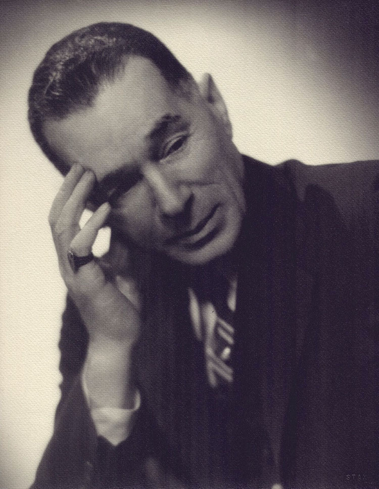
George Herriman (circa 1940)

To Walk in Beauty
by Chris Ware

For one of the most prolific and highly-praised cartoonists who ever lived, George Herriman, the creator of Krazy Kat (1913-1944), didn’t like talking about himself. Recoiling from photographers and brushing off personal questions with elliptical answers and even occasional fabrications, George or “Garge” or “The Greek” always preferred the focus to be on the multivalent, multifarious, and multicultural characters who populated the inner world he made every day with the scratchings of his pen. A direct throughline of thought-to-gesture in black ink on white paper, George Herriman’s drawings come alive before the reader’s eye with a vital, persuasive complexity previously unknown in the history of art. Krazy Kat lived on the page - but he - or she - had a secret. And so did George Herriman.

Krazy Kat has been described as a parable of love, a metaphor for democracy, a “surrealistic” poem, unfolding over years and years. It is all of these, but so much more: it is a portrait of America, a self-portrait of Herriman, and, I believe, the first attempt to paint the full range of human consciousness in the language of the comic strip. Like the America it portrays, Herriman’s identity has been poised for a revision for many decades now. Michael Tisserand’s new biography Krazy does just that, clearing the shifting sands and shadows of Herriman’s ancestry, the discovery in the early 1970s of a birth certificate which described Herriman as “colored” sending up a flag among comics researchers and aficionados. Tisserand confirms what for years was hiding in plain sight in the tangled brush of Coconino County, Arizona, where Krazy Kat is supposedly set: Herriman, of mixed African-American ancestry, spent his entire adult life passing as white. He had been born in the African-American neighborhood of racially mixed, culturally polyglot 1880s New Orleans, but within a decade Herriman’s parents moved George and his three siblings to the small but growing town of Los Angeles to escape the increasing bigotry and racial animosity of postbellum Louisiana. The Herrimans melted into California life, and it was there that George, with brief professional spates in New York, would remain for the rest of his life.

But imagine knowing something about yourself that’s considered so damning, so dire, so disgusting, that you must, at all cost, never tell anyone. Imagine leaving behind a life to which you cannot claim allegiance or affection. Imagine suddenly gaining advantages and opportunity while you see others like you, who have not followed in the footsteps of your deception, suffering. Herriman, once he was considered white, didn’t even have a way of voicing this identity. Until he started drawing Krazy Kat.

I may be in the minority here, but I really think that most if not all readers of Krazy Kat during Herriman’s lifetime would have had a hard time thinking of Krazy as anything but African-American. Krazy’s patois, social status, stereotypical “happy-go-lucky despite it all” disposition all funnel into a rather pointed African-American identity. And Herriman, confoundingly, was not above using racial and even racist imagery himself, his early work especially filled with eye-popping stereotypes and blackface caricatures. At the turn of the century, when Herriman was just starting his career, the nineteenth-century cultural phenomenon of blackface minstrelsy, while admittedly in the early process of passing into nostalgia, was still prevalent. Large orchestral shows of dozens of performers like Haverly’s and Christy’s Minstrels, grotesquely metastasized from the already ghastly four-person troupes, filled vaudeville halls and theaters; blackface performances, in a cruel twist of cultural fairness, were the first places for African-American performers to find a foothold. (W. C. Fields called Bert Williams, probably still the best known African-American entertainer from this era, “the saddest man I ever knew.”)

At the same time, a reader alive in the early part of the twentieth century probably didn’t really have to think about these associations any more specifically than we think the “Minions” sound vaguely Latino, or why Felix the Cat or Mickey and his minstrel mouse gloves were so funny. Of course Krazy Kat was black. A funny black cat. Just the right amount of slippage and shift in Krazy’s animus, helped along by a tradition of children’s animal stories, was all that was necessary for him/her to be two things - and nothing - all at once.

Nevertheless, one detail in Herriman’s strip that would have absolutely cemented this identity in the minds of contemporary readers has since passed into obscurity: Krazy Kat’s banjo. Through received clichés and shifts of poverty and culture in America, the banjo has come to be thought of as an instrument of poor whites, but at the turn of the century, it was as emblematic as a watermelon as part of the African-American stereotype. In fact, the banjo has a solemn origin: descended from the West African akonting, xalam, and ngoni instruments, played as an accompaniment to storytelling by Wolof griots in Senegal or the Jola in Gambia, early instruments like what became the American banjo were recreated by American slaves from whatever plantation materials were at hand - gourds, turtle shells, coconuts, animal skins - to try to hold on to a memory of life and culture torn from their grasp.


To the modern reader, the banjo in Krazy Kat might seem a lighthearted accessory, but when Krazy picks it up to sing “There is a Heppy Land Fur, Fur Away”, the meaning, to thoughtful readers of the 1920s to the 1940s, would have been clear. Even more astonishingly, Krazy never plays a “proper” banjo, but plays the gourd or coconut banjo, the origins of which by the time of the strip’s appearance would indeed have been obscure. Herriman knew what he was doing, and it’s not insignificant that the very last strip he left unfinished on his drawing table showed Krazy playing a gourd banjo. The earliest representation known of such an instrument appears in the watercolor The Old Plantation, painted by South Carolina slaveholder John Rose in the late eighteenth century.

What do these racial and cultural connections mean for how we see Herriman’s work? From their dimming over the years compared with Krazy Kat’s increasing artistic incandescence, they are clearly not necessary to an appreciation of the strip. But put yourself in Herriman’s shoes, and then reread Krazy Kat with this knowledge rewoven into the tapestry of his work. Think of pink Ignatz, the mouse who is Krazy’s constant tormentor. Think of the brick. Think of what W.E.B. DuBois called the “dual consciousness” of African-Americans, think of the brick hitting Krazy, over and over and over again. (Tisserand shrewdly notes that a July 30, 1866, New Orleans race riot, which Herriman’s father may have witnessed, started when a white boy threatened to throw a brick at African-American soldiers parading through the town.) Think of what recasting that gesture of hate as one of love actually means to its recipient. Think of the lynchings of the 1910s, the race riots of the 1960s, the American police shootings of 2016, the iPhone videos that continually show the treatment of African-Americans as property. Think of Barack Obama, half Scotch-Irish, half African.

George Herriman saw the history of America and its future and wrote it in ink as a dream on paper, and it is a dream that is still coming true. In December, disparate Native-American tribes and activists who had gathered in North Dakota for months staved off an oil pipeline that would have cut through ancestral Sioux burial lands; Herriman began visiting the Diné or Navajo nation and befriending its citizens before some western states were even twenty-five years old. Navajo rug patterns and the folklore of Monument Valley came to define the very cosmos of Krazy Kat. (A wonderful detail in Tisserand’s book recalls Herriman, who had Hollywood friends, setting up a private screening of older western movies with actual Navajo supporting actors for a Navajo audience, solely because the actors had said insulting things in their native language that only the Native audience could understand.)

And our most recent election involved debates about the equality of transgender teens, of those trapped inside a body by which they feel betrayed. Krazy Kat’s self-defining gender-switching - “I don’t know if I should take a husband or a wife,” Krazy once remarks - couldn’t be more timely, more oracular. Nor, sadly, could Ignatz’s seemingly implacable hatred. Even sadder, in that same American election, Ignatz won.

Everyone “passes” in some way or another; everyone has something they’d rather not discuss, something of their history they’re trying to downplay or hide, some story that doesn’t jibe with the vision and identity they’d prefer to have. This is the essence of fiction. Every one of us nightly, daily, hourly—every minute—reviews, sorts, discards, rewrites details that allow us to somehow get on with our lives, unrecorded acts of revision tantamount to what a writer commits professionally on a page. Do it well, and you’re mentally healthy. Do it badly, and you’re crazy. Fundamentally, we understand others only as refractions through the optic of ourselves, and fiction not only offers an alternative construct, but in its finest form allows the reader to inhabit, and most importantly, to empathize with another consciousness. (Or in Herriman’s case, with a cartoon cat.) So is kaleidoscopic Krazy really the crazy one, whom Ignatz can only understand through the reducing lens of his narrow, white mind?

Lately, I’ve been wondering if Herriman knew that one day his secret-in-plain-sight would be uncovered, that America would change, adapt and grow up enough as a people to understand Krazy Kat in all of its psychological and poetic depth. I’m not sure if we’ve yet reached that point, but what myself and other cartoonists already knew - that the strip was already the greatest ever drawn - is now magnified, multiplied and maximized. Krazy Kat is not just one of the greatest comic strips, it’s one of the strangest, most inventive, emotional, and personal works of art of the twentieth century. In their admiration for Herriman, Philip Guston, Willem de Kooning, and Jack Kerouac sensed something in his line and voice that was endemically American, deeply felt. Herriman should now take his rightful place as one of the most original African-American voices of the early twentieth century, contemporary with, if not predating, Richard Wright and Zora Neale Hurston as one of the first writers to understand the racial animus of America and to try to fix the essence of black consciousness on paper. That Herriman made it come alive, sing, dance and suffer in an art form barely fifty years old is all the more astonishing. For decades, we’ve all been reading and laughing and, most of all, feeling for Krazy Kat, who passed right under our eyes as a living drawing on a page. But what we were really feeling came straight from the heart. It was the very soul of George Herriman himself.


Adapted from an essay that appeared in the catalog of an exhibition on George Herriman at the Museo Nacional Centro de Arte Reina Sofía, Madrid, Spain, in 2017.