The New Yorker
14 February 2000
by Art Spiegelman

As a kid, I spent a lot of time alone. Because my mother was single and worked all day long, my grandparents’ house became a sort of second home, where, if I wasn’t being monitored directly, I occupied myself drawing or reading while my grandmother and grandfather tended to their yard and housework. My grandfather had been a managing editor of the Omaha World-Herald, where he assumed the makeup of the daily and Sunday comics pages. For him, this task was a vestigial pleasure, because, as a boy, he’d wanted to be a cartoonist, though providence and necessity (he had been booted from college for stealing university stationery and sending a forged letter to all the fraternities mandating that they appear Sunday morning for V.D. testing) had willed otherwise.
As a perk of his role as the comics decider, he’d received collections of the various comic strips that the World-Herald published, and kept them on a shelf in his basement office, which I was free to peruse in my housebound wanderings, while he and my grandmother raked, mowed, and sprayed DDT on their lawn outside. My grandfather had been among the country’s earlier managing editors to add a strange, iconographic, and purposefully designed “space-saving” strip to the World-Herald’s pages, named Peanuts. (My grandmother told me once how she had sat at the kitchen table with him reading the syndicate pitch samples and “howling with laughter.”) I regularly lost myself in these early Peanuts paperback collections. Charlie Brown, Linus, and Snoopy became my friends. At one point, after reading an especially upsetting Valentine’s Day strip, where, as usual, Charlie Brown received no cards, I crafted an awkward valentine and demanded that my mother mail it directly to the newspaper, where I knew she had an “in” and where, somehow, I hoped it might find its way into Charlie Brown’s tiny, stubby-fingered hands.
What kind of artist, through his simple newsprint drawings, could break the heart of a child like that?

It’s not the skill of the drawing, or the lines, or the lettering, or the funny words that make a strip work. Timing is the life force of comics. Without a sensitivity to the rhythms and the music - a.k.a. the reality - of life, a comic strip will arrive D.O.A., nothing more than a bunch of dumb pictures. When the comic-strip reader moves through those four panels containing those little repeating hieroglyphs, the characters must come alive on the page with as much ferocity and resonance as the people in one’s own life and memory. The reader doesn’t just look at Charlie Brown, Linus, Lucy, and Snoopy but reads them as musical notes in a silently heard composition of hilarity, cruelty, and occasional melancholy.
In 1950, the comics page was a more or less settled territory into which very few new features could be shoehorned, and, from the get-go, Peanuts was marketed as a space-saver. The strip was created out of four equally sized panels, which allowed it to run horizontally, vertically, or stacked two by two. The simple, almost typographical reduction of the Peanuts characters - the inflated heads and the shrunken bodies - not only saved editorial-column inches but created room for the words in the strip to be legible. This requirement, nearly alchemically, also enabled the transplanting of the children of Peanuts out of a seen, external world of people and places and into a minimalist, abstract, remembered, and internal world. Who would’ve thought that such a hard-nosed commercial decision would catalyze one of the greatest works of popular art of the twentieth century?
Indeed, the earliest Peanuts strips almost seem to take smallness as its peeved raison d’être, a sort of humiliation that the characters must suffer in a space unaccommodating to their bigger ideas, urges, and emotions. The Peanuts characters evolved rapidly right before readers’ eyes during the first two years of the nineteen-fifties. Schulz instinctively allowed just the tiniest bit of realism back into their proportions and postures, and somehow, I think, ineffably shaped them within the idiosyncrasies of his own handwriting. By 1954, Schulz was so masterfully intuiting and internalizing his characters that they seemed to burn the page, modulating between whispers and cataclysmic eruptions so violent that the panels could barely contain their fury. The blank, everyman Charlie Brown of the earliest strips gave way to a self-doubting loser; Lucy developed into a tormentor, while her younger brother, Linus, eventually became the strip’s philosopher.
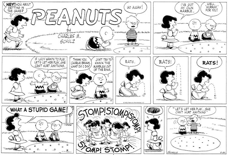
Whereas the daily strip enabled the characters’ personalities to mature, the Sunday iteration - double the size and number of panels, and in color - allowed for an expansion of the strip’s time and space. Here Schulz drew what, by contrast, were redolently realistic suburban settings. This longer form also allowed him to develop his “music,” orchestrating more complex, extended moments than the shorter daily strips permitted. A choice example of a finely tuned Peanuts Sunday strip might be the March 20, 1955, episode where Charlie Brown and Schroeder are playing marbles and Lucy invades their game, getting angrier and angrier at her missed shots (“rats... Rats! rats!”) and then improbably and violently (“What a stupid game!”) stomping all of their marbles flat (stomp! stomp! stomp! stomp! stomp!). The penultimate panel shows her angrily stalking away, a scribbled skein of lines in a balloon above her head - a skein that the reader “hears” as the endnote of the zigzaggy musical composition that precedes it.

By contrast, just nine months earlier, in May, 1954, Schulz had produced a multi-part Sunday sequence that is one of the weirdest hiccups in the strip’s development: Lucy, with Charlie Brown’s encouragement, enters an adult golf tournament. Now, it’s odd enough that these kid characters would even play golf, let alone play in a tournament, but the fact that Schulz would place Charlie Brown and Lucy next to adults - yes, actual adults appear in the strip - feels very, very wrong. The four-week sequence is full of clunkers and disharmonies, producing a queer sense of dislocation and falseness. It’s almost like the strip has the flu. Indeed, even Schulz seems to be aware of the problem - one panel shows Charlie Brown and Lucy through a forest of adult legs, he admonishing her to “just try to forget about all these people... just forget about ’em.” While the experiment proves Schulz’s willingness to test his strip’s limits, it cemented the primary rule of the Peanuts cosmos: adults might be talked about (sports legends, Presidents, Charlie Brown’s father), or even soliloquized (Linus’s infatuation with Miss Othmar), but they must always, quite literally, be out of the picture.
Peanuts increasingly became a strip where the children acted like adults (unlike the very earliest newspaper comics, in which adults acted like children). For a strip, and a nation, riding on postwar economic euphoria, such psychological inversion seems all too appropriate for the baby-boomer readers of its heyday. In the same way that architecture seems both to contain and to affect our memories, something about the synthetic psychological landscape of Peanuts seems to capture the peculiar timelessness by which we imagine and embody our sense of self. To loosely quote Vladimir Nabokov: we all have children buried alive inside us somewhere. “You have to put yourself, all of your thoughts, all of your observations and everything you know into the strip,” Schulz said in 1984. Peanuts could even be tartly described, as Art Spiegelman once did to me, in a phone call, as “Schulz breaking himself into child-sized pieces and letting them all go at each other for half a century.”
Caught up in remembrances of age-old wrongs and slights, Schulz seemed to have well-worn ruts in a road that led backward, the gates of injustice opening on his drawing table with every new strip. Rejections, dismissals, and disappointments flooded into the story lines of Peanuts. So accessible and immediate were these memories that, after the end of his first marriage, he apparently thought it O.K. to pay a visit to his old girlfriend Donna Johnson Wold, a.k.a. the Little Red-Haired Girl, who had rejected him at least twenty years before and was by all accounts perfectly happy being married to someone else. Toward the end of his life, Schulz regularly noted in his school yearbook (from which his drawings had been rejected, incidentally) when his classmates died, one by one. I’ll corroborate: in my own life as a cartoonist, I’ve made similarly ill-advised personal decisions, and sometimes a vicious word spoken by a mean kid to me forty years before will surface while I’m working, and I’ll say something back to him at the drawing table, out loud. There’s definitely something very weird about this profession, and my simply typing “the Little Red-Haired Girl” and not having to explain it demonstrates Schulz’s genius at harnessing it. We all have our own little red-haired girl.

Cartoonists, like dog owners, tend to look like their work, but Schulz somehow skirted that rule, the parenthetical, closely spaced eyes in the middle of Charlie Brown’s fat bald head resembling nothing about Schulz the man, who had widely spaced eyes, a strong, long nose, and an enviable thatch of hair to the very end. But that’s part of Schulz’s talent: Charlie Brown looks less like Schulz than, one must suppose, he feels like him. From the Yellow Kid to Barnaby to Henry to Tintin to Charlie Brown, there’s a long history of large, bald, white male faces through which the reader may “see” these characters’ various comic-strip worlds. This is no accident; the less specificity a character has, the more he (or maybe she—where are our shes?) becomes the strip’s protagonist, an everyman. Culturally, and however unfairly, the pink disc of Charlie Brown’s big baby face is about as blank and everyman as one can get.
For white American males, at least. But Schulz did try: in answer to certain readers feeling “left out” of the strip, the introduction of Franklin, in 1968, came with a rightful dose of dread on Schulz’s part about seeming condescending to African-Americans. He needn’t have worried, though, because Franklin felt real - or at least felt respected - as a kind kid on the beach with whom Charlie Brown plays in the sand. (“Whites Only” pools were not uncommon in 1968.) Though Schulz may have lived a quiet, remote life in his California studio, he was woke enough to realize that all one had to do was care enough about a character for he or she to “work,” even if the shell of the character wasn’t his own. Despite the over-all racial imbalance of the Peanuts cast, this caring is really the secret, mysterious power of Schulz’s entire strip. Charlie Brown, Lucy, Linus, Snoopy, Schroeder, Franklin, and everyone else came alive on that page because of Charles Schulz’s ability to make you care about and feel for - and, in Charlie Brown’s case, at least, feel through - nearly every one of them.
There is a translucency, if not a transparency, to Schulz’s drawing style that allows for such sympathy. It’s not diverting or virtuosic - it’s direct and humble. (He described it as “quiet.”) The simple act of looking from one drawing to the next animates the rhythm of the characters’ movements, echoing, somehow, our own distillation of experience. Due to an essential tremor in Schulz’s drawing hand, as the result of a quadruple-bypass surgery in 1981, this distillation felt shakier in later years; he sometimes even steadied his drawing arm with the other, to reduce the tremors to a minimum. But this difficulty did not change the strip’s essence, or Schulz’s devotion to drawing it: “I am still searching for that wonderful pen line that comes down - when you are drawing Linus standing there, and you start with the pen up near the back of his neck and you bring it down and bring it out, and the pen point fans out a little bit, and you come down here and draw the lines this way for the marks on his sweater, and all of that... This is what it’s all about - to get feelings of depth and roundness, and the pen line is the best pen line you can make. That’s what it’s all about.”
Schulz’s mind, and then hand, transmuted the Peanuts characters onto the paper and then into the eyes and minds of millions of readers, and he knew those readers trusted him to “make the best he could make.” He never gave up on them. Besides, no one else could have done it; despite the deceptive simplicity of a Peanuts drawing, faking one - let alone four of them in a row - is impossible. If there is one accomplishment in the art of cartooning for which Schulz should be credited, it’s that he made comics into a broader visual language of emotion and, more importantly, empathy. For this, all cartoonists - especially those of us who have attempted “graphic novels” - owe Schulz, well, everything.
© Chris Ware

Is there a better image for the repeated betrayal of trust than Lucy yanking the football out just as Charlie Brown is about to connect? What depiction of stubborn, ridiculed faith is more powerful than Linus sitting alone in his pumpkin patch waiting for the Great Pumpkin? All of Murphy's laws together offer no better illustration of the malign nature of inanimate objects (and the futile mixture of rage and resignation available in response) than Charlie Brown with his kite stuck in a tree.
For close to half a century, Charles Schulz has been contributing indelible images to our consciousness, from Snoopy's fantasied "dogfights" with the Red Baron to Linus' security blanket to Lucy's hopeless infatuation with the monomaniacal Schroeder. Some of them even pop up and acquire new meaning, contemporary layers of meaning, long after we thought they'd been exhausted. Who would have ever guessed, for instance, that Lucy's hostile, self-aggrandising, destructive and ultimately useless (but inexpensive!) psychiatric advice booth would anticipate, so completely and pitilessly, the '90s radio advice-giver Dr. Laura?
Peanuts began in 1950, neatly bisecting the century and making it the first (and arguably the last) great modern comic strip. To those unfamiliar with it, that first year is bizarre, almost unrecognisable - and it's not just a matter of the slicker, button-cute character designs. Rather than a gentle, philosophical loser, Charlie Brown is a hyperactive prankster (prefiguring Bill Watterson's Calvin, down to the manic open-mouthed grin); the reader looking for familiar faces among the rest of the cast will be disappointed by interchangeable second bananas such as Shermy and Patty, and soon thereafter, Violet (who?).
The peculiar thing about Peanuts' early development is that, with one significant exception, all of Charlie Brown's major co-stars-to-be debuted as toddlers or infants. Not only that, but as generations of infants: baby Schroeder, little Lucy Van Pelt and her baby brother Linus were introduced and allowed to "grow up" (ie to reach Charlie Brown's age); later, they were followed by Charlie Brown's sibling Sally (and much later, Lucy and Linus' brother, the somewhat pointedly-named Rerun). Nowadays, of those five characters (six, if you count Snoopy, who began as a non-speaking puppy, too), only Sally seems genuinely younger than the rest. Peanuts is entirely different from other strips in which characters age, such as Gasoline Alley or For Better Or For Worse. Lucy, Linus, Schroeder and Sally didn't mature so much as they evolved from a sketch to a finished drawing - as if Schulz had to work his way into his best characters literally by raising them to maturity. It's also been suggested that the "babies" were Schulz's way of easing into the quirkier characterisations, with Schroeder as the icebreaker, without endangering the interior logic of the early strip. And, of course, it allowed him to incorporate the dynamics of sibling age differences, particularly with the Van Pelt kids.
(The one exception is Peppermint Patty, literally an "outsider" who lives across town; she often seems to be starring in her own, separate strip, and remains an intruder when she "crosses over" with the rest of the cast. Curiously, in the fallow '80s, when the rest of Peanuts was awash in irritating Snoopy relatives and talking schoolhouses, the "Peppermint Patty" strip within-a-strip seemed to retain its snap.)
Peanuts has been going steady for close to 50 years. Even though it has declined from its peak (late '50s to late '60s), even though it sometimes lurches into mystifying, private non-sequiturs, it can still provoke laughter and delight. (And it's worth noting that the '90s Peanuts is a substantial improvement on the '80s Peanuts.) The witty aggressiveness of yore has been toned down: you don't hear anyone call Charlie Brown a blockhead any more, and the trademark explosive, exasperated "Good grief" is a thing of the past, too - but there is a deeper, darker current of wistfulness (those haunting strips of Charlie Brown alone in his room, at night) that can be surprisingly affecting. Even the shakiness of the line - as well as those odd un-funny strips - remind us that Peanuts is, and has always been, a daily, hand-crafted gift from one of the greatest cartoonists of all time.

The six issues released so far focus on three high school students. Keith, a "normal" teen, is an insecure youth with a crush on a classmate named Chris, who barely notices him. Rob has "the bug", manifested by a small mouth on the neck, but has managed to conceal it from his peers. Chris and Rob share mutual attraction, but when Chris discovers Rob's condition she is repulsed. She later finds she has caught the disease from him. Ostracised by her schoolmates, Chris soon finds Rob is the only one she can talk to about her new problem.
All of this might be horribly cheesy if it weren't a product of Charles Burns' extraordinary artistry. Drawing realistically but with thick, cartoony lines, his illustrations are graceful and eye-pleasing even with ugly subject matter. More importantly, his evocative imagery shows this to be the work of a thoughtful artist. Surrealistic dream and drug trip sequences figure predominately, and symbolism, especially of the phallic and vaginal variety, abounds. Believable and identifiable characters couple with effective dramatic writing, raise the series well above the level of soap opera. Burns is a masterful cartoonist, and Black Hole demonstrates interesting art actually can be made about teenage mutants.

Gilbert puts Luba (and us) through the wringer - and takes pains to develop complex new characters along the way, characters deeply implicated in the novel's corrupted cultural landscape. Foremost among these are Luba's mother Maria, a skin-deep beauty whose perfection verges on self-parody, and Luba's husband Peter, within whom chivalrous paternalism (Luba calls him "Daddy") and a ruthless political will vie for position.
These characters are bound by the demands of "business", a bland euphemism for any sort of brutality ratified by political and economic ambition. Violence spreads - sometimes personal, sometimes gauzed over by the language of commerce. Peter, through an elaborate underground economy, helps deal drugs; his young wife, cloistered by Peter's chauvinism, injects them. Deals are made, deferred, consummated; on one of them hinges the fate of Luba's firstborn. Against this savage backdrop, Gilbert highlights moments of unexpected tenderness: characters do things you don't expect, for reasons darkly hinted at but nonetheless persuasive.
Poison River's pages often skip back and forth through time without warning, and stunning revelations come with ease - there are points in the novel where offhand remarks force you to rethink all that has come before. Baroque, fragmented, and serialised at a glacial pace, Poison River proved too tough to follow in magazine format, but, as revised and collected in 1994, stands as a novel of ferocious brilliance.

Regular readers developed a feel for Izzy's personality over the years and seen her character given depth by her Cassandra-like role in The Death Of Speedy Ortiz. They also recognise the house from the cryptic "How To Kill A..." from Love & Rockets #1, as well as the potent visual markers of pre-Mexico Izzy. When her hair had grown long, we know that the change is complete, something significant has happened. When she tell us about the flies on the ceiling, references in past stories take on a whole new level of meaning.
But this story functions just as well as a stand-alone fable, a tale of self-destruction. Isabel seeks to escape her past (including a divorce, an abortion and attempted suicide) and in Mexico unexpectedly finds a chance at redemption. When she finds out the devil has followed her, she runs yet again - to no avail. And when the Devil tells her, "It's not your sins but your guilt that allows me to come to you," the story takes a harrowing nightmarish turn. Jaime not only employs the ambitious narrative leaps that give his stories a distinctive economy and rhythm, for this story he creates a magical-realist symbology that resonates powerfully as psychological horror. The chiaroscuro clarity of his art makes the surreal extremes unnervingly accessible, allowing a seamless blend of dreams and memories and the unexplained. The ending is nuanced in its contradictions and confrontations: a conquering of fears, an acceptance of consequences, a loss of hope. The ultimate tragedy is writ clear in the last panel: that Izzy's fate, like all people's, isn't her burden alone.

Coming off the cancellation of the Playboy-backed Trump and subsequent failure of the self-published Humbug, Kurtzman picked up his drawing tools again at the request of publisher Ian Ballantine, who hoped to duplicate the success of the Mad paperbacks with original paperback cartoon books.
Kurtzman's concept was a quatrain of extended satirical strips: "Thelonius Violence", a Peter Gunn parody narrated in bebop jive, complete with musical soundtrack effects; "Organisation Man in the Grey Flannel Executive Suite", a sardonic look at the corporate world, in which Kurtzman got in his digs at the magazine industry; "Compulsion on the Range", a witty fusion of in-vogue Freudian pop psychology into the TV series Gunsmoke; and "Decadence Degenerated", a funny but deeply serious story of a small-town lynching, build around Kurtzman'z own appalled recollections of a stay in the Deep South.
At 140 brilliant pages, the Jungle Book is certainly Kurtzman's most substantial graphic achievement. The vigour and immediacy of the brushwork, the bold use of tones, the hypnotic pattern of sustained and broken visual rhythms from panel to panel and page to page, make it one of the most formally inventive comic books ever published. And Kurtzman's mordant wit, freed from the constraints of shorter magazine pieces, would never again display as pitiless a bite.
That last Frontline Combat story, a meditation on fate, was called "The Big If". Harvey Kurtzman's Jungle Book provides the biggest "if" in comics history: What if it had been a success? What if Kurtzman instead of being forced to leapfrog from more failed anthologies to the compromised Little Annie Fanny to teaching and illustration jobs, had been able to recreate himself as a one-man satirical storyteller - writing and drawing for magazines and books? What if he had succeeded in caving a niche in the mainstream publishing world, into which the whole next generation of cartoonists could have poured - short story writers, essayists, and novelists who just happened to work in the comics form?
Harvey Kurtzman's Jungle Book remains one of the art form's most stunning successes, and one of the fields most heartbreaking failures.
REVIEW BY ROBERT CRUMB:
He is as good as any cartoonist in history that I know of. Some of his greatest stuff was done in a little Ballantine Book called Harvey Kurtzman's Jungle Book published around 1959. Kurtzman did all the drawing as well as the writing. I hope somebody will reprint it someday in its entirety on good paper, as I'd like to own a copy.


 UPDATE:
Anyone interested in crossing the ever-narrowing divide between High and Low culture ought to contemplate the work and troubled career of Bernard Krigstein (1919-90), a postwar comic-book illustrator who had the privilege and the misfortune of being an Artist with a capital "A" working in an Art Form that considered itself only a Business. Krigstein was never associated with a specific character (the most sure ticket to comics success), and he never wrote his own stories (a handicap in a narrative medium). He wasn't beloved by publishers, editors, or readers. What reputation he has rests on a handful of short stories he illustrated in 1954 and 1955 for EC comics (the folks who brought you Tales from the Crypt and Mad), but one of those stories, Master Race, was an accomplishment of the highest order - a masterpiece.
All eight pages of Master Race are exquisitely reproduced in Greg Sadowski's new coffee-table biography, "B. Krigstein" (Fantagraphics; $49.95), as are a few other key stories and some sample pages, but the entire project is as quixotic as the career it describes. Ominously subtitled "Volume One (1919-1955)", the book offers a profusion of the artist's juvenilia, paintings (including student copies of Renaissance works in the Met), minor illustrations, sheaves of wartime sketches, and letters to his wife, Natalie (who wrote the foreword), and even a reproduction of his college transcripts. This detailed sifting of the remains wouldn't seem like folly if the subject were, say, Jackson Pollock or some other fabled hero anointed by the Gods of Art History. The book is probably the one Bernard Krigstein would have wished for himself, but it is not the book he needs: a well-selected anthology culled from the couple of hundred comic-book stories he illustrated, mostly in the nineteen-forties and fifties. As it stands, the current book is best read as a poignant bildungsroman about a disappeared type: the mid-century lower-middle-class New York Jewish intellectual, drunk on art and culture, struggling to survive morally and aesthetically in the commercial wilderness.
"The Amazing Adventures of Kavalier and Clay," Michael Chabon's 2000 novel, reminds us that the early comic-book industry was a specifically Jewish milieu, virtually an extension of the rag trade. It was invented by a Jewish printing salesman and popularized with stories created by two Jewish kids from Cleveland about an immigrant from the planet Krypton. Many of the first generation of creators - like Will Eisner, Bob Kane (Kahn), Stan Lee (Lieber), and Jack Kirby (Kurtzberg) - were first- and second-generation New York Jews. And, while many of them were intelligent, very few were educated, and only Krigstein was a true intellectual. He would have had more in common with the staff of Partisan Review or Commentary than he did with his colleagues on Nyoka the Jungle Girl, Space Patrol, and Strange Tales of the Unusual.
Krigstein first heard what he later called "the sound of art" in junior high school. He opened a book on art appreciation and got bitten by one of Cézanne's apples. At Brooklyn College, his future wife persuaded him to switch his major from accounting and commit himself to becoming a "fine" artist. Economic need made Krigstein, like many other aspiring painters, stumble into comic-book work. Unlike the others, he began to sense the form's potential and, without condescension, put all his skill and insight into testing its limits. His paintings looked back to representational values that were at least fifty years out of date; his comics were visionary and looked ahead at least that far.
After he abandoned the field, in the nineteen-sixties (and was abandoned by it), he said, "I found that comics was drawing and... shed all criticism of the form as I worked in it." Usually hampered by banal scripts, Krigstein reflected:
My futile idea was that action in comics, as in any art, doesn't end with one person pounding another person in the jaw. There's also the action of emotion, psychology, character and idea. I yearned to have stories which dealt with more reality and people's feelings and thoughts... a kind of literary form, let's say even a Chekhovian form, where one could delve into real people and real feelings.
Manny Stallman, a more typical comic-book artist, once turned to Krigstein's brother in disbelief and said, "Bernie's actually taking this stuff seriously!"
Commercial art, for all its constraints, seemed like the only haven for figurative artists at mid-century, and Krigstein took a craftsman's pride in his accurate perspectives and his researched images based on observation. Without looking cramped, his well-balanced panels began to teem with crowds of individually articulated figures. He disdained shortcuts and easy solutions, and replaced the cartoonist's vocabulary of sweat marks and action lines with a painter's language of composition and form. It's as if the other cartoonists were expressively drawing Yiddish while Krigstein eloquently drew Hebrew.
Combative by nature, he fought the indifference and deadlines of the assembly-line shops for the right to ink his own panels. Astoundingly, at the zenith of the McCarthy era he led a battle to unionize freelance comic-book artists so they would all receive standardized rates, health benefits, and a modicum of respect. After his organizing efforts crumbled, in 1953, Krigstein had the good fortune to hook up with EC comics. The scripts were notches above the rest, and the outfit sought the best illustrators, encouraging them to develop individual approaches.
Nearing the height of his powers, Krigstein adjusted his style for each of the EC stories he was assigned: stately calligraphic panels influenced by Eastern art for adapting a Ray Bradbury fable set in ancient China; a scratchy German Expressionist approach for a story about an evil hypnotist seen from the murderer's point of view; crisp fifties modernism for the tale of a murderously curdled suburban marriage. All displayed Krigstein's cool intelligence and mastery. All were elegant - even beautiful - though somehow uningratiating. Highly respected by his EC peers, Krigstein was not a favorite with EC readers, who preferred Wally Wood's obsessively detailed rocket ships and Graham Ingels' fetid corpses.
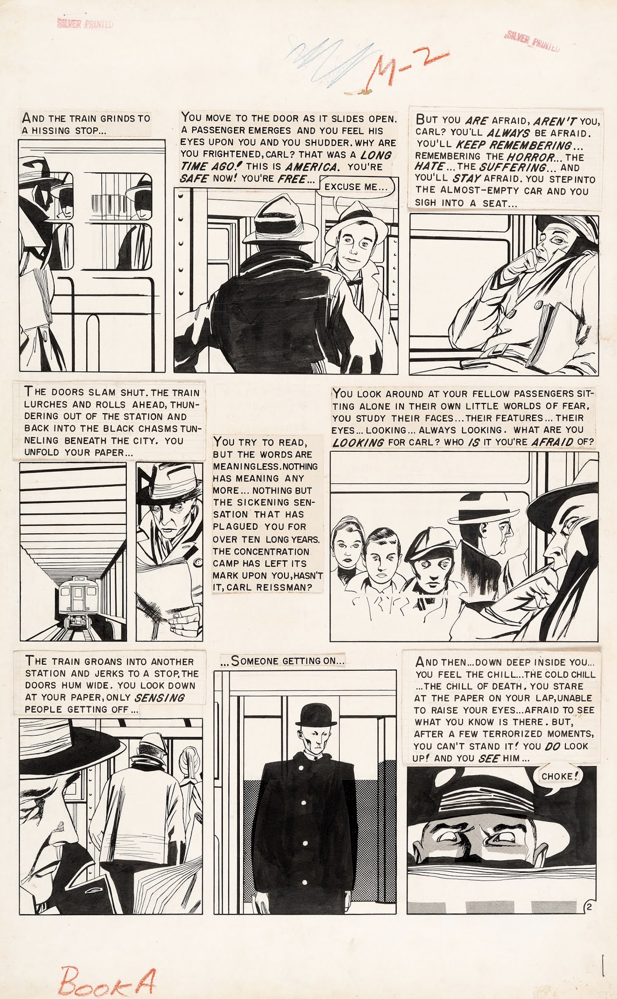
Krigstein began to vibrate with the inner language of comics, to understand that its essence lay in the "breakdowns," the box-to-box exposition that breaks moments of time down into spatial units. "It's what happens between these panels that's so fascinating," he said in a 1962 interview. "Look at all that dramatic action that one never gets a chance to see. It's between these panels that the fascinating stuff takes place. And unless the artist would be permitted to delve into that, the form must remain infantile."
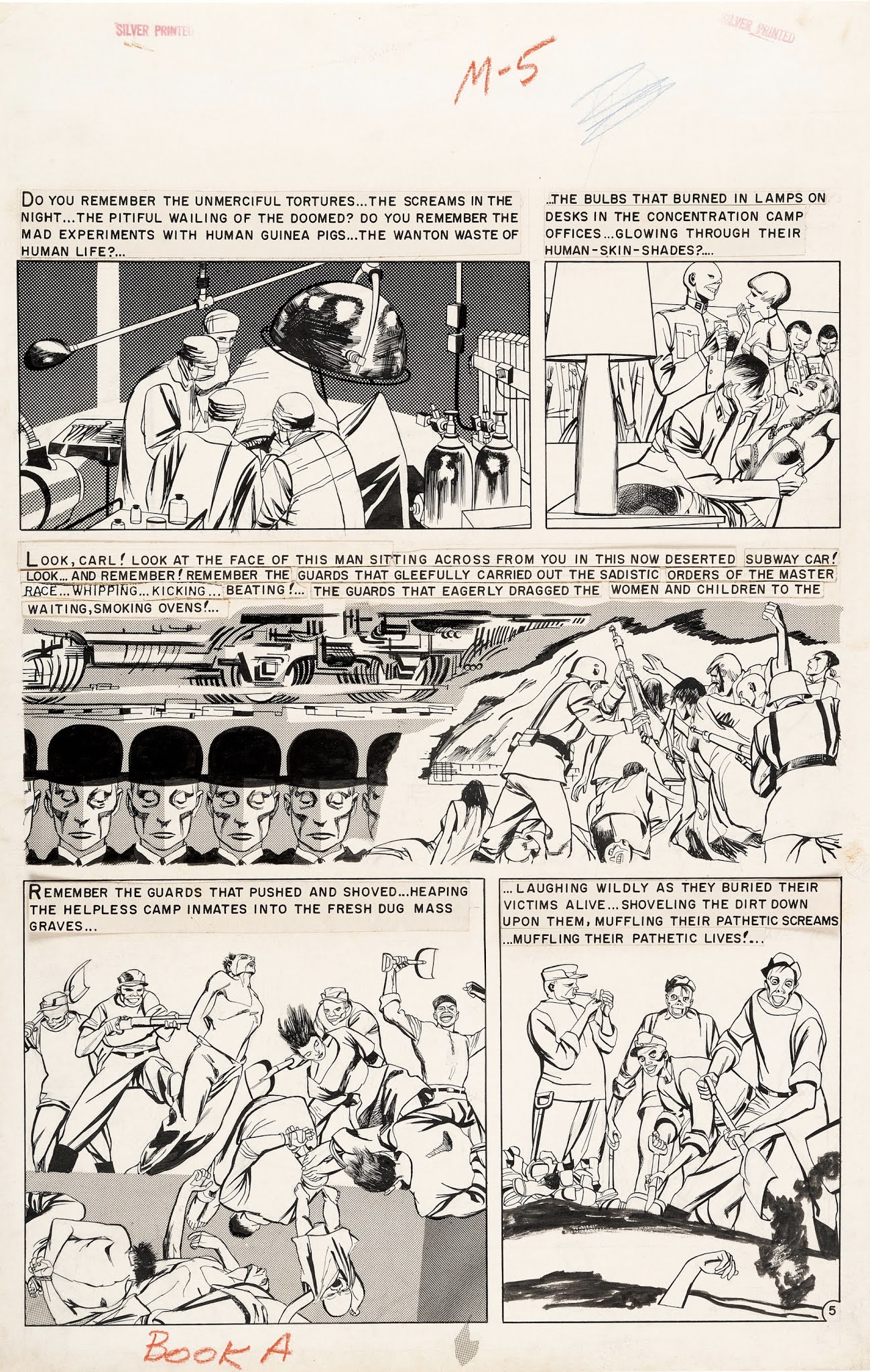
Krigstein became ravenous for more panels than the rigidly formatted short scripts permitted; he took to subdividing the pre-lettered art boards to allow more and more—albeit smaller and narrower—boxes on his pages. Then Al Feldstein, EC's primary editor and scriptwriter, assigned him a six-page story, "Master Race." A memory-haunted concentration-camp refugee, Carl Reissman, enters a subway car and recognizes the cadaverous stranger who sits across from him. A flashback details the horrors of the Third Reich and finally reveals that Reissman had been a perpetrator - the commandant of a death camp. The stranger chases him down an empty platform, where Reissman slips and is crushed by an onrushing train. Whether the mysterious stranger was a former victim who once swore revenge or a projection of Reissman's guilt is left unresolved.
Feldstein thought of this as one more "snap-ending" story patterned after O. Henry, much like the three others he cranked out each week. It just so happened that this one was about the Nazi death camps and postwar guilt at a time when the culture was unwilling to reckon with the catastrophe in any medium. Krigstein seized on the script as a chance to demonstrate his own and the medium's possibilities. He begged for twelve pages and was begrudgingly granted eight.
Krigstein's formal qualities as a storyteller—not the story's subject matter - make Master Race a tour de force. He encapsulates the decade of Nazi terror powerfully but with restraint, never slipping into the Grand Guignol that made EC notorious. The two tiers of wordless staccato panels that climax the story have become justly famous among the comics literate. They have often been described as "cinematic," a phrase thoroughly inadequate to the achievement: Krigstein condenses and distends time itself. The short chase that ends Reissman's life takes up about the same number of panels given over to the entire Hitler decade; Reissman's life floats in space like the suspended matter in a lava lamp. The cumulative effect carries an impact - simultaneously visceral and intellectual - that is unique to comics.
Hardly anyone noticed the story, published in Tales Designed to Carry an IMPACT #1. It was barely distributed, lost in the aftermath of the devastating 1954 Senate investigation into the relationship between reading comic books and juvenile delinquency. As EC and the rest of the comics industry evaporated around him, Krigstein briefly went to work in his father's dress factory. After several months of filial squabbles, he turned to freelance magazine, book, and record-jacket illustration, where his integrity and his contentiousness eventually limited his success. He vainly tried to interest book publishers in a massive comics adaptation of "War and Peace," but by 1962 had settled into a twenty-year career teaching illustration at New York's High School of Art and Design, to subsidize his devotion to painting.
I was a cartooning major at Art and Design in 1963. Only vaguely aware of Krigstein's comics, I gave him a wide berth. He was a small, barrel-chested man with a reputation among my illustration-major friends as a tough teacher, humorless and completely dismissive of comics. I was delighted to learn from Sadowski's book that the initials Krigstein used when signing his early superhero pages, "B. B. Krig," stood for the nickname he had earned in the Army: Ballbuster.
I met him only once, in the early seventies. John Benson, the editor of an EC fanzine called Squa Tront, wanted to expand and publish a panel-by-panel analysis of Master Race that I had written in 1967 as a college term paper. We went to visit Krigstein at his painting studio, on East Twenty-third Street, so I could read it to him and get his responses. Krigstein at first demurred that those days were long behind him and he didn't remember much about the work. As I began reading, he entered into the analysis avidly, acknowledging a reference to Futurism in one panel, to Mondrian in another, denying a reference to George Grosz in yet another. He basked when I pointed to a visual onomatopoeia that conjured up a subway's rumble. It was as if messages he'd sent off in bottles decades earlier had finally been found.
At the end of the paper, I had compared his approach to that of some important contemporaries whom I also admired, including Harvey Kurtzman and Will Eisner. When I read that paragraph, Krigstein darkened. "Eisner!" he shouted. "Eisner is the enemy! When you are with me, I am the only artist!" He yanked me further into his studio and pointed at the walls. "Look!" he roared. "You see these paintings?" I saw several large, molten, and lumpy Post-Impressionist landscapes in acidic colors. "These are my panels now!" His voice betrayed all the anguish of a brokenhearted lover.
© Art Spiegelman

The script, credited to the underrated Al Feldstein, tells the story of a chance meeting between a former concentration camp commandant and a camp survivor on a New York subway. The encounter ends with the former Nazi's death. As a straight piece of drama, Master Race is a solid, capable work of fiction. Feldstein's script is professionally forceful and provocative, while Krigstein's illustrations serve the story's dramatic highlights perfectly: the depictions of both the chase and the commandants crimes are magnificently expressive without veering into melodrama.
However, Master Race is best remembered for Krigstein's exploration of the possibilities of narrative in comics form. Expanding the script from six to eight pages, Krigstein opened up the story's graphic possibilities. His solutions to various storytelling problems are incredibly sophisticated: radical shifts in perspective between the pursuer and the pursued; building mood through panel size and text placement; switching from objective to subjective viewpoints; and showing dramatic highs by slowing down the action across a series of panels. The panels where Krigstein shows the passing of the subway cars through repeating images within the same panel are so astonishing, so adept, and so perfect they serve as arguments in and of themselves that Master Race is a rare artistic achievement by one of comics greatest forward thinkers.
Master Race is also one of the most studied comics of all time, most notably in the seminal piece of comics criticism "An Examination of Master Race" (by John Benson and David Kasakove, working in part from an Art Spiegelman essay and close reading of the story). A perfect marriage of artist, approach, and subject matter, Master Race rewards the constant reconsideration it richly deserves.
I met him only once, in the early seventies. John Benson, the editor of an EC fanzine called Squa Tront, wanted to expand and publish a panel-by-panel analysis of "Master Race" that I had written in 1967 as a college term paper. We went to visit Krigstein at his painting studio, on East Twenty-third Street, so I could read it to him and get his responses. Krigstein at first demurred that those days were long behind him and he didn't remember much about the work. As I began reading, he entered into the analysis avidly, acknowledging a reference to Futurism in one panel, to Mondrian in another, denying a reference to George Grosz in yet another. He basked when I pointed to a visual onomatopoeia that conjured up a subway's rumble. It was as if messages he'd sent off in bottles decades earlier had finally been found.
At the end of the paper, I had compared his approach to that of some important contemporaries whom I also admired, including Harvey Kurtzman and Will Eisner. When I read that paragraph, Krigstein darkened. "Eisner!" he shouted. "Eisner is the enemy! When you are with me, I am the only artist!" He yanked me further into his studio and pointed at the walls. "Look!" he roared. "You see these paintings?" I saw several large, molten, and lumpy Post-Impressionist landscapes in acidic colors. "These are my panels now!" His voice betrayed all the anguish of a brokenhearted lover.
REVIEW BY DAVE SIM:
All they have to do is give him his own book, as they did with Kurtzman, and comic books could have jumped three or four decades in maturity inside of a year. No go. In fact, just the opposite happens. They start cutting the page count. To me it was an object lesson in the fact that innovation and business interests, while completely compatible are seen by businessmen as completely incompatible... If in later years, long after I'm dead, someone sees something in my work that seems - to them - as innovative as Master Race seemed - and seems - to me... Well, I'm pretty sure they will also see that what I achieved was only possible through self-publishing and, hopefully, I will have saved a handful of future creators from hitting a brick wall at their innovative peak that Feldstein and Gaines forced Krigstein to hit at his own creative high point.