03 August 2021

The EC War Comics by Harvey Kurtzman & Others (No. 12)

The EC War Comics (1950-1955)
by Harvey Kurtzman & Others

REVIEW BY R.C. HARVEY:
(from The 100 Best Comics of the Century! in The Comics Journal #210, 1999)
In his war stories for the EC adventure titles Two-Fisted Tales and Frontline Combat, Harvey Kurtzman (1924-1993) raised the art of storytelling in comics to a new level while at the same time investing the stories with a realism that infused them with moral passion. The launch of both books coincided with the beginning of the Korean "police action" in the early 1950s, and Kurtzman seized the opportunity to tell the truth about war. War stories in most comic books at the time championed American servicemen at the expense of the enemy's humanity, proclaimed unequivocally the justice of the United Nation's cause, and glorified battlefield action by making killing, bloodshed and death seem patriotic. This, Kurtzman believed, was a lie. And he set out to erase the lie.

It was this crusade that inspired Kurtzman's legendary passion for research. Only the truth can eradicate a lie, and to tell the truth, one needed to study history and news reports in order to unearth fact and to be able to portray facts accurately. Kurtzman had been impressed with Charles Biro's storytelling in the Lev Gleason crime comic books. "He offered stories based on fact, presented in a hard-edged documentary style, a highly original approach to comics back then," Kurtzman said. He recalled the excitement he felt reading those stories, "the shock" of being brought "nose-to-nose with reality." He set out to do the same thing with his war stories. The realities of the battlefield would destroy the phony, glamorous vision of war.

But Kurtzman's war stories were not anti-war: in deglamourising warfare, he did not oppose the effort in Korea. His stories acknowledged the necessity of the fight - not only in Korea but in wars generally. Against that necessity, Kurtzman balanced recognition of the over-all futility of warfare. His unique achievement was to strike the balance. But in those days - in the wake of the superpatriotism of World War II just concluded, during another war in which veterans of the previous conflict were also fighting and dying - to publish such a balanced view was extraordinarily unprecedented. While Kurtzman's stories recognised the causes of wars and the necessity of fighting them, he dramatised the loss, the profligate waste of human life that characterised war everywhere in every time.

To show these consequences, Kurtzman's stories often focused on the fate of a single individual. One story chronicled in elaborate detail the steps a Korean farmer took in building his house - picking a site, laying the foundations, erecting a framework, making bricks, putting it all together. Then on the day he finishes his work, a bomb falls on the house and in a second destroys the painstaking labour of months. In another story, a dying soldier wonders about the arbitrariness of timing: if he hadn't stopped for a moment to tie his shoe, he would have been 20 feet further down the road and when the bomb hit - he would have been far enough away to survive.

In telling the stories, Kurtzman paced his narrative more dramatically than others did at the time. To focus on a key sequence, for instance, he sometimes deployed a series of almost static visuals, the progression of  the panels building to a conclusion with "voice-over" captions while the camera tracked in for a final close-up, giving the last moment of the sequence emotional intensity. This restrained kind of manoeuvre gave his stories the even-handed patina of a documentary, enhancing their realistic aura. A stickler for execution, Kurtzman painstakingly laid out every page of his stories, penciling in the action and the verbiage; and he demanded that the illustrators follow his layouts exactly.


REVIEW BY FRANK MILLER:
(from an interview in The Comics Journal #101, 1985)
EC does represent the most consistently well-crafted line of comics to date. The cartoonists working for EC - Wood, Davis, Severin and Johnny Craig, who deserves to be acknowledged as one of the true greats of the field - consistently produced the finest work of their careers. Craig's and Harvey Kurtzman's work, in particular, are examples of superior talent and dedication to craft. Anyone who hasn't purchased the Cochran reprints, particularly of Craig's crime comics and Kurtzman's war books, is missing out on thrilling work.


FURTHER READING:


02 August 2021

Polly & Her Pals by Cliff Sterrett (No. 18)

Polly & Her Pals (1912-1958)
by Cliff Sterrett

REVIEW BY R.C. HARVEY:
(from The 100 Best Comics of the Century! in The Comics Journal #210, 1999)
The first comic strip with a woman as title character, Cliff Sterrett's masterpiece debuted December 4, 1912. At first dubbed Positive Polly, it focused on one of the social phenomena of the time, the "new woman": Polly Perkins is a thoroughly modern self-possessed young miss who is attending college and otherwise making a place for herself in the world outside the home. Her rebellion against society's stereotypical expectation for women amazes and alarms her more old-fashioned parents, particularly poor Paw, whose traditional sensibilities are constantly bombarded by new fashions in both clothes and manners, his once secure and sane Victorian world in a state of continual comic turmoil.

Although Sterrett (1883-1964) changed the strip's title to indicate its broadening focus, even Polly & Her Pals does not reflect the true basis of the comedy - the clash of mores between generations. Paw's exasperated outrage inspired most of the laughter, and he was soon the star of the strip. To wring everything he could from the situation, Sterrett surrounded the old man with a cast of idiosyncratic secondary characters whose assorted eccentricities were designed expressly to assail Paw with modernity in all its variations and varieties. Polly eventually faded into the background, but in the early days of the strip, she attracted considerable attention for daring to display her long legs. And in her facial profile - bulging brow, tiny nose, pouting mouth - Sterrett established a convention for depicting a pretty girl's face that was widely adopted by other cartoonists. But little else about Sterrett's way of drawing could be readily imitated.

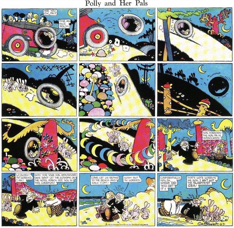
As his style matured in the mid-twenties, Polly became a spectacular symphony of line design in black and white in daily strips and a riot of primary colours on Sundays - rampant reds, succulent yellows, pristine blues. The stylistic earmark was the interplay of patterned line and geometric shape. Checks, strips, black solids, quilt-like patchworks, and surrealistic backgrounds were juxtaposed in panels populated by creatures whose anatomy was wholly abstract, completely geometric in cubism's Futuristic manner: heads were simple spheres; bodies and limbs, cylindrical tubes. This abstraction of the human form permitted widely unrealistic but supremely comic expressiveness in both face and feature, and Sterrett exploited the possibilities with playful exuberance. 

Kitty, the family pet, for instance, became a completely geometric cat, assuming a larger significance in the strip's motif: her geometry made her as anthropomorphic as her owner, and she emerged as a Greek chorus, commenting on Paw's predicaments by outright imitation of his actions or in her exaggerated reaction to his moods.

Inspired by the surrealistic impulses of modern art as well as Futurism, Sterrett's Sunday pages in the late twenties in particular were unparalleled in their comic distortions of reality, in their subordination to abstract design of the representational mission of the drawings. The pages were agog in exotic potted plants, fanciful embroidered pillows, abstracted cityscapes, outlandish tubular trees with electric foliage zig-zagging across the sky. Any many of the gags seemed dictated by Sterrett's desire to draw certain subjects in certain ways, often experimental. It's midnight on one Sunday and the panels are mostly black, the action revealed solely in patches of light; on a Sunday at the beach, all the action id depicted under water, and we see only the distorted bottom portions of the characters wading. 

By the 1930s, Sterrett's drawings were less inventive: the surrealistic elements disappeared, leaving just the geometric forms of Futurism, and these had become mere conventions. Suffering from arthritis, Street surrendered the art chores on the dailies to an assistant; the last Sunday Polly was published June 15, 1958.


FURTHER READING:


01 August 2021

Covering The New Yorker: Adrian Tomine

Between the ages of 17 and 20, Adrian Tomine self-published 7 issues of his mini-comic Optic Nerve, which comprised of short stories displaying the first hints of the distinctive, realist style that he would go on to perfect. In 1994 Optic Nerve was subsequently published for 14 issues by Drawn & Quarterly and would be where his acclaimed graphic novels (Sleepwalk & Other StoriesSummer BlondeShortcomings and Killing & Dying) would be first serialised.

His Eisner Award winning book, The Loneliness of a Long-Distance Cartoonist, was published in 2020, which Alan Moore described as:

"In this heartfelt and beautifully crafted work, Adrian Tomine presents the most honest and insightful portrait you will ever see of an industry that I can no longer bear to be associated with."


Love Life
by Adrian Tomine

The New Yorker:
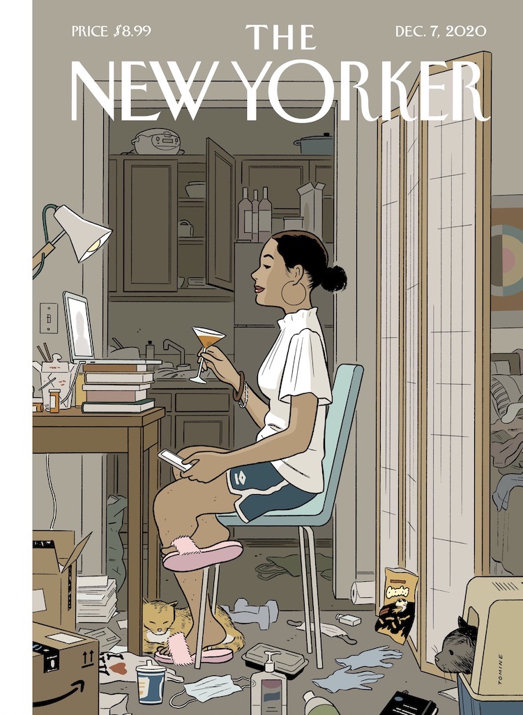
Your work tends toward concision, yet a big part of the pleasure in this cover is the accumulation of details. Was that difficult to achieve?

Adrian Tomine:
For better or worse, I’ve developed a fairly specific, detailed illustration style, and there’s no real shorthand for a messy room. Once I realized that I would actually have to draw all the things that would telegraph that messiness, I got a little obsessive about cataloguing artifacts from daily pandemic life. I have a feeling that, years from now, I might look back at this cover and have a kind of P.T.S.D. reaction to something as insignificant as a bottle of hand sanitizer.

You have a distinctive palette of muted, neutral tones, yet you’ve still managed to highlight your subject against the background. How important is light in your compositions?

I’ve wasted an insane amount of time thinking about lighting in Zoom meetings, so it seemed fitting that it would be central to this image. I’d love to be one of those effortlessly beautiful people who can just open their laptop in a dark room and look terrific, but, instead, I’m often rearranging entire rooms, running extension cords to various lighting sources, and scheduling meetings based on when I can get natural window light. Also, I was looking at Edward Hopper as I was working on this, and light was probably the most consistent thread that ran through his work.

You recently published a book, “The Loneliness of the Long-Distance Cartoonist,” which makes a cameo on this cover. The book was very well received. Did the praise help you with the next project, or paralyze you?

Everything paralyzes me, whether it’s praise or criticism. Somehow I always find a way to carry on and to keep making things, but there’s literally no reaction to my work that I can’t twist into something to obsess over.

In your book, and in your New Yorker covers, you seem to home in on painful moments to find the humor in them. Do you experience a eureka moment when you locate that contradiction?

I think that’s a good way of putting it. To be honest, I don’t know how someone could get through life without being able to bask in that contradiction. In my personal life, I’ve often felt very moved by that act of finding humor in pain. If someone can authentically pull that off and be really funny, that’s worth more than a hundred words of earnest consolation to me.

I know you and your wife have been confined at home with two young children—but what’s with the cat? Is that from life or from your imagination?

That’s my tribute to our cats, Dolly and Pepper. Dolly passed away, unfortunately, but it felt nice to immortalize her in this way. I’ve drawn every other member of our household on the cover at some point, so it seemed only fair. (For the record, we keep the litter box in a much more socially distanced location.)


Fourth Wall
by Adrian Tomine

Sometimes a cover image will just appear in my mind, fully formed. In other cases, I’ll have the vaguest semblance of an idea but no sense of how to turn it into a cover. Those movie-set trailers are a good example of this. I’d drawn them in my sketchbook a long time ago, and I knew they were an ubiquitous, specific part of New York life, but I didn't have a story beyond that. Then, a few years ago, I decided to try my hand at screenwriting, and in a particular moment of frustration and despair this image popped into my mind. The apron on the back of the chair was a spur-of-the-moment addition while I was sketching, and I think that was the last piece I was looking for.

I think New York is one of those cities where, whatever your ambition is, you can look around and instantly see someone achieving that dream, often at a level that you never even knew was possible. That experience can be dispiriting, but also extremely inspiring, and that’s part of what I was trying to capture.


Upstate
by Adrian Tomine

Spending time in nature is something I do solely for the happiness of my children, like going to puppet shows or listening to Katy Perry. I can wander around the city with my kids, potentially surrounded by psychopaths, and I’m completely at ease. But put us in some tall grass, and all my neurotic, protective instincts come out.


Recognition
by Adrian Tomine

Where I live in Brooklyn, there’re always a lot of books being set out on the sidewalk, and there’re also a lot of authors walking around the neighborhood. Lifelong New Yorkers may take for granted the sight of people setting stuff on their steps to give away, but I still notice it. I’ve had the experience of seeing stacks of New Yorkers with my cover out on the street, though I haven’t seen my books put out - but then, I also don’t have a giant photo of myself on the back cover.


Gowanus Canal, Brooklyn
by Adrian Tomine

I think it's kind of beautiful and hilarious to see people eating their organic kale and quinoa salads while gazing across the opaque, fetid water. It’s strange to see the recent proliferation of health-conscious and environmentally conscious restaurants and grocery stores, right next to the piles of scrap and rubble. I guess it proves that there's no part of the city that can't be revitalized, recontextualized, or ruined - depending on your point of view.


Memorial Plaza
by Adrian Tomine

When I heard that the 9/11 memorial and museum were going to be the top tourist attractions in New York this summer, I first sketched only tourists going about their usual happy activities, with the memorial in the background. But when I got to the site, I instantly realized that there was a lot more to be captured - specifically, a much, much wider range of emotions and reactions, all unfolding in shockingly close proximity. I guess that’s the nature of any public space, but when you add in an element of such extreme grief and horror, the parameters shift.


31 July 2021

Remembering Will Eisner by Neil Gaiman

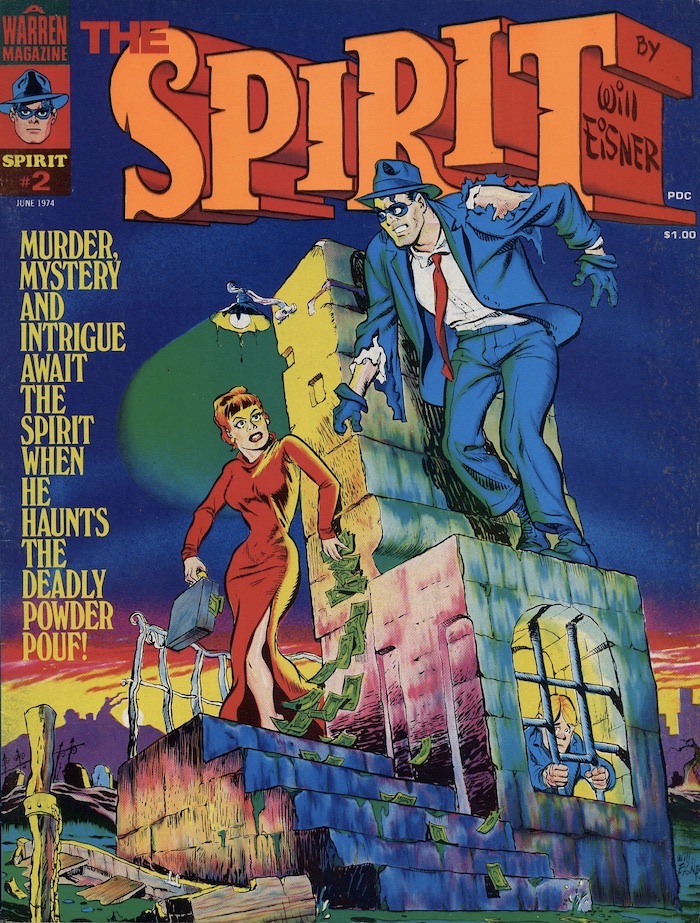
Will Eisner's The Spirit

NEIL GAIMAN:
It isn’t yet easy or comfortable for me to write about Will Eisner. He was too important, and writing this reminds me how much I miss my friend Will Eisner. Rereading his stories reminds me that I miss Will Eisner the storyteller, the craftsman, the dreamer, the artist.

When Will died in 2005, he was as respected and as revered around the world as he would let us respect and revere him. He was a teacher and an innovator. He started out so far ahead of the game that it took the rest of the world literally 60 years to catch up.

Will’s life is, in miniature, a history of American comics. He was one of the very first people to run a studio making commercial comic books, but while his contemporaries dreamed of getting out of that ghetto and into more lucrative and respectable places - advertising, perhaps, or illustration, or even fine art - Will had no desire to escape. He was trying to create an artform.

In seven pages - normally less than 60 panels - he could build a short story worthy of O Henry; funny or tragic, sentimental or hardbitten, or simply odd. The work was uniquely comics, existing in the place where the words and the pictures come together, commenting on each other, reinforcing each other. Eisner’s stories were influenced by film, by theatre, by radio, but were ultimately their own medium, created by a man who thought that comics was an artform, and who was proved right.

There are arguments today about whether or not Will was actually the first person to coin the term “graphic novel” for his 1978 book of short stories A Contract With God, the book that kicked off the third act of his creative life. There are far fewer arguments about what he actually did in the 1940s with the The Spirit stories, or about the influence he had on the world of comics throughout his creative life.

I’ll step forward here: I bought my first copy of The Spirit in 1975, in a basement comics shop in south London. I saw it hanging on a wall and knew that, whatever it was, I wanted it. I would have been about 14. Reading it on the train home, I had no idea that the stories I was reading were 30 years old. They were fresher and smarter than anything I’d seen in comics – stories that somehow managed to leave out everything that wasn’t the story, while telling wonderful tales of beautiful women and unfortunate men, of human fallibility and of occasional redemption, stories through which the Spirit would wander, bemused and often beaten up, a McGuffin in a mask and hat. I loved The Spirit then. I loved the choices that Will made, the confidence, the way the art and the story meshed. I read those stories and I wanted to write comics, too.

Two or three years later I stopped reading comics, disappointed and disillusioned by the medium as only a 16-year-old can be, but even then I kept reading The Spirit. I read those stories with unalloyed pleasure and when, as a 25-year-old, I decided it was time to learn how to write comics, I went out and bought Will’s Comics and Sequential Art, and pored over it like a rabbinical student studying his Torah.

And then time went on and all of a sudden, I was writing comics.

After becoming a comics-writing person, I met Will on many occasions, all over the world. I remember watching him receive an award for lifetime achievement in Germany - the thrill of seeing a thousand people on their feet and clapping until their hands hurt and carrying on clapping! He looked modestly embarrassed, while his wife Ann beamed like a lighthouse.

The last time we met was on the north coast of Spain, where the world fades out into a kind of warm autumnal haze. We spent almost a week together - Will and Ann and comics creators Jaime and Koko Hernandez, and me - a tight-knit group of people who spoke no Spanish. One day Ann and Will and I walked down along the edge of the sea. We walked for a couple of miles, talking about the history of comics and the future of the medium, and the people Will had known. It was like a guided tour of the medium we loved. I found myself hoping that when I got to be Will’s age I could be that sharp, that wise, that funny.

This is an edited extract from two essays in A View from the Cheap Seats (2017) by Neil Gaiman.


30 July 2021

The Autobiographical Comics of Spain Rodriguez (No. 89)

The Autobiographical Comics of Spain Rodriguez (1974-2012)

REVIEW BY ROBERT BOYD:
(from The 100 Best Comics of the Century! in The Comics Journal #210, 1999)
Spain's early autobiographical comics were macho blustery tales of his motorcycle gang, the Road Vultures. The subject matter alone strongly differentiated Spain from his wimpier colleagues, but what really stood out was Spain's approach to autobiography. While people like Robert Crumb, Aline Kominsky and Justin Green were doing cathartic, confessional autobiographical comics, Spain was hardly present in his own stories. Spain's Road Vulture stories, most of which are collected in the book My True Story, are composite portraits of a social group. Comics are particularly well-suited to this somewhat radical form of storytelling. In one panel, you can depict a dozen different things happening at once. And Spain is famous for his incredibly dense panels showing the brawls, dances and games of the Road Vultures - dozens of figures are crammed into these remarkable group shots.

Spain continued his collective biography form in the story Chicago 1968, but over time, he became willing to narrow the focus. In an ongoing series of stories in Blab!, Spain examines his life in the '50s when his two best friends were Fred Toote and Tex. The three are collectively known as the "North Fillmore Intelligentsia". They'e all bored young men out to have fun, each with a burden of sorts - Tex's growth was stunted by a deformed back, Toote is on the verge of completely losing it at any moment, and Spain - Spain's got a vulnerable heart.

Spain's easily wounded romantic nature is shown in his finest story Down at the Kitty Kat. Here Spain perfectly balances the group portrait approach of his earlier stories with the more personal approach seen in the other North Fillmore Intelligentsia stories. The Kitty Kat is where "the pimps, the fags, the whores, the curious, the alcoholic... the blues lovers, Canadian bikers, thrill seekers, junkies, insomniacs, [and] hepcats" would congregate. The North Fillmore Intelligentsia is there and Spain is nursing a broken heart. But the story doesn't linger on that - there are a lot of other interesting things happening at the Kitty Kat, and Spain the author is as interested in them as he is in dwelling on his younger self's dejection.

Spain is able to pull off these group portraits because even when showing a crowd, he shows individuals. Each character, no matter how minor, has a distinctive face, and Spain's ear for dialect helps even further to differentiate the various characters. But for an artist with such a reputation as a tough guy, Spain's greatest achievement is his moving, even tender depictions of the North Fillmore Intelligentsia.


ART SPIEGELMAN:
(from 'Spain Rodriguez: Tributes' at TCJ.com, 2012)
Looking through decades of his work over the last few days, I realized that I’d sometimes get lost following the storylines of his comics as well, tho the cadence of the drawings kept me with him, and he sure got the storytelling consistently under control over recent decades in the lifelong and relentless pursuit of his craft. His drawing always reminded me of rock-solid carpentry built out of rough-hewn lumber. Despite his serious chops and his testosterone charged adventure comics influences, his art was just too quirky and filled with too much conviction to veer into the glibness that could’ve found him a comfortable home at a “mainstream” comic company. It’s what made him an underground comix star.


ROBERT CRUMB:
(from 'Spain Rodriguez: Tributes' at TCJ.com, 2012)
I first met Spain in New York in the fall of 1968. He was living with Kim Deitch and doing a one-page strip for a weekly “underground” paper called The East Village Other. Kim was also doing a weekly strip for this paper. Spain had left Buffalo for good, left the world of outlaw bikers behind and embraced the East Village hippie scene, though there was a lot about the hippies that Spain didn’t like. “I ain’t no hippie,” he used to say. His allegiance to radical left-wing politics and his proletarian class identity were stronger and clearer than most of the youths in the hippie subculture, the “counter-culture,” as it was called. His politics were driven by genuine, authentic class anger, class hatred. I liked that about him. It was always clarifying, bracing, to discuss politics, social and cultural issues with him. Plus, he had a sharp sense of humor which leavened that anger. He was not your typical “humor-impaired” leftist, nor was he a dogmatic Marxist, spouting slogans or left-wing terminology. I appreciated those discussions with him, as he helped clarify certain things for me, politics, economics, history. He was well-read, self-educated in these areas.


FURTHER READING:


29 July 2021

Little Orphan Annie by Harold Gray (No. 62)

Little Orphan Annie (1924-1968)
by Harold Gray 

REVIEW BY DAVID LASKY:
(from The 100 Best Comics of the Century! in The Comics Journal #210, 1999)
[This review has been removed at the request of the author.]

REVIEW BY ART SPIEGELMAN:
Check out The Complete Little Orphan Annie by Harold Gray. The blank-eyed orphan was far grittier and moving than the saccharine Annie you know from the damn musical. [It] started in 1924 in a world chillingly like ours: crawling with cake-eaters, greedy bankers and international con men who exploit the hardscrabble working stiffs Annie hangs with when her “Daddy” isn’t around to protect her. The cartoonist, a tightlipped Midwestern Dickens, pushes the virtues of honesty, pluck, and hard work in adventures that can melt the heart of even hard-boiled cynics like I pretend to be.


REVIEW BY CHESTER BROWN:
I remember talking about how much I’d been influenced by Harold Gray, the cartoonist who wrote and drew Little Orphan Annie. That influence has certainly continued, along with being influenced by other cartoonists of the early-to-mid-20th century. In those days, cartoonists tended to draw full characters in the frame and not rely so much on close-ups. Very early on, close-ups were unheard of. At the time of George Herriman, you just didn’t do close-ups. Even Harold Gray, he might do a shot from the waist up, but never a full face in a panel, y’know. For whatever reason, that’s what I respond to. It seems kind of emotionally excessive to really zoom in on a face or a pair of eyes, or things like that. And it probably has a lot to do with my psychological makeup, but I don’t examine that too closely. It’s just a matter of, “Yeah, this is what I respond to, so I want to create similar sorts of work."


FURTHER READING:


28 July 2021

Julius Knipl, Real Estate Photographer by Ben Katchor (No. 56)

Julius Knipl, Real Estate Photographer (1988-1996)
by Ben Katchor

REVIEW BY BART BEATY:
(from The 100 Best Comics of the Century! in The Comics Journal #210, 1999)
I don't know if every one of Ben Katchor's Julius Knipl, Real Estate Photographer strips is comprised of eight panels, four on the top and four on the bottom, but I suppose they must be. That same drudge-like layout week after week seems all too fitting a reflection of the general mundane surroundings in which the events routinely unfold. Moreover, the plain layout reminds us to look deeply at the content of the strip itself, to recognise that the significance resides not on the surface  but in the constant evolution of minor details that come to light when you care to examine the seemingly quotidian long enough to find real beauty.

Katchor's strip is a celebration of the mundane and the ordinary. Every week he takes his readers into ordinary lives in a quest for the sublime. The breakfast special, the vacant lot, the souvenir program, these are the basis for some of the most spectacular ruminations on like ever to grace the comics page. For make no mistake about it, these are spectacular strips. Katchor's inventive use of the framing, his sketchy, sometimes hesitant lifework and his confident washes conspire to create one of the most visually arresting strips in decades. When his art is combined with his sly, subtle pacing, the result is never overpowering but it can often take your breath away just the same.

Julius Knipl, Real Estate Photographer is, without a doubt in my mind, the most literate, intelligent and consistently important weekly comic strip to have emerged since Feiffer. That so few papers and readers have recognised that fact at this point is only an indicator of how oblivious people become when they fail to search for the significance of what's right in front of their noses.


FURTHER READING:


27 July 2021

Jimbo by Gary Panter (No. 70)

Jimbo (1976-1996)
by Gary Panter

REVIEW BY TOM SPURGEON:
(from The 100 Best Comics of the Century! in The Comics Journal #210, 1999)
When Gary Panter and his signature creation Jimbo are at their best, there is no comics reading experience that compares. But even when they are not at their best, Panter and Jimbo are vitally important to the medium's growth. Panter has been called the closet cartoonist to Picasso, an apt comparison because of the way their approach to art has become as important as the art itself.

Panter's trademark approach, as pointed out by friend Matt Groening, was to mix the techniques and knowledge of fine art and painting with a sort of casual, even crude, cartooning style. He called this kind of drawing "ratty" and in an 1985 interview with Dale Luciano in the Journal went so far as to make a distinction between making marks on the paper and drawing lines: "A line is a tool for making or defining an illusion. A mark is more a thing that exists for and by itself." This was a startling approach in the mid-1970s, even when after the undergrounds' rise comics of many kinds valued slickness in art and presentation.

Panter's stance would be irrelevant if the work that resulted wasn't so compelling and remarkable. The first Jimbo strip appeared in Slash magazine in 1976, although Panter told Luciano the character had been around since 1973. Jimbo's most memorable appearances were in RAW, where Panter's work stuck out even in that crowd, and in the solo volume published by Raw Books. One should read as much Jimbo as possible, because half of what impresses is the range of technique and approached on display - all in the service of some of the most surreal sequences in comics history. Even in the series' latest incarnation, a line of poor-selling comic books from Groening's Zongo line of creator-owned comics, Jimbo fascinates. There, seemingly tossed-off panels and cartoons are slowly revealed to be a vast, complex, and eminently logical epic work, shocking in the artistic bravado of several beautifully drawn sequences. And bonus of all bonuses, that epic is a hilarious, wonderfully loose and insightful story about the awful world in which we live - a fitting vehicle for the last great everyman character of the 20th Century.


REVIEW BY MATT GROENING:
Is Jimbo: Adventures in Paradise another mind-blowing, oversized masterpiece from the legendary ink-spattered Gary Panter? I say yes. And I also say: Collect Them All!


FURTHER READING:


26 July 2021

Dick Tracy by Chester Gould (No. 33)

Dick Tracy (1931-1977)
by Chester Gould

REVIEW BY ROBERT EDISON SANDIFORD:
(from The 100 Best Comics of the Century! in The Comics Journal #210, 1999)
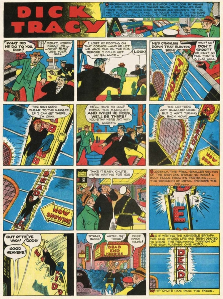
Before Bob Kane's Batman made the quirky villain criminally chic, before Hollywood movies turned trench coats and fedoras into hero's garb and before American detectives (at least the hardboiled sort) were known for brains as well as braun, there was Dick Tracy, the quintessential, as his name announces, "cop's cop".

Strong, savvy, only menacingly silent, he was a classic (and classy) type in the making since his first appearance in the Sunday, October 4, 1931 edition of the Detroit Mirror. Distant cousin to Sir Arthur Conan Doyle's Sherlock Holmes and influenced by the bloody tales of Edgar Allan Poe, Dick Tracy the comic strip was a response to Al Capone's Chicago, where its creator, Chester Gould, an Oklahoman, was living and working at the time. Initially pitched as "Plainclothes Tracy" to Captain Joe Patterson of The Chicago Tribune-New York News syndicate, the character was born to be, according to Gould, "a detective in this country that would hunt [gangsters] up and shoot 'em down."

Despite the efforts of mystery writers like Max Collins or true-to-Gould artists like Mike Lilian, the series today reads like a parody of itself, far removed from its neorealistic, slightly futuristic pulp fiction origins. It's almost a dirty thing to say a comic is less great because it is less than realistic. Yet as George Perry and Alan Aldridge observed of the strips at its best in The Penguin Book of Comics, "The criminals and crimes in Dick Tracy may be wildly exaggerated; his police work is sound and orthodox."

Because a work is ultra realistic, does that make it art or good? No. What makes good art is its truth, its sentiment and the quality of its expression. Once Gould's skills as an illustrator and storyteller grew to transcend his four-panel dailies, so, too, did the iconographic appeal of his creation.

In his introduction to The Celebrated Cases of Dick Tracy 1931-1951, Ellery Queen wrote: "Pictorially, Gould has a comic-book genius for drawing grotesquely caricatured faces and heads and for inventing grotesquely Dickensian character-names to match the faces and heads [to wit, The Brow, Flattop, Pruneface, B-B Eyes]. And Gould's plots have all the excitement and suspense of 'thriller' fiction. So Dick Tracy is blood-brother in the royal line of fictional detectives, and an authentic 'first' in the history of the form."

The original procedural detective of fiction, he is as singular creation as his yellow trench coat or two-way wrist radio.


CHESTER GOULD:
My only thought is to keep my strip faithfully realistic and powerful enough so that it will stand out from the usual run of wishy-washy everyday stuff.


REVIEW BY JERRY ROBINSON:
Chester Gould introduced a new hard-hitting type of realism [that] marked a radical and historic departure: the comics were no longer just funny.


FURTHER READING:


25 July 2021

Covering The New Yorker: Eric Drooker

Eric Drooker's drawings and posters are a familiar sight in the global street art movement, and his paintings appear frequently on covers of The New Yorker. Born and raised in New York City, he began to slap his images on the streets as a teenager. Since then, Drooker's reputation as a social critic has grown, and has led to countless editorial illustrations for The Nation, The New York Times, The Progressive etc. His first graphic novel, Flood! A Novel in Pictures won the American Book Award, followed by Blood Song, soon to be a major motion picture. After designing the animation for the film, Howl, he was hired by DreamWorks Animation.


Grand Central Terminal
The New Yorker (20 March 2020)
art by Eric Drooker

TNY: This image evokes the public art created under the Works Progress Administration, during the Great Depression. Has the pandemic changed your notions of what public art should look like in times of crisis?

ERIC DROOKER: I always loved the public art of the nineteen-thirties. I’m drawn not only to the democratic aesthetic of the W.P.A. but to the very concept of public works. During the New Deal, the U.S. government actually hired artists to create grand works in public places. And the experiment was hugely successful; it gave relief to thousands of Americans—and meaning to millions—and helped pull the country out of the Great Depression. In recent decades, concepts such as “public space” and “public health” are often branded as socialist, but many of my images are influenced by the art of that era.

Are there artists whom you turn to for solace in times of upheaval?

Francisco Goya immediately comes to mind; I find myself returning, in times of tumult, to his etchings. Pieter Bruegel, James Baldwin, and, recently, Emil Ferris have helped me through many a long, dark night. And I’m as inspired as the next guy by Bill Shakespeare. He’s thought to have written some of his best plays (“King Lear,” “Macbeth”) while the theatres were closed during an outbreak of bubonic plague.

What has been your main source of news for the pandemic?

I read a wide variety of newspapers, and especially the foreign press, which generally gives a more nuanced, rounded, and relevant picture than U.S. media.


Central Park Row
The New Yorker (12 November 2018)
art by Eric Drooker

You grew up and went to school in New York. Were you often in Central Park?

I lived downtown, and so as a kid spent far more time in Tompkins Square Park, but my family went up to Central Park frequently. I have many vivid memories of exploring it with friends and my little brother.

Has the park changed for you over the decades?

Thankfully, no. The zoo was rebuilt some years ago; a slight improvement, I’d say. (The old zoo of my childhood felt like visiting animals in jail.) Of course, the surrounding metropolis, once so wild and teeming with life, has been tamed, defanged, and now feels utterly suburban. But the park is an oasis frozen in time.

What does fall in New York recall for you?

Fall is my favorite season. The city’s towers are gray and sombre, but once you step into the park the autumn leaves put on their bright, spectacular show.

Who are your influences, in terms of artists who render urban landscapes?

Artistically, I’m in the Ashcan School - the urban lineage of John Sloan, George Bellows, Lynd Ward, Martin Lewis, Edward Hopper, and Rockwell Kent.


Rockaway Beach
The New Yorker (6-13 July 2015)
art by Eric Drooker

I’m attached to Rockaway Beach: school teachers often took us there on class trips. It’s so easy to get to: simply take the A train all the way to the end of the line. Of course, the elevated subway doesn’t literally run in the water, but as a kid it felt that way. When Hurricane Sandy hit in 2012, the entire neighborhood was submerged and thousands became homeless overnight. FEMA and the Red Cross were late to respond; parts of Rockaway remained without electricity for several months. 


Maximising Profit
The New Yorker (10 October 2011)
art by Eric Drooker

There’s this growing crowd of mostly young people down there right now, who camp out. Manhattan Island has become more and more an exclusive place for the super wealthy, or the super corporations - and a hostile place for people to live, not just for the working class, but even for the middle class. The city has become this monolithic cathedral to money.


Coney Island Express
The New Yorker (5 September 2011)
art by Eric Drooker

Coney Island is probably my favorite spot remaining in the city... a surreal dreamland, with its original, ethnic character. It has a seedy, kind of dangerous quality - it’s the underbelly of American culture, the unconscious.