Showing posts with label TCJ Top 100 Comics. Show all posts

17 August 2021

Bringing Up Father by George McManus (No. 65)

Bringing Up Father (1913-1954)
by George McManus

REVIEW BY R.C. HARVEY:
(from The 100 Best Comics of the Century! in The Comics Journal #210, 1999)
The strip called Jiggs & Maggie by most of its readers started January 12, 1913, and like many of its vintage, it was essentially a one-joke enterprise, part of a constellation of strips about various aspects of courtship and married life that George McManus (1882-1954) was producing. 

In Bringing Up Father, Jiggs, an ordinary Irish labourer, has become very wealthy and has moved his family into posh surroundings, but Jiggs persists in his old habits. And in his uninhibited naturalness (of which his socially ambitious wife Maggie is ashamed), and consequent desire to escape (for however brief a time) from the pretensions of the social world into which his wealth has thrust him (and from his wife's relentless attempts to reform him), we have both the source of the strip's comedy and an evocation of the immigrant experience in America - the ascent out of old world poverty into the relative prosperity of the new world.

A tireless escape artist, Jiggs is victorious (and persistent) enough to suggest that people are always better off being themselves than pretending to be something else. McManus multiplied endless comedic variations on this theme, preserving the aura of early comic strips well into mid-century. 

Drawing with a fine and delicate line, he embellished the strip with decorative rococo backgrounds and ornate props - the filigree of a city skyline, the graceful curlicues in the design of a stair-railing or in the pattern of Maggie's dress - and by the artful placement of solid blacks, including the stunning deployment of silhouettes. 

Still in circulation, Bringing Up Father is the second-longest running strip in history.


FURTHER READING:
TCJ: Bringing Up Father & The Rest of The Comics Page by R.C. Harvey
Bringing Up Father at Wikipedia
The Library of American Comics


16 August 2021

The ACME Novelty Library by Chris Ware (No. 17)

The ACME Novelty Library (1993-present)
by Chris Ware

REVIEW BY RICH KREINER:
(from The 100 Best Comics of the Century! in The Comics Journal #210, 1999)
Over the past six year, the 11 issues of ACME Novelty Library have established Chris Ware as the most electrifying new cartoonist of our personal fin-de-siecle. It's a title to which he couldn't resist bi-polar meaning. On the plus side, there's the fresh tingle of innovative graphics conveying earnest narratives which compel unique participatory experiences. At the opposite pole, involvement carries an unsettling jolt which, at low voltage, can be laughed off; at full power, the comic shocks like a live wire, too direct, visceral, and overwhelming to want to stay in touch with.

Ware has proven himself to be a tactical cartoonist, perhaps the most doggedly innovative practitioner since funnies froze into form. Each volume in the carefully and lavishly appointed Library represents a supremely rational invention or appropriation of forms. As excruciatingly apt crystallisations, they suggest what Joseph Cornell's exquisite boxes might have looked like had they intended to tell stories. Individual issue subvert nostalgia (childhood toys and comic book ads), quaint neutral backdrops (isolated, beautifully-drawn panels and scenes), and appropriate  innocent visual formats and languages (cartoonish characters and animation-like sequences). They reveal a sensitivity to period architecture and to the role of music as catalyst. Invariably they co-opt cheery design elements, darken the claire-ligne, and generally shutter up any ray of hope of optimism. Each is a singular provocative, mordantly humorous, utterly wrenching read, cunningly executed, as cleanly and irrefutably rendered as an electrician's blue-print.

Ware's exploration of the medium's properties spans the visual spectrum and reconstructs its borders. At an iconic level - drawing's atomic scale - cartoon quanta acquire abstracted strangeness and charm. At eye level, mechanical manipulations produce amazing narrative rebuses. At the relatively "cosmic" scale, Ware fashions whole universes in uniquely propertied packaged where alternative laws of narrative physics operate side by side with traditional artistic flourishes. "It's like reading in three dimensions", said Journal critic Andrew Arnold (TCJ #200). No need to be so Newtonian. With topographical warping and expanded horizons, Ware now has us traversing the fourth dimension of visual time.

The series format-busting instalments depict thematic stumbles through childish nightmare (where eyeballs repeatedly pop from heads), psychologically resonant images (abandoned homes are returned to and, locked, broken into), modern woes of alienation and emotional paralysis (being encased in a crude, bulky robotic shell), and fears that defy common taxonomy (a suicidal pistol shot to the head that has little effect). A slate of significant and intermittent characters dream their pathetic fantasies, embody their perverse and ruinous romanticism, and play out their sad repertoire of conditioned responses accordingly. "Characters grind dryly off each other, sliding into blank, isolated holes of disappointment and loss... The comics proceed without the usual cushioning of denial and self-delusions which allow most human beings to continue living without going mad." (Scott Gilbert, TCJ #174)

The most lovingly ground down and uncushioned is Jimmy Corrigan, The Smartest Kid on Earth. His extended story has taken on new dimensions of generational misery, particularly the impossibility of compensating for a lack of parental affection and oversight. His airless and ineluctable domestic tortures, blunt spiritual trauma, and bleak social terrain are so ghastly that Aeschylus would have shied from levelling them on the House of Atreus.

Remarkable talents force the rest of us - especially critics - to keep up. Some have slighted the book for its seeming coolness and distance from its emotional content; this sounds like the early gripe against analytic cubism for departing from the dynamics of overt emotional displays of prior artistic movements. I myself once fretted that, on the basis of the first issue, the book "may be something of a one-note, but that singular unwavering pitch is held so long and perfectly that the comic remains an altogether unique and powerful experience." (TCJ #168) Leave it to the great ones to demonstrate how that one clear, perfectly perceived and transmitted tone can be the timbre of the spheres. The ACME Novelty Library remains absolutely piercing. 


FURTHER READING:


15 August 2021

The 100 Best Comics Cartoonist Kayfabe Review!

The 100 List | The Reviewers | List Making
Cartoonist Kayfabe

The Cartoonist Kayfabe YouTube Channel is THE place to get an audio/visual inside scoop on comics from two lifetime comic-book makers - Jim Rugg and Ed Piskor! In the videos below Jim and Ed turn the pages of The Comics Journal #210, which featured The 100 Best Comics of the Century! list.


Top 100 Best Comics of the Century: Part 1


Top 100 Best Comics of the Century: Part 2


13 August 2021

Why I Hate Saturn by Kyle Baker (No. 84)

Why I Hate Saturn (1990)
by Kyle Baker

REVIEW BY BART BEATY:
(from The 100 Best Comics of the Century! in The Comics Journal #210, 1999)
Without a doubt the most loaned out comic book I have ever owned is Kyle Baker's Why I Hate Saturn, and each time it's circulated amongst my friends it's come back just a little worse for wear. My copy is dog-eared and battered, it's had drinks spilled on it, part of the cover has worn away for some reason, the spine is cracked,  a couple of pages have fallen out and it smells vaguely of Thai food for reasons I can't ascertain.

And that feels so appropriate.

This story of a young woman recklessly tossed about on the sea of fate, cut loose by a series of coincidences and plot points well beyond her control, used and abused by crazed ex-boyfriends, sisters, and editors belongs in a book that, like its lead character, is just nearly holding it together.

Baker's fashionably hip end-of-the-80s sensibility seemed mildly outrageous a the time (remember the bazooka-wielding finale?) but after the intervening decade it's beginning to look a lot like reportage. What hasn't changed is the fact the rapid-fire dialogue still crackles with life while Baker's hyper-expressive visuals still make this one of the most approachable graphic novels of the past decade.

My copy's in such bad shape because I've yet to meet someone who won't finish the book once they've started it. It's simply too fast, too funny and too difficult to put down. So it gets read and read and read again.

It may not look so pretty up on the shelf, but I'd trade a dozen of those pristine graphic novels that I've read once and then put away for just one more of these books that looks like it's been read by a small army. Because it has been.


REVIEW BY HO CHE ANDERSON:
(from an Instagram post, 2021)
Kyle Baker! This man’s work was like a depth charge going off in my brain. The Shadow was my intro to his stuff; it was only later I discovered his more personal work like Cowboy Wally. Then came this bad boy and Kyle ascended to the levels of Los Bros, and (cough, cough) Woody Allen (this book feels a lot like an Allen-style New York comedy). Hilarious, beautiful, highly recommended.


12 August 2021

The New Yorker Cartoons of Charles Addams (No. 58)

The New Yorker Cartoons of Charles Addams (1935-1988*)
* New Addams cartoons appeared in The New Yorker well after his death.

REVIEW BY LARRY RODMAN:
(from The 100 Best Comics of the Century! in The Comics Journal #210, 1999)
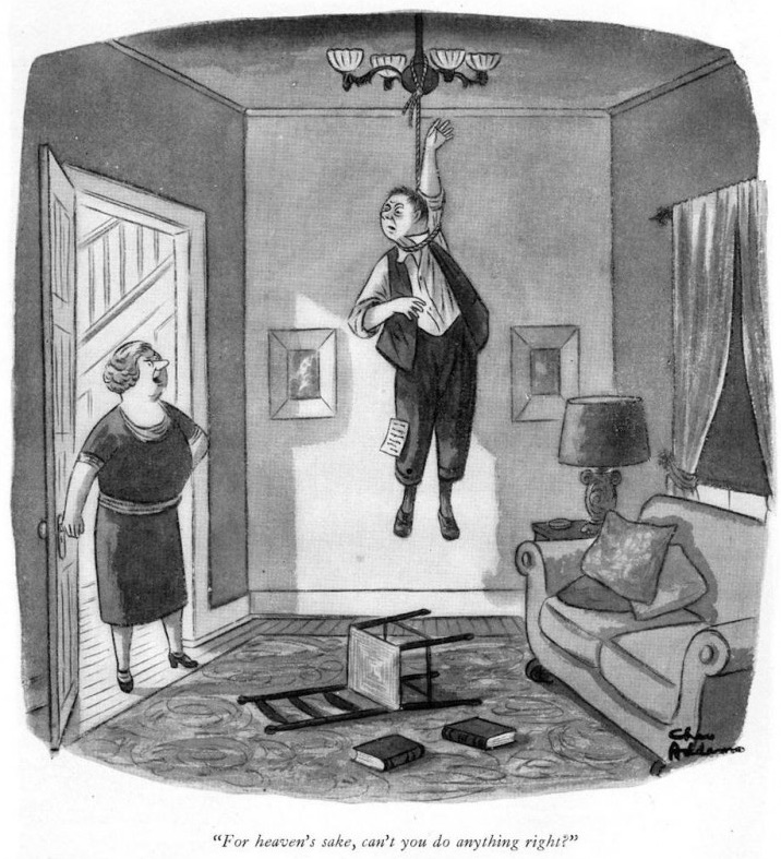
Charles Addams morbid fancy was just beneath the surface when his first cartoon appeared in The New Yorker in 1935, but it's possible that the gag - featuring an out-of-his-depth, milquetoast hockey player - hinted at a future career of unsettling, sometimes violent incongruities.

This apparently gentle soul went on to produce disturbing work for over 60 years. In keeping with The New Yorker's perforation of social affection, these cartoons solicited a cruel shock of recognition at the expense of gentility. Behavioural codes (never mind the laws of physics) were completely subverted, artfully suggesting the most uncivilised outcome.

The characters who make up the Addams Family began to appear in his cartoons by 1937, jelling Addams' mordant identity for generations of readers. While they're not the persistent focus of his work, it's easy to see what people responded to in them. They're warped, yet friendly; an eccentric presence within an often threatening framework. His mise en scene conjured the mildew of Victorian gothic conservatories, intimating that forgotten customs, such as laying out the recently deceased in the front parlour, would not be considered off-base to the maladjusted characters in their hedge against the outside world.

Verbally describing The New Yorker single-panel cartoons, with their interrelated captions and drawing, can be a flat, awkward proposition. It's probably unnecessary in Addams' case, anyway. His situational cartoons, in themselves, are familiar icons. Just about everyone has seen his cartoons of ski tracks which run on both sides of the tree. He excelled at captionless "What's wrong with this picture?" cartoons, and drawings of bizarre whimsy and surreality.

Striking a precarious balance of urbanity and malevolence, Addams showed us the banality of evil - in a perky, cheerful manner - which only made things worse.


FURTHER READING:


11 August 2021

Binky Brown Meets the Holy Virgin Mary by Justin Green (No. 9)

Binky Brown Meets the Holy Virgin Mary (1972)
by Justin Green

REVIEW BY CHARLES HATFIELD:
(from The 100 Best Comics of the Century! in The Comics Journal #210, 1999)
Binky Brown is the longest, and most profound, piece of sustained narrative to emerge from underground comix. A shocking, riotous, and absurdly moving memoir of Catholic guilt, Binky offers both harrowing psychological insight (into the condition since labeled Obsessive-Compulsive Disorder) and stunning graphics, the latter courtesy of Green's eclectic vocabulary and dead-on parodic instincts. Rife with pointed symbolism, the pages of Binky riff deliriously on Durer, Crumb, Chester Gould, Superman comics, and scores of other sources, with a superb technique that at times approaches engraving-like texture. The story begins lucidly enough, clearly dividing fantasy from reality, but eventually its finely observed realism collides and merges with antic, dreamlike symbolism. Green's restless, protean style demonstrates that realistic, personal comics need not be tethered to any literal-minded notion of illustrative realism - a lesson not lost on the many cartoonists who have been influenced by Binky's blend of autobiography and graphic fantasy.

Since being published by Last Gasp in 1972, Binky has inspired seminal first-person comics by such cartoonists as Crumb, Kaminsky-Crumb and Spiegelman. On its own terms, it remains an extraordinary achievement: a surreal, bleakly humourous mixture of anti-Catholic polemic and scourging confession. Over its 40 pages, Green uncorks his psyche, examining in harrowing detail the intersection of Catholic doctrine and his own neurotic, guilt-driven personality. Religious fervour and psychological obsession feed into each other, turning "Binky" (Green) into a fretfulzealot whose life is all but consumed by radical self-doubt. Binky is devoted to (and exhausted by) constant checking, double-checking, and triple-checking to make sure no sins are committed - or at least none left unatoned.

Binky's obsession involves imaginary rays of light emanating from his penis, his limbs, and even the material objects around him. These rays must be prevented at all costs from sticking representations (visual or verbal) of the Catholic Church, and in particular the Virgin Mary. This is of course an artist's conceit: the rays threaten to converge on the Virgin in much the same way that, in classical perspective, imaginary lines connect parallel objects to a common vanishing point. The world of Binky is one of grid-like precision, a landscape crisscrossed by invisible vectors of sin. Green's artwork both reflects and resists this linearity, with a riot of mixed forms: rigid and angular versus rounded and fleshy. Indeed, his carefully  worked pages enact a struggle between hard-edged asceticism (in his words, "order, uniformity, rigidity, and obedience") and indulgent sensuality. Binky crackles with this tension.

What makes Binky so bold and effective is the extravagance of Green's visual metaphors. While he faithfully captures the cultural landscape of his formative years, Green also deploys a series of bizarre symbols that capture young Binky's inner landscape just as precisely. At first such conceits are confined to young Binky's dreams and fantasies, but they gradually assert themselves through passages of Green's anti-Catholic argument (eg parochial school students are brainwashed and turned into marionettes, replete with strings). Eventually, elements of fantasy begin to intrude on Binky's everyday life: visual metaphors multiply as Binky becomes increasingly dominated by his obsessive guilt. As Binky's world becomes more and more pinched and cloistral, Green's artwork breaks free, employing a huge arsenal of design conceits, graphic devices and rendering styles. Shifting layouts, labels, signboards and mock-scholarly annotations run rampant, while open, white panels contrast with zip-a-tone grays and densely cross-hatched backgrounds. Those expecting a documentary realism, to authenticate Green's polemic, will be perplexed by his anarchic visual imagination.

Reflexive playfulness characterises Binky from beginning to end. For example, the penultimate panel finds the hero, having spurned Catholicism, eyeing an overdue stack of library books: First Catechism, Perspective and Fun With a Pencil. This single image underscores not only Green's relationship to the Church, but also his grasp of classical art and his dedication to drawing. Even more: in the background, a cartoon by R. Crumb hints at another source of inspiration. Metonymically, Crumb (himself a lapsed Catholic) stands in for the underground comix, then in their heyday, which liberated Green artistically, inspiring him to set forth his own story in comics form.

Of course, the "pencil" in the third title, Fun With a Pencil, also substitutes metamorphic ally for the feared penis, the original source of the rays which have so monopolised Binky's imagination.  Green employs this metaphoric likeness from the outset: the frontispiece is a grimly hilarious image of the naked artist, hands bound behind his back, a pen gripped in his mouth, with a long scythe-like blade poised dangerously close to his groin. Both artist's tool and endangered phallus are impious and inadmissible (Green dips his pen in God's blood; his very word balloon bears a crown of thorns). Here Green, in a confession to his readers, admits that Binky represents an effort to "purge" himself of a "compulsive neurosis." Begging indulgence for focusing on "the petty conflict in [his] crotch", the cartoonist suggests that portraying his neurosis in "easy-to-understand comic-book format" may actually help others similarly afflicted, and thus intervene in a larger social problemm: "If all the neurotics were tied together we would entwine the globe many times over in a vast chain of human suffering."

With this, Green hits on one of the great virtues of autobiography: its ability to expose private trauma as a public issue, and to focus our attention on the relationship between self and society. It is this social dimension which lifts Binky above mere calculated outrage and makes it insightful, provocative, and, finally, wonderfully moving.


REVIEW BY ART SPIEGELMAN:
It' s no small thing to invent a genre. I readily confess that without his work there could have been no Maus.


REVIEW BY ROBERT CRUMB:
Justin Green - he's out of his mind. I love every stroke of his nervous pen, every tortured scratch he ever scrawled. He was among the top storytelling artists of the first wave of “underground” comics, a darkly humorous social commentator, and the FIRST, absolutely the FIRST EVER cartoonist to draw highly personal autobiographical comics. Binky Brown started many other cartoonists along the same path, myself included. Few have come close to him in revealing themselves in this medium. For me, there’s nothing more enjoyable than the confessions of a tortured soul, if the story is well-told, entertaining, honest, and then funny on top of it. If that’s what you’re looking for, and if you like it in comic book form, Justin Green is the first and the best!


REVIEW BY CHRIS WARE:
Thank God that it’s getting harder to imagine a time when comics were a lowly commercial hack-job for illustrators who couldn’t find work anywhere else. It’s even harder to imagine the effect of a comic book in such a cultural climate by an artist who tore himself to pieces right on the page, trying to get at the core of something that was literally consuming him, but this is what Justin Green did. With Binky Brown, comics went practically overnight from being an artform that saw from the outside in to one that sees from the inside out. His internal struggle can practically be felt in the drawings themselves, the style sometimes changing from panel to panel - sometimes even within the panels themselves - all in an effort to simply arrive at The Truth. Comics wouldn’t be what they are today without this book, and this new edition places it in its proper place in the comics literary canon. Thank God for Binky Brown. And thank God for Justin Green.


FURTHER READING:
TCJ: The ABCs of Autobiography Comics by Patrick Rosenkranz (2011)


10 August 2021

The Willie & Joe Cartoons by Bill Mauldin (No. 85)

The Willie & Joe Cartoons (World War II Era)
by Bill Mauldin

REVIEW BY ROBERT BOYD:
(from The 100 Best Comics of the Century! in The Comics Journal #210, 1999)
Bill Mauldin acquired his fame as an anti-authoritarian critic in the most autocratic of societies, the U.S. Army during World War II: in the panel cartoons he drew for military newspapers, he depicted the life of the "dogface" (foot soldier) the way it was. Rained on, shot at and kept awake in the trenches day and night, the combat soldier was wet, scared, city and tired all of the time; and Mauldin's spokesman - the scruffy, bristle-chinned, stoop-shouldered Willie and Joe in their wrinkled and torn uniforms - were taciturn but eloquent witnesses on behalf of the persecuted. Through simple combat-weary inertia, they defied pointless army regulation and rituals: they would fight the war, but they wouldn't keep their shoes polished. 

Their popularity was an affront to generally accepted notions of military propriety, but Mauldin never wavered even after General George S. Patton leaned on him. "I knew these guys best," Mauldin said, " and [the cartoons] gave the typical soldier an outlet for his frustrations, a chance to blow off steam." 

Returning to civilian life a celebrity, Mauldin continued the same satirical approach he'd followed in the military, but cartoons that were critical of post-war America were seen as "political" rather than "entertaining", and newspapers began dropping his feature, saying they had their own political cartoonists.  Then in 1958, he simply became a political cartoonist, replacing the dour Daniel Fitzpatrick at The St. Louis Post-Dispatch, and suddenly, Mauldin's liberal perspective had a home again. "I'm against oppression," he said, " - by whomever."


JEAN SCHULZ:
Although he was basically reserved, Sparky [Charles M. Schulz] was not afraid to publicly declare his admiration for fellow cartoonists and authors... I am not sure how Sparky and Bill first became acquainted, but I think it is likely that Sparky contacted an editor at United Features Syndicate, which then handled both Peanuts and Mauldin’s cartoons, and asked that an introduction be made. At any rate, Sparky and Bill had a telephone relationship for a number of years, and what I remember most are the times he would come home and share with me the war stories that Bill had regaled him with over the phone earlier that day. One of Mauldin’s best-known cartoons is of the soldier shooting his Jeep. Sparky has a bronze sculpture of that scene in his studio. Sparky admired Bill’s ability to be “in the face” of the officers, always sticking up for the little guy.


TODD DePASTINO:
Bill Mauldin retired from cartooning in 1991 after an injury to his drawing hand. Stricken by Alzheimer’s disease, he entered a nursing home in 2002. In the months before he died, old veterans and their relatives sent him over 10,000 cards and letters They thanked him for keeping their humanity alive during that most savage of wars. These tributes, more than any honor or award, rank Bill Mauldin as one of the greatest artists of the twentieth century. Bill Mauldin died on January 22, 2003. He is buried at Arlington National Cemetery.


DAVE SIM:
(from a letter to Bill Mauldin, reprinted in Cerebus Vol 16: The Last Day, 2004)
...the Willie and Joe cartoons still hold up as tip-top examples of the cartoonist's craft more than half a century later. Great composition, great expression, great body language, great execution, buoyant spontaneous brush strokes, spotting of blacks. I'll stop now before I start sporting a beret and a pointy little goatee. But to say the least, you always made the most difficult parts of cartooning look easy... If even a handful of my own readers still find my own work half so memorable decades after I have at last put down my pen and brush, I will count myself fortunate, indeed. To use the phrase which always denoted my father's highest accolade, Mr Mauldin, "Y'done good."


FURTHER READING:


09 August 2021

The Idiots Abroad by Gilbert Shelton & Paul Mavrides (No. 44)

The Idiots Abroad (1982-1987)
by Gilbert Shelton & Paul Mavrides

REVIEW BY RAY MESCALLADO:
(from The 100 Best Comics of the Century! in The Comics Journal #210, 1999)
Some say great works of art should be timeless. Here's one that's not only dated, it's dated twice over... and works wonderfully for that reason. As 1960s hippie throwbacks hurled into the cruel world of the 1980s, can the Fabulous Furry Freak Brothers survive? Idiots Abroad is the only Freak Brothers epic, spanning three issues of the slower-than-erratic comic. That alone could make it the greatest Freak Brothers story ever, but the length of the story is matched by the scope of the Brothers' travels - and that, in turn, is matched by the scope of Shelton and Mavrides' satire.

What starts as an innocent trip to score cheap dope leads to a worldwide Freak diaspora. Fat Freddy is abducted by soccer players and travels throughout Europe being chased by terrorists (who are in turn pursued by the American military), befriending the eccentric genius Pablo Pegaso and searching desperately for decent American food. Freewheelin' Franklin heads to Central America where he deals with survivalists, banana republic dictators and pirates. And in the genius stroke that would eventually tie together the chaos, Phineas heads to the Middle East and becomes the head of a worldwide religion movement called Fundaligionism ("It sounds like fun... it has a fund... it's got that old time 'legion...") whose followers sing out, "Hallelujah-gobble!"

The counterculture paranoia for authority rings true as greed - for money, power, soccer-shaped bombs - is renewed ridiculously threatening and taken to the illogical extreme of a New World Order government. The notion that organised religion is the tool of an international shadow cabinet has been expressed before (often by those with the same recreational habits as the Freaks), but Shelton has a gift for taking such conspiracy theories and making then hilarious extensions of his characters. As do all great satirists, he doesn't play fair with his targets but shows why fairness wouldn't make any sense anyway. Moreover, his delight in putting his main trio through their paces remains unabated: somehow, the Freak Brothers continue to amuse with their individual quirks and idiocies. Though Phineas turns Freddy and Franklin into the ultimate Renaissance men, the duo turn their back on the Freak World Order and bring the complex weave of plot lines to a glorious crashing finale. The Freaks shall Freaks remain, it would seem - and hopefully will continue to be counterculture throwbacks well into the next millennium. Hallelujah-gobble, indeed.


FURTHER READING:


05 August 2021

Los Tejanos by Jack Jackson (No. 95)

Los Tejanos (1982)
by Jack "Jaxon" Jackson

REVIEW BY GARY GROTH:
(from The 100 Best Comics of the Century! in The Comics Journal #210, 1999)
Inspired by Harvey Kurtzman's war stories at EC, Jack Jackson has taken his mentor's obsession with the accurate and iconoclastic depiction of history several steps further in a series of impressive historical graphic novels of which Los Tejanos may be the best.

Los Tejanos is the story of the Texas-Mexican conflict between 1835 and 1875. Jackson's view of the conflict is seen through the eyes of the tejano (literally Texan of Mexican, as distinct from anglo, heritage) Juan Seguin. It is through Seguin that Jackson humanises and provides scale for this vast and complex story; the history is filtered through his consciousness. Seguin is a pivotal and tragic figure who, due to inexorable political circumstances and innate nationalistic prejudices, was considered suspect to the anglo Texans and, ultimately, a traitor from the Mexican point of view. The equal opportunity hostility directed toward Seguin allows Jackson the luxury of not taking sides (except perhaps Seguin's) that achieves a kind of passionate, hard-won impartiality toward both (or I should say, including the U.S., all three) sides. 

There is, to all of Jackson's historical work, an unflinching no-nonsense approach, of which Los Tejanos is characteristic; that no side in this conflict is flattered is a testament to Jackson's own independence as an historian. The lineage of Texas' independence and eventual absorption into the Union is a political snakebite, which Jackson navigates with consummate skill and clarity.

Jackson has managed to compress an intimidating quantity of historical facts and information while never losing sight of the narrative's human dimension by refining the language of comics to serve his unique needs as an historian and comics artist: a heavy reliance on captions combined with an aphoristic visual approach whereby each panel serves as a visual synecdoche, summarising incident or motivation, capturing the essence of an historical moment. Such work could only have been accomplished by an artist who cares deeply about the gravitas of both art and history.


GARY GROTH:
(from Remembering Jack Jackson in The Comics Journal #278, October 2006)
...I'd see Jack every summer at the Dallas-Con. We'd always get together for lunch or dinner or drinks at the end of the night. In person, Jack very much reflected his meat-and-potatoes aesthetic: He had a straight forward, no-nonsense approach to conversation, eschewing bonhomie and bullshit, always focusing in on the salient points, never trying merely to score points, always Socratic and probing by nature. He was never a grandstander and never much concerned with status, either. He busted his ass, was never compensated adequately, and remained stedfast in his creative convictions in the face of indifference, hostility and commercial failure. He knew what he was doing had value. I don't have to point out how rare this kind of commitment is...


04 August 2021

Feiffer / Sick, Sick, Sick by Jules Feiffer (No. 6)

Feiffer / Sick, Sick, Sick (1956-1965)
by Jules Feiffer 

REVIEW BY ROBERT BOYD:
(from The 100 Best Comics of the Century! in The Comics Journal #210, 1999)
Jules Feiffer began his strip Sick, Sick, Sick in the Village Voice in 1956. He later claimed that it was a cynical move, designed to put him on the map by putting his work in front of the New York book editors who had previously given him the bum's rush. But this doesn't ring totally true when one sits down and reads the strips. It took Feiffer a little while to get up to full steam, but once he did, Sick, Sick, Sick (later retitled Feiffer) became a classic - a razor-sharp satire of the lives of hip young urbanites and the world they inhabited. 

His quintessential character Bernard Mergendelier, a young urban hippie type destined for a life of mediocrity. He craves power over his own life - his love life, his work, his day-to-day existence - and simultaneously worships and despises anyone who does have that kind of power. Hence his ambiguous relationship with his friend Huey, the Brando-esque jerk to whom all the women flock. Feiffer gives Huey some of his best lines: "Put on your shoes, I'll walk you to the subway' is repeated ironically by R. Crumb's loathsome protagonist in Snoid. The sequence in which Bernard is discussing love and respect while Huey makes eye-contact with a "phoney little magazine chick" is a classic comparison of two types.

As Feiffer and the country moved deeper into the '60s, Feiffer evolved into more of a political strip, and Feiffer is still one of the best political cartoonists alive. He works without the symbolic characters that have been the political cartoonists stock in trade since Nast. His approach to political cartooning is original and obviously an influence on younger political cartoonists like Toles and Tom Tomorrow.

It almost seems too much to add that Feiffer is an excellent playwright, screenwriter, and most recently, children's book author. And as a cartoonist, Feiffer's been willing to radically experiment, as best exemplified by the oddly fascinating cartoon novel Tantrum. It is difficult to imagine any other successful strip cartoonist taking such a bold aesthetic risk as Feiffer did with Tantrum

But his weekly strip remains his most influential work. In the world of daily strips, it is impossible to conceive of Doonesbury without Feiffer. And perhaps more important, he showed cartoonists that it was possible to have relatively uncensored, adult-oriented weekly comic strips. As underground newspapers evolved into alternative newsweeklies all over America, Feiffer's descendants proliferated. Without Feiffer, there may have been no weekly strips be Matt Groening, Lynda Barry, Ben Katchor, Kazans, Carol Lay, Tony Millionaire, Tom Tomorrow and many other. But few of these younger cartoonists have yet matched the brilliance of the first 10 years of Sick, Sick, Sick.


03 August 2021

The EC War Comics by Harvey Kurtzman & Others (No. 12)

The EC War Comics (1950-1955)
by Harvey Kurtzman & Others

REVIEW BY R.C. HARVEY:
(from The 100 Best Comics of the Century! in The Comics Journal #210, 1999)
In his war stories for the EC adventure titles Two-Fisted Tales and Frontline Combat, Harvey Kurtzman (1924-1993) raised the art of storytelling in comics to a new level while at the same time investing the stories with a realism that infused them with moral passion. The launch of both books coincided with the beginning of the Korean "police action" in the early 1950s, and Kurtzman seized the opportunity to tell the truth about war. War stories in most comic books at the time championed American servicemen at the expense of the enemy's humanity, proclaimed unequivocally the justice of the United Nation's cause, and glorified battlefield action by making killing, bloodshed and death seem patriotic. This, Kurtzman believed, was a lie. And he set out to erase the lie.

It was this crusade that inspired Kurtzman's legendary passion for research. Only the truth can eradicate a lie, and to tell the truth, one needed to study history and news reports in order to unearth fact and to be able to portray facts accurately. Kurtzman had been impressed with Charles Biro's storytelling in the Lev Gleason crime comic books. "He offered stories based on fact, presented in a hard-edged documentary style, a highly original approach to comics back then," Kurtzman said. He recalled the excitement he felt reading those stories, "the shock" of being brought "nose-to-nose with reality." He set out to do the same thing with his war stories. The realities of the battlefield would destroy the phony, glamorous vision of war.

But Kurtzman's war stories were not anti-war: in deglamourising warfare, he did not oppose the effort in Korea. His stories acknowledged the necessity of the fight - not only in Korea but in wars generally. Against that necessity, Kurtzman balanced recognition of the over-all futility of warfare. His unique achievement was to strike the balance. But in those days - in the wake of the superpatriotism of World War II just concluded, during another war in which veterans of the previous conflict were also fighting and dying - to publish such a balanced view was extraordinarily unprecedented. While Kurtzman's stories recognised the causes of wars and the necessity of fighting them, he dramatised the loss, the profligate waste of human life that characterised war everywhere in every time.

To show these consequences, Kurtzman's stories often focused on the fate of a single individual. One story chronicled in elaborate detail the steps a Korean farmer took in building his house - picking a site, laying the foundations, erecting a framework, making bricks, putting it all together. Then on the day he finishes his work, a bomb falls on the house and in a second destroys the painstaking labour of months. In another story, a dying soldier wonders about the arbitrariness of timing: if he hadn't stopped for a moment to tie his shoe, he would have been 20 feet further down the road and when the bomb hit - he would have been far enough away to survive.

In telling the stories, Kurtzman paced his narrative more dramatically than others did at the time. To focus on a key sequence, for instance, he sometimes deployed a series of almost static visuals, the progression of  the panels building to a conclusion with "voice-over" captions while the camera tracked in for a final close-up, giving the last moment of the sequence emotional intensity. This restrained kind of manoeuvre gave his stories the even-handed patina of a documentary, enhancing their realistic aura. A stickler for execution, Kurtzman painstakingly laid out every page of his stories, penciling in the action and the verbiage; and he demanded that the illustrators follow his layouts exactly.


REVIEW BY FRANK MILLER:
(from an interview in The Comics Journal #101, 1985)
EC does represent the most consistently well-crafted line of comics to date. The cartoonists working for EC - Wood, Davis, Severin and Johnny Craig, who deserves to be acknowledged as one of the true greats of the field - consistently produced the finest work of their careers. Craig's and Harvey Kurtzman's work, in particular, are examples of superior talent and dedication to craft. Anyone who hasn't purchased the Cochran reprints, particularly of Craig's crime comics and Kurtzman's war books, is missing out on thrilling work.


FURTHER READING:


02 August 2021

Polly & Her Pals by Cliff Sterrett (No. 18)

Polly & Her Pals (1912-1958)
by Cliff Sterrett

REVIEW BY R.C. HARVEY:
(from The 100 Best Comics of the Century! in The Comics Journal #210, 1999)
The first comic strip with a woman as title character, Cliff Sterrett's masterpiece debuted December 4, 1912. At first dubbed Positive Polly, it focused on one of the social phenomena of the time, the "new woman": Polly Perkins is a thoroughly modern self-possessed young miss who is attending college and otherwise making a place for herself in the world outside the home. Her rebellion against society's stereotypical expectation for women amazes and alarms her more old-fashioned parents, particularly poor Paw, whose traditional sensibilities are constantly bombarded by new fashions in both clothes and manners, his once secure and sane Victorian world in a state of continual comic turmoil.

Although Sterrett (1883-1964) changed the strip's title to indicate its broadening focus, even Polly & Her Pals does not reflect the true basis of the comedy - the clash of mores between generations. Paw's exasperated outrage inspired most of the laughter, and he was soon the star of the strip. To wring everything he could from the situation, Sterrett surrounded the old man with a cast of idiosyncratic secondary characters whose assorted eccentricities were designed expressly to assail Paw with modernity in all its variations and varieties. Polly eventually faded into the background, but in the early days of the strip, she attracted considerable attention for daring to display her long legs. And in her facial profile - bulging brow, tiny nose, pouting mouth - Sterrett established a convention for depicting a pretty girl's face that was widely adopted by other cartoonists. But little else about Sterrett's way of drawing could be readily imitated.

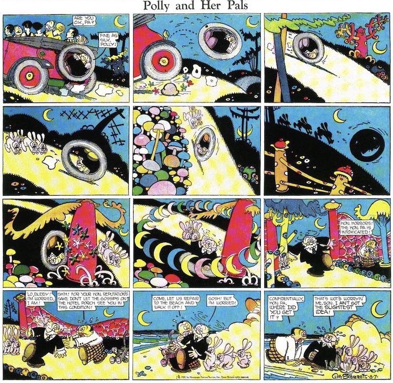
As his style matured in the mid-twenties, Polly became a spectacular symphony of line design in black and white in daily strips and a riot of primary colours on Sundays - rampant reds, succulent yellows, pristine blues. The stylistic earmark was the interplay of patterned line and geometric shape. Checks, strips, black solids, quilt-like patchworks, and surrealistic backgrounds were juxtaposed in panels populated by creatures whose anatomy was wholly abstract, completely geometric in cubism's Futuristic manner: heads were simple spheres; bodies and limbs, cylindrical tubes. This abstraction of the human form permitted widely unrealistic but supremely comic expressiveness in both face and feature, and Sterrett exploited the possibilities with playful exuberance. 

Kitty, the family pet, for instance, became a completely geometric cat, assuming a larger significance in the strip's motif: her geometry made her as anthropomorphic as her owner, and she emerged as a Greek chorus, commenting on Paw's predicaments by outright imitation of his actions or in her exaggerated reaction to his moods.

Inspired by the surrealistic impulses of modern art as well as Futurism, Sterrett's Sunday pages in the late twenties in particular were unparalleled in their comic distortions of reality, in their subordination to abstract design of the representational mission of the drawings. The pages were agog in exotic potted plants, fanciful embroidered pillows, abstracted cityscapes, outlandish tubular trees with electric foliage zig-zagging across the sky. Any many of the gags seemed dictated by Sterrett's desire to draw certain subjects in certain ways, often experimental. It's midnight on one Sunday and the panels are mostly black, the action revealed solely in patches of light; on a Sunday at the beach, all the action id depicted under water, and we see only the distorted bottom portions of the characters wading. 

By the 1930s, Sterrett's drawings were less inventive: the surrealistic elements disappeared, leaving just the geometric forms of Futurism, and these had become mere conventions. Suffering from arthritis, Street surrendered the art chores on the dailies to an assistant; the last Sunday Polly was published June 15, 1958.


FURTHER READING:


30 July 2021

The Autobiographical Comics of Spain Rodriguez (No. 89)

The Autobiographical Comics of Spain Rodriguez (1974-2012)

REVIEW BY ROBERT BOYD:
(from The 100 Best Comics of the Century! in The Comics Journal #210, 1999)
Spain's early autobiographical comics were macho blustery tales of his motorcycle gang, the Road Vultures. The subject matter alone strongly differentiated Spain from his wimpier colleagues, but what really stood out was Spain's approach to autobiography. While people like Robert Crumb, Aline Kominsky and Justin Green were doing cathartic, confessional autobiographical comics, Spain was hardly present in his own stories. Spain's Road Vulture stories, most of which are collected in the book My True Story, are composite portraits of a social group. Comics are particularly well-suited to this somewhat radical form of storytelling. In one panel, you can depict a dozen different things happening at once. And Spain is famous for his incredibly dense panels showing the brawls, dances and games of the Road Vultures - dozens of figures are crammed into these remarkable group shots.

Spain continued his collective biography form in the story Chicago 1968, but over time, he became willing to narrow the focus. In an ongoing series of stories in Blab!, Spain examines his life in the '50s when his two best friends were Fred Toote and Tex. The three are collectively known as the "North Fillmore Intelligentsia". They'e all bored young men out to have fun, each with a burden of sorts - Tex's growth was stunted by a deformed back, Toote is on the verge of completely losing it at any moment, and Spain - Spain's got a vulnerable heart.

Spain's easily wounded romantic nature is shown in his finest story Down at the Kitty Kat. Here Spain perfectly balances the group portrait approach of his earlier stories with the more personal approach seen in the other North Fillmore Intelligentsia stories. The Kitty Kat is where "the pimps, the fags, the whores, the curious, the alcoholic... the blues lovers, Canadian bikers, thrill seekers, junkies, insomniacs, [and] hepcats" would congregate. The North Fillmore Intelligentsia is there and Spain is nursing a broken heart. But the story doesn't linger on that - there are a lot of other interesting things happening at the Kitty Kat, and Spain the author is as interested in them as he is in dwelling on his younger self's dejection.

Spain is able to pull off these group portraits because even when showing a crowd, he shows individuals. Each character, no matter how minor, has a distinctive face, and Spain's ear for dialect helps even further to differentiate the various characters. But for an artist with such a reputation as a tough guy, Spain's greatest achievement is his moving, even tender depictions of the North Fillmore Intelligentsia.


ART SPIEGELMAN:
(from 'Spain Rodriguez: Tributes' at TCJ.com, 2012)
Looking through decades of his work over the last few days, I realized that I’d sometimes get lost following the storylines of his comics as well, tho the cadence of the drawings kept me with him, and he sure got the storytelling consistently under control over recent decades in the lifelong and relentless pursuit of his craft. His drawing always reminded me of rock-solid carpentry built out of rough-hewn lumber. Despite his serious chops and his testosterone charged adventure comics influences, his art was just too quirky and filled with too much conviction to veer into the glibness that could’ve found him a comfortable home at a “mainstream” comic company. It’s what made him an underground comix star.


ROBERT CRUMB:
(from 'Spain Rodriguez: Tributes' at TCJ.com, 2012)
I first met Spain in New York in the fall of 1968. He was living with Kim Deitch and doing a one-page strip for a weekly “underground” paper called The East Village Other. Kim was also doing a weekly strip for this paper. Spain had left Buffalo for good, left the world of outlaw bikers behind and embraced the East Village hippie scene, though there was a lot about the hippies that Spain didn’t like. “I ain’t no hippie,” he used to say. His allegiance to radical left-wing politics and his proletarian class identity were stronger and clearer than most of the youths in the hippie subculture, the “counter-culture,” as it was called. His politics were driven by genuine, authentic class anger, class hatred. I liked that about him. It was always clarifying, bracing, to discuss politics, social and cultural issues with him. Plus, he had a sharp sense of humor which leavened that anger. He was not your typical “humor-impaired” leftist, nor was he a dogmatic Marxist, spouting slogans or left-wing terminology. I appreciated those discussions with him, as he helped clarify certain things for me, politics, economics, history. He was well-read, self-educated in these areas.


FURTHER READING:


29 July 2021

Little Orphan Annie by Harold Gray (No. 62)

Little Orphan Annie (1924-1968)
by Harold Gray 

REVIEW BY DAVID LASKY:
(from The 100 Best Comics of the Century! in The Comics Journal #210, 1999)
[This review has been removed at the request of the author.]

REVIEW BY ART SPIEGELMAN:
Check out The Complete Little Orphan Annie by Harold Gray. The blank-eyed orphan was far grittier and moving than the saccharine Annie you know from the damn musical. [It] started in 1924 in a world chillingly like ours: crawling with cake-eaters, greedy bankers and international con men who exploit the hardscrabble working stiffs Annie hangs with when her “Daddy” isn’t around to protect her. The cartoonist, a tightlipped Midwestern Dickens, pushes the virtues of honesty, pluck, and hard work in adventures that can melt the heart of even hard-boiled cynics like I pretend to be.


REVIEW BY CHESTER BROWN:
I remember talking about how much I’d been influenced by Harold Gray, the cartoonist who wrote and drew Little Orphan Annie. That influence has certainly continued, along with being influenced by other cartoonists of the early-to-mid-20th century. In those days, cartoonists tended to draw full characters in the frame and not rely so much on close-ups. Very early on, close-ups were unheard of. At the time of George Herriman, you just didn’t do close-ups. Even Harold Gray, he might do a shot from the waist up, but never a full face in a panel, y’know. For whatever reason, that’s what I respond to. It seems kind of emotionally excessive to really zoom in on a face or a pair of eyes, or things like that. And it probably has a lot to do with my psychological makeup, but I don’t examine that too closely. It’s just a matter of, “Yeah, this is what I respond to, so I want to create similar sorts of work."


FURTHER READING:


28 July 2021

Julius Knipl, Real Estate Photographer by Ben Katchor (No. 56)

Julius Knipl, Real Estate Photographer (1988-1996)
by Ben Katchor

REVIEW BY BART BEATY:
(from The 100 Best Comics of the Century! in The Comics Journal #210, 1999)
I don't know if every one of Ben Katchor's Julius Knipl, Real Estate Photographer strips is comprised of eight panels, four on the top and four on the bottom, but I suppose they must be. That same drudge-like layout week after week seems all too fitting a reflection of the general mundane surroundings in which the events routinely unfold. Moreover, the plain layout reminds us to look deeply at the content of the strip itself, to recognise that the significance resides not on the surface  but in the constant evolution of minor details that come to light when you care to examine the seemingly quotidian long enough to find real beauty.

Katchor's strip is a celebration of the mundane and the ordinary. Every week he takes his readers into ordinary lives in a quest for the sublime. The breakfast special, the vacant lot, the souvenir program, these are the basis for some of the most spectacular ruminations on like ever to grace the comics page. For make no mistake about it, these are spectacular strips. Katchor's inventive use of the framing, his sketchy, sometimes hesitant lifework and his confident washes conspire to create one of the most visually arresting strips in decades. When his art is combined with his sly, subtle pacing, the result is never overpowering but it can often take your breath away just the same.

Julius Knipl, Real Estate Photographer is, without a doubt in my mind, the most literate, intelligent and consistently important weekly comic strip to have emerged since Feiffer. That so few papers and readers have recognised that fact at this point is only an indicator of how oblivious people become when they fail to search for the significance of what's right in front of their noses.


FURTHER READING:


27 July 2021

Jimbo by Gary Panter (No. 70)

Jimbo (1976-1996)
by Gary Panter

REVIEW BY TOM SPURGEON:
(from The 100 Best Comics of the Century! in The Comics Journal #210, 1999)
When Gary Panter and his signature creation Jimbo are at their best, there is no comics reading experience that compares. But even when they are not at their best, Panter and Jimbo are vitally important to the medium's growth. Panter has been called the closet cartoonist to Picasso, an apt comparison because of the way their approach to art has become as important as the art itself.

Panter's trademark approach, as pointed out by friend Matt Groening, was to mix the techniques and knowledge of fine art and painting with a sort of casual, even crude, cartooning style. He called this kind of drawing "ratty" and in an 1985 interview with Dale Luciano in the Journal went so far as to make a distinction between making marks on the paper and drawing lines: "A line is a tool for making or defining an illusion. A mark is more a thing that exists for and by itself." This was a startling approach in the mid-1970s, even when after the undergrounds' rise comics of many kinds valued slickness in art and presentation.

Panter's stance would be irrelevant if the work that resulted wasn't so compelling and remarkable. The first Jimbo strip appeared in Slash magazine in 1976, although Panter told Luciano the character had been around since 1973. Jimbo's most memorable appearances were in RAW, where Panter's work stuck out even in that crowd, and in the solo volume published by Raw Books. One should read as much Jimbo as possible, because half of what impresses is the range of technique and approached on display - all in the service of some of the most surreal sequences in comics history. Even in the series' latest incarnation, a line of poor-selling comic books from Groening's Zongo line of creator-owned comics, Jimbo fascinates. There, seemingly tossed-off panels and cartoons are slowly revealed to be a vast, complex, and eminently logical epic work, shocking in the artistic bravado of several beautifully drawn sequences. And bonus of all bonuses, that epic is a hilarious, wonderfully loose and insightful story about the awful world in which we live - a fitting vehicle for the last great everyman character of the 20th Century.


REVIEW BY MATT GROENING:
Is Jimbo: Adventures in Paradise another mind-blowing, oversized masterpiece from the legendary ink-spattered Gary Panter? I say yes. And I also say: Collect Them All!


FURTHER READING: