13 July 2021

A Contract With God by Will Eisner (No. 57)

A Contract With God (1978)
by Will Eisner

REVIEW BY DAVID RUST:
(from The 100 Best Comics of the Century! in The Comics Journal #210, 1999)
Will Eisner's breakout book A Contract With God & Other Tenement Stories has a contentious claim to be considered the first graphic novel. This makes it important as a historical curiosity, but hardly accounts for its inclusion on this list. Much more importantly, it marks a master craftsman's first attempt to turn the comics medium from genre-based storytelling to straight, literate fiction. As great as all those old Spirit stories are, Contract is Eisner showing us comics can be art and self-expression as well as entertainment.

The book collects four tales of urban life in a seamless blend of social realism and melodrama. Set in the same building in a New York Jewish ghetto, these stories fictionalise events Eisner remembers happening around him during his childhood. 

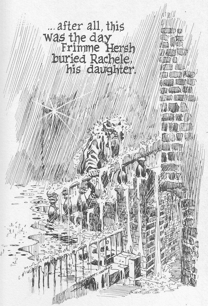
In the title piece, Frimme Herch believes he is favoured by God until the death of his daughter, which he interprets as God's betrayal. Herch becomes a financial success, but his loss of faith prevents him from happiness. In an ironic twist, Herch regains his faith but is them seemingly struck down by a God angered at Herch's presumptions.

In The Street Singer, a failed opera diva seduces the title character and plans to live out her failed dreams by guiding the younger man's career. The two are clearly using one another for their own purposes but manage to give one another hope in their otherwise bleak lives. Born losers, the star crossed pair become lost from one another in the big city and never get the opportunity to pursue their dreams. 

The Super manages to arouse sympathy for the grouchy, porn-addicted building manager who lusts after a young tenant. Eisner is not interested in heroes or villains, and the characteristics which would make the man repugnant in most stories are coupled with vulnerability and humanity.

In the final story, Cookalein, Eisner casts his sympathetic eye for human foibles on a group of urban residents summering in the country who grope about in clumsy searches for love, sex and social advancement.

The specificity of setting lends authenticity to the universality of Eisner's concerns, which include love, loss, alienation, hope and despair. Eisner's formal creativity and mastery of atmosphere invest these tales with emotional power. The novelty of the format aside, A Contract With God is a moving and compelling book, and the masterpiece of one of the medium's first true artists.


WILL EISNER:
(discussing the death of his daughter Alice from leukaemia)
My grief was still raw. My heart still bled. In fact, I could not even then bring myself to discuss the loss. I made Frimme Hersh’s daughter an “adopted child.” But his anguish was mine. His argument with God was also mine. I exorcised my rage at a deity that I believed violated my faith and deprived my lovely 16-year-old child of her life at the very flowering of it.


REVIEW BY FRANK MILLER:
(from an interview in The Comics Journal #209, December 1998)
Well, a lot of it to me gets back to Eisner. He still in many ways is a framework for me, and I think at least to date, probably the most important piece of work he did was A Contract With God. Certainly in terms of influence, because I wasn't the only one who sat up and took notice when that book came out. It had a profound effect on how I approached not just the fate of my work, but the kind I wanted to do. I wanted to work much more long form. That's ironic, because it was a series of short stories. But I think he quietly started a revolution. He's been relentless in pursuing it.


REVIEW BY SCOTT McCLOUD:
(from the introduction to the 1997 edition of A Contract With God)
I’m writing this in 2016, more than a decade after Will Eisner died. The potential of comics is being demonstrated daily in ways Eisner anticipated when he created A Contract With God nearly forty years ago, but also in ways he could’ve hardly imagined. And of course, inevitably, the book itself will suffer the fate of any first-of-its-kind pioneer. It’s been joined now by so many of its kind that it’s easy to lose it in the crowd. There are now graphic novels with ever more complex formal ambitions, with subtly written dialogue, up-to-date sensibilities, pitch-perfect irony, and politically urgent subject matter. Graphic novels proliferate and improve with every passing year. But they’re still branches on an immense family tree that was once just a sapling - planted in soil he always knew was fertile.


REVIEW BY DAVE SIM:
(from an interview in The Comics Journal #83, August 1983)
I kept putting off buying A Contract With God for a long time because I knew it would be a long time before I saw another Contract With God, and when I read it, it was just like, Oh, if there were only 18 things coming out like this.


REVIEW BY CHESTER BROWN:
(from an interview in The Comics Journal #135, April 1990)
Another bridge type book was A Contract With God by Will Eisner, which I picked up when it first came out back in '79... it was an important book too, in making me see that there were other types of ways of doing comics. There were other kinds of comics that were possible... here he was doing something different, and something that wasn't about a character with a mask on his face. That was neat stuff, and kind of eye-opening at the time.

FURTHER READING:

12 July 2021

The Bungle Family by George Tuthill (No. 99)

The Bungle Family (1924-1945)
by George Tuthill 

REVIEW BY ART SPIEGELMAN:
(from The 100 Best Comics of the Century! in The Comics Journal #210, 1999)
My candidate for Most Underrated Comic Strip in our History: George Tuthill's The Bungle Family, a domestic comedy strip that ran off and on from 1924 to 1945. It was fairly popular in its day but rarely gets a mention in books on the medium and has certainly never been honoured with a U.S. government postage stamp design like Blondie. Tuthill's grubby, uningratiating drawing style and the verbose density of balloon prose hardly make a good first impression; Tuthill's genius was as a writer able to put over one of the darkest visions of American life this side of Nathaniel West. The lower middle-class Bungles, George and Josephine, have no more charm than the style they're drawn in: they are petty, mean-spirited, with no self-awareness, constantly bickering and backbiting among themselves as well as with their neighbours and landlords. Unlike Dagwood and Blondie, one doesn't feel that this is a couple that genuinely cares for each other; they are accidental allies surrounded by hostile figures they detest more than each other. There is no one panel or sequence that can encapsulate this strip's sardonic qualities: Hell is in the details that accumulate in the repeated daily doses that the newspaper comics theatre can provide. Tuthill's misanthropic vision (he's the funny page's Celine) is painfully real, though the strip careened through surreal episodes - especially in its later years - that included visitors from outer space and time travel. visually deadpan, genuinely hilarious once you tune in to its frequency, with a great ear for dialogue and an unsurpassed sense of character, The Bungle Family grows on the reader like a fungus until, like all great art, it becomes a central reference point in one's way of understanding the world.


REVIEW BY DAN NADEL:
(from TCJ.com, 2014)
The Bungle Family deserves an audience - it is perhaps the most contemporary of the classic comic strips, with timing and dialogue situations that are oddly current in today's comedy culture. It's a great and funny and nasty and, in its way, beautiful piece of work.


REVIEW BY BILL BLACKBEARD:
As a work of narrative comic art, The Bungle Family effectively went unseen over its quarter-century span except on the daily and Sunday comic pages of American newspapers, with no shelvable record or cinematic adaptation of any kind. Yet the strip appeared in hundreds of papers with virtually no drops from its early years through the '40s, when Tuthill closed it down to almost universal protests from readers and editors, yielding to their entreaties once for a revival run of a few years, then retiring it firmly in 1945 for good. (For two more decades, Tuthill lived quietly as the wealthy squire of tiny Ferguson, Mo., relishing his days away from drawing-board demands, never knowing the attention that still unborn comic-strip fandom would have brought him from the ’60s on—and perhaps not caring.)


FURTHER READING:


11 July 2021

Covering The New Yorker: Jean-Jacques Sempé

Our Sunday-Morning Outings
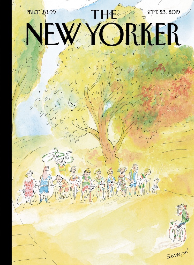
The New Yorker (23 September 2019)
art by Jean-Jacques Sempé

In the past fifty years, many of J. J. Sempé’s hundred and twelve covers have celebrated the gratifications offered by la petite reine, his beloved bicycle. With a fragile and delicate line, Sempé captures a wide range of life’s simple pleasures - friendship, nature, animals, and music are recurrent themes - that even contemporary French people can’t take for granted. We recently chatted with the eighty-seven-year-old artist, en français, about the sources of his inspiration and the dreams that haunt his old age. You have often spoken of your love of bicycling, but what inspired this specific image?

JEAN-JACQUES SEMPÉ:
It’s always been one of my dreams - to have a group of friends who go for bike rides in the country every Sunday morning. In real life, it never happened. I kept trying to organize it but everyone was always too busy to slow down for it.

How did you conceive those outings?

Well, we’d get a bit of exercise, build some muscle and also spend some time together. We’d take our bikes on the train and get to the small country roads that run along the fields. It’s quiet and smells good and it’s totally out of fashion. Sometimes one of us would know a good country restaurant, but then it would turn out that it was closed. I keep thinking back on those outings - it’s one of the things I really wish I had done.

Do you have many other unrealized dreams?

Well, my most vivid dream is to have a piano duel with Duke Ellington. And, of course, he gets to win because I’m pathetic and he’s very, very good. I think about it virtually every night. Ellington is a man I adored. There’s a photo of him, smiling, on my piano. I look at him when I play and search for his approbation.

Did you ever meet Ellington?

Yes, once, a while back in Saint-Tropez. He was giving a concert and a friend of mine said, Come with us, we’ll have a drink with him afterward. When the concert ended, I rushed to the back. It was pitch black, no one was there, but in the dark I made out the outline of a piano and sat down. I was hitting a few keys when Ellington walked in. He said, “Not so bad!,” sat next to me, and said, “Do the right hand, I’ll do the left.” (The right hand is the easier one, of course.) We played a piece of his that I know quite well: “Satin Doll.” By then there were lots of other people around and they drew his attention away. I was so impressed that I had exchanged a few notes with him that I didn’t want anyone to talk to me or even look at me. I was trying to preserve the moment.


art by Jean-Jacques Sempé

The cover for the magazine’s Fall Books Issue was done by Jean-Jacques Sempé... He recently talked to us about childhood, one of the more recurrent themes in his work. Your drawings often riff on [the theme of childhood]. What draws you to it?

I find youth attractive for its innocence and naïveté. Not my youth - I have only horrible memories of when I was young - but the hope that comes with being young. I miss the eagerness for discovery, the belief that things could get better.

You created many features for kids, including Le Petit Nicolas. Is there a special appeal in working for children?

Le Petit Nicolas was a series of books I did with René Goscinny, the French comics legend, who also was the scriptwriter of Astérix. I grew up in Bordeaux, in a piss-poor family, and hated school - I dropped out to enroll in the Army just so I could eat and have a place to sleep. René had gone to the Lycée Français in Buenos Aires, Argentina, where he was a good student - very much unlike me.

The Nicolas stories were a way to revisit the misery I endured while growing up while making sure everything came out just fine. Kids are always getting into fights but no one is hurt afterward.

Did you have favorite books when you were growing up?

I once read, in the advice column of a women’s magazine, that you should read as much as you can to improve your spelling. There was nothing to read at home, so I read the back of packages, manuals, billboards - anything I could find. I loved everything Alexandre Dumas wrote, especially “The Three Musketeers.” (I was d’Artagnan!) And I got to be a very good speller, which made me inordinately proud.


Biking In The Rain
The New Yorker (7 May 2018)
art by Jean-Jacques Sempé

New York City is one of your most obsessive themes. What draws you to that landscape?

I’m passionately attached to the city, so I try to find it again by drawing it. I love the colors in New York. They’re dynamic: bright yellows, greens, reds, and blues. Paris, where I live, is beautiful but it’s always gray. I love Paris too, but it’s not the same.

What are other differences between drawing New York and Paris? How are the cities different for you?

New York is a place where people know what it’s like to be starting out. New Yorkers have sympathy for those who are trying to se débrouiller, to make do or get by. Novices aren’t discouraged. It’s not a bourgeois town set in its ways like Paris. In New York, everyone has to keep moving forward.

It’s often hard to distinguish what era your work is set in. There’s a timeless quality there. Is that intentional?

You flatter me, but, yes, in a way. When I think about New York, I think about the whole. I try to paint an ambience that has the buildings, the smells, and the sounds, Duke Ellington and James Thurber. Here, I wanted to paint a petite dame, a little old lady who holds her balance in that immense and magnificent town.

Your first published cover was in 1978, yet you’ve made only five or six trips to New York over the past forty years. Why don’t you come more often?

A big issue for me is the language barrier. If I had been able to speak English well, I’d probably have settled there. But I just don’t speak it at all. I didn’t want to be seen as one of those arrogant Frenchmen who only speaks his own language. I hate not being able to talk. It throws me back to the old days, when I was young and so paralyzed with shyness that I stuttered.

You’ve noted Saul Steinberg as an influence. Any others?

Oh, yes! It’s all the artists of The New Yorker who have inspired me. Sam Cobean, Mary Petty, Saxon, or Chas Addams, too numerous to name them all - what they have in common is elegance and lightness of touch. I adore Thurber. I learned from all of them, I shaped my work just so I could fit in that group.


art by Jean-Jacques Sempé

It’s an obsession, I would love to become a child on the beach once again. It may sound infantile, but that’s the feeling I long for: to be a child without care, taking in the immensity of the ocean and still feeling safe.


10 July 2021

09 July 2021

Zap by Various (No. 80)

Zap #0-16 (1967-2016)
by Crumb, Griffin, Mavrides, Moscoso, Shelton, Spain, Williams & Wilson

REVIEW BY TOM SPURGEON:
(from The 100 Best Comics of the Century! in The Comics Journal #210, 1999)
It is well known in comics circles that Zap was neither the first underground comic (Jack Jackson published God Nose in 1963) nor even the first appearance by Crumb or many of the eventual contributors, who had enjoyed exposure through their appearances in the underground newspaper movement. But for the world at large, Zap in underground comix, and the buzz and excitement that greets the most recent issue is a sign that Zap struck at the collective consciousness of our culture in a way few comics ever have.

Zap has reinvented itself at least three times. The first two issues are all R. Crumb, and one can see the heavy Harvey Kurtzman influence, particularly in their presentation. But whereas with Kurtzman's magazine the medium was a big part of the message, Crumb's comics were more playful and his satire was more intensely personal. The anything-goes quality of his work continued into various extremes when the magazine made its first transition into an anthology. From a vantage point 30 years later, one is struck by how extreme the violence and sexual elements are in works from Wilson and Spain, and how elegant the art in cartoons from Moscoso and Williams. Strangely, Crumb and Shelton become almost straight men in this company, although it is Crumb's famous incest comic in issue #4 that ran afoul of New York obscenity  law. Even Zap's famous jam illustrations have a subtext of subverting standard creative practices in favour of sheer graphic splendour.

Somewhere along the way, Zap added a reflective element. For instance, the Crumb and Shelton strips in Zap #13 were both in more serious, accomplished styles, and both involved taking stock of the time Zap was created. Even the still shocking Wilson's work is viewed differently in the context of his having done so many years of Checkered Demon comics. Zap's time is past in terms of the accomplishments of the artists - all of whom remain interesting and worth reading - but because fewer and fewer artists are starting comics using similar approaches. What remains is less the movement than the comics, and for visual energy no-one will ever outstrip the creators behind Zap.


ROBERT CRUMB:
(from an interview with The Chicago Tribune, 2014)
In the 1940s, a lot of comics were done for servicemen (his own father had been an illustrator for the Marine Corps), but as culture, it was a very low form of popular entertainment. If you had pretensions to being cultured, you looked down on comics. So, to answer your question, the biggest change I have seen is comics going from being mainstream entertainment for children to something an adult can pick up. Specifically Zap said that this low form of culture could be a form of personal expression, and I think that, for the past 50 years, is our biggest legacy, that sense of comics as a form of personal expression. And maybe if comics are still seen that way, if comics have stayed honest, it's because you don't get rich doing them. The rewards are small. Because of that, (expletive) gets weeded out. You can't put across a good comic without thought. There is not enough reward for the sweat, and I think maybe, now that Zap is finished, that's what we said: If you don't love what you're doing, you're definitely not doing this.


CHRIS WARE:
Without Zap there would be no such thing as alternative / literary / artistic / self-expressive comics and graphic novels. Zap started it all.


FURTHER READING:


08 July 2021

Chris Ware Exhibitions: On Display Now!

Chicago: Where Comics Came to Life (1880-1960) 
Chicago Cultural Center, Chicago, USA 
June 19 to October 3, 2021 
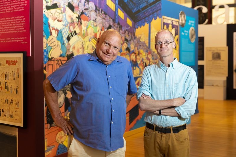
Curated by artist and author Chris Ware, and Chicago Cultural Historian Emeritus, Tim Samuelson, this exhibition is designed and planned as an intentional historical companion to the concurrently appearing survey of contemporary Chicago comics at the Museum of Contemporary Art, in which Ware’s work also appears - see below.

A significant but often overlooked contribution to American art and culture is Chicago’s role in the development of the early comic strip. Through its countless newspapers and its publishing industry, Chicago led the transformation of comics from daily fantasy and joke features into ongoing stories grounded in the textures and details of real life, its first real step towards legitimacy as an expressive language and semi-literary art form. The exhibition focuses on the origins of the comics in popular publishing, the immeasurable importance of African-American cartoonists and publishing, the first woman cartoonists and editors, the first daily comic strip, and finally the art and comics of undeservedly forgotten Frank King, who with “Gasoline Alley” captured not only the rhythms and tone of everyday existence in his characters that aged not only at the same daily rate as its newspaper readers, but were also fictionalized versions of real people. More details here...

The Chicago Tribune: "Ware is arguably the most celebrated cartoonist of the past 20 years, an Oak Park resident and New Yorker illustrator whose intricate stories of regret, lonesomeness and childhood nod to architecture, the interconnectedness of everyday existence and the history of comics. Samuelson, who retired at the end of 2020, was longtime official historian of the city of Chicago. When he says he is just a pal, it sounds like a benign dodge, a wish to look more retired than he actually is. When it comes to architect Louis Sullivan, ragtime music and the earliest comic strips - the pair often fanboy as a team."

Chicago Comics: 1960s To Now 
Museum of Contemporary Art, Chicago, USA 
June 19 to October 3, 2021 
The exhibition is guest-curated by Dan Nadel. Chicago has been a center for comics for decades—a haven not only for making and publishing cartoons, but also for innovating on the medium. Chicago Comics: 1960s to Now tells the story of the art form in the influential city through the work of Chicago’s many cartoonists: known, under-recognized, and up-and-coming. The exhibition traces the evolution of comics in Chicago, as cartoonists ventured beyond the pages of newspapers and into experimental territory including long-form storytelling, countercultural critique, and political activism. Chicago Comics examines styles, schools of thought, and modes of publication across six decades of cartooning, including works from artists who are changing the medium today. The exhibition seeks to bring to the fore artists of color who were previously under-recognized throughout their careers. In this pursuit, the exhibition features archival material previously not seen in museums and offers a revised history of the art form. Represented throughout this timeline are special sections that highlight key artists including Kerry James Marshall, Lynda Barry, and Chris Ware. More details here...


MAD #1-24 edited by Harvey Kurtzman (No. 8)

MAD #1-24 (1952-1956)
edited by Harvey Kurtzman, with Wally Wood, Bill Elder, Jack Davis and others

REVIEW BY DARCY SULLIVAN:
(from The 100 Best Comics of the Century! in The Comics Journal #210, 1999)
Despite their very name, comics have contributed very little to America's comic legacy. Comic strips have introduced many of the most famous persona of American humour, from Charlie Brown to Zippy to Ziggy. But strip away the obscurities (including all alternative comics), the borrowings from other media and the juvenilia, and only one comic book emerges as a true influence on the country's comic consciousness: MAD.

MAD has been an American institution for more than 40 years. Even kids who skipped the Superman and Spider-Man phase snuck MAD to school, memorised the zany names given to characters from films (even films they'd never seen), compete to see who could most adeptly manipulate the back cover fold-in.

The MAD honoured here, however, prospered for just four years, from the comic's birth in 1952 until 1956, when its father, Harvey Kurtzman, left its publisher, William Gaines' EC Comics, in one of the classic creator's rights disputes in comics history. (Shades of Image: Kurtzman not only left MAD, he took his top artists with him and started his own humour magazines.)

Kurtzman possessed a fluid, rhythmic drawing style suited to physical humour. He was also a detail obsessed writer, who had rewritten the rule book on war comics on EC's Two-Fisted Tales and Frontline Combat. As Kurtzman saw it, he was a seeker of Truth.

Of course, a few bucks wouldn't hurt. Kurtzman wanted a book he could crank out faster than his heavily researched war comics. He proposed a humour magazine to Gaines. In its first incarnation MAD was a comic book about comic books (postmodernist alert!) - largely poking fun at the kinds of comics that kept EC afloat.

MAD quickly ran out of comic books to lampoon and began taking on other media, particularly film and advertising. And in a stroke that still seems revolutionary, Kurtzman persuaded Gaines to publish MAD in magazine format - thus sidestepping the then raging furor over comic books and giving Kurtzman the "status" book he sought (he'd been wooed by a major magazine of the day, Pageant).

Notoriously strict about artists following his breakdowns, Kurtzman is clearly MAD auteur. But the artists who drew it - especially Wally Wood, Bill Elder and Jack Davis - rose to the occasion, introducing a new freneticism to comic art. They squirted panels full of sight gags and non sequiturs, creating a dense style described as "chicken fat". That manic energy, along with Kurtzman's rapid-fire verbal riffing, made MAD's pages absolutely electric and immediate.

Critics have praised MAD so fulsomely that the magazines true historical impact has been distorted. Neither Kurtzman or MAD created American satire - but they did bring it to a younger audience. Kurtzman and company used humour as a crowbar to pry apart what things were and what they pretended to be. "Just as there was a treatment of reality in the war books," Kurtzman wrote in his comics history From Aargh! to Zap!, "there was a treatment of reality running through MAD; the satirist/parodist tries not just to entertain his audience but to remind it of what the real world is like."

Ultimately, though, Kurtzman and MAD's subsequent writers were part-time satirists and full-time funnymen. Like children, they would make fun of anything - left or right, young or old, good or bad - simply because it was there. Gaines would later argue that MAD had no morality, no statement beyond "Watch out - everybody is trying to screw you!" Satire was important to MAD, but its real metier was iconoclasm. It was a pie chucked at the nearest face visible.

And like the pie in the face, it was both anarchic and quaintly traditional. Kurtzman brought the Jewish inflections of Catskills comedy to comic books - what are MAD coinages like "potrzebie" and "veedlefetzer" if not put-on Yiddish? Kurtzman's joke constructions drew frequently and expertly from vaudeville comics. The balance between deconstructive cliche-busting and well-structured routines, between Swiftian wit and pure spitball silliness, helps account for Mad's sustained and wide-ranging popularity. For all its buzzing surface quality and apparent rudeness, MAD wasn't nasty - it had charm.

MAD's historical importance grew in the 1960s and 1970s, when it offered the pre-protest set their own connect-the-dots guide to social criticism. And many of MAD's most famous conventions - the movie parodies with Mort Drucker's deadly caricatures, the gonzo visual slapstick of Don Martin, the witty wordless rim-shots by Sergio Aragones and Antonio Prohias - post-date Kurtzman's reign as well. But these and other riches simply wouldn't exist without Kurtzman and his original collaborators, who created MAD's skewed, sarcastic, staccato style. Godfather of the undergrounds, influencer of modern film humour, infiltrator of virtually all media, Kurtzman's little "quickie book" stands not just as one of the greatest comic books ever, but as a true cultural phenomenon.


REVIEW BY ALAN MOORE:
(from a tribute to Harvey Kurtzman in The Comics Journal #157, 1993)
The first time I encountered Harvey Kurtzman, I was around ten years old. The encounter took place between the covers of The Bedside MAD, a paperback collection; strange, American, the cover painting possibly by Kelly Freas, the edges of the pages dyed a bright, almost fluorescent yellow. To this day, it burns inside my head. The stories in that volume and the Kurtzman stories I discovered later brandished satire like a monkey-wrench: a wrench to throw against pop-culture's gears or else employed to wrench our perceptions just a quarter-twist towards the left, no icon left unturned. 


REVIEW BY DAN CLOWES:
Had he not existed, I'd be a dull, humorless lout working in a muffler shop somewhere, and so would practically everyone I know. I shudder to think how horrible the world would be today without that which Harvey Kurtzman begat!


REVIEW BY BILL GRIFFITH (ZIPPY THE PINHEAD)
MAD was a life raft in a place like Levittown, where all around you were the things that MAD was skewering and making fun of. MAD wasn't just a magazine to me. It was more like a way to escape. Like a sign, This Way Out. That had a tremendous effect on me.


FURTHER READING:


07 July 2021

V For Vendetta by Alan Moore & David Lloyd (No. 83)

V For Vendetta (1982-1983, 1988-1989)
by Alan Moore & David Lloyd

REVIEW BY RAY MESCALLADO:
(from The 100 Best Comics of the Century! in The Comics Journal #210, 1999)
While best known for their elaborate structures and narrative gimmicks, what made Alan Moore's '80s work truly distinctive was the passion he brought to his stories. At his best, Moore wanted to give his readers a message that would matter in their own lives, something that would makes comics a transcendent experience. The gimmicks and motifs not only helped him carry across his message, it also provided a surface or irony and mastery meant to distract us from the earnestness of this ambition. So while Watchmen won all the attention for its fearful symmetries, I would argue that V For Vendetta is Moore's best mainstream work to date. Started in Warrior magazine in the early 1980s and completed for DC Comics at the end of the decade, V For Vendetta was the warning to his homeland about the cost of creeping fascism. By wrapping this message in a romantic notion of the masked adventurer, Moore set forth a re-evaluation of the superhero that was as relevant as it was bleakly realistic.

Set in a Britain turned fascist by a global nuclear war, the story focuses on V, a mysterious swashbuckling figure in a Guy Fawkes mask who performs unbelievable feats in the name of anarchy. Beyond the title character, the V motif takes on many forms throughout the story (including all the chapter titles), but is most memorable as a Zorro-like Anarchy symbol turned upside-down. Despite this gimmick and the strong genre trappings, V For Vendetta is more a series of character studies than anything else. V's acts of terrorism aren't as horrifying as the future Moore envisions, and artist David Lloyd provides the perfect visuals for a nation living in constant fear of the jackboot. The strong chiaroscuro of Lloyd's style creates a world shrouded in darkness, where figures could be sweepingly dramatic, matter-of-fact predatory, or mundanely desperate. And, as often he does in his best work, Moore goes to great lengths to explore the inner lives of secondary characters, to create as a whole a milieu as possible. Readers feel the desperation of life under fascism, even among the elite. And as with all great adventures, there's a seduction: not of V and Eve, the young woman he takes on as his protege, but Eve and anarchy itself, as we witness her heard earned freedom from self-induced tyranny.

Chapters range from the archly experimental ("Video" uses dialogue taken strictly from television) to the universally resonant (the heartfelt bravery of "Valerie") and there were missteps such as "This Vicious Cabaret" (which attempted comics as sheet music). What mattered, though, was the way Moore and Lloyd played upon the romance of the outlaw (especially one opposing a corrupt state) while being fully aware of the consequences such romanticism can have. In that manner, the infused the seductive nature of anarchy with an implicit warning of its own. The ending is both elegiac in its hope and realistic in its expectations: it concedes an important distinction between destroyers and creators and allows the resulting price to be paid nobly. And in that complex honesty, Moore's passions and abilities shine most vividly.


ALAN MOORE:
(from the introduction to the collected V For Vendetta)
I began V For Vendetta in the summer of 1981, during a working holiday upon the Isle of Wight.

My youngest daughter, Amber, was a few months old. I finished it in the late winter of 1988, after a gap in publishing of nearly five years from discontinuation of England’s Warrior magazine, its initial home. Amber is now seven. I don’t know why I mentioned that. It’s just one of those unremarkable facts that strike you suddenly, with unexpected force, so that you have to go and sit down.

Along with Marvelman (now Miracleman), V For Vendetta represents my first attempt at a continuing series, begun at the outset of my career. For this reason, amongst others, there are things that ring oddly in earlier episodes when judged in the light of the strip’s later development. I trust you’ll bear with us during any initial clumsiness, and share our opinion that it was for the best to show the early episodes unrevised, warts and all, rather than go back and eradicate all trace of youthful creative inexperience.

There is also a certain amount of political inexperience upon my part evident in these early episodes. Back in 1981 the term “nuclear winter” had not passed into common currency, and although my guess about climatic upheaval came pretty close to the eventual truth of the situation, the fact remains that the story to hand suggests that a nuclear war, even a limited one, might be survivable. To the best of my current knowledge, this is not the case. 

Naivete can also be detected in my supposition that it would take something as melodramatic as a near-miss nuclear conflict to nudge England toward fascism. Although in fairness to myself and David, there were no better or more accurate predictions of our country’s future available in comic form at that time. The simple fact that much of the historical background of the story proceeds from a predicted Conservative defeat in the 1982 General Election should tell you how reliable we were in our role as Cassandras.

It’s 1988 now. Margaret Thatcher is entering her third term of office and talking confidently of an unbroken Conservative leadership well into the next century. My youngest daughter is seven and the tabloid press are circulating the idea of concentration camps for persons with AIDS. The new riot police wear black visors, as do their horses, and their vans have rotating video cameras mounted on top. The government has expressed a desire to eradicate homosexuality, even as an abstract concept, and one can only speculate as to which minority will be the next legislated against. I’m thinking of taking my family and getting out of this country soon, sometime over the next couple of years. It’s cold and it’s mean-spirited and I don’t like it here anymore. 

Goodnight England. Goodnight Home Services and V for Victory.

Hello the voice of Fate (London) and V For Vendetta.
~ Alan Moore, Northampton, March 1988


06 July 2021

Prince Valiant by Harold Foster (No. 100)

Prince Valiant (1937-1971)
by Harold Foster

REVIEW BY GREG CWIKLIK:
(from The 100 Best Comics of the Century! in The Comics Journal #210, 1999)
It is well known that Harold Foster always considered himself to be an illustrator rather than a cartoonist, and it is Foster's artwork that gives Prince Valiant its majesty and scope. He remains unrivalled in his depictions of sea and sky, wild forest glades, medieval fortresses looming over fields of jousting knights. Foster was an outdoorsman and his love of nature in all its seasonal variations permeate the strip. A superb draughtsman and a master of complex composition, his work is never formulaic: whether drawing a wistful maiden lost in thought on a parapet, or rendering a warrior manning a catapult on a crowded and chaotic battlefield, each is always depicted as an individual possessing distinct characteristics of dress, physical appearance, and expression. His charming and earthly rendering of everyday domestic life also balances the more romanticised elements.

It is true that certain details of costume and architecture are conflated from other periods and sometimes owe more to Victorian imagination than to recent scholarship. But Foster had the rare gift of being able to transform his historical imagery, whatever its source, into a vivid, convincing and personal evocation of the past. When, for example, he portrays a boatload of Vikings, they come across as real flash-and-blood individuals, even if their winged helmets and barbaric ornaments may not be strictly accurate; and when Val leaps to the ship's rigging, harp in hand with the vast ocean visible behind him and sings a ballad to the weary sea rovers, Foster achieves one of those moments of true emotional and visual poetry that occur time and again in his work.


REVIEW BY EDDIE CAMPBELL:
(from a review in Escape Magazine #6, 1985)
I've always felt that Prince Valiant stands high over its contemporaries in the Adventure/Classical genre of the Newspaper Sunday, because, whereas Alex Raymond's Flash Gordon and Burne Hogarth's Tarzan were sometimes marred by juvenile simplism, Foster's work is not only impressive to look at like those, but is always interesting to read... As an artist, he never in his life rushed a pen-stroke; every tree, cloud and rock is put down with immaculate precision.


REVIEW BY DAN NADEL:
Sure I'd read Foster before, but I'd never found a way in. Fortunately, Fantagraphics recently released Prince Valiant Vol 1: 1937-38, and I was able to absorb the material in a wholly new way... Prince Valiant opens up a world that I wanted to stay in - a wide-eyed early 20th century approach to fantasy with a now-vanished sincerity and wholesomeness. It's an all too rare pleasure in comics.


FURTHER READING:


05 July 2021

Barnaby by Crockett Johnson (No. 68)

Barnaby (1942-1946, 1952)
by Crockett Johnson

REVIEW BY TOM SPURGEON:
(from The 100 Best Comics of the Century! in The Comics Journal #210, 1999)
It is worth noting David Johnson Leisk, who created the strip Barnaby for the New York paper PM under his more famous pen-name in 1942, had two interesting careers after comic strips: he was a successful illustrator of children's books (including the classic Harold & The Purple Crayon) and an avant-garde painter of geometric shapes and objects. Barnaby reads like the work of a wide-ranging intellect rather than a lifer in the comics trade. Its spare beauty comes from its perfect sense of time and place, and its emphasis on the sometime whimsical, sometimes not-quite-real way in which children create meaning in their lives. 

Barnaby was concerned with the title character's relationship with his fairy godfather, Mr. O'Malley, one of the great creations in strip comics. A rotund figure in a hat, whose wings extended from his oversized coat, carrying a cigar, and avoiding all overt displays of fairy godfather powers, Mr. O'Malley looked less an object from classic children's literature than a slightly-addled uncle (one possible reading of Barnaby is to see all the characters as a child's interpretation of various types of adult). Most of the narratives dealt with Mr. O'Malley making more difficult - and ultimately more satisfying - situations which Barnaby, despite being a very young child, was often well-equipped to handle on his own. Mr. O'Malley's friends and professional acquaintances made frequent appearances, and Johnson's arch take on many of those fantastic character-types helped make Barnaby a prototype for a young persons' entertainment with much to offer adult readers. 

Barnaby also underlines how fragile a strip's success can be, particularly when one breaks it down element by element: Johnson's art is simplified by today's standards, but gave the strip a distinctive and elegant look; typeset lettering has almost never worked for any comics work, but allowed Johnson to save space within his dailies; and the World War II setting of the original strips would seem to date it, but a more modern, script-altered update showed how important and how well-observed those original strips were in regard place and time.

Barnaby is a perfectly-balanced work greater than the sum of many admirable parts. Never the most popular feature of its time, it has a sterling critical reputation and is remembered fondly by many who read it as children. Johnson's return for the final story, where Mr. O'Malley decides to forego the rules and stay with Barnaby past his next birthday only to find that the birthday boy can't see him anymore, is one of the great send-offs in strip history, and its sentimental power is a testament to some of the medium's most enduring characters.


REVIEW BY CHARLES M. SCHULZ:
Barnaby was one of the great comic strips of all time.


REVIEW BY DAN CLOWES:
(from an interview, Comic Art #1)
You know, you look at it panel by panel and it doesn't do much, but when you read the stories it really comes alive. Not only is it absolutely hilarious, but it has this really strong, unexpected emotional quality.


FURTHER READING: