11 September 2021

Julie Doucet: A Fan's Notes by Adrian Tomine


 Julie Doucet: A Fan's Notes
by Adrian Tomine

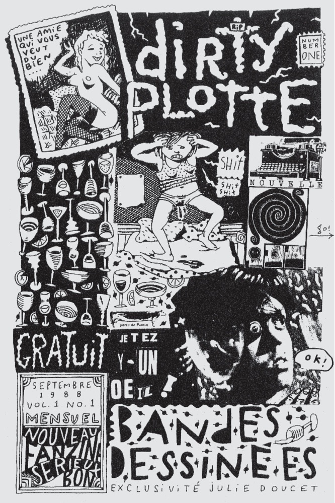
I first encountered Julie Doucet’s comics at a crucial time in my life, when the superhero comics I’d grown up with had finally, completely lost their appeal, but the far-fetched dream of becoming a cartoonist persisted. I know I was in high school at the time, so I’m guessing it was probably around 1989 or 1990. Based on Chester Brown’s glowing recommendation in his comic Yummy Fur, I sent some cash to Julie’s Montreal address, and a few weeks later I received a meticulously hand-crafted packet of her comics. I had seen a few minicomics at that point, but something about Julie’s in particular had a huge impact on how I thought about comics and, on a broader scale, what I wanted to do with my life.

Aside from being shocking, funny, and beautiful, those early Dirty Plotte minicomics were inspirational because they made cartooning seem both attainable and impossible. The fact that they were so clearly hand-made, by one artist with a one-of-a-kind vision of the world, gave the teenage version of me that wonderfully narcissistic feeling of “Hey, maybe I could do this, too!” That the stories themselves were deeply personal, quotidian, dream-based, and concise only added to that admittedly arrogant but exhilarating feeling. And the fact that the art, the language, the stories felt so new (and in some ways alien) to me made it clear that comics as a medium had infinite possibilities, and that as much as I tried, I could never even come close to what Julie was doing. That was exhilarating in its own way, especially for a kid who, only a few years prior, had no greater ambition than to “draw comics the Marvel way.” There was no going back to superheroes after that, and it wasn’t long before I was printing copies of my first minicomic at the local Kinko’s.

I followed Julie’s ensuing career closely, tracking down and collecting her work wherever it appeared. The evolution of her art and writing through the years that Drawn & Quarterly was publishing Dirty Plotte was staggering. The release of each issue felt like a new album from a favorite band. It was an event. Every development in her drawing style or her storytelling or her sense of design was thrilling, and impossibly, it all kept getting better.

Even fifteen years after she unofficially retired from comics, I still think of Julie as kind of the platonic ideal of a cartoonist. Visually, her work is complex, meticulous, wild, and thoroughly alive, simultaneously building upon and departing from comics orthodoxy. Her style is at once haunting and sweet, beautiful and grotesque, but also completely, indisputably original. Every line, every detail, every person, even every coffee pot is a part of Julie’s universe. The stories, while often dreamlike or even nightmarish, are brilliantly readable, depicting and evoking a wide range of moods and emotions. Even her most mundane story is revelatory by virtue of its specificity, its language, its eccentricity. Most importantly, her comics are self-expression in its purest form, and that, to me, is the greatest possible use of the medium. At this point in her incredible artistic evolution, I’m not sure that Julie would take this as a compliment, but I still think of her as that increasingly rare thing: a natural-born cartoonist, who, when she puts pen to paper, just somehow instinctively does everything right.

I first met Julie in person more than twenty years ago, and we’ve crossed paths a handful of times since then. But to be honest, I don’t feel like I know her that well. I’ve had the good fortune of becoming friends with many of my favorite cartoonists, and while I treasure those relationships, there’s something great about the fact that Julie Doucet is still this mythic force, somewhere far away, creating art that only she could make. Almost thirty years after receiving that packet of minicomics in the mail, I’m a fan, and I’m eternally grateful for that experience.

This essay is taken from Dan Nadel's "The Julies" article which appeared in Dirty Plotte: The Complete Julie Doucet, published by Drawn & Quarterly in 2018. Read Dan's complete essay here...

10 September 2021

Donald Duck by Carl Barks (No. 7)

Donald Duck (1942-1965)
by Carl Barks

REVIEW BY KIM THOMPSON:
(from The 100 Best Comics of the Century! in The Comics Journal #210, 1999)
A Disney Studios writer and gag-man (he worked on a number of Donald Duck shorts from the mid-1930s on, as well as the feature file Bambi), Carl Barks was assigned his first comics story in 1942: a shelved Mickey Mouse animated feature. In collaboration with his studio mate Jack Hannah, he converted it into a 64-page Donald Duck comic, which Western Publishing released under its Dell Comics imprint (Donald Duck Finds Pirate Gold, Four Color #9). Barks, who had worked as a gag cartoonist and illustrator before joining the studio, decided he found comic-book work more hospitable than the rigours of the increasingly regimented studio, quit his salaried job and approached Western about more comics work. He was subsequently anointed Western's Duck chronicler - both in the continuing Four Color "solo" series (longer, more adventure-oriented yarns that usually filled the issues) and in Walt Disney's Comics & Stories.

WDC&S provided Barks' most regular berth: Between 1943 and 1965 he drew and (usually, but not always) wrote over 250 ten pagers. These were originally designed as paper equivalents of the Donald Duck cinematic shorts: strings of slapstick gags in which Donald was portrayed as an ill-tempered, farcical loser battling either his nephews or other malign adversaries - people, animals, or objects. But as Barks gained confidence in his new medium, he began to work up more subtle, nuanced characterisations for his protagonists. 


REVIEW BY ART SPIEGELMAN:
I loved Carl Barks' work since those days of long-lost innocence when I assumed the duck stories were all written and drawn by Walt Disney himself. As far as I was concerned, they were Walt's best work, done on lunch-breaks, when he wasn't making animated cartoons or hosting his weekly TV show. Before that I just believed the ducks were somehow real, and now, as an adult I've reverted to my first opinion: the ducks ARE real. Not the way they look, of course, but they're emotionally real, realer than most people I've met.


FURTHER READING:


09 September 2021

The Sketchbooks of Robert Crumb (No. 19)

The Sketchbooks of Robert Crumb 
(1964 to present)

REVIEW BY GARY GROTH:
(from The 100 Best Comics of the Century! in The Comics Journal #210, 1999)
Robert Crumb has maintained sketchbooks, which he has written and drawn continually, from the early '60s to present. Seven large, hardcover volumes have appeared from the German publisher 2001 printing sketches datings from 1967, with the most recent one (published November 1998) running up to 1996, representing 29 years and nearly 3,000 pages of facsimile reproduction. Fantagraphics Books (conflict of interest alert!) has published six R. Crumb Sketchbooks to date, which begin three years earlier than [publisher] 2001's (1964) and include more pages from the artist's sketchbooks in the years that 2001 has published. The US editions of the sketchbooks from 1964 to 2000 will comprise over 4,000 pages.

The very conception of a single, unified, organic (and ongoing) life's work, as this is, like Crumb's individual stories and his work generally, sui generis: it is not merely inconceivable that no other artist has felt the inner need to consistently draw in a sketchbook for over 35 years (and counting), but an immutable fact. Not only has no cartoonist done so but I am aware of no artist who ever has (Frida Kahlo's drawn diaries come the closest, but not very); in fact, these sketchbooks are, as a body of work, incomparable in their magnitude, scope and intensity, and there in lies their uniqueness and, in part, their value. (We may assume that other, invariably lesser, artists will follow Crumb's example in the future, of course).

Crumb then, has created an entirely new "genre", but how does one describe it? It is not autobiography in any recognisable or understood sense; it is not a systematic or linear iteration of important professional and personal details, there is none of the "objectivity" we associate with biography such as the customary citation of names, dates, places and so forth. It is, therefore, not so much a chronicle of a life than a chronicle of a life of perceptions, which is of considerably greater aesthetic interest.

What differentiates the sketchbooks from Crumb's finished comics work is that the wedding of perception and technique achieves a degree of purity that the considered and necessarily cohering choices of tonality, style, structure, etc, tend to dilute. It is, among other things, a raw insight into process: how are ideas formed, how are connections made, how is technique and craft honed, how is the ability to truly see cultivated? Art is always mediated by artifice and every artist, no matter how self-revealing or self-lacerating, wears a mask that separates himself from his work. The cumulative effect of these sketchbooks is to narrow the gap between the artist and his art, or, put another way, to create such an intimacy as to render the profound connection between art and humanity palpable.

It also stands as a monumental existential document. Crumb repeatedly expresses, through a variety of penetrating and coruscating visual metaphor, the central existential struggle: to live in the full light of consciousness with all the risk, pain, and suffering that entails.

One can practically become lost in the onrush of caricatures, impeccably rendered portraits, formal practice (such as when Crumb was learning to use a brush in the early '80s), intense self-scrutiny, excerpts from various authors, screeds, comic strips, roughs for strips that never appeared, a visual playfulness that one rarely sees in his comics after 1970, stunning displays of virtuoso draftsmanship, the occasional abstract or surreal vista, diary-like entries (such as one agonising over his relationship with his son Jessie), heart-breaking depictions of his daughter Sophie, worshipful drawings of his wife Aline, his sensual supple line and mastery of form, humour, seriousness, empathy, misanthropy, goofing off and self-flagellating anguish - in short, the full panoply of a life of perceptions rendered with consulate artistry.


ALAN MOORE:
(from an article in The Life & Times Of Robert Crumb)
Crumb's earliest work shows a youthful sense of delight and exuberance, a sense of glee to be working in the comic medium with access to all its varied icons and delights. The characters in the early pieces, however weird or macabre or ridiculous, seem to be purposefully two-dimensional comic characters... His grotesque pranks are told in the same way that any animated character's more innocuous japes would be presented, right down to the sense of a winking camaraderie with the reader in the final panels. In Crumb's piece, though, turning it into something dark and different, raising all sorts of new and unsettling questions about the nature of the form itself... But there was a gradual sense, at least as I saw it, of Crumb becoming impatient or weary with simply subverting the cartoon icons of his youth. It looked as if he felt the need to grow and was looking around for territory to grow into... In his work for Arcade, we see Crumb confidently striking out for new pastures with an assurance that shows in every line... I'd scarcely recovered from the hard, no-nonsense pessimism of Crumb's look at life in This Here Modern America when along came his powerful and affecting portrait of an early backwoods man, That's Life. This piece, which manages to chart the rise and fall of a whole section of the music industry while telling a powerful human story is, I think, one of the best things that Crumb has ever done. A sad and bitter indictment, it is nevertheless accomplished with a real human warmth... Take a look at his sketchbooks and see just how much he's capable of caring about a stack of firewood or the light on his wife's forehead or a corner of his backyard, and if that doesn't make you feel better about the world we live in, then get a friend to try holding a mirror under your nose.


FURTHER READING:


08 September 2021

The Cartoon History of the Universe by Larry Gonick (No. 73)

The Cartoon History of the Universe (1990 to present)
by Larry Gonick

REVIEW BY RAY MESCALLADO:
(from The 100 Best Comics of the Century! in The Comics Journal #210, 1999)
Larry Gonick is a gifted cartoonist performing a great duty for education: he's teaching us how to laugh at history. This doesn't mean he ridicules history or dismiss its significance - far from it. Gonick takes the events and figures and attitudes of ancient times and makes them accessible through beautifully humorous drawings, a strong sense of narrative, and a mastery of history that can give university professors a run for their money. While Gonick doesn't quite stay true to his title - he starts with the Big Bang, but quickly settles on Earth as his focus - he doesn't limit himself to the West, either. The expected histories of the Greeks and Romans are followed by chapters devoted to various Asian cultures; clearly, Gonick's ambitious project aims to be as comprehensive as it can possibly allow.

Gonick's three strongest assets are a classic Bigfoot visual style, a strong eye for the connecting tissue between events, and research, research, research. The hackneyed metaphor of books as "time machines" is given a fresh dust-off in his hands, mostly because he puts his money where his mouth is and delivers an engaging story from all that he has read and all that he's pieced together. With such a rich, fascinating subject as the history of everything, Gonick has the best material possible for comedy as well education. The Spartan way of life is summed up by a humorous mantra ("I can take it, I can take it...") that leads to an unexpected punchline; the story of the Buddha is recounted with both discretion and an empathic eye for the humanity of the religious figure as a young man. Gonick is equal parts comedian and scholar: physical humour and caricature (ie Socrates is a grimy, old curmudgeon), shatters popular myths, while illustrated foot notes provide further context for complex situations. Comic exaggeration is used to great effect, but also responsibly captures the gist of his lessons. 

Gonick is also willing to poke fun at the process of making history. His introduction to each chapter is charming, there are several enlightening sequences about historical interpretation (including one that satirises the way extrapolation from an artefact can become out-and-out silliness), and he even draws interesting connections between the follies of ancient cultures and our own. That attention to relevancy - in whatever form, in whatever time, in whatever place - helps make Gonick a distinctive comix voice and a praiseworthy historian. With two volumes done and more undoubtedly on the way, Gonick's special brand of edutainment should continue to enlighten and delight for years to come.


WILL EISNER:
Larry Gonick has created a genre all his own. The use of comic art to tell serious history is a brilliant application of the medium. The underlying scholarship in this work reinforces and demonstrates the capability of cartoons as a valid teaching form... Best of all he is wedding learning with fun. Bravo!


FURTHER READING:


07 September 2021

The Hannah Story by Carol Tyler (No. 97)

The Hannah Story (1994)
by Carol Tyler

REVIEW BY KIM THOMPSON:
(from The 100 Best Comics go the Century! in The Comics Journal #210, 1999)
No event is more painful than the loss of a child; sorrow so profound is nearly impossible to commit to paper, and difficult not to trivialise or sentimentalise. Carol Tyler's 12-page The Hannah Story about the early death of her sister Ann, and the circumstances that finally enable her mother Hannah to confront this bottomless sorrow, avoids all these pitfalls and emerges as perhaps the saddest and certainly most beautiful of the '90s "autobiographical" comics.

Tyler smartly plays the early part of the story as a mystery - what happened to Ann, and why won't her mother talk about it? - and once her mother (prompted by witnessing the birth of her granddaughter, Tyler's daughter) finally opens up and tells the story, the emphasis is on the awful circumstances (hateful in-laws, a husband on the other side of the country) that preceded the toddler's death. The death itself (a combination of serious, but not inherently deadly, accident, and subsequent medical neglect), Tyler treats only glancingly, as if the enormity of the event were impossible to record - but her skill and sensitivity have pulled the reader so far into her parents' lives that she needs nothing more than a boldly stylised panel of Hannah and her husband receiving the awful news to drive the emotional point home.

Tyler, whose comics had previously appeared mostly in black and white, was finally given the chance to work in full colour in The Hannah Story, which appeared in the first of Drawn & Quarterly magazine's 'up-scale' second volume. She rose to the occasion with a deliberately limited but flexible sepia-based palette that changed subtly from sequence to sequence - darker, almost black-and-white for her own childhood memories; richer, faded brown's for Hannah's story (augmented with greens for the idyllic sequence at her mother's home); and small patches of full colour for the "contemporary" sequences, with a startling, huge, somehow healing burst of red (an Oriental rug that figures in the story) in the final panel. The delicate lifework is more nuanced and detailed than usual for Tyler, without ever losing clarity and readability.

There are hundreds, perhaps thousands, of comics stories that can make you laugh, but only a handful that can make you cry. The Hannah Story heads that short list.


FURTHER READING:


06 September 2021

American Splendor #1-10 by Harvey Pekar & Others (No. 61)

American Splendor #1-10
by Harvey Pekar & Others

REVIEW BY JIM OTTAVIANI:
(from The 100 Best Comics of the Century! in The Comics Journal #210, 1999)
There are almost no comics from the mid-1970s worth reading again out of any motivation other than nostalgia... and mighty few of those. In fact, many consider this period one of the medium's nadirs. Mainstream (ie superhero) comics were as bland a corporate hash as you can imagine. House styles dominated the art, and the stories were even more stale than the storytelling. By this time underground comics had passed their peak as well, and were as formulaic as the men-in-tights books. For the most part, they simply replaced obligatory fight scenes with obligatory sex and dope gags. As Lee Mars put it in Comic Book Rebels: "What a lot of the mainstream talent did when they were 'unleashed' was to do the same stories they had done before - only the girls didn't have clothes on. Wow - what a breakthrough!"

Enter Harvey Pekar with a real breakthrough. In 1976, his American Splendor brought unflinching realism into comics. He billed his book as coming "from off the streets of Cleveland" and that's the kind of stories readers got - no bombast in either tagline or narrative, no romancing of either sex or violence. Pekar combined the underground's do-it-yourself ethic with a slightly more mainstream approach in that he acknowledged he couldn't do it all. His strength is in dialogue and observation, not in art. So he employed some of comics' best talent (most notably R. Crumb) and led a move towards realism in comics storytelling that continues today.

His narrative range is broad; from the introspective and static in "The Harvey Pekar Name Story", "An Everyday Horror Story" and "I'll Be Forty-Three on Friday (How I'm Living Now)" to aggressive and manic in "American Splendor Assaults The Media" and "Violence". These stories typify the early issues of American Splendor and still ring true. Reading them once and then returning to them after a long absence, you'll realise how many small details have remained etched in memory and continue to resonate. Pekar's first ten issues are exceptional comics, and for good reason. They're honest, well rendered (both in words and pictures), and seminal.


ALAN MOORE:
(from the Fast Company Interview, 2011)
I’ve always considered Harvey a dear man and a great friend, as well as an amazing influence on me, and a whole generation of autobiographical graphic artists. He’s a pillar of the comics medium. Without him, the comics landscape would be an impoverished field... What I really admired about Harvey was, he was a resolutely blue collar artist, and one of only working class voices that I’d come across in comics with a level of political commitment, especially a left-wing one. I mean, this man had a spectacular meltdown on the Letterman show about a strike going on at the network that it was not publicizing. He never tried to rise above that class.


ROBERT CRUMB:
(from the introduction to American Splendor: Bob & Harv's Comics)
Hardly anything actually happens... Mostly it's just people talking, or Harvey by himself, panel after panel, haranguing the hapless reader. There's not much in the way of heroic struggle, the triumph of good over evil, resolution of conflict, people over coming great odds, stuff like that. It's kinda sorta more like real life... real life in late twentieth century Cleveland as it lurches along from one day to the next... And Harvey Pekar is their witness. He is one of them. He reports the truth of life in Cleveland as he sees it, hears it, feels it in his manic-depressive nervous system.


FURTHER READING:
TCJ Interview: Previously Unpublished Interview With Harvey Pekar (2019)
TCJ Blood & Thunder: Pekar vs Fiore (1990)
TCJ Review: Harvey Pekar's Cleveland (2012)


01 September 2021

Go Visit A Comics Exhibition In September!


UNITED KINGDOM:

Quentin Blake and John Yeoman: 50 Years of Children’s Books
A celebration of over 40 books created by Quentin Blake with writer John Yeoman. More details...
Where: Derby Museum & Art Gallery, Derby
When: Now until 3 October 2021

Ralph Steadman: Hidden Treasures
The first ever public display of three never-before-seen artworks by British satirist, artist, cartoonist, illustrator and writer Ralph Steadman. More details...
Where: The Cartoon Museum, London
When: Now until 10 October 2021

Black Panther & The Power of Stories
Three iconic costumes from Marvel Black Panther film - T’Challa, Shuri and Okoye - sit alongside Marvel comics, historic museum objects and local stories. More details...
Where: Christchurch Mansion, Ipswich
When: Now until 24 October 2021

V For Vendetta: Behind The Mask
This major new exhibition invites you to step inside the story and characters of one of the world’s most iconic graphic novels: V for Vendetta. Featuring original artwork by David Lloyd. More details...
Where: The Cartoon Museum, London
When: Now until 31 October 2021

Drawing Life
A new display showcasing the very best of the Cartoon Museum collection of cartoon art, curated by Guardian cartoonist and Cartoon Museum Trustee, Steve Bell. More details...
Where: The Cartoon Museum, London
When: Now until 31 December 2021

The Political Comics & Cartoons of Martin Rowson
Featuring Rowson’s most powerful political cartoons, caricatures and comics from the past forty years. More details...
Where: Kendel, Cumbria
When: 15 October to 5 November 2021

Beano: The Art of Breaking The Rules
Come face-to-face with the Beano gang through original comic artwork and amazing artefacts, plundered from the Beano’s archive. More details...
Where: Somerset House, London
When: 21 October 2021 to 6 March 2022

NORTH AMERICA:

Three With a Pen: Lily Renée, Bil Spira & Paul Peter Porges
Featuring works by the three Jewish artists driven from their homes in Vienna after the German annexation of Austria, the so-called “Anschluss,” in 1938. More details...
Where: Austrian Cultural Forum, New York
When: Now until 3 September 2021

George Bess: Tale of Unrealism
Featuring the stunning artwork of French artist, George Bess, best known for his collaborations with Alejandro Jodorowsky. More details...
Where: Phillippe Labaune Gallery, New York
When: 9 September to 5 October 2021

Hometown Heroes: Steve Ditko
A retrospective exhibit of the legendary Steve Ditko’s career, with original works, production art, prints and memorabilia. More details...
Where: Bottleworks, Johnstown, PA
When: Now until 11 September 2021

Drawn to Combat: Bill Mauldin & The Art of War
A retrospective of the provocative work by two-time Pulitzer Prize winning cartoonist Bill Mauldin about a nation’s time of war, civil rights, and social justice. More details...
Where: Pritzker Military Museum, Chicago
When: Now until Spring 2022

Chicago: Where Comics Came to Life  - 1880 To 1960
Curated by Chris Ware, and Chicago Cultural Historian, Tim Samuelson, this exhibition is a historical companion to the concurrently appearing survey of contemporary Chicago comics at the MCA. More details...
Where: Chicago Cultural Center, Chicago
When: Now until 3 October 2021

Chicago Comics: 1960s To Now
Telling the story of the art form in the influential city through the work of Chicago’s many cartoonists: known, under-recognized and up-and-coming. Featuring Chris Ware, Lynda Barry, Chester Gould and more! More details...
Where: Museum of Contemporary Art, Chicago
When: Now until 3 October 2021

Society of Illustraors: Comic Art Exhibition & Sale
Over 180 pieces of original comic book art from EC, Marvel & DC, from 1935 up to the modern era. More details...
Where: Society of Illustrators, New York
When: Now until 23 October, 2021

Marvel Universe of Superheroes
Celebrating Marvel history with more than 300 artefacts - original comic book pages, sculptures, interactive displays and costumes and props from the Marvel blockbuster films. More details...
Where: Museum of Science & Industry, Chicago
When: Now until 24 October 2021

Walt Kelly: Into The Swamp
Celebrating Walt Kelly and his social commentary through the joyous, poignant, and occasionally profound insights and beauty of the alternative universe that is Pogo. More details...
Where: Billy Ireland Cartoon Library & Museum, Columbus, Ohio
When: Now until 31 October 2021

The Legend of Wonder Woman
An exhibition celebrating 80 years of DC Comics’ iconic Amazon. More details...
Where: Cartoon Art Museum, San Francisco
When: Now until 31 December 2021

Romanticism To Ruin: Reconstructing the Garrick
Focused on the lost buildings of Louis Sullivan. Co-curated by John Vinci, Tim Samuelson, Chris Ware and Eric Nordstrom. More details...
Where: WrightWood659, Chicago
When: 24 September to 27 November 2021

Marvelocity: The Art of Alex Ross
Featuring original art from his most recent book, Marvelocity, visitors will also learn about how Alex Ross developed into a great illustrator through his childhood drawings, preliminary sketches and paintings. More details...
Where: Canton, Ohio
When: 23 November 2021 to 6 March 2022

COMIC ART MUSEUMS & GALLERIES

UNITED KINGDOM:

British Cartoon Archive
By appointment access to over 200,000 cartoons and comics. More details...
Where: University of Kent, Canterbury

Heath Robinson Museum
A permanent exhibition dedicated to Heath Robinson’s eccentric artistic career. More details...
Where: Pinner, London

Orbital Art Gallery
The gallery space of an awesome comics shop. More details...
Where: Central London

Quentin Blake Center for Illustration
Soon to be home to Quentin Blake's archive of 40,000 works. More details...
Where: Clerkenwell, London

The Cartoon Museum
Celebrating Britain’s cartoon and comic art heritage. More details...
Where: Central London

V&A National Art Library Comic Art Collection
By appointment access to the Krazy Kat Arkive & Rakoff Collection. More details...
Where: South Kensington, London


EUROPE:

Basel Cartoon Museum
Devoted to the art of narrative drawing. More details...
Where: Basel, 
Switzerland

Belgian Comics Art Museum
Honouring the creators and heroes of the 9th Art for over 30 years. More details...
Where: Brussels

Hergé Museum
Explore the life and work of the creator of Tintin. More details...
Where: Belgium

Le Musee de la Bande Dessinee
A celebration of European comics culture. More details...
Where, Angouleme, France


NORTH AMERICA:

Billy Ireland Cartoon Library & Museum
The world’s largest collection of materials related to cartoons and comics. More details...
Where: Columbus, Ohio

Cartoon Art Museum
Exploring comic strips, comic books, political cartoons and underground comix. More details...
Where: San Francisco, California

Charles M. Schulz Museum
Dedicated to the life and works of the Peanuts creator. More details...
Where: Santa Rosa, California

Fantagraphics Bookstore & Gallery
Bookstore and gallery space of the publisher of the world's greatest cartoonists. More details...
Where: Seattle, Washington

Frazetta Art Museum
The largest collection of Frazetta art. More details...
Where: East Stroudburg, PA

Norman Rockwell Museum
Illuminating the power of American illustration art to reflect and shape society. More details...
Where: Stockbridge, MA

Philippe Labaune Gallery
Comic art and illustration by emerging and established artists from around the world. More details...
Where: New York, NY

The Society of Illustrators
Dedicated to the art of illustration in America. More details...
Where: New York, NY


21 August 2021

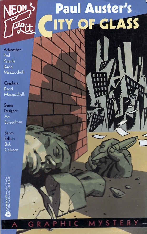
City Of Glass: Introduction by Art Spiegelman

City of Glass (1994)
by Paul Karasik & David Mazzucchelli

It was a misnomer that started it...

A "Graphic Novel!" Bah! 

What would Peter Stillman, Paul Auster's cracked seeker of Ur-language in City of Glass call the visual adaptation of the novel he figures in? A Crumblechaw? A Nincompictopoop?? An Ikonologosplatt??? Comics may no longer be the "real name" for a narrative medium that intimately intertwines words and pictures but isn't necessarily comic in tone.

In the mid '80s some well-intended journalists and booksellers tried to distinguish a handful of book-format comics from other, less ambitious, works by dubbing them "graphic novels." But even though my own book, Maus, was partially responsible for making bookstores safe for comics, the new label stuck in my craw as a mere cosmetic bid for respectability. Since "graphics" were respectable and "novels" were respectable (though that hadn't always been the case), surely "graphic novels" must be doubly respectable!

It was a wrong-headed notion that started it...

It would take another decade before enough long, ambitious comics gave the concept critical mass - until enough work worthy of critical attention made a bookstore section of some sort inevitable - but, tired of seeing my Maus volumes surrounded by fantasy and role-playing game manuals, I tried to jump-start the process. In the early '90s I groused to one of my editors that if my work was fated to be ghettoized in a graphic novel section, perhaps the neighborhood could be improved by hiring some serious novelists to provide scenarios for skilled graphic artists. I got permission to approach several well-known novelists, including William Kennedy, John Updike and Paul Auster.

It was a number of friendships that started it...

I was fortunate enough to become friends with Paul Auster in the late 1980s, and my repeated cajoling got him to toy with the possibility of collaborating with a cartoonist. He had the glimmering of an idea: a vision of a boy floating above water. Next thing I knew, that glimmer became his next novel, Mr. Vertigo, and he kindly invited me to provide a jacket drawing. All the novelists I contacted were intrigued by my proposal, then fled. (Updike, who early in his career wanted to become a cartoonist, said it had taken him fifty years to finally become reconciled to making his cartoons with words.) Even I was a bit dubious of my own idea, secretly convinced that the "purest" expression of the comics form demanded text and pictures made by one person.

And so the project languished, only to be replaced with what I believed was an even worse idea. At some point Paul had suggested that I simply adapt one of his already published works. I shrugged that off until another friend, Bob Callahan, in turn cajoled me into co-editing a series of books with him: comics adaptations of urban noir-inflected literature. I couldn't figure out why on Earth anyone should bother to adapt a book into... another book! To make the task more difficult, the goal here was not to create some dumbed-down "Classics Illustrated" versions, but visual "translations" actually worthy of adult attention. City of Glass was exactly the sort of novel Callahan was reaching for to define what we eventually called "Neon Lit," but rereading Auster's slim volume made the choice seem downright daunting - and therefore actually worth a shot! For all its playful references to pulp fiction, City of Glass is a surprisingly non-visual work at its core, a complex web of words and abstract ideas in playfully shifting narrative styles. (Paul warned me that several attempts to turn his book into a film script had failed miserably.)

I enlisted David Mazzucchelli, whose art on Frank Miller's Batman: Year One had shown a grace, economy and understanding of the form that made the superhero genre almost interesting. The astonishing avant-garde comics and graphics he then went on to self-publish after abandoning the "mainstream" at the height of his acclaim made him seem ideally suited to the challenge of grappling with our proposed adaptation. But after a number of attempts, David began to look disheartened: he was more than able to tell the "story" in Paul's novel but couldn't quite locate the inner rhythms and real mysteries that made the story worth telling. Maybe it was impossible.

Grasping at straws, I called Paul Karasik who had been a student of mine at New York's School of Visual Arts back in 1981 and 1982 (the very years, it turns out, that Paul Auster was writing City of Glass). As a teacher I had come up with some resolutely implausible assignments - like asking students to turn a rather non-narrative passage of Faulkner's The Sound and the Fury into comics - and Karasik had consistently demonstrated a gift for intelligent, plausible solutions.

After explaining our impasse, I remember him cockily telling me he was born for this assignment, but I didn't hear his Auster-like back-story til much later. It seems that back in 1987 (the year, it turns out, that Paul Auster and I first met) Paul Karasik was teaching art at Packer Collegiate in Brooklyn Heights. Learning that one of his most talented eleven year old students, Daniel, was the son of the novelist, Paul Auster, Karasik read several of his books, and for a lark... broke down a few pages of City of Glass in one of his sketchbooks!

The new breakdown sketches he did six or seven years after that first experiment were inspired. When I got to the pages that captured Peter Stillman's memorable speech to Quinn, my jaw dropped. It was an uncanny visual equivalent to Auster's description of Stillman's voice and movements:

"Machine-like, fitful, alternating between slow and rapid gestures, rigid and yet expressive, as if the operation were out of control, not quite corresponding to the will that lay behind it." 

By insisting on a strict, regular grid of panels, Karasik located the Ur-language of Comics: the grid as window, as prison door, as city block, as tic-tac-toe board; the grid as a metronome giving measure to the narrative's shifts and fits.

There was one problem with the sketches: Neon Lit's small final page format couldn't accommodate all those relentless rows of tiny panels without looking uncomfortably cramped. The scrupulous compressions (Paul K had shaped the adaptation so that each cluster of panels took up proportionally about as much space as the corresponding paragraphs did in Paul A's prose original) needed to be rethought so the pages could "breathe" a bit more. Occasional larger images were needed to beckon the reader's eyeballs into the congested grid. Fortuitously, this allowed David back in as a full participant in the further condensing and reshaping whereby he could engage the work with all his formidable skills.

As for Auster, I'm convinced he behaved generously throughout...

Paul Auster, appreciative of the wiggle-room translations and adaptations demand, spent a long, fruitful day with Mazzucchelli, Karasik and I, studying the draft and offering suggestions. Generous as always, he was pleased and supportive, but I don't think he fully realized just how overwhelming the odds against success had been or that his novel had occasioned a break-through work. By poking at the heart of comics structure, Karasik and Mazzucchelli created a strange doppelganger of the original book. It's as if Quinn, confronted with two nearly identical Peter Stillmans at Grand Central Station, chose to follow one drawn with brush and ink rather than one set in type. The volume that resulted, first published in 1994, overcame all my purist notions about collaboration. It offers one of the richest demonstrations to date of the modern Ikonologosplatt at its most subtle and supple.

 - art spiegelman 12/31/03