30 October 2021

Raymond Briggs: A Life's Retrospective by Eddie Campbell

Blooming Books (2003)
by Raymond Briggs

REVIEW BY EDDIE CAMPBELL:
This is the ideal kind of book I should like to see about a favourite artist, and the best since the book on Herriman by O'Donnell & company. It has the same balance as that excellent volume, about 100 pages of illustrated commentary, in tandem with twice as many pages of complete and readable works by the artist being celebrated - and celebrated is the correct word for the present book, a life's retrospective of the beloved author of Ethel & Ernest, a book that featured on my recent list of the three dozen or so graphic novels that make the form a significant cultural event of our times. (See appendix to my own How To Be An Artist). With Briggs now nearly 70, we might feel that the celebration is overdue, except that we would not normally expect our art heroes to be treated so fairly in their lifetimes.

Three classic Briggs stories are reproduced complete and at full size, with the same values as their original appearances. These are Father Christmas (1973), The Tin-Pot Foreign General and the Old Iron Woman (1984) (a satirical comment on the Falklands war that is nowadays difficult to find, if not out of print) and The Bear (1994). Two others are presented complete but in reduced size: The Elephant and the Bad Boy (1978), a fine early example from the period before Briggs customarily illustrated his own texts, and The Snowman (1978), the most famous of the Briggs books, of which the animated adaptation is a standard Christmas television event in several countries. All his other books are visually represented with several pages or excerpted panels, with special mention due to the handful of pencil roughs for Ethel & Ernest in the endpapers. There is not a great deal of this kind of thing for the technical enthusiast or art specialist, though I should not forget to mention some preparatory sketches for an abandoned sequel to Fungus The Bogeyman (1977). The attention to dates that you see here reflects the similar attention to bibliographical particularity in the book itself.

Seeing it all gathered together like this, I am most impressed with the consistency of theme with Briggs' world. The commentary, written by Nicolette Jones, makes the best use of this by organising the material not strictly chronologically but around a series of connections. This enables us to see clearly, for example, the marries couple, Jim and Hilda, in Gentleman Jim (1980), an almost tragic story of a toilet attendant with ideas above his station, are the same hapless Jim and Hilda of When The Wind Blows (1983), in which they are victims of the nuclear war that has appeared to be more or less imminent over the last 50 years.

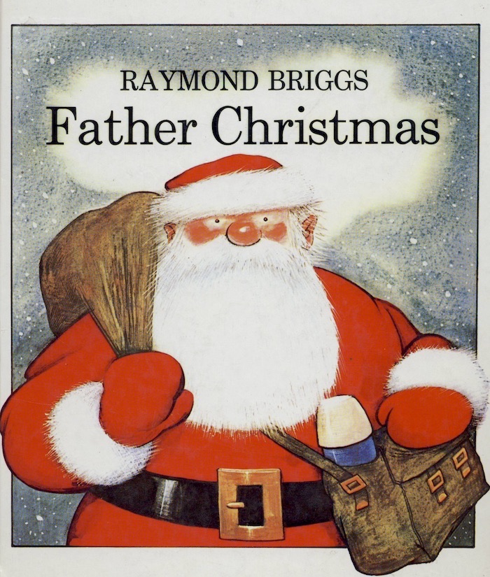
My first encounter with Briggs was the Father Christmas book. I can't remember how I would have come across it, since it presented itself to the world as a children's book and I was 18, no longer a child and not yet back into the kid's book market on behalf of my own kids, when it was published. I can only suppose that my instincts for sniffing out the true comic strip, no matter what shape-shifting form it might assume, were by then fully functioning. Just as remarkable was the fact that Brian Bolland, three years ahead of me at the same college and by now a good friend, had also happened upon it independently. I found this to be true in later years also, that my kind of people all had their personal fondness for Briggs without ever having discussed it among ourselves or agreed that he was of our ilk (that we are artistic kin, so to speak). For example, horror maniac Steve Bissette staying with me in Brighton in 1985 while over for the London Comic book convention, had to make time for a detour to try and locate a copy of the Fungus The Bogeyman Plop-Up Book (1982).

Father Christmas was the one where Briggs first went over wholeheartedly to the comic-strip medium as his format of choice. "It was the pressure of space that forced me into the labour-intensive botheration of strip cartoons. In 1972, while working on Father Christmas, I found I needed far more than the 32 pictures of the standard nook (meaning children's picture book), and more even than the 64 of two pictures per page. There was so much to go in that 10 or more pictures per page were needed, so leading straight into the bottomless abyss of strip cartooning," wrote Briggs in a recent article in the Guardian newspaper. All the words are hand-lettered, with direct speech contained in freehand word balloons. Furthermore, he seemed to be aware of the innovations that had been taking place in comics around that time, and of the seriousness with which the form was being taken in some circles. He established a system of four tiers of panels, which he would combine and expand, enlarging into big double-page vistas when the action invited, and there are several places in the 32-page book where this happens. 

Whatever came before Father Christmas was always vague to me, Briggs' prehistory. In fact, he was by then a highly respected and successful illustrator, having been in continuous publication since 1957. In Blooming Books, the "early years" are given more information on this part of his career than I have so far seen. Then there are 11 pages on "the nursery classics". The Mother Goose Treasury (1966) tends to be the earliest book still mentioned in the artist's resume. It's much more fun than you would expect. There's an image of a man riding a flaming wheelbarrow as one of the five sprightly vignettes around the verse of "The Mad Man." An enchanting page of watercolour and newspaper collage frames "If all the world were paper." There are over 800 separate drawings in this intoxicating rush of a book. Having brought up three children, I feel an odd encroaching sadness that I didn't have this wonderful book to hand through those years, along with all the other favourites of me and my wee ones. such as Bill Pete's Huge Harold and Scroggy (the monster who was afraid of the dark), the name of the author of which is no longer retrievable from the filing system of my head. But his career, in so far as it interested me (and my ilk), started with this grumbling little Santa Claws, whose "blooming Christmas" catchphrase gives the current volume its title. Two years later there was a sequel, Father Christmas Goes on Holiday (1975), rendered just as lovingly in the same style. In 1979 I gave my copies of these to a little girl - I didn't foresee that I would later want to fondly regard then as an essential part of my permanent collection. 


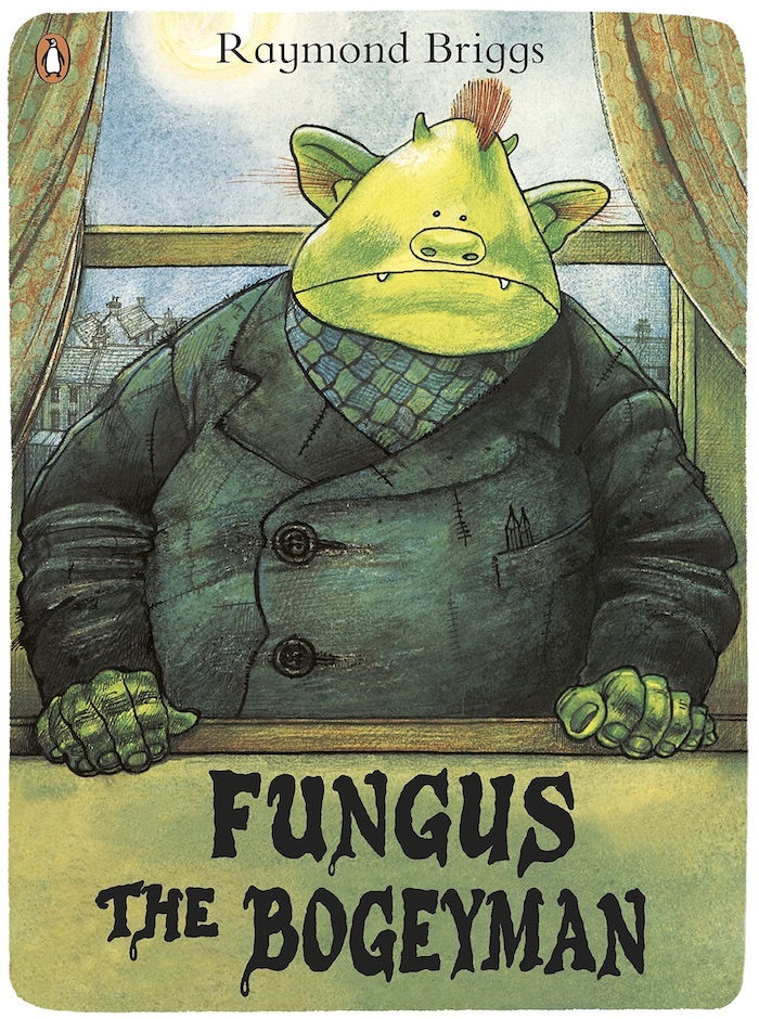
Then there followed that remarkable pair of books, Fungus The Bogeyman (1977) and The Snowman (1978). They have little in common but they will always be a pair in my mythology because they so perfectly illustrate the expressive potential of the comic-strip vocabulary. Fungus is a mad, messy heap of a book. A gorgeously baroque extravaganza of mucky detail, down to the foot notes below panels explaining the impenetrably opaque grittiness of the dialogue: "Boilbye, sourheart" (inscribed in Fungus' balloon as he kisses his wife) "Boilbye: corruption of 'Boils be with you" (footnote under the panel). Huge crumpled sheets of text descend in front of pictures to explain details that they almost obscure while doings in this wonderfully anarchic book, coloured in a sickly palette of greens and grays. Fungus Junior sleeps in an unwashed sardine can. Noses run. Earwax accumulates in every corner of every page. Everything is rendered by hand: every colour applied in a fussy-coloured penciller dribble watercolour.

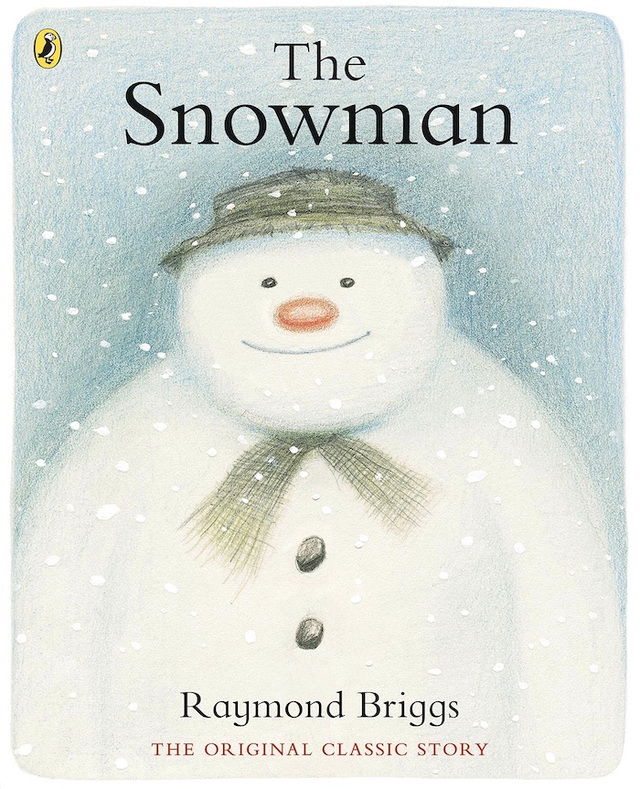
And then there is The Snowman, all crystalline blueness of snow and rosey pinkness of chee, and not a single word in the entire silent 32 pages. Are the poles of the expressive potential of the comic strip anywhere better demonstrated than in these two books side by side? A swift reference to the excellent bibliography of his works at the back of Blooming Books shows Briggs' output between 1973 and his promised book for 2004, The Puddleman, to be only 16 titles. That's approximately two years work per book, and it shows in the craftsmanship.

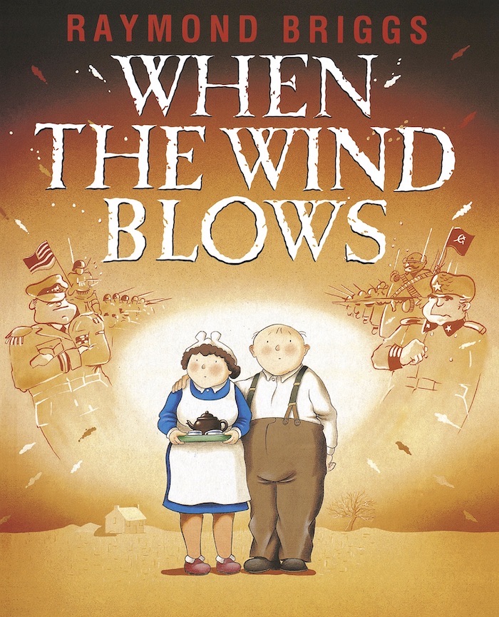
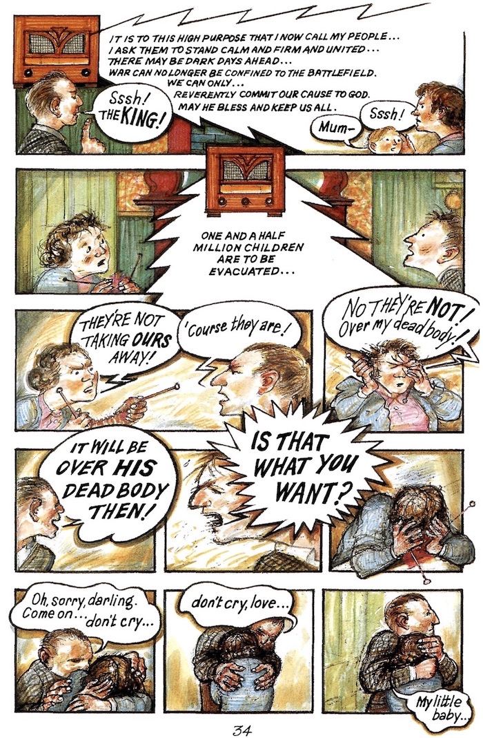
With When The Wind Blows (1972) we have a work that still adheres to the physical dimensions of the illustrated children's storybook, which is to say the hardcovers and full-colour pictures. But the work is unequivocally aimed at an adult reader, although Briggs, like all the great children's authors, was never "writing down" to the kids in his earlier books. It wouldn't surprise me to find that he wasn't actually aware that he was pitching this one to a different readership at all. The simple and trusting Jim and Hilda prepare for the coming nuclear bombardment by attending to the information in the government's official instruction manuals, which, as Briggs demonstrates in his narrative with actual quoted passages, were criminally inadequate. The book fits its time perfectly and became a cause celebre. Britain had found itself with a horribly aggressive government (the Falklands war had been fought that year) and there was a swelling ground level  of objection exemplified by the activities of The Campaign for Nuclear Disarmament. The book was adapted as a radio play, a stage drama and then an animated film. Looking at the 15 pages of the original book that are reproduced here (allowing for six reduced very small) we see that Briggs has cranked  the contrasts up a few more notches. The pages now have six tiers instead of the four he used for the Father Christmas books, giving us between 20 and 24 tiny pictures per page, building to the explosion, a huge, white, flinging double-page spread. In a recent interview he said he got the idea for the tiny pictures when he saw a reduced sized foreign edition of Father Christmas. He hadn't realised panels could be so small and still work.

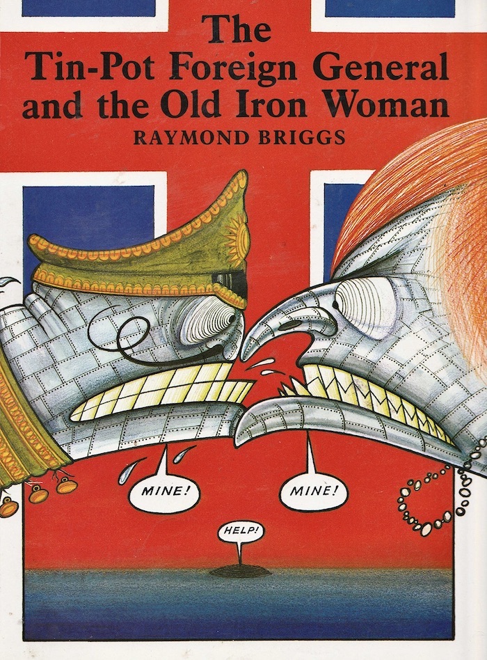
Briggs took his new found role as satirist seriously, and took on Prime Minister Thatcher herself in the next book, The Tin-Pot Foreign General and the Old Iron Woman. This one puts the small panels aside to follow the traditional style of children's illustrated books more closely, which makes satirical sense as Briggs describes the the horrors of the Falklands War as though he were writing a primer. It was an unusual style for him altogether, with its wickedly vigorous caricatures of the two principal combatants, Thatcher and Galtieri. This contrasted with the sensitive and humble pencil drawings of the victims of the conflict, the returned amputee servicemen.

In the year following the publication of this book, I was living in the same town as Briggs and I am sure our paths would have crossed eventually if Fate had not dragged me off to another country. He used to teach illustration at the Brighton College of Art. The Escape Magazine guys [Paul Gravett and Peter Stanbury] did a great little interview with him, and came round to my apartment afterwards for a cup of tea. There was a moment there - maybe it last a couple of years - when boundaries fell away and I thought of Briggs and myself (and all sorts of other folk) as working in the same field. This was demonstrated by the fact that when one of the major British newspapers, The Sunday Times, ran a competition to acquire a running comic strip for itself, Briggs sent in samples, just as I did, and probably everyone else I was associated with at the time. At this late stage I can't remember whether they got a permanent strip out of the exercise, but I remember seeing Briggs' samples, which were run in another British paper, The Guardian. It was great to see him thinking of himself as a newspaper strip cartoonist for a few brief weeks, and working in sharp, black line too. There seemed to be an arrival at a peak of sorts, after which things were not to be quite as they had been before.

For some reason Briggs appeared to lose interest in working within the comic strip form. His next four books go all the way over to the old style of children's books. In The Man (1992), text and image are kept quite separate from each other. Where balloons are used, they have set type in them. The Bear (1994), which is about a little girl who is visited by a huge polar bear at night in her bedroom, has more direct passages in it, and some gorgeous coloured pencil drawing in a reprise of the Snowman style. But it still has the type, and at any rate is perhaps most obviously and intentionally a child's book out of all Briggs works after Father Christmas. This is not to say he had reverted strictly to being a maker of books for the kids, although these two may have been a response to editorial urging after the curious pair that preceded them. 

Unlucky Wally (1987) and Unlucky Wally: Twenty Years On (1988) are something of an anomaly in Briggs' oeuvre. I am amused to see them dealt with in a somewhat embarrassed and peremptory manner in Blooming Books. Here they are given the least space of all his works and are described as his "least commercially successful." Briggs' former editor, Julia McRae, by that time publishing under her own imprint, offers that if she still had been his editor she would have steered him clear of these self-indulgences. I have the first of them (I was offered the second for a couple of bucks but declined. I now wish I had it here for completions sake and perhaps because the first one is starting to grow on me.) It is, in short, a 48-page exercise in self-loathing. Poor obnoxious Wally is plagued by boils, dandruff, haemorrhoids, blackheads, whiteheads, varicose vines, bad breath, foul bowels, false teeth, flatulence, a runny nose, ad nauseam (literally). A scene that shows him failing his army medical shows him in a room full of burly tattooed naked men at the exact moment the doctor holds his testicles. The only forward movement in the action is the punch line on the final page, to the effect that his mum and dad think he's wonderful. When accused of being too hard on this poor loser, Briggs response was that he was only ever talking about himself. However, since the catalogue of maladies is one that could hardly by sustained by an individual, I suspect that he intended to take us all down with him. A similar incident occurs in The Man with an outpouring of racist slurs that apparently the editor requested by trimmed down. The editing only succeeded in removing the magnanimity of all-inclusiveness. 

I do not intend to imply  there is an inherent superiority in comic-strip technique over traditional illustration. I have evolved well beyond the stage of defending the comic strip in principle. But we see in the early book about the elephant (The Elephant and the Bad Boy, 1969) a reaching for a kinetic visual language to integrate all the parts. We see the artist casting about for a system that will increase the sense of movement rather than fragment it in the way that looking alternately to a writer's text and then at an artist's image does (and even at that the images are in two modes, colour and monochrome). Father Christmas is not a superior work because it employs comic strip technique, but rather because it succeeds in integrating all of the parts of Santa Claus' universe into a magical night ride. That it uses comic strip technique to achieve this is a secondary consideration. That the later books inspire less of our affection has  less to do with the abandonment of this technique than with the overall feeling that creative directional thrust has been weakened. On the same principle, I do not mean to assert that a work is superior because it addresses an adult rather than a child. Briggs' work will perhaps never impress me more than the first time I saw Father Christmas.

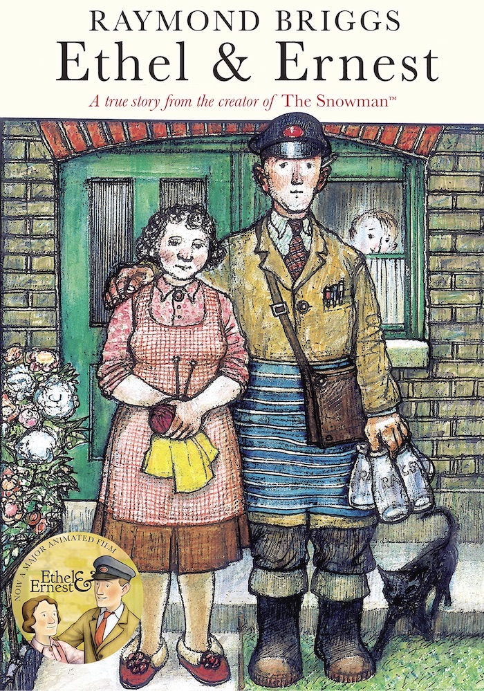
In spite of the above mentioned curiosities, Briggs returned triumphantly to the pure comic-strip idiom with Ethel & Ernest (1998). He has had one self-penned book published since then, being Ug: The Boy Genius of the Stone Age (2001). While it is in the grand old Briggs style that was established from Father Christmas on, it is a slim achievement compared to Ethel & Ernest and I would prefer to end with remarks about that one. Published when he was 64, it was a supreme capping of a great career, a masterpiece in any medium. It would be unfair of us to ask him to go higher than that. It is a biography of his parents and at the same time an account of their times, seen through the particularity of their world view. Briggs himself is in it, of course. The scene of him viewing his mother's body in the hospital is almost too moving to look at. The artist fastens upon the distressing detail of the can of industrial scouring preparation located on the table beside the trolley on which the body rests. Blooming Books give us a striking juxtaposition. The very same trolly with the same cleaning preparation occurs in Unlucky Wally: Twenty Years On. ("Cheerio, Mum" mumbles Wally) showing the unanticipated extent to which autobiography has been a constant in the oeuvre of Briggs. (And giving me another annoying reminder that it's the one Briggs book I haven't read.).

I have often wondered to what extent Briggs is aware of the rest of the universe of comic books and the "graphic novel". For instance, in casting our eye over the field of the last twenty years, we would notice that autobiography has become a magnetic pole of sorts, attracting a number of cartoonists who have already made their mark in other Idioms to take their turn at carrying the standard. Art Spiegelman is the obvious example. The question arises as to whether Briggs had become or had been made familiar with the work of the New York artist. Though its true that correspondences in the work of widely situated artist can occur through the most unlikely coincidences, that separate examples of such high aspiration should occur in the unlikely form of the comic strip without some awareness stretches incredulity. Both artists bare themselves rather painfully with regard to the deaths of their mothers. I would like to believe that Briggs was knowledgeable of this and other events transpiring in the field of the "graphic novel" as it was now being called. It's difficult otherwise to imagine him driving at a work as complete and true as Ethel & Ernest without some knowledge of the movement. But he does not tend to mention these things on the odd accession we read his words directly. That may simply be due to the feeling that the magazine interviewing him may not be au fait with the general facts and major players, a feeling usually confirmed when the interview sees print. I was once dismayed to see words of my own in print as "George Ignatz of Pogo and Krazy Kat fame". It can be better to steer clear of such details.

Another matter that I should like to investigate, if I ever find myself in the interviewer's position, is the extent to which Briggs and Posy Simmonds have been mutually aware. Posy, as you know, or should know, is a newspaper-strip cartoonist whose work has always had a sophisticated adult orientation, and who drifted into children's books using a remarkably similar approach to that of Briggs. Her book Fred was published in 1987 and Lulu and the Flying Babies in 1988. I haven't seen he former, but the latter owes a great deal to the Briggs style, with its delicate pencil colouring and hand lettered balloons. It is surely significant that in her book of 1994, Bouncing Buffalo, she has turned more toward a conventional children's book style, with large pictures and separated text. In other words, both Briggs and Posy have compromised their "strip" approach in the same period and in books from the same publisher. One would have to ask if this was the result of an editorial directive, and if so, whether it was a result of the changing fortunes in the life of the graphic novel. The book market has had a love affair with it starting in 1986 but by the end of the decade things had taken something of a downturn. There would be another turnaround before the end of the nineties and both Briggs and Posy played a roll in the revival, with Ethel and Ernest and Gemma Bovery respectively. But I should like to know how much of this pattern was visible to the participants. It would be useful information in helping us to think about the formation of the graphic novel as owing something to the coming together of strands from different outposts of graphic art, from newspaper strips, children's books, and the underground and small-press movement within the comic-book field.

Much is made in some quarters to demonstrate that Briggs' work "is comics", what ever that may mean (the opinions of the nincompoop brigade - McCloud, Harvey etc - tend to obfuscate more than they illuminate). The aficionado of the comic books sees himself as belonging to a confraternity not dissimilar from a brotherhood of mutants. To this type, it is not enough to characterise Briggs as an illustrator who borrows the techniques of the strip cartoonist. It must be further demonstrated the he is or is not of the true gene. In the intro to Blooming Books by Jones: "Briggs, who went to bat for students he believed in... whose work he admired and who happened to be cartoonists." (Indeed, the secret marks by which we recognise our own.) Briggs, in his latter-day comments, has started to adopt the traits of the initiate and to defend the form at the drop of a hat. In this mode he tends to sound rather whiny, as in the article quoted above: "Why I'd like to be a proper author" - subtitled "Strip cartoons are a botheration for Raymond Briggs" - from The Guardian (November 2, 2002), which you may be able to locate online. "I wish I could be a proper writer, having to do only the words. Proper writers can start at the beginning, go on til they get to the end, then stop and hand it in. No drawing and painting, no design, no jacket to do and, above all, no hand lettering. Luxury." The intended effect is probably to invoke the personality of that endearing curmudgeon, his own, Father Christmas, but I do not warm to it. Perhaps I have spent too long trying to create the impression of a vigorous and unapologetic artistic movement to allow room for other voices. If it turns out that Briggs in fact identifies, at a deep level even, with the comic-book aficionado in all of his supposed emotional insecurity and maladroit unhealthiness, then it's time to go back and reexamine the two Unlucky Wally books. We might hear what we missed the first time around when we weren't listening properly. 


Eddie Campbell is the celebrated creator of Alec and Bacchus, and collaborator (as artist) with Alan Moore on From Hell. His recent book The Goat-Getters explores the early years of the newspaper strip.


Eddie Campbell: 45 Graphic Novels of Serious Intent

Alec: How To Be An Artist (2001)
by Eddie Campbell

"Graphic Novel... The term will embody the arrival of an idea; a serious intent will be brought into the common comic and remain as a trend through the last quarter of the twentieth century, perhaps further. The trend will be revealed through attempts to build extended works using the mechanics of the humble comic strip. They are probably to be numbered in thousands. Such a waste of paper is bound to make you wonder if the end result can be worth it. Some will be bad, some dull, perhaps the worst crime a comic can commit. Some will be no more than regular comic books dressed up pretentiously. Some will be well-meaning, some bright. Some may be good even, and just not make my list because I'm a fallible clairvoyant. There will be around four dozen books at year 2001 whose theoretical aggregation (for in reality we cannot expect them all to like each other) will nevertheless imply a worthwhile phase in the human continuum, and to be a part of such a moment is perhaps the longing at the heart of artistic ambition. Needless to say, some of those authors listed will make shorter works superior to the long ones for which I have celebrated them. I am pointing out the landmarks. May a perceptive historian map the ground between and may his book be better than some of the stupidities out there." 
 ~ Eddie Campbell, from Alec: How To Be An Artist

  1. The Cowboy Wally Show (1987)
    by Kyle Baker

  2. by Kyle Baker

  3. Dear Julia (2000)
    by Brian Biggs
     
  4. by Raymond Briggs
     
  5. by Raymond Briggs

  6. by Chester Brown

  7. by Chester Brown

  8. by Eddie Campbell

  9. by Daniel Clowes

  10. David Boring (2000)
    by Daniel Clowes
     
  11. by Howard Cruse
     
  12. by Will Eisner

  13. A Life Force (1985)
    by Will Eisner

  14. by Will Eisner

  15. To The Heart Of The Storm (1991)
    by Will Eisner

  16. by Will Eisner

  17. Casanova's Last Stand (1993)
    by Hunt Emerson

  18. Tantrum (1979)
    by Jules Feiffer
     
  19. Violent Cases (1987)
    by Neil Gaiman & Dave McKean

  20. Signal To Noise (1992)
    by Neil Gaiman & Dave McKean

  21. Mr Punch (1995)
    by Neil Gaiman & Dave McKean

  22. Hicksville (1998)
    by Dylan Horrocks

  23. The Jew Of New York (1998)
    by Ben Katchor
     
  24. Berlin (2001)
    by Jason Lutes
     
  25. Cages (1998)
    by Dave McKean
     
  26. adapted by David Mazzucchelli
     
  27. by Alan Moore & David Lloyd

  28. Watchmen (1988)
    by Alan Moore & Dave Gibbons
     
  29. Big Numbers (1990)
    by Alan Moore & Bill Sienkiewicz

  30. From Hell (1999)
    by Alan Moore & Eddie Campbell
     
  31. The New Adventures Of Hitler (1990)
    by Grant Morrison & Steve Yeowell

  32. by Gilbert Hernandez
     
  33. by Gilbert Hernandez

  34. by Jamie Hernandez

  35. Uncle Sam (1998)
    by Alex Ross
     
  36. Palestine (1996)
    by Joe Sacco

  37. Safe Area Gorazde (2000)
    by Joe Sacco

  38. by Seth

  39. Gemma Bovary (1999)
    by Posy Simmonds

  40. Jaka's Story (1990)
    by Dave Sim & Gerhard

  41. Going Home (1999)
    by Dave Sim & Gerhard

  42. Maus (1993)
    by Art Spiegelman

  43. The Tale Of One Bad Rat (1995)
    by Bryan Talbot

  44. Goodbye Chunky Rice (1999)
    by Craig Thompson
     
  45. Jimmy Corrigan (2001)
    by Chris Ware

Eddie Campbell is the celebrated creator of Alec and Bacchus, and collaborator (as artist) with Alan Moore on From Hell. His recent book The Goat-Getters explores the early years of the newspaper strip.


24 October 2021

"Arcade: Too Avant-Garde For The Mafia?" by Alan Moore

Arcade #1-7 (1975-1976)
edited by Art Spiegelman & Bill Griffith
Arcade #1 cover art by Robert Crumb 


INTRODUCTION:

Alan, 
Thanks for the entertaining letter. Seeing as it was of such a high intellectual calibre, we'll most likely print it in our next issue... You almost found us too late. No 7 is just out and No 8 (out in 6-10 months) will be our last as a magazine. After that we go annual, in paperback form. I'm afraid we're a bit too avant-garde for the Mafia. 
Tally ho, 
Griffy

I received the above letter in the late September of 1976 after coming across a handful of issues of Arcade at the comic shop Dark They Were & Golden Eyed. I'd originally picked the magazine up on impulse after being attracted by a cover line that promised the unlikely combination of William S Burroughs and S Clay Wilson, apparently to be found within. What I discovered was a collection of comic material that swiftly elevated Arcade: The Comics Revue to the Olympian reaches of my Three Favourite Comics Ever In The History Of The Universe. As is usually the way when I encounter something I'm really fond of, my condition escalated rapidly from good natured boyish enthusiasm to an embarrassing display of slobbering hysteria. I wrote a long and love-struck letter to the magazine swearing that in order to ensure the continued publication of this Pulp Paragon I would be prepared to have sexual intercourse with a Komodo dragon or kill my family with a blunt butter-knife (or words to that effect). A few weeks latter I received the above rely from Bill Griffiths. I reprint it here partly because I really like the bit about my high intellectual calibre, and partly because of its historical interest: The last issue of Arcade was issue 7. There was no annual paperback. The Mafia obviously got them after all.

During its brief lifespan Arcade published some of the only truly worthwhile material produced during the 1970s, and for a short time seemed almost capable of revitalising the near extinct genus of the Underground Comic. This dream was truncated suddenly when Bill Griffiths woke up one morning to find Zippy The Pinhead's pointed, severed head in bed with him, or whatever way it was that those ruthless pinstripes Sicilians put the frighteners on him. The fact that Arcade folded is a shame; the fact that it has been pointedly ignored ever since is a tragedy... at least on the effete scale with which we aesthetes evaluate tragedies.

In an effort to address the balance a little I'd like to attempt a brief and necessarily inconclusive rundown on the magazine. To understand Arcade you first have to understand a little of its historical context, so I hope you'll bear with me as I do my best to lubricate the dry facts.

Arcade #2
Cover art by Robert Crumb

LUBRICATION:
Arcade #1 was published in the spring of 1975 as a quarterly black and white magazine of around fifty pages, sporting beautiful full colour covers, many by Robert Crumb, printed on card. It appeared at a time when the Underground comic had started to cough up blood after several years of looking pale and ill. The initial wave of energy provided by ZAP Comix had reached its high water mark, broken, and fallen back. The busts and court cases had taken their toll, and the only undergrounds that seemed to be breaking even were those that tended towards sex and horror: Skull, Slow Death and lesser titles seemed to appear with some regularity while the more adventurous and experimental books fell by the wayside. One gets the impression in retrospect that the underground market was slimming itself down and getting rid of its social conscience in preparation for its metamorphosis into the Heavy Metal audience of some years later. Whatever the situation, things looked bleak for the underground.

In 1975 then, Arcade served as a rallying point for those cartoonists who were more concerned with their art than their bank balances. In the process it brought more concentrated intelligence to bear upon the comix strip medium than has been experienced since the balmy heyday of the Great American Newspaper Strip. So what was it all about?

As a package it was delightful: Nice printing on white paper and card covers aside, it had a sort of garish pulp charm that latterday descendants such as RAW can't really hope to capture. Arcade wasn't hard edged and intimidatingly intellectual. It was approachable, and everything from the style of the mast head lettering to the gallery of self-portraits on the contents page reflected this somehow. Entertaining as the package might have been however, it didn't hold a candle to the contents.

The contents of Arcade had a pleasing regularity, considering how diverse the actual material was. Most of the early issues opened with a full page illustrated text feature by Jim Osborne on the inside front cover, similar to the Loathsome Lore features that the late Roy Krenkel did for Warren's early run of Creepy. These were historical items centring upon some famous real-life monster from history, such as baby-butchering Caterina Sforza or Peter Kurten the DĂĽsseldorf vampire. Lovingly illustrated in Osborne's delicate stippling, these catalogues of genuine atrocities became so numbingly terrible as to be almost funny, leading the reader in to the uneasy no-mans land between the disturbing and the amusing that was to almost a trade mark for a number of the most prominent Arcade artists, and the nearest that the magazine ever got to a distinctive House Style.

Arcade #3
Cover art by Robert Crumb

After an imaginatively designed contents and editorial page, the main contents unrolled. As the issues passed, some of these emerged as Arcade's equivalent to continuing features.

SPAIN RODRIGUEZ:
As an example, there seemed to be a sort of unofficial biography spot, in which one of Arcade's regulars would produce a comic strip biography of the character of his choice. These included George Kuchar's darkly comic piece on H.P. Lovecraft and a brilliant study of the life of Henri Rousseau by Bill Griffiths but the very best was a portrait of Stalin by Spain Rodriguez (Arcade #4). Within a limited number of pages, Spain created a convincing picture of the brooding and psychopathic 'Red Monarch' and the strange abstracted landscape in which he lived. The use of heavy block shadows and Rodriguez' powerful sense of composition give a real atmosphere and weight to the story, with an abrupt and brutal pace to the storytelling that matches the chilling nature of the subject matter quite adequately. A scene in which Stalin's wife is reported a 'Suicide' (whatever that meant in Stalinist Russia) is portrayed as a severe downshot, looking straight down from near the ceiling of an elegant bathroom at the woman sprawled upon the floor like a stringless puppet, hard lines of black ink radiating from her slashed wrists and trickling off across the white tiles. And the final images are perfect: The narrative caption boxes relate how, during his final years, Stalin would travel by car along highways built for his solitary personal use across Russia. Wherever he stopped along the way there would be a room waiting for him specially constructed so as to be an exact duplicate of his room in the Kremlin, right down to the book lying open on the bedside table. While this is sinking in, we see three pictures, showing a simple side elevation of a sparsely furnished, neat-looking bedroom. Each picture is identical to the others except that they get progressively smaller. In effect, we get the impression of an endless series of identical rooms stretching away into the empty distance, proving an unnerving glimpse into the mind of someone who once controlled half of the world.

JUSTIN GREEN:
Another high-point of Arcade was Justin Green's Classics Crucified series, in which Green, the undisputed Nabob of Neuroticism and creator of the remarkable Binky Brown Meets The Holy Virgin Mary, took the concept behind Classics Illustrated to its logical and bloody extreme. Whereas Classics Illustrated somehow managed to maintain an air of false dignity all the time it was sawing Captain Ahab's other leg off in an attempt to fit Moby Dick into a comic-book, Green pulled out all the stops and deliberately vulgarised works of classic literature with all the delicacy of a PCP-crazed dog-sodomist. The best example is probably his three page reworking of Dostoevsky's Crime & Punishment in issue 3 of Arcade. I won't go into detail, but the final panel should adequately describe the reverence with which this greatest of Russian novelists has been approached. After tortured protagonist Raskolnikov has reached the point of self-revelation that has eluded him throughout this massive novel ("Oh God! I just realised... I'm a shitty murderer and a terrible person!") his persecutor, Inspector Porfiry Petrovich, strikes up a relationship with Raskolnikov's loved one, Sonia. In the last panel, Green summarises Dostoevsky's notion that the torture of one individual is somehow redeemed in the elevation of others to loving harmony, most adequately as Inspector Petrovich poignantly remarks, "Just think... if those two bimbos wasn't knocked off, I never woulda met Sonia!" Sonia gazes at him adoringly and says, "He is my Sugar-Father." End of strip. For my part I thought it was better than the original.

KIM DEITCH:
Then there was Kim Deitch's recountings of the stories upon his own pet theme: Famous Frauds. Filtered through Deitch's Fleischer-esque sensibilities, the stories of such notable tricksters as Don Carlos Balmo-I, who was actually a woman, and the chess-playing robot Ajeeb took on a new and surreal dimension. Ajeeb was particularly interesting: a huge and hollow ‘automaton' concealing a small human operative, Ajeeb outlasted several operators – one of whom turned to drink and went mad after spending his entire working life sitting in the cramped interior of the stuffy and lightless pseudo-robot – before finally suffering the humiliation of defeat at the hands of an 11 year old boy. The boy won a box of cigars, and that was Bobby Fischer's very first chess prize. The stories are simply told and fascinating, and therein lies a lot of the appeal, both of Deitch's work in particular and of Arcade in general: the stuff was well written and well constructed. It hung together well and it had a point. Would that there were four books like that around today.

Arcade #4
Cover art by Robert Crumb

OTHER CONTRIBUTORS:
Most issues had a text feature written by some contemporary notable and illustrated by one of the Arcade crew. The idea worked well, the three page text features broke up the otherwise acres of comic strip and set off the work to its best effect by contrast. The better pieces in this category included two inspiring pairings: Charles Bukowski and Robert Crumb; and S. Clay Wilson and William Burroughs. Crumb's rubbery Terrytoon lines perfectly evoked the seamy nostalgia of Bukowski's prose, while in Burroughs S. Clay Wilson seemed to have found a match for his own abnormally horrid imagination.

Jim Hoberman also contributed a text column, Space Age Confidential by name. Variously illustrated by Deitch, Robert Williams and Art Spiegelman, Space Age Confidential talked enthrallingly about such American icons as Coca-Cola, Disneyworld and President Calvin Coolidge. In doing so it underlined another prominent strand running through Arcade, a sort of determination to expose the dark and bizarre side of contemporary pop culture, starting with the comic strip and working outwards.

Despite the heavy whiff of Dadaism in the material, Arcade displayed nothing but the greatest respect for the medium it was working within. Great moments in the medium's past were recalled and re-examined in a feature called Arcade Archives. While at the moment we have an exemplary publication like Nemo to help us find out about strips of the past, in 1975 Arcade Archive's four or five pages a quarter were the best thing on offer. It was here that I first discovered such glittering geniuses as Harrison Cady, and became convinced that a familiar name like H.M. Bateman might be worth a deeper examination.

This concern for the past of the medium was matched with a concern for its future that was best reflected in a feature known as Arcade Sideshow, which rounded out the magazine. Sideshow consisted of numerous half-page strips by new artists, or occasionally by an older hand who simply wanted to experiment with the interesting restrictions of the half-page format. Aline Kominsky, Mark Beyer, Sally Cruikshank, Rory Hayes - I encountered them all for the first time in the sawdust and popcorn atmosphere of the Sideshow. The title seemed especially adequate in light of the freakishness of some of the art-styles on display. It was my first exposure to the idea of primitivism in comic art, and after my initial conditioned repulsion had worn off – about three months – I found myself approaching the work of people like the late Rory Hayes with a real and almost inexplicable pleasure. This is the edge of the underground that most comic fans balk at. When confronted by the painful amateurishness of an Aline Kominsky, the mind conditioned to Neal Adams and Mike Golden will probably recoil in stark terror and vomit mauve bile. The root of the argument seems to be, "But she can't draw." In terms of standard comic art, this is perfectly true. John Byrne can draw and Aline Kominsky can't. What you have to realise however, is that the drawing ability of the artist is not what art is about. Not all the time. And I for one would love to see Aline Kominsky do an issue of the Fantastic Four.

All of the above is an attempt to list just the continuing features of Arcade,  and even so it is incomplete. I haven't mentioned Art Spiegelman's Real Dream spot, where readers were invited to send in dreams for Spiegelman to illustrate, or Yippie monument Paul Krassner's expose upon Timothy Leary and the grim facts behind the Lenny Bruce industry. This is largely because the most significant of Arcade's contributions to the medium were one-off pieces rather than continuing features. However astonishing the material listed above might actually be it was really only the setting for the various pieces de resistance that Arcade was to present over its seven issue lifespan.

There were so many good pieces, even in such a drastically curtailed run, that I can only hope to list a few in passing before tackling a couple of personal favourites in depth. There was Jay Kinney's wordless and ominous Midnight, executed entirely upon scaper-board; the late Willy Murphy's excellent Arnold Peck adventures, Diane Noomin's Sultana of schlock Didi Glitz in a series of vacuous vignettes, the stunning colour work adorning the back covers by Spiegelman, Moscoso, McMillan, Robert Williams, Kliban and others, and so on and so on in an endless shopping list of extraordinary talent gathered in one place at one time. Quite genuinely, this was the most perfectly conceived and executed comic publication since Harvey Kurtzman's MAD, and there has been nothing like it since.

Arcade #5
Cover art by Jay Lynch

I think that without a doubt the three most consistent creators working at Arcade were the magazines editors; Bill Griffith and Art Spiegelman; and that cranky old misogynist Robert Crumb himself.

ROBERT CRUMB:
Crumb's Arcade work, although it has perhaps been surpassed by some of the material he's contributed to Weirdo, was his best to date at that point. Apart from surprisingly lyrical covers, he contributed a healthy number of strips to the magazine's interior, including a two-page dissertation upon buttocks, a selection of unpublished drawings from his sketchbook that proved every bit a meticulous and fascinating as his comic work, and a stunning and bleak look at like in This Here Modern America that oozed despair. Indeed, after looking at the best two pieces that Crumb contributed to Arcade one might be forgiven for assuming that the Mid-Seventies were not a particularly happy time for the artist.

In Arcade #6, Crumb contributed something that looked very much like the last word in funny animal anthropomorphism at the time, and still does to a certain extent. Entitled Ain't It Nice and starring Those Cute Little Bearzy Wearzies, the strip portrayed a vision of inner urban life and love every bit as flatly and methodically as something like Last Exit To Brooklyn could achieve in the literary field. It was seven pages long, and each page had a grid containing twenty individual panels. The strip minutely chronicles a day in the life of two working class inner urban bears, Jippo and Boopsy, as they go through their day. Some moments are ugly, some are surprisingly touching, but by the end of the strip you feel a sort of pang of recognition, along with a sensation of having learned something. Crumb has used funny animals in the classic sense: By showing human foibles portrayed by animals an artist can sidestep all the obscuring preconceptions that people have about human behaviour and enable them to look at themselves dispassionately as if they were observing another species. The beauty of Crumb's concept here is that he has made the human behaviour being portrayed a lot more disturbingly naturalistic and near the knuckle than most of his predecessors. In doing so he also shows us how much of the animal there is in human behaviour by way of the rough physical preliminaries that the two-lovers go through before finally arriving at a sloppy and drunken sexual bout. There's a sort of inversion of the principals of anthropomorphism there that hasn't been attempted since Kurtzman/Elder Mickey Rodent strip in MAD.

Crumb's best piece, however, concerned real people. Appearing in Arcade #3 under the title That's Life, it chronicled the brief and unspectacular rise and fall of a black backwoods singer called Tommy Grady who cut one 78rpm record before being shot dead in 1931. The first three pages take us through Tommy Grady's last year of life. He fights with his wife and hits the road taking only a knapsack and a guitar. Picked up by friends on their way to Memphis to cut a record, he is persuaded to cut a tune himself as part of the then-current boom in Ethnic Music. Blowing his first pay-check on drink he picks up a woman and gets shot dead in a senseless argument with her boyfriend. The next two pages carry us through the depression of the thirties, when many of the small record labels went out of business and a large number of records deleted, Tommy Grady's amongst them. The final page brings us up to the seventies, where an avaricious blues collector looking suspiciously like Crumb himself, buys a solitary surviving copy of Tommy Grady's only record from an old black woman as part of a job lot. He takes it to his blues aficionado friends in L.A. who give it a public airing over their expensive hi-fi units. The last panel shows a crowd of rich white-American blues scholars smiling blissfully as Tommy Grady's voice drifts around the elegant apartment: "Po-o boy, lo-ong way f'um home... Po-o boy lo-ong way f'um home..." A lone caption reminds us of the title: "...And that's life!" Crumb at his manic-depressive zenith.

Arcade #6
Cover art by Robert Crumb

BILL GRIFFITH:
The fact that the two editors of Arcade, Griffith and Spiegelman, contributed so many of the most wilfully experimental pieces (as well as the best in many instances) leads me to suspect that they saw the experimental angle as one of Arcade's major reasons for existence, and individually they followed their convictions with a vengeance. Griffith contributed a number of truly memorable pieces including a number of half-page Griffiths Observatory strips for the Sideshow feature. The Rousseau piece mentioned earlier figured highly amongst the rest of his works, as do the Commedia Dell Zippy and the disturbing The Toad & The Madman in which Mr Toad and Alfred Jarry discourse upon the unspeakable truth. Also the strictly paced piece of film noir entitled Doll Boy should be given a mention if only for its style and control.

Griffith's best piece, at least in my mind, remains A Fools Paradise Revisited in Arcade #3. In this ten page strip, Griffith followed the passage of the ubiquitous Zippy The Pinhead through a lavish and classical Stately home. Each page is divided into four wide horizontal panels, stacked one on top of the other, creating a cinemascope effect (or Zippyscope, as the artist would have it). After a number a splendid sequences made more evocative by the panoramic nature of the visuals, we get a single deviation from this rigid page structure. One strip on the last page is broken into seven smaller panels, showing Zippy The Pinhead's progress as he drifts out to sea upon a chunk of ice-berg. Zippy's comment at this juncture, delivered with one word in each panel as the pitiful Pinhead drifts away towards the distant horizon, is revealing: "I Hate Everything That's Modern. Everything. That's. Modern. I Hate. It..." It's not until you've read it a few times that you realise that the sun is slowly rising in the background as night gives way to daytime, and that the magnificent microcephile has managed to string one sentence out over some three or four hours. Like Jarry's Pere Ubu, Zippy perpetrates a sort of comedy of the unconscious, stumbling through a half-understood landscape shattering time, logic and preconception as he goes. The bits that you laugh at loudest are always the bits that you least understand consciously, and at times the Zippy mystique manifests itself eerily beneath the veneer of slapstick – and nowhere more effectively than here.

ART SPIEGELMAN:
Griffith's co-editor, Art Spiegelman, is the last artist under discussion here. Of all the contributors to Arcade, Spiegelman remains the most creatively self-conscious in his use of the medium, and in consequence achieves many of the more penetrating insights. For the most part Spiegelman's work is as much about the comic-strip medium as whatever story he happens to be telling. While this is true to a lesser extent even of such recent work as Maus, the trend for self-examination was most apparent during Spiegelman's stint on Arcade.

In the first issue, Spiegelman contributed a piece entitled Cracking Jokes which manages to provide an accurate and scholarly dissertation upon humour while being in itself funny. By taking a simple four frame gag and examining it over and over again from every conceivable standpoint for three pages, Spiegelman actually manages to say something about humour itself at the same time as expanding one's notions of what the comic medium is capable of.

Other notable strips include Ace Hole Midget Detective, in which Spiegelman manages to weave a detective story in together with a few observations on Picasso and the relationship between comics and modern art; and As The Mind Reels, in which he successfully intercuts between a mundane soap-opera, a pasta advertisement, a bored housewife's telephone conversation and his own working notes for the strip, creating a sort of collage of everyday life punctuated by televisual inanity, contrasting the real-life of soap operas with the real-life of the everyday world.

My favourite Spiegelman piece, however, is a two page exercise included in Arcade #6, entitled The Malpractice Suite. What Spiegelman has done is to take panels from the Rex Morgan newspaper strip by Bradley and Edgington - head and shoulders shots for the most part – and then extend the lines of the image beyond the panel borders to form them into new shapes and contexts. As an example, we see a standard Rex Morgan panel with a woman up close in the foreground, turning away from us in a head and shoulders shot. She is starting to glance towards a man in a raincoat who has just come to the door, his feet invisible below the bottom panel borders, however we see that what Spiegelman has added to the original design has placed it into a disturbingly different and surreal context. The woman whose face we see in the foreground is given a crude and stumpy body beyond the frame borders, the blouse open to reveal naked and sagging breasts. The man in the background, it transpires is not in the background at all. He's about eight inches high and he's in the foreground. The bare-breasted woman is holding him up in one hand like a popsicle. The sudden change in he way that reality is perceived is disturbing, and suggests all of the subliminal tensions and currents that exist just beyond the panel borders of everyday life.

Arcade #7
Cover art by M.K. Brown

LEGACY:
Of course the most bewildering thing is exactly how they managed to fit all of the good material mentioned at wearying length above as well as all the worthy stuff I didn't mention – into a mere seven issues, although I for one am glad that they did. To me Arcade was an almost perfect culmination of the whole idea of Underground Comix. Granted, there have been worthy individual efforts by the various Arcade contributors since then, but somehow without the same flair. RAW is a splendid magazine, but it's intimidating. I can't bring myself to criticise anything that is that well printed and I find myself approaching RAW in almost the same way as I approach gallery art - coldly and from a polite distance. Crumb's Weirdo is similarly excellent, but I think that at least in terms of a magazine he needed someone to balance his consuming taste for artistic deviance with slightly less iconoclastic sensibilities.

Balance is what Arcade achieved, in a nutshell. It balanced Griffiths' metaphysical slapstick against Spiegelman's thirst for self-reverential comic material and ground their more explosive experiments with a solid anchor of Robert Crumb's simple and unadorned storytelling. It pushed the medium in all sorts of new directions, the vast majority of which still remain to be properly explored almost ten years later. Anyone seriously interested in seeing what directions comics might go in the future could do a lot worse than checking out just how far they've been in the not too distant past.

If the Mafia were really responsible for Arcade's demise then perhaps Joe Valachi was right to squeal on the bastards after all.

Alan Moore

This article is reprinted with the kind permission of the author. It originally appeared in the British fanzine Infinity #7-8 in 1984. Infinity resurfaced between 2012 and 2014 as a free-digital magazine and is well worth checking out.


23 October 2021

RAW Magazine edited by Art Spiegelman & Francoise Mouly (No. 16)

RAW Magazine (1980-1991)
edited by Art Spiegelman & Francoise Mouly

REVIEW BY KIM THOMPSON:
(from The 100 Best Comics of the Century! in The Comics Journal #210, 1999)
RAW didn't come out of nowhere, exactly. With his co-editor Bill Griffith, Art Spiegelman had already staked out much of the same creative territory half a decade earlier with the short-lived underground anthology Arcade (1975-1976); moreover, the superb hardcover collection, Breakdowns (a combination of Spiegelman's Arcade material and his best underground work) had thrown down the gauntlet - in terms of ambitious formats as well as formal experimentation - for other cartoonists to pick up in the coming decade. Even so, in the vast funny book wasteland of 1980, with underground comics seemingly tapped out and new "alternatives" yet to come (don't even bring up the mainstream, then, as now, at one of its many nadirs), the extravagantly oversized, lushly printed, frighteningly expensive ($3.50!) RAW #1 came as the biggest shock to the comics system as ZAP #1.

RAW was built around a core of cartoonists that included a new generation of technical virtuosos intent on producing discomfort in the reader (Mark Bayer, Charles Burns, Sue Coe, Drew Friedman, Kaz, Mark Newgarden and Gary Panter); the very best of the previous decades still-kicking undergrounders (R. Crumb, Kim Deitch, Justin Green and Griffith and Spiegelman); and an impeccably selected cross section of modern European cartoonists (Doury, Loustal, Mariscal, Masse, Mattotti, Meulen, Munoz / Sampayo, Swarte and Tardi). Add in the editors' serious and painstaking but prankish approach to magazine production (issues included bubblegum cards, deliberately ripped covers, and a set of X-rated bits "censored" from a story), RAW became an art object as well as superlative reading experience.

After eight self-published tabloid-size issues in seven years, Spiegelman and Mouly re-launched RAW as a Penguin paperback. Even though this second "volume" was designed in a more mainstream friendly format, there were no creative concessions; in fact, by making impossible the graphic indulgences of the tabloid-size editions, the "new" RAW handily rendered moot the most frequent criticism - that its emphasis on design overshadowed narrative. Unfortunately Spiegelman and Mouly called it quits after three issues. At the time, RAW had become so infrequent (those three Penguin editions took six years to produce) that its disappearance didn't carry a sting - more like a long slow, creeping disappointment as the '90s continued on with no new releases. But by that time, RAW had launched so many careers, defined (and in some cases exhausted) so many trends, and opened so many possibilities that its job had arguably been done.

(And then there was that Maus serial, too...)


22 October 2021

Wigwam Bam by Jaime Hernandez (No. 13)

Wigwam Bam (1990-1993)
by Jaime Hernandez

REVIEW BY TOM SPURGEON:
(from The 100 Best Comics of the Century! in The Comics Journal #210, 1999)
Wigwam Bam is Jaime Hernandez's best-realised long work, an amazingly rich meditation on the power memory has over one's everyday life. In itself an affecting story, Wigwam Bam gains even more significance in the context of the artist's wider Love & Rockets run. More-over, it contains one of the best meta-fictional conceits in comics history. Characters within Wigwam Bam struggle to come to terms with an idealised view of the relationship between Hernandez's characters Hopey and Maggie - just as readers who experienced those early stories also must deal with their nostalgia for that relationship.

Underestimated as a writer, Hernandez makes use of a number of fascinating and unconventional narrative techniques in Wigwam Bam. The story begins with an ending: Maggie leaves Hopey, and does not physically appear again in the story. This development echoes Hopey's abandonment of Maggie during the stories collected in The Death of Speedy - the beginning of a larger story cycle for which Wigwam Bam is the climax - and allows Hernandez to investigate the often inscrutable Hopey without her most humanising relationship.

As was the case with Hopey in those earlier stories, Maggie's presence in Wigwam Bam is actually larger for her absence. In fact, the most emotionally satisfying conclusion is Maggie's, as Hernandez allows a discovered diary to speak to the turmoil the character experienced as the story began, giving her decision to leave a believable, emotionally laden context.

The supple, gorgeous art on display in Wigwam Bam has never been more important to the ultimate success off one of the cartoonist's stories. The world into which Hopey finds herself drifting is presented in terms attractive enough that even as odder aspects seem appealing, making the violent turn of events near story's end that much more disturbing. Hernandez's skill with character design is crucial - new characters (and there are many) make their impressions immediately, while older characters are distinct while retaining elements of the previous incarnations. Hernandez's skill in delineating characters allows him to tell stories in an extremely graceful shorthand - we derive from how the characters relate to one another, or simply by how they look and carry themselves, hundreds of text pages worth of meaning. 

The messages implicit in Wigwam Bam are neither reassuring nor trendily nihilistic. Instead, each character's story delivers a note of poignancy mixed with guarded, subtle optimism. While Maggie's diary shows how her memories of a childhood friend's death have led her to fear abandonment, reading that diary helps the character Izzy come to terms with her own feelings about the Maggie and Hopey relationship. The scenes where Hopey realises how quickly any support she's enjoyed has fallen away, leaving her exposed and alone, are rightfully devastating. But they also serve as a sign that the worst has passed, and that the events may become a lesson for a character who resists every kind of growth. All of the characters in Wigwam Bam grapple, successfully or not, with similar epiphanies of wisdom and pain. Wigwam Bam is one of the best stories in any medium about memory, adulthood and loss.


FURTHER READING: